You’re supposed, as you get wiser, to kill your idols. The understanding of humanity that comes with knowledge and the experience of life is supposed to make you less easily impressed by individuals that appear exceptional, and to look for the contribution of serendipity and opportunity in achievement. You learn to be very sceptical of life narratives polished by hindsight.
So it makes all the more difference to see that a few people survive repeated contemplation. Those persons’ standing in your thoughts is an intensely personal matter: a mix of their public identity and your personal interactions that are, in that specific combination and weighting, just yours. Their work, their publications, and their utterances in the presence of many get mangled with all the private conversations and those moments that survive the natural erosion of memory. And, in the case of any person who writes, that other voice, the published one: generalised in form and precise in appearance, but direct and personal at the same time, like a secret whispered in isolation, that expands into a fuzzy stream of thoughts and ideas.
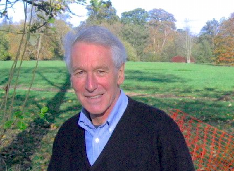
Keeping good company to a very – very – small number of people, Richard Southall brushed off easily any exercises to question his importance for my thinking. Intellectually, I feel indebted to his way of thinking about type and typography. Personally, I have been humbled by his kindness, and his open attitude to anyone who came to him with a question, however silly that may have been (and, boy have I asked some stupid ones myself…).
The stories of how Richard ended up in typography are best left to those who knew him in his youth, and have firsthand recollections. Similarly, his engagement with seminal chapters of type and typography have been documented to some degree by others — notably, and recently, by Alice Savoie for her PhD. He was particularly bad at reminding people of his track record, admitting eventually that when this or that critical development was happening he had been there, or at least had been involved with the people who carried it out, and his contribution had somehow escaped the simplistic narratives that reached us decades later. (Crosfields, Xerox PARC, Stanford University – with Don Knuth between 1983 and 1986, working on the Metafont project, and so on. Not least, teaching at Reading from 1974 for a decade.)
His last major public event was at the Automatic Type Design conference in Nancy, in the spring of 2014. His last text a chapter in the History of the Monotype Corporation, a stupendously detailed review of the development of the company’s composing machines that demonstrated a deep and fundamental understanding of technologies spanning lifetimes of innovation.
His Printer‘s type in the twentieth century can be a bit challenging, but is required reading for anyone interested in understanding typeface design and its relationship to typesetting environments. A “statement of intention” of sorts for the book can be found in his “A survey of type design techniques before 1978” in Typography Papers 2 (1997).
His most profound texts are shorter articles and papers, where he discusses the issues surrounding design decisions, and the locus of a typeface: “Shape and appearance in typeface design” in J H Miller (ed) Protext III: Proceedings of the Third International Conference on Text Processing Systems (1986); “Interfaces between the designer and the document” in J André, R Furuta & V Quint (eds) Structured Documents (1989); “Problems of font quality assessment” (with Debra Adams) in Jacques André & Roger D Hersch (eds) Raster Imaging and Digital Typography (1989); and the two articles in Rosemary Sassoon’s Computers and typography (1993): “Presentation rules and rules of composition in the formatting of complex text” and “Character description techniques in type manufacture”. These echo ideas discussed in his work for subtitling fonts for television, e.g. in “Character generator systems for broadcast television” in Information Design Journal 2:1 (1981), and his seminal “Metafont in the Rockies: the Colorado typemaking project” in Roger D Hersch et al (eds) in Electronic publishing, artistic imaging, and digital typography (1998). There’s more, and well worth discovering.
Richard’s ideas about “models” and ”patterns” in type design are the definitive starting point for any discussion of typemaking, and – with some adjustments for terminology – absolutely essential in any review of typeface design processes with digital tools. In fact, the growth of rendered instances of typeforms across many devices make his ideas more relevant than ever, and prove that his approach provides the key ideas for discussing typeface design across type-making technologies. Together with some texts by Robin Kinross, his writings are amongst the very few indispensable texts for any theoretical discussion of typeface design.
His bio note in the backflap of Printer’s type reads: “Richard Southall has been involved with type and typography since the early 1960s; in publishing, composing-machine manufacture and development, teaching, research and consultancy.” Its extreme modesty belies the depth of its truth and the scale of his impact.