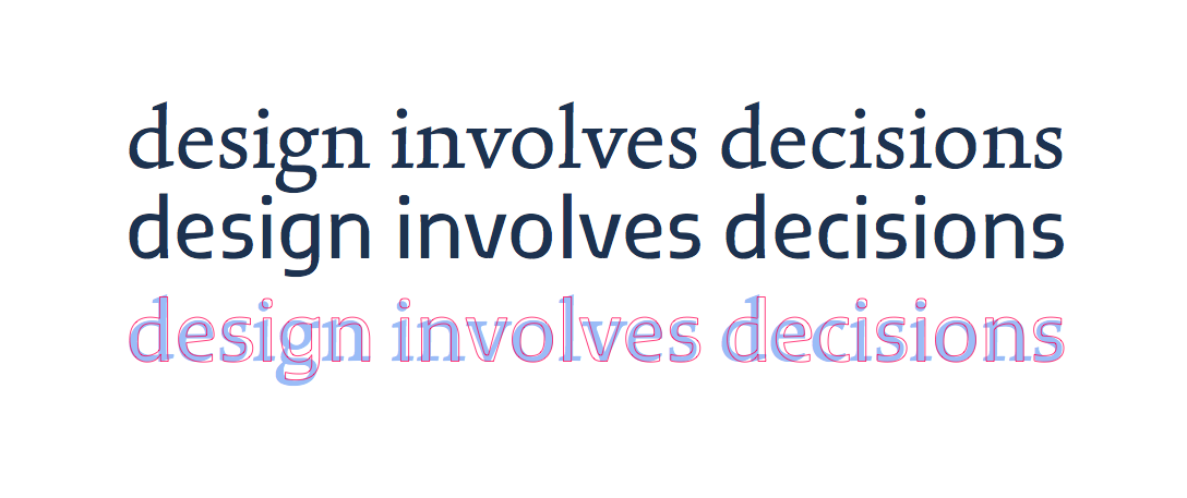
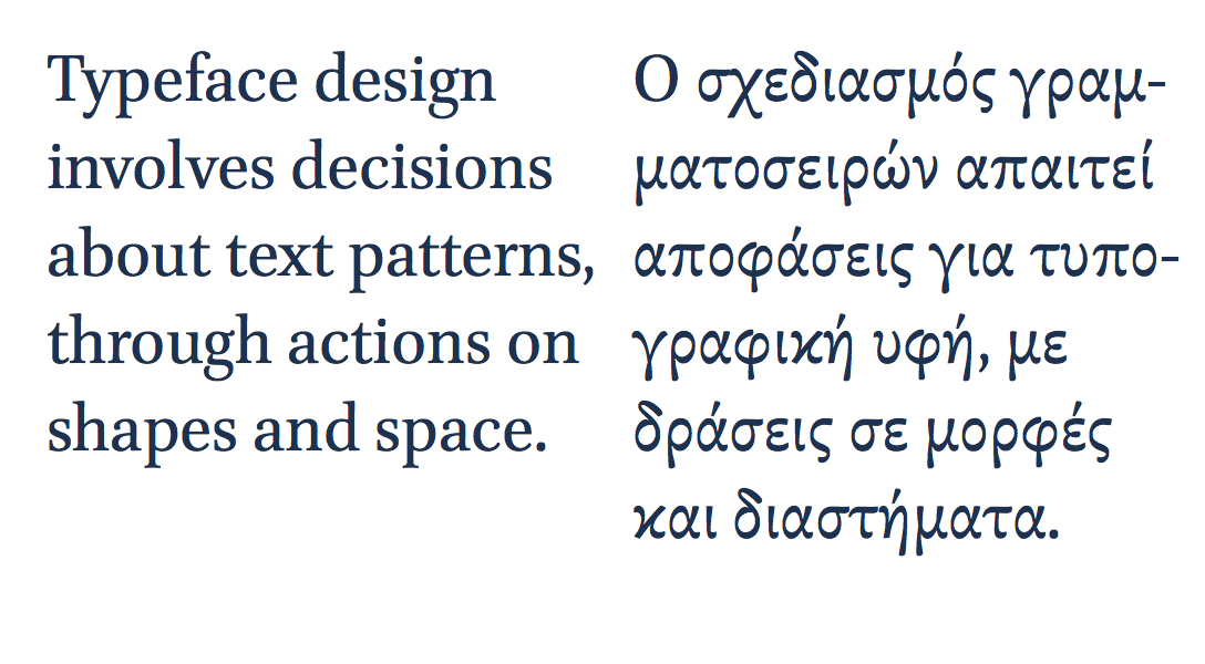
Marc Weymann’s typeface in this issue is, like all good text typefaces, strangely familiar. Familiar, because the rhythm of black strokes and white counter spaces reminds us of so many texts we’ve read: the strokes neither loudly dark or vainly thin, and the details of the terminals respectful of the excesses of contrast and the resolution of tired eyes. Strangely so, because this veil of familiarity hides a whole range of subtle contrasts: a combination of smooth patterns reminiscent of formal writing with nibs, and the sharp clarity of letters carved in stone.
Marc’s typeface is misleadingly gentle with its references, but rewarding closer inspection. Other typefaces for text are much less discreet, forcefully calling attention to their novelty, even as they still respect that set of conventions that allow us to read comfortably. Jeremy Tankard’s Fenland, probably the most notable of typefaces published in 2011, takes the ancient paradigms derived from writing tools, and throws them aside for the sake of shapes reminding of discarded piping; its stroke joints challenge the instincts embedded in most modulated text typefaces of the last few centuries. Yes, expectations confounded, it proceeds to space the letters on exactly the same underlying pattern as Formal, as respectful of the reader’s eyes as any.

Typeface design involves, at the most basic level, decisions on shapes at the level of the letter, the line, and the paragraph. I use this definition intentionally, to make the point that design decisions are not circumscribed by the immediately manipulable (in the case of digital fonts: the glyph outlines, or the spacing interface, or the code for positioning and substitutions). Indeed, typeface design decisions happen at the tip of a siphon, where a whole range of considerations about readers, texts, typesetting environments, and wider cultural concerns get distilled into virtual nudges of points or mouse drags.
In other words, a typeface designer is conscious of the context surrounding his field of practice – in the narrow sense of the typeface design industry, in the intermediate sense of typographic design for documents (where typefaces are but one of the constituent elements), and in the wider sense of design as interaction with a visually rich and refined culture.
This is what makes typeface design such an interesting area to work in: it is a context-driven discipline, where past practice, conditions of use, user perspective, and invested meaning all weigh heavily in design decisions. Indeed, professional experience in typeface design is primarily reflected in the depth of understanding of these wider considerations, the clarity with which these can be translated into typeforms, and the insight with which this context can be married to a personal creative voice. If we want proof of this, we need only look at the older generations of typeface designers, who – working ,more often than not, on decades-old applications – still produce new designs that contribute fundamentally to our typographic libraries.

This approach can be seen most clearly with work in scripts that the designer is unfamiliar with, and in any case cannot read fluently. In this scenario, design decisions cannot be trusted without an engagement with the characteristics of the script, an understanding of the way the typeforms of the script have responded to changes in type-making and typesetting technologies, and an appreciation of the typographic conventions for the genre of documents the typeface is intended for. In fact, the closer the connection of the script to its written form, and the more complex its typesetting, the more important it is that the designer engage intimately with these considerations. This approach places four-plus-one conditions on multi-script typeface design. First, that the designer has access to historical and contemporary artefacts: books and other printed material, ephemera, type-making and typesetting equipment. Second, access to primary sources: texts and material such as drawings produced during the type-making process. Third, access to secondary sources: texts written by type makers about type-making, and designers about their practice. Fourth, interpretative sources: texts by researchers such as historians and theorists on the development of type design. The ‘plus-one’ is a framework for integrating research into design practice that enriches the designer’s understanding, and unlocks informed creativity.
It is not difficult to see the connection between these conditions and the growth in formal education in typeface design, largely in parallel across the world. In fact, typeface design is in some ways leading a gradual shift in the wider design education sector, away from a paradigm of silently reflective responses towards user-centred, research–informed design practice. This approach is typical for a research-based discipline in the humanities. It is, though, alien to design taught in art colleges and institutions based on practice teaching outside of context, on the model of apprenticeships.

These considerations are not purely an academic matter. In the last decade we have witnessed a rapid growth in the demand for typefaces with very large character sets spanning many scripts. Pan-european typefaces with several hundred characters are often just a starting point, with Arabic or several Indian scripts added during the typeface’s lifetime. More recently we have seen notable growth in Armenian, as well as East Asian and South-East Asian scripts like Korean, Thai, Khmer, and Burmese. This demand, driven by an expansion of communication services and globalised branding, has pushed typeface design towards a level of effort that rewards teamwork, and the gradual building of expertise, through the combination of formal and self-directed study, and professional activity.
This is the environment in which we should seek to educate typeface designers: to expect them to ask questions about their practice, and seek answers through research. Indeed, we should see type design skills as inseparable from research skills, and an enquiring attitude. We should expect designers to engage with their field actively, and to write: to produce knowledge about their discipline. Seeing design activity as wider and deeper than any individual project is a key characteristic of the transition of typeface design towards a fully-established discipline.