Welcome to WordPress. This is your first post. Edit or delete it, then start writing!
Author: gerryleonidas
Basel School of Design
Lecture in the annual Visual Communication series, with the title “Enlightened typography for a small world”, explaining the link between typeface design and documents that work for global, unknown readers. Describing the challenges for designers, and showing how the risks of marching into unknown type territories are outweighed by the opportunities of fascinating knowledge, and the space to innovate in ways that change peoples’ lives.
Video forthcoming.
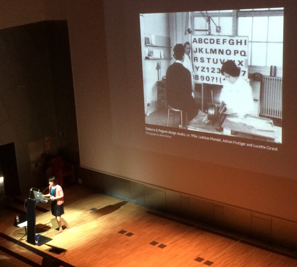
CCFDR and Glyphs
Two visits at the Centre for Chinese Font Design and Research, hosted in the offices of Founder Electronics, focused on design issues in fonts for Chinese, design tools and processes, and professional training for multi-script design. The second of the visits had very concrete aims: orchestrating the localisation of Glyphs into Simplified Chinese, to enable designers in China to experiment with new workflows.
Way of Type: Beijing
An extended visit to Beijing, invited by CAFA and Founder Electronics. Judging the Latin part of Founder’s 8th Type Design Competition with[ ATypI president] José Scaglione. Held every two years, included for the first time Latin typefaces by Chinese designers. The next day, the winners were announced in the National Centre of the Performing Arts (the “Egg”), together with the opening of the TDC61 exhibition, the Chinese leg of the global tour of the annual design competition; and the opening of the “Chinese Type Modern 1919–1955” exhibition with material from the archives of Founder on the transition of Chinese type-making across technologies.
Font Forum conference
The exhibition and competition awards served as the opening events for the two-day Font Forum, a conference on typeface design with speakers from China, Japan, and Europe. Facilities at CAFA are excellent, making it ideal for an international conference.
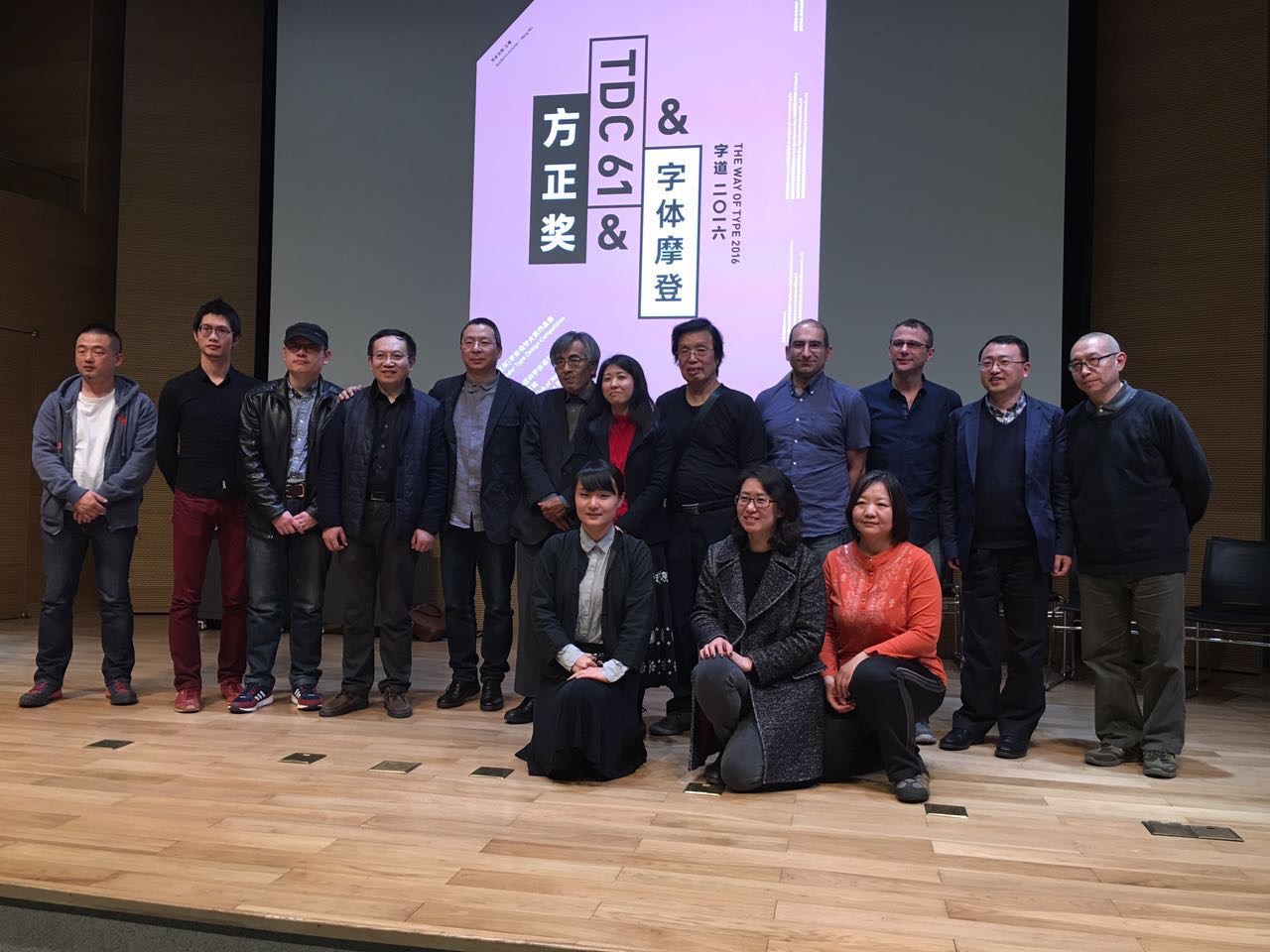

CAFA workshop
The main part of the visit was taken over by a workshop on typeface design at CAFA. The interest in Latin typeface design is considerable, and the skills of many students impressive. This is a sign of the gradual globalisation of Chinese design education, and the demands by the local professional employers for skills that can serve markets across language and script regions. Although the workshop was primarily focused on typeface design, there was great interest in typographic design, and especially for mobile platforms.
All trousers, no legs
A comment on the type choice for the new Google identity. Published on Medium, republished on Business Insider and the UoR News site, and translated into Spanish for Don Serifa.
Granshan Reading
Farewell, Richard Southall
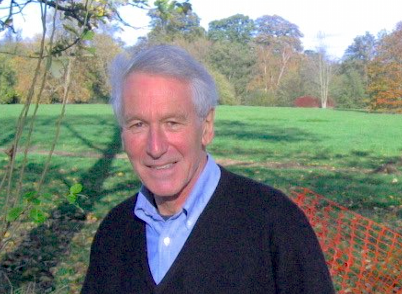
You’re supposed, as you get wiser, to kill your idols. The understanding of humanity that comes with knowledge and the experience of life is supposed to make you less easily impressed by individuals that appear exceptional, and to look for the contribution of serendipity and opportunity in achievement. You learn to be very sceptical of life narratives polished by hindsight.
So it makes all the more difference to see that a few people survive repeated contemplation. Those persons’ standing in your thoughts is an intensely personal matter: a mix of their public identity and your personal interactions that are, in that specific combination and weighting, just yours. Their work, their publications, and their utterances in the presence of many get mangled with all the private conversations and those moments that survive the natural erosion of memory. And, in the case of any person who writes, that other voice, the published one: generalised in form and precise in appearance, but direct and personal at the same time, like a secret whispered in isolation, that expands into a fuzzy stream of thoughts and ideas.
Keeping good company to a very – very – small number of people, Richard Southall brushed off easily any exercises to question his importance for my thinking. Intellectually, I feel indebted to his way of thinking about type and typography. Personally, I have been humbled by his kindness, and his open attitude to anyone who came to him with a question, however silly that may have been (and, boy have I asked some stupid ones myself…).
The stories of how Richard ended up in typography are best left to those who knew him in his youth, and have firsthand recollections. Similarly, his engagement with seminal chapters of type and typography have been documented to some degree by others — notably, and recently, by Alice Savoie for her PhD. He was particularly bad at reminding people of his track record, admitting eventually that when this or that critical development was happening he had been there, or at least had been involved with the people who carried it out, and his contribution had somehow escaped the simplistic narratives that reached us decades later. (Crosfields, Xerox PARC, Stanford University – with Don Knuth between 1983 and 1986, working on the Metafont project, and so on. Not least, teaching at Reading from 1974 for a decade.)
His last major public event was at the Automatic Type Design conference in Nancy, in the spring of 2014. His last text a chapter in the History of the Monotype Corporation, a stupendously detailed review of the development of the company’s composing machines that demonstrated a deep and fundamental understanding of technologies spanning lifetimes of innovation.
His Printer‘s type in the twentieth century can be a bit challenging, but is required reading for anyone interested in understanding typeface design and its relationship to typesetting environments. A “statement of intention” of sorts for the book can be found in his “A survey of type design techniques before 1978” in Typography Papers 2 (1997).
His most profound texts are shorter articles and papers, where he discusses the issues surrounding design decisions, and the locus of a typeface: “Shape and appearance in typeface design” in J H Miller (ed) Protext III: Proceedings of the Third International Conference on Text Processing Systems (1986); “Interfaces between the designer and the document” in J André, R Furuta & V Quint (eds) Structured Documents (1989); “Problems of font quality assessment” (with Debra Adams) in Jacques André & Roger D Hersch (eds) Raster Imaging and Digital Typography (1989); and the two articles in Rosemary Sassoon’s Computers and typography (1993): “Presentation rules and rules of composition in the formatting of complex text” and “Character description techniques in type manufacture”. These echo ideas discussed in his work for subtitling fonts for television, e.g. in “Character generator systems for broadcast television” in Information Design Journal 2:1 (1981), and his seminal “Metafont in the Rockies: the Colorado typemaking project” in Roger D Hersch et al (eds) in Electronic publishing, artistic imaging, and digital typography (1998). There’s more, and well worth discovering.
Richard’s ideas about “models” and ”patterns” in type design are the definitive starting point for any discussion of typemaking, and – with some adjustments for terminology – absolutely essential in any review of typeface design processes with digital tools. In fact, the growth of rendered instances of typeforms across many devices make his ideas more relevant than ever, and prove that his approach provides the key ideas for discussing typeface design across type-making technologies. Together with some texts by Robin Kinross, his writings are amongst the very few indispensable texts for any theoretical discussion of typeface design.
His bio note in the backflap of Printer’s type reads: “Richard Southall has been involved with type and typography since the early 1960s; in publishing, composing-machine manufacture and development, teaching, research and consultancy.” Its extreme modesty belies the depth of its truth and the scale of his impact.
Swift strokes and sampled constructs
Lecture at the 2015 ISType conference in Istanbul. Slides on Speakerdeck, video on Vimeo.
Beyond Latin
In Eye magazine no 90: setting the stage for a panel of designers discussing the global state of ‘non-Latin’ type, and the implications of digital tools liberating type design from arcane limitations; and rounding off the key points.
Smashing week
My slides from SmashingConf in Freiburg are on Speakerdeck, with some additional annotations. The video of the talk will go online at some point, is now online, but the slides capture the key points.
The stats on Speakerdeck suggest that people find the slides useful, but we are still a bit off from an easy way to host a presentation that makes the content searchable, taggable, connectable. The new TED system of linking the talk transcription to the video is very impressive, but difficult to imagine for smaller events with tighter budgets.
The effort put in to get “just” good video and audio from presentations is already substantial, especially for academic conferences and smaller events (i.e. tight budgets, uneven expertise). For speakers who plan their talks integrating images/video into the spoken narrative, the challenge is harder.
Immediately after SmashingConf, Joana Correia and Eben Sorkin captured almost the totality of the talks at ATypI Barcelona (which will be posted online over the coming weeks and months on the Association’s site). Their dedication and hard work was humbling, but it was obvious that even professional recording systems are external to the presentation proceedings. In a sense, the capturing setup is a plugged-in observer, rather than integrated in the presentation itself. Going further, I’d argue that capturing should be integrated into the authoring process, with markup, annotations, and linking considered from the outset.
This seems like a good time to revisit my thoughts from a year ago on capturing conference presentations, although – TED system apart – most of what I wrote probably stands.