A comment on the type choice for the new Google identity. Published on Medium, republished on Business Insider and the UoR News site, and translated into Spanish for Don Serifa.
Category: comment
Farewell, Richard Southall
You’re supposed, as you get wiser, to kill your idols. The understanding of humanity that comes with knowledge and the experience of life is supposed to make you less easily impressed by individuals that appear exceptional, and to look for the contribution of serendipity and opportunity in achievement. You learn to be very sceptical of life narratives polished by hindsight.
So it makes all the more difference to see that a few people survive repeated contemplation. Those persons’ standing in your thoughts is an intensely personal matter: a mix of their public identity and your personal interactions that are, in that specific combination and weighting, just yours. Their work, their publications, and their utterances in the presence of many get mangled with all the private conversations and those moments that survive the natural erosion of memory. And, in the case of any person who writes, that other voice, the published one: generalised in form and precise in appearance, but direct and personal at the same time, like a secret whispered in isolation, that expands into a fuzzy stream of thoughts and ideas.
Keeping good company to a very – very – small number of people, Richard Southall brushed off easily any exercises to question his importance for my thinking. Intellectually, I feel indebted to his way of thinking about type and typography. Personally, I have been humbled by his kindness, and his open attitude to anyone who came to him with a question, however silly that may have been (and, boy have I asked some stupid ones myself…).
The stories of how Richard ended up in typography are best left to those who knew him in his youth, and have firsthand recollections. Similarly, his engagement with seminal chapters of type and typography have been documented to some degree by others — notably, and recently, by Alice Savoie for her PhD. He was particularly bad at reminding people of his track record, admitting eventually that when this or that critical development was happening he had been there, or at least had been involved with the people who carried it out, and his contribution had somehow escaped the simplistic narratives that reached us decades later. (Crosfields, Xerox PARC, Stanford University – with Don Knuth between 1983 and 1986, working on the Metafont project, and so on. Not least, teaching at Reading from 1974 for a decade.)
His last major public event was at the Automatic Type Design conference in Nancy, in the spring of 2014. His last text a chapter in the History of the Monotype Corporation, a stupendously detailed review of the development of the company’s composing machines that demonstrated a deep and fundamental understanding of technologies spanning lifetimes of innovation.
His Printer‘s type in the twentieth century can be a bit challenging, but is required reading for anyone interested in understanding typeface design and its relationship to typesetting environments. A “statement of intention” of sorts for the book can be found in his “A survey of type design techniques before 1978” in Typography Papers 2 (1997).
His most profound texts are shorter articles and papers, where he discusses the issues surrounding design decisions, and the locus of a typeface: “Shape and appearance in typeface design” in J H Miller (ed) Protext III: Proceedings of the Third International Conference on Text Processing Systems (1986); “Interfaces between the designer and the document” in J André, R Furuta & V Quint (eds) Structured Documents (1989); “Problems of font quality assessment” (with Debra Adams) in Jacques André & Roger D Hersch (eds) Raster Imaging and Digital Typography (1989); and the two articles in Rosemary Sassoon’s Computers and typography (1993): “Presentation rules and rules of composition in the formatting of complex text” and “Character description techniques in type manufacture”. These echo ideas discussed in his work for subtitling fonts for television, e.g. in “Character generator systems for broadcast television” in Information Design Journal 2:1 (1981), and his seminal “Metafont in the Rockies: the Colorado typemaking project” in Roger D Hersch et al (eds) in Electronic publishing, artistic imaging, and digital typography (1998). There’s more, and well worth discovering.
Richard’s ideas about “models” and ”patterns” in type design are the definitive starting point for any discussion of typemaking, and – with some adjustments for terminology – absolutely essential in any review of typeface design processes with digital tools. In fact, the growth of rendered instances of typeforms across many devices make his ideas more relevant than ever, and prove that his approach provides the key ideas for discussing typeface design across type-making technologies. Together with some texts by Robin Kinross, his writings are amongst the very few indispensable texts for any theoretical discussion of typeface design.
His bio note in the backflap of Printer’s type reads: “Richard Southall has been involved with type and typography since the early 1960s; in publishing, composing-machine manufacture and development, teaching, research and consultancy.” Its extreme modesty belies the depth of its truth and the scale of his impact.
Expert Shmexpert
KL asked what is an Expert. This is what I scribbled on the way home from the airport. (This was a brain dump, so apologies for the masculine articles; they are the result only of introspection.)
Internally:
Starts with a knowledge of facts, insofar as they are known, and their interpretations. Combines this with constant observation and questioning of these sources.
Aims to have a deep knowledge in his field, and a wide understanding in relates ones. Knows where the gaps in his knowledge lie, and how to fill those in when they intervene with the ability to understand and explain. Recognises his limits, and tries to be conscious of his bias, such as it is.
Combines a long view to detect trends, and an appreciation of the potential impact of individual actions.
Has a refined bullshit detector.
Externally:
Uses all of the above to explain patterns of development, the context of decisions made, and the perspective of the people and organisations making these decisions.
When communicating, tries to empathise with his audience’s perspective, and adjusts to their level of interest, but addresses them as equals.
Explains how his field matters, to whom, and why. Is able to engage peripheral audiences by revealing the connections between his field and their sphere of action or area of interest, if this is possible.
Combines confidence in his views with the humility to admit openly their limits. Has the patience to break down his explanations so that people will appreciate where this confidence stems from, and the openness to admit error or lack of insight.
Form(al) education
The re-issued form magazine dedicated an issue to design education. Anja Neidhardt asked me four questions, as part of her research for her article. (The issue can be read on Isuu via the form website.) Here are my answers to Anja’s questions:
At Typo Berlin (if I remember right) you said about teaching: “What we do is: We cheat”. Please explain this statement.
The context for this sentence was a longer statement about the nature of typographic and typeface design. Typography happens in contrast with other areas of design, where the functional conditions are relatively simple and the space for formal experimentation relatively wide. In the typographic disciplines we look to past practice as a guide to the assumptions that users will make in each circumstance. This happens because the design objectives are relatively complex (the information density is high) and their configurations relatively stable (a news article has a similar structure on a print newspaper as on a smartphone); and because the consumption of typographic design is iterative, and cumulative: changes take place in an environment of many similar objects used concurrently, within a continuum of experience by each user. In other words, the more radical a change, the more it needs to echo and relate to pre-existing structures and affordances. The use of visual metaphors in interface design is a typical case of this mechanism.
So, designers rely on a whole range of pre-existing decisions for their own designs to make sense. In the best case, these pre-existing conventions are consciously acknowledged; in these cases the designer can engage in depth with his subject, and improve the discipline. But in many cases designers are only partially aware of the way conventions have been formed, and how their own ideas are influenced by the design environment. In these cases, designers “cheat” in the sense that their work feeds off past projects without due recognition.
How does education in the field of typography look like today? What should be changed, and why?
It is possible to see strong growth in some areas, and early signs of risk in others. My own niche area of typeface design is experiencing strong growth, and will continue to do so for many years, in response to the globalisation of typographically complex documents, and the need to support text-intensive environments. The result is a lot of new courses at a range of levels, and a strong interest by both younger and more experienced designers to study. With regard to document-level typography (from a periodical publication to newspapers to reference works) there is a critical transformation in progress, with inadequate response by education institutions globally.
Until roughly the last decade the design and the production spheres were relatively separate, and with clear professional roles (in other words, a designer was not also the printer). The situation nowadays is different, where the “maker” may be a designer as well, or work in an environment with a lot of overlap (the person who writes the code to render a text on screen may implement a specification by someone else, but may just as easily devise the typographic specification him/herself).
This new environment, where the typographic specification has, in fact, a high overlap with the encoding of the text, places new requirements for typographic education. The easiest examples are those of “conventional” publications like novels and magazines turned into ebooks and tablet-based apps. The old model called for a relatively stable typographic specification, implemented by typesetters and printers who made the content of authors and editors appear in print. In contrast, we now have typographic specifications that are not only fluid across platforms and use scenarios, but also across time: the typographic design changes often in little steps, instead of only every few years in big ways. And, whereas the roles of authors and editors may be clear, the “makers” (designers and coders who make the content appear on each device) are now melded into multi-skilled individuals, or closely integrated teams (at least where things go well).
It is my impression that design education has not responded fast enough to the challenge of these new models of publishing, and have not acknowledged the need to respond to the demand for these new roles. Furthermore, we are now at a stage where “tradition” typographic education is at risk of falling behind. The sequence in which complex documents are migrating to screens, and the way in which content is specified, has helped establish some basic parameters for on-screen typography that makers can refer to while maintaining the readability of documents, but lacking the skills and understanding to deal with more complex information structures (this is a kind of “cheating” like that discussed above).
Colleges and universities teaching typography face the challenge of adapting to a typography that is personal, portable, responsive to its context and that of the reader’s route through texts, that references established conventions, that integrates time-based elements, and even jumps across may possible combinations of all these parameters. The ones that respond to this challenge will have strong growth ahead, but I think that the difficulty of radical change in many institutions puts typographic education at risk.
On the one hand there are many, many fonts made for the latin writing system. But on the other hand there is a lack of fonts in some countries. How can students be taught to design typefaces for languages they don’t speak?
Indeed, in recent years we see an overdue push to cover gaps in global typeface design coverage, both in wide character sets (multi-script typefaces) but also in extended typeface families in non-Latin scripts. This corrective is a response to changes in type-making and typesetting technologies, the growth in the range of documents (in the widest sense of the word) produced in global scripts, and the spread of readership in new demographics. Although digital technology liberated the type-making tools from the geographic restrictions of previous technologies, the know-how and support resources have remained, for many scripts, near the traditional centres of typeface design. It is not surprising, then, that designers who are experienced in some scripts may be called on to design typefaces in new scripts – a practice reinforced by existing professional networks and the focus on business development in English. In practice, professional designers may be expected to build experience in a whole range of related or unrelated scripts. The education challenge is then clear – and pressing, since the market is growing faster than existing designers can develop their skills.
Four areas need to be addressed for a student to develop non-native design skills (and the same for a designer experienced only in their native script):
First, and most fundamentally, an understanding of the historical development of the written and typographic script as it currently stands, with particular focus on the impact of type-making and typesetting technologies on the form of individual characters, the character set and any composition rules (esp. substitution and positioning).
Second, an exploration of the key combinations of writing tools and movements that generate “valid” letterforms and words in the script. This is particularly important in all the scripts that have a much closer relationship to written forms than the Latin (which is, in fact, the overwhelming majority).
Third, an understanding of how existing styles correspond to specific typographic structures, and how they are used in native documents. (For example, how is hierarchy, emphasis, and differentiation in tone indicated in the typography of the non-native script? What is the practice when equivalents to styles like “italic” or “thin” are not present?)
Fourth, an understanding of the tension between tradition and modernity in the context of the local visual culture. This forms the basis for progressing beyond mere adaptation towards originality and even innovation. The role that lettering can play in inspiring alternate styles is a key example of this area; another is the relationship of stroke properties to established styles (for example, in one script a monoline stroke may be considered “default and traditional” whereas in another the loos of contrast may be a radical proposition).
While developing a critical understanding of the non-native script, students also need to do some text analysis. This will give them insights into the combinations of letters and the patterns of shapes (just as a German designer will also test their Latin typeface with texts from all European languages). Unlike the four areas of learning, this is a process that is easy to share amongst designers, and pool the results, which can then be converted into common test documents.
It is, of course, important to seek feedback from native readers, but not any native reader – even if they are design professionals from the native community. Feedback needs to be sought from people who can give type-specific comments, which are fairly specialised. (Graphic designers, for example, are used to seeing type in a different scale from type designers, and tend not to understand the cumulative effects of detail changes within individual letters.) And before readers instinctively object, it is useful to be reminded that there are many examples of exceptional typefaces by non-native designers, with and – in some cases – without native feedback.
A final caveat: in Reading type design students develop native- and non-native script skills in parallel. This makes for better, deeper education, but is a different scenario from that of an already experienced designer of (for example) Latin typefaces seeking to learn how to design in another script.
Will there be another, new Erik Spiekermann? Or is time up for big stars like him?
This is a nonsense question. Erik is very successful in his field, with a high public profile – but the same can be said of many professionals in their respective fields. It is more appropriate to ask why is Erik’s success interesting, or whether his career is more revealing in relation to other high profile designers of his generation (of which, let’s be clear, there are many).
Erik’s career is notable for two reasons: firstly because, unlike other designers whose work is focused within a relatively narrow domain (such as typefaces, or posters, or transport maps, or branding) his work spans several domains: all of the ones I just mentioned, and then some. This richness of practice is illuminating in itself, regardless form the fact that in some of these cases it can be described as capturing the spirit of the times perfectly, and in a few cases even being ahead of the curve. There is a problem in this richness for those who want to capture design outputs into neat narratives, because clearly in Erik’s case there isn’t one, but multiple strands of thinking in parallel. So, the uniqueness of his work lies not in individual projects, but in the totality of his work.
The second reason Erik’s career is notable is that he has made a point of using his visibility to get key messages about design to wider audiences, and not just in the design world. Even in his most indulgent moments, the notions of rigour and process are present. He has also shown that user-sensitive, evidence-driven design does not need to be dry or visually uninspiring – a common failing in the wide information design world. And, related to this, Erik does not take himself seriously – one of the most positive personality traits one can aim for.
The second question (“is it time up for big stars”) neglects the length of Erik’s career. There are many people in the wider design world who are gradually building very strong public personas that can be expected to be just as recognisable and influential when they reach Erik’s age (and probably, give the speed with which things happen nowadays, much sooner). They are more likely to be from the “design for screens” crown (I want to avoid separating IA, UX, and so on) but there are many possible candidates.
Palettes are evil (2011)
In a recent piece for #Eye80 I lamented the loss of insight in document design that the vertical flat screen and zoom brought. I also dropped an aside that “palettes are evil”. I wasn’t clear enough, and confused @mmBubbleTea who thought I meant colour palettes. I meant the interface ones, and I apologise for the confusion. I might as well explain briefly why I don’t like palettes.
When the basic conventions for interfacing with apps got established, apps couldn’t perform the amount of operations we see in pro apps today. Even on smaller screens, there was enough space to fit a range of commands. But as features increase, there is an increasing competition for screen real estate: the document (your constant focus) versus the chrome of the app (and the OS, of course – not so much on Windows, but very much so until recently on the Mac). The problem is not only that the vital area of the screen decreases, as more selections and commands need to be accommodated; it is that only a few of those are you likely to need to select.
As apps often compete on features, and propagate those from one category of app to another (e.g. vector commands to a page layout application) the number of possible choices balloon. Palettes then become an exercise in squeezing options in. This happens on two levels: one, grouping related options and fitting them on a single object on screen; and second, the management of all the possible groupings. Adobe apps are particularly problematic in this respect: there simply are too many things to add, leading to problems at both levels: what to put in each group (palette) and how to manage the various palettes themselves.
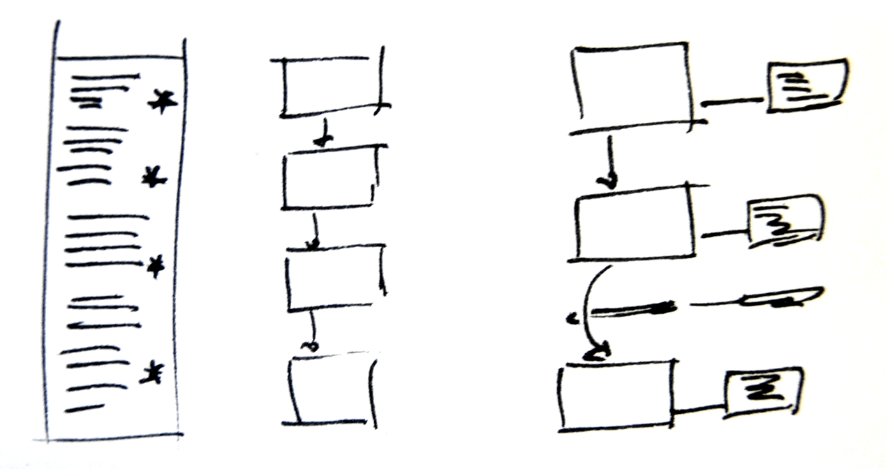
Look at this screenshot, for example: I am designing at the level of a paragraph, but cannot see the options for both paragraph styles (the basis for my design choices) and the “local” paragraph palette. I cannot see both paragraph and character styles at the same time, without “unhooking” the palette from the column. This is problematic, as I then have the absurd situation in the second image, where the “heading” of the palette floats over the document, and the palette hangs to its left. (Bad luck if your focus was the text underneath!)

The first image also shows a big problem with the secondary options, which are enabled by a really small button, next to the “retract palette” one. A big secondary surface (actually, tertiary, if you count the column of palettes) opens up, covering yet more of your screen, in a visual style that departs completely from the language established by the column and the hanging palettes. And I can’t keep the damn thing open, even though things like “Keep options” might be pretty useful to have hanging around (pun unintended).

And why do I need three palettes to design a table? In my typographer’s mind the table is a single object, with a cascade of attributes. Can I please see all in one go? Of course, the explanation is obvious: the design interface follows the engineering, rather than the other way round. The app applies attributes in discreet levels (document, object, paragraph, word, and so on) and the palettes follow this structure.
In recent years we have seen app developers trying to second-guess what the designer is working on, and what they might want to do. They then try to provide only the pertinent options. (Cue Office’s ribbon, or indeed InDesign’s “workspace”.) Apps that are unencumbered by legacy features have tried smarter interfaces (Pixelmator and Acorn come to mind), although their developers are having to say clearly that feature parity with Photoshop, for example, is not their objective. This may be a good thing, and presage the current approach of tablet apps, where one-app-for-all models are eschewed for the “does a few things really well” approach.
The wider problem of interface design for command-heavy apps is whether the developer thinks about the design process in ways parallel to the designer (cough, Fontlab, cough!). Designers usually think about a cluster of attributes at the same time, and work in their mind with relative terms. They have to translate these to specific (and often meaningless) measurements, which detract from the real: the pattern of form and counterform, foreground and background.
Here’s a simplistic example. Let’s say I need to make some decisions about these two lines:

Should I really be thinking separately about type size and linespacing? Column width and depth? In what units? Actually, I tend to think in fruit:

It doesn’t matter what the units are, and indeed the tendency of apps to snap to “neat” round numbers is a big problem. I think only of relative relationships, how much is this in relation to that, and them to the other? And, if I’m more careful, I’m really thinking of the white space surrounding the column as an integral part of the paragraph, rather than as an attribute of the containing frame. So, what I want is a design environment that reflect my thinking – not an app that requires me to translate design decisions based on relative proportions into a set of discreet, unrelated measurements.

Finally, the elephant in the room: the screen size on which we are working. Whereas large screens are becoming ever more affordable, we are seeing more complex tasks performed on tablets (okay, on iPads). We won’t see page layout apps rushing to migrate to the iPad, although the argument for some editing on-the-go cannot be avoided. But we are already seeing many good image editing apps on the iPad, and it is not a huge leap of the imagination to think of a web-based layout environment with a client on the app.
Well, that was a rant and a half.
A few things about typeface design
Teaching on a postgraduate course feels very much like a spiral: the annual repetition of projects, each a vehicle for a journey of education and discovery for the student, blurs into cyclical clouds of shapes, paragraphs, and personalities. There seems to be little opportunity for reflection across student cohorts, and yet it is only this process that improves the process from one year to the next. Having passed the tenth anniversary of the MA Typeface Design programme was as good an opportunity as any to reflect, and ILT’s offer to publish the result an ideal environment to get some ideas out in the open. Although my perspective is unavoidably linked to the course at Reading, I think that the points I make have wider relevance.
Our students, both young and mature, often find themselves for the first time in an environment where research and rigorous discussion inform design practice. The strong focus on identifying user needs and designing within a rigorous methodology is often at odds with past experiences of design as a self-expressive enterprise: in other words, design with both feet on the ground, in response to real-world briefs. In addition, students are expected to immerse themselves in the literature of the field, and, as much as possible, contribute to the emerging discourse. (There are many more books and articles on typeface design than people generally think; some are not worth the paper they’re printed on, but some are real gems.) I shouldn’t need to argue that research, experimentation, and reflection on the design process lead not only to better designs, but better designers.
In recent years, two significant factors have started influencing attitudes to design. Firstly, as generations grow up using computers from primary school onwards, it is more difficult to identify the influence of the computer as a tool for making design decisions, rather than implementing specifications. Secondly, the trend in higher education to restructure courses as collections of discrete modules results in a compartmentalization of students’ skills and knowledge: it is becoming more difficult for the experience in one class to have an impact on the work done in another. (A third, less ubiquitous, factor would be the diminishing importance of manual skills in rendering and form-making in design Foundation and BA/BFA courses, a subject worthy of discussion in itself.)
So, repeating the caveat that these observations are strictly personal, I offer them in the hope they will prove interesting at least to the people setting up and running new courses in typeface design, and the many designers teaching themselves.
1 Design has memory (even if many designers don’t)
Typography and typeface design are essentially founded on a four-way dialogue between the desire for identity and originality within each brief (“I want mine to be different, better, more beautiful”), the constraints of the type-making and type-setting technology, the characteristics of the rendering process (printing or illuminating), and the responses to similar conditions given by countless designers already, from centuries ago to this day. Typographic design never happens in a vacuum. A recent example is Emigre magazine: can its early period be seen without reference to the sea-change in type-making and typesetting tools of the mid-eighties? and is not its middle period a mark of emerging maturity and focusing, critically and selectively, on those conventions worth preserving in a digital domain? Emigre is important as a mirror to our responses to new conditions and opportunities, and cannot be fully appreciated just by looking at the issues. (Especially if you look at scaled-down images, rather than the poster-like original sizes!). At a more subtle level, the basic pattern of black and white, foreground and background, for “readable text” sizes has been pretty stable for centuries, and pretty impervious to stylistic treatments. Does not a type designer gain by studying how this pattern survives the rendering environments and the differentiation imposed by genre and style?
And yet, many designers have a very patchy knowledge of the history of typography and letterforms. More worryingly, students and designers alike have little opportunity to experience genre-defining objects in reality (imagine discussing a building looking only at the blueprints for building it, not walking up to it, and through its rooms). It is perhaps not surprising that the wide but shallow knowledge gained from online sources is dominant; there seems also to be little discrimination between sources that employ review and editorial mechanisms, and those that are open to wide, unchecked contributions. This shallow approach to reading and investigating results in a lack of coherent narratives, not only about how things happened, but also why. And how were similar design problems addressed under different design and production environments? What can artefacts tell us about how people made decisions in similar situations before? How did changing conditions give rise to new solutions? To paraphrase Goudy, the problem is not any more that the old-timers stole all the best ideas, but that the old ideas are in danger of being re-discovered from scratch. (Just look at the web designers rediscovering the basic principles of text typography and information design, as if these were newly-found disciplines.)
[IMAGE: Michael Hochleitner’s Ingeborg, an award-winning typeface that revisits Modern conventions with originality and humour.]
2 Design is iterative, and improved by dialogue
The process of typeface design is, in essence, a reductive refinement of ever smaller details. First ideas are just that: sketches that may offer starting points, but have to be followed by a clear methodology of structured changes, reviews, testing – and repetition of the whole process. The attention of the typeface designer must progress in ever decreasing scales of focus: from paragraph-level values on the overall density of a design, to the fundamental interplay of space and main strokes, to elements within a typeform that ensure consistency and homogeneity, and those that impart individuality and character. At the heart of this process is dialogue with the brief: what conditions of use are imposed on the new design, and what are the criteria to determine excellence in responding to the brief? (For example, how will the end users make value associations with the typeface?)
The wider the typeface family, the deeper the need to test conclusively, not only with documents that highlight the qualities of the typeface, but also with documents that approximate a wide range of possible uses. Even in cases of very tight briefs (as in the case of bespoke typefaces for corporate clients), the range of uses can be extremely broad. But good designers are also aware of the constraints of their testing environment. The misleading impression of transparency and fidelity that computer applications give, and the limitations of laser-printer output, obstruct trustworthy decisions. Designers must be aware of how looking at medium resolution printouts in dark toner on highly bleached paper can bias their decisions.
We are also seeing a gradual return to typeface design being a team enterprise, drawing on the expertise of a group rather than an individual. This, of course, is not new: typeface design in the hot-metal and phototype eras was very much a team product. But just as the digital, platform-independent formats enabled designers to function outside a heavy engineering world, so it enabled the explosion of character sets and families to unprecedented levels. The necessary skills and the sheer volume of work required for text typefaces have driven a growth of mid-size foundries, where people with complementary skills collaborate in a single product. The corollary is a rise in the need for documentation and explanation to a community of fellows. The short-lived “creative hermit” model is giving way to new models of work.
[IMAGE: Eben Sorkin’s Arrotino, a contemporary typeface with deep roots in fifteenth-century typography.]
3 Scale effects are not intuitive
The conventional curriculum for design education rarely tackles scales smaller than a postcard. More importantly, the compositional aspects of design tend to take precedence over details at the level of the paragraph, let alone the word. Typeforms for continuous reading are designed at fairly large sizes (on paper or, more usually, occupying most of a computer screen) but are experienced in much smaller sizes where their features have cumulative effects, weighted by the frequency with which specific combinations occur. These conditions arise in every text setting, be it for prose read forty centimetres away, or a sign viewed from a distance of tens of metres.
Of all the skills typeface designers need to develop, understanding how to make shapes at one scale behave a particular way in another scale is the most troublesome one. Imagining the difference that a small change in a single letter will have in a line or paragraph of typeset text is not an innate skill: it is entirely the result of practice. The best designers are the ones who will naturally ask “why does this paragraph look this way?” and try to connect the answer to specific design choices.
A common example of problems connected to scale effects arises whenever a student follows a writing tool too closely as a guide for designing typeforms: whereas the ductus (the movement of the stroke) and and the modulation can be preserved across scales without much difficulty, the details of stroke endings and joints cannot; typographic scales demand a sensitivity to optical effects that simply do not apply at writing scales. The best examples come from typefaces designed for the extremes of text scales: for telephone directories (famously by Ladislas Mandel and Matthew Carter), Agate sizes for listings, and early typefaces for screen rendering. The smaller the size (or the coarser the rendering resolution), the more the designer primarily separates blobs and bars of white space, and only secondarily deals with style and detail.
[IMAGE: Alice Savoie’s Capucine: an award-winning typeface in a fluid modulated style that successfully integrates Latin and Greek in magazines.]
4 Tools are concepts
Regardless of the scale effects mentioned above, there is a requirement to appreciate the link between typeface design and writing, and the tools used for writing. To be clear: I am not talking about calligraphy, but writing in the widest possible sense, from graffiti, a hasty ‘back in five minutes’ sign, to the most elaborate piece of public lettering. More than the specific forms of letters, the process of writing illuminates the patterns and combinations we are used to seeing, and gives insights into the balance of shapes and the space between them. The relationship of writing tools to the marks they make has been discussed in some depth (for the Latin script by Noordzij and Smeijers, most importantly), but the transformation of these marks through the computer much less so. (There are some texts, but mostly they focus on specific cases, rather than general principles; the notable exception is Richard Southall.)
And yet, since the early days of punchcutting, type-making involves a process of fracturing the typeforms, modularizing and looking for patterns. Later on, when the roles of designer and maker began to be distinguished (most emblematically with the Romain du Roi, like the Encyclopédie a true product of the Age of Reason) typeface design became programmatic, each typeface an instance of a class of objects, rooted in a theory of letter construction – however sensitive to human practice or aloof that may be. Later, the hot metal “pattern libraries” and the rubylith cutouts of shapes to be photographically scaled and distorted for phototype point to the same process, of abstracting the typographic shapes into elements that have little to do with the movements of a tool. As for the digital domain, deconstruction and repeatability remain key aspects of the design process.
To ensure a typeface built with fragmentary processes has internal consistency, the designer needs to develop a mental model of a tool that may follow the tracks of a writing tool, but may include mark-making and movement behaviours quite distinct from anything that is possible to render with a real writing tool. (Easy example: the parallelogram-like serifs of a slab, on a typeface with a pen-like modulation.) Such mental models for typemaking are increasingly important as type families expand into extremes of weight and width, where any relationship with a writing tool quickly evaporates. So, an invented tool that, for example, makes incised vertical strokes and pen-like bowls, can become the basis for a wide range of styles, ensuring consistency without the limitations of a specific tool; at the same time, because the model is agnostic of weight and width, it does not hinder the generation of large families with overall consistency but local richness. (Compare this approach with a wide family developed through extremes of multiple master outlines, where consistency relies on the details of typeforms having close correspondences.)
[IMAGE: A small part of Jérémie Hornus’ analysis of the Amharic script in preparation for developing his own successful typeface family.]
5 The Latin script is the odd one out
The demand for typefaces with extended character sets has been growing steadily for many years. OEM and branding typefaces are expected to cover more than one script, and often three or more. Beyond the obvious scripts of the wider European region (Cyrillic, Greek, and Latin), the interest has shifted strongly towards Arabic and the Indian scripts. But there are two key differences between the Latin typographic script, and pretty much everything else: firstly, that the type-making and typesetting equipment were developed for a simple alphabetic left-to-right model that would have to be adapted and extended to work with the complexities of the non-Latins. Although rectangular sorts will work sufficiently for the simple structure of western european languages, the model strains at the seams when the diacritics start multiplying, and pretty much collapses when the shapes people use do not fit in neat boxes, or change shape in ways that are not easy to describe algorithmically. No surprise that most non-Latin typesetting implementations make use of compromises and technical hacks to get the script to work. The second factor is that most non-Latin scripts did not experience the full profusion in styles that arises from a competitive publications market, as well as a culture of constant text production. (It’s no surprise that the language of display typography first developed in nineteenth-century Britain, in parallel with the Industrial Revolution: urbanization, rising literacy, and trade in goods and services go hand in hand with the need for typographic richness and differentiation.)
Many students (indeed, many professionals) will ask ‘Can a non-speaker design a script well for a language they do not read?’ But a typeface arises in response to a brief, which by definition taps into wider design problems. For example, many of the conventions surrounding newspapers apply regardless of the market; the constraints on the typographic specification can be deduced from the general qualities of the script and the language (e.g. can you hyphenate? how long are the words and sentences? with what range of word lengths? what is the editorial practice in the region in terms on article structure, levels of hierarchy, and headline composition?). Having established the typographic environment, we can examine the written forms of the language, and the tools that have determined the key shapes. In this matter most scripts other than the Latin (and to some degree Cyrillic) maintain a very close relationship between writing and typographic forms. Writing exercises and a structural analysis of examples can help the designer develop a feel for the script, before reading the words. More importantly, in their non-Latin work, analysis of the script’s structure and the relationship between mark-making tools and typeforms can help the designers to develop criteria for evaluating quality.
Typographic history is well populated with designers excelling in the design of scripts they could not read – indeed, the examples are some numerous that it would be difficult to choose. Encouraging students to address the complicated design problems inherent in non-Latin scripts is not only a way of enriching the global typographic environment, it is also a superb means of producing designers who can tackle a higher level of difficulty in any aspect of their design.
[IMAGE: Fernando Mello’s Frida: an award-winning typeface that redefined what is possible in Latin and Tamil typeface design.]
6 And finally…
The final lesson for students of typeface design is that a formal environment can teach the functional aspects of design, but can only help them at a distance to develop the aesthetic qualities of their typefaces. Especially when they are working in categories already heavily populated with typefaces, the distinctions between the simply good and the superb will be very refined. And when the consideration turns to originality, inventiveness, and how much a particular design causes us to rethink our responses to typeset text, then teachers have little input. The student, balancing between the deep knowledge of the specialist and the broad curiosity of the generalist, must develop, largely on their own, their capacity to be conscious of past and emerging idioms, to see their own work in the context of developing styles, and – most difficult of all – to identify how their own personal style can co-exist with the restrictions of utility and the conventions of genre.
From concrete to fluid, but not yet to social
Lectures are often static objects. The size of the audience, time constraints, and the need for conference organisers to keep some editorial control make sessions mostly about transmission (“this is going to be just me speaking now”) rather than engagement (“I’ll guide a discussion through which you’ll learn”).
Although the audience size and format are often quoted, the traditional static nature of lectures was also connected, and in no small measure, to the way visual material was prepared. Slides (of the old kind, not digital ones) were expensive things you’d have to plan very carefully. Object needed to be photographed (expensive and slow), and slides developed and mounted (ditto). If you wanted text on slides, you’d need to prepare the text separately and shoot the slide on a rostrum (yet more cost and delay). Once lectures were delivered, they would either remain in the memories and notes of attendees, or be published as pamphlets or transcripts, usually omitting the images. The situation for lectures that are preserved as podcasts is similar.
My oldest lecture with PDF slides is from early 1999. I still remember the elation of being liberated from film. Scanners and Acrobat made planning of versions for different lengths and audiences orders of magnitude easier, and eliminated many costs. And working with text in slides became trivial. Yet, while the speed and flexibility of building lectures improved dramatically, the format of the lectures changed very little. From the point of view of the audience, the only difference is that transitions between slides were much faster and smoother, and that it was possible to linger on a single slide for many minutes, since doing this with a transparency risked burning the slide. Regardless, the transition to PDFs did not change the structure of the lecture from a somewhat rigid narrative punctuated by images.
The gradual adoption of presentation software like Keynote and PowerPoint for public lectures (because teaching environments are a different case; another blog post) precipitated a shift to lectures being structured as sequences of images with annotations attached to them. The ease with which presentation apps allowed tree-style outlines to be built or imported strengthened this trend as a way to compose a lecture.
For the speaker this means a greater number of slides, since each point in the narrative needs a slide simply to exist, let alone be elaborated. For the audience this is a Good Thing, since it adds a visual dimension to explanations that would otherwise be left to words alone. This is pretty much where we are today; tools like Prezi do not shift from this model. (Sliderocket offers collaborative functions and tracking elements, but these are intended for internal teams, not public engagement.)
But whereas lecture composition and delivery has (sort-of, if you’re in a generous mood) kept up with developments in content authoring, it has not progressed much in adding value to a lecture after it has been captured. We have acceptable records of what was shown and said at the time of delivery, mostly by sticking a camera in the aisle so that both the speaker and the slides are in the frame, or by splicing a talking head in a frame that is mostly taken over by the slide, or by trying to switch between the two. From the speaker’s point of view, the best you can hope for is a separate feed for the audio from the microphone, instead of the camera’s own.
Both these options exist in silos on YouTube or Vimeo, mostly. Although comments on the video’s page are possible, these stick on the page of the video, and by default refer to the whole: comments cannot link explicitly to a point in the stream.
Depending on the how the speaker uses the lecture slides, posting the deck on Speakerdeck or Slideshare may be anything from very useful to utterly confusing. Some speakers use their slides to illustrate points and punctuate their talk: they conceive the narrative as a combination of verbal and visual content in sync. But these decks tend to make little sense on their own, since the speakers’ explanations and bridging sentences are missing. (A “bridging sentence” spans two slides, and is used to join the transition to a new visual message with the verbal narrative.)
On the other hand, speakers that use their slides as a record of the argument trade a less engaging presentation for a more useful record of the talk’s key points. This category of decks spans anything from a few sentences on a slide, like this:
… to semantic soups that make your head spin and scream “FFS, what where you thinking?!”
Both video capture and deck publishing are undeniably useful. But they are closed objects, with very limited scope for interaction and cross-referencing. Especially in non-academic circles, where a talk is not an exposition of a scholarly paper, the video or slide deck may be the only “text”. Speakers may transcribe their points in blog posts, but then the text in the blog post encapsulates the ideas, not the talk itself.
It is also possible to take a deck as a starting point, and annotate it in a way that it becomes a more-or-less self-contained text. I tried this with my latest talk on the relationship of tools and innovation, delivered in Warsaw a week ago. The slides went from 67 to 93, and the word count from 590 to 1,330. This is an experiment to compare the reach of this deck with other decks that were uploaded within minutes of delivery, warts n’ all.
This was the slide that I added immediately after, in the uploaded deck:
In some slides, I added text on the original slides:
So far so good?
But a good lecture generates commentary, both during its delivery and after it has been published. While a lecture is being delivered, things are happening: people are reporting, commenting, expanding, and even making old-style notes:
Services like Eventifier or Storify can build a partial record of an event after the fact, but they are not optimised for the smaller scale of a single lecture. And they primarily compile what’s already out there, without the functionality to edit the results or comment on specific parts. Even so, these results are not linked back to the lectures themselves, let alone the moment the tweets were posted or the images taken.
Worse, if someone writes a coherent and engaged response to a talk (like John D. Berry did for my Ampersand talk) this is isolated from the source, whether it exists on video or slide deck. Or any other part of the discussion the talk might have generated, for that matter.
Not very “social”, then. Events that are, in essence, starting points for discussions and catalysts for ideas, become fragmented, flat sets of disconnected objects.
So, what then?
A good lecture is a story with convincing arguments. A great lecture will leave the audience with new ideas, and set off ripples of discussions and further “texts”. Ideally, all these things are connected, and become part of a collaborative document. This is what citations do in the academic world, and what links do online. It seems paradoxical that we have easy ways to connect verbal hiccups, but do not have an easy, robust, and open way to link within lectures. Considering the effort that a good lecture encapsulates, this is pretty wasteful.
I don’t know if this platform exists, but here’s my back-of-an-envelope model for a slide deck viewer; obviously only one slide (and the discussion it generates) are viewable at a time:
For this to work every slide would need to have its own URL, but that should be really easy. (So, my slides above could have addresses like
speakerdeck.com/gerryleonidas/2013/11/23/tti/slide28
and a comment
speakerdeck.com/gerryleonidas/2013/11/23/tti/slide28#http://twitter.com/username/status/01234567890123456789
For a video talk, something like this:
If there’s an easy way to link to a specific time point in a video stream from within a comment or a tweet, and collect all that together, I’ve missed it. But I’d like to be able to link to
vimeo.com/clearleft/2013/06/28/ampersand/gerryleonidas/20-45/.
You get the picture.
Any takers, internet?
Echoes on designing across scripts
Last Sunday, at the ATypI conference in Amsterdam, Alexandra Korolkova was awarded the Prix Charles Peignot for Excellence in Type Design. Although the award is for work in typeface design, Alexandra stands out for another reason: she has written, illustrated, and composed a book on typography within a very short time after graduation. I can’t read Russian, but I bought the book straight after she showed it to me in 2008, as a superb example of early achievement and determination. It also looks good.
In her acceptance speech Alexandra touched on the issue of typeface designers working in scripts they are not native to. The comments sparked some discussion on Twitter, when Laurence Penney noted the contrast with my article on Typographica reviewing the developments in global type design. My article encapsulated my research and practical experience in this area, rather than address the specific issue of contemporary designers working on multi-script typefaces. (I promised I’ll do this before too long.)
So far, so good. If nothing else, the exchange highlighted that the type world is not yet in agreement about the issue of designers shaping letters in scripts they can’t read. But this morning I was hunting for an unrelated reference and Spotlight brought up an email from the very first OpenType list that gave me that special feeling of
The email is dated 1 July 1998, and the subject is Matching glyphs from different scripts. It is part of a long thread, which does not survive complete in my archive, so it’s somewhat in medias res. I’ve anonymised the correspondents, and excised a short paragraph that was referring to another thread. Otherwise it’s as was.
Dear [A] and [B], I think you missed my point. Please let me explain.
First I wrote:
Greek certainly proves the point that, while proficiency in a non-native language helps the designer, it by no means an essential condition for excellence in type design.
This is supported by typefaces such as Porson Greek, Scholderer’s New Hellenic, the Max Steltzer Series 90 (via Schelter & Giesecke), more recently some of Matthew Carter’s designs. Although the first two knew classical Greek, the conditions of approaching a language as an object of scholarly observation and analysis based on a finite and immutable set of texts, and the conditions of reproduction of such texts, argue against the
classicists having a dynamic relationship with the language. A native user not only engages in dialogue, but also encounters the written/printed language in unknown format & content, and in huge variety. On the other hand, there are too many typefaces designed by Greek graphic designers / computer engineers / whatever in which the native familiarity with the language did not do the least good in terms of the typographical quality of their work. I cannot refer to examples here, since such typefaces are limited to the domestic market, but I promise to bring a folder with examples at ATypI 98 (I showed some examples in my talk at ATypI 97, if things go as planned these will get a wider airing in the coming months).
My point is that the ability to design a successful typeface, resides primarily in the ability to digest as much as possible of the script’s/language’s typographical tradition, analyse it in formal terms pertinent to typograhical design (which are not necessarily as exact as an engineer would have in mind) and apply the personal interpretation stemming from experience, opinion, and talent of the individual. The reason why non-native designers find Greek much harder than their native flavour of the Latin script is not their inability to converse in Greek, but the lack of continuous contact with a plethora of Greek letterforms. (To this you could add the lesser factor of the unfamiliarity with scribal letterforms, but this is a huge debate in typographical circles, and I would take it with a pinch of salt.)
[A] wrote:
I’m afraid you cannot convince me that you believe this when two breaths later you aver
My feeling … is that people at the right places are becoming much more aware of the need to *test a design with qualified native speakers ….* The problem with marketing would seem to be the budgetary and scheduling pressure for few test/feedback cycles. But still, I think the situation nowadays is better than a a decade or two ago.
I’m terribly sorry, but if you grant the requirement to test a design with native speakers — and then go on to decry the evil of budgetary constraints which allow only a “few” test / feedback cycles, you are not doing anything but confirming my original claim in different language. The glyphs may have been rearranged, but they appear to add up to the same point.
[A], I did not write: “test a design with native speakers”, I wrote: “test a design with qualified native speakers”. The “qualified” bit is at least as important — if not more so — than the “native” bit. The non-typographically aware reader is a very poor judge of typeface design, simply because familiarity with the language and the experience of daily exposure to a huge variety of written/printed letterforms makes reading a far from conscious excercise relying hugely on contextual deduction. This is well established and you can easily test yourself. The limited number of revision cycles (and note that I did not place “few” within quotes) simply encroaches on the amount of information the non-native type designer can receive from the _qualified_ native reviewer.
It is also very hard to accept that the type industry has more funds available for testing now than it did two decades ago ! … !
It probably does not. But the speed and ease of altering digital designs makes revision much easier than the production of hot-metal or phototype typefaces ever allowed, wouldn’t you agree?
Moreover I have problems with the implication that all the subtleties of a printed language can be resolved in a few “beta cycles”. A typeface is not some tacky little piece of software, no matter what technological clothes it wears.
Nobody suggested that “all the subtleties of a printed language” can be resolved in a few revisions, whatever these subtleties may be (which I am not sure I could answer conclusively). But I would think that it is beyond doubt that a promising design can be made at least adequate, if not quite good for producing printed/rendered texts in the language in question; and, of course, a design with no promise can be pointed out as such, so that no more effort is spent on it. Yes, a typeface is not a piece of software; it is a bunch of shapes and patterns of black and white whose designer intends to be preceived in a particular way. In other words, typefaces are subjective interpretations of relatively stable common denominators in a far-from-watertight cultural (in the broader sense) environment. It is precicely because of this definition that it is possible for a person with more experience/knowledge/ability/whatever to help another person with parallel qualifications to achieve a new subjective interpretation of these denominators that is accepted as valid within that cultural context.
I scent — perhaps I am being oversensitive? — a deeper implication here, that a great art/craft can be democratized to the point where virtually any “hack” can do it–an important postwar illusion that is gradually being punctured. […]
I think you are jumping to conclusions. Nowhere do I imply that it is possible to write a “Bible for Greek Type Design”. But I am certain that it is possible to put on paper unambiguously certain factors that affect significantly the probabilities a particular design has to be successful. For example, it is not possible to understand the development of Greek letterforms without correlating the changes in letterforms to political and cultural conditions a) within the Greek lands; and b) where Greek was used by non-Greek nationals. There’s nothing under this subject that cannot be put in a book (given the required research and effort) but much that contemporary type designers could not be bothered to delve into.
As a “beta tester” for Greek, I try to bring to the design process all the experience / knowledge / ability / whatever a design requires to be accepted by familiar users of Greek texts. I am confident that I give very good value-for-money, but I cannot guarantee the success of a typeface; that resides with the talent of the original designer. This factor, “the talent of the original designer”, is the only part of the process that you can call an art. There’s more than one way of designing Greek. I can help the designer to make it “correct” Greek, but only the designer him/herself can make it beautiful.
[…]
I think [C]’s comment sums it up pretty well:
[…] The obvious answer to this dilemma is education and cooperation. We all need to learn from one another, and there will be mistakes but this is the only sensible way to go within our field. […]
**********
Nothing new under the sun. (And, five years later, [C] would spearhead a project that marked a peak for cooperation in typeface design.)
Postscript
I don’t remember when the OpenType list first went live. My earliest emails date from Q4 1997. For several years the list was probably the best source of information and expert opinion for people developing the OpenType standard. Since wide character sets and typographic “smarts” were part of the standard from the very beginning, it is no surprise that many discussions addressed issues in global typography.
The OpenType list of the early years is unique. This was one of the first online fora that documented script- and language-specific information for digital typography in a manner that, to subscribers at least, was easily accessible. If I remember correctly, early archives were lost in one of the server moves. Although these threads exist on subscribers’ personal archives, as far as I know they have not been made public. I’d love to be proven wrong.
You can’t put a price on expertise
Them:
Good afternoon,
[publisher name] is currently considering a book proposal titled [something to do with your work]. We are looking for reviewers who actively teach this course or a course on Graphic Design / Typography / Communication Design / Visual Communication. You will have approximately 1 week to complete your review of a proposal including an abstract, sample material and table of contents; the honorarium will be $50 worth of books from [publisher name]. We will send the material via email attachment.
If you are interested in reviewing, please reply and let me know:
• The name of the course you teach.
• When did you most recently teach it, and how soon will you teach it in the future?
• What book, if any, do you require your students to use in the course?Thank you in advance for your reply.
Me:
Dear [redacted name],
thank you for your email.
I’m sorry, but I cannot help you. My rate for commercial work is 150 GBP per hour, or 900 GBP per day. I am happy to come down if the project is one I am really keen to be involved in, but, in all honesty, 50 USD in book vouchers is insulting.
A saying about monkeys and peanuts does come to mind.
Good luck with the project,
I never heard back.
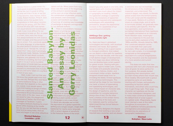
Slanted Babylon

I’ve got an essay in the special issue of Slanted on non-Latin typeface design. It’s only available through the online store (or to attendees of the Granshan conference in Bangkok). My text is typeset in some shade of pink, which is a very popular colour in Thailand. It will probably be re-published in some other title as well.