A primer on Greek type design (1998–2002)

[n.b. This is a pre-publication version of the text that appeared eventually in Language, Culture, Type in 2002. The text was written in 1998 for the third issue of Type, the ATypI journal. Type no. 3 never materialised, and the text was later edited again for inclusion in the book published by ATypI with the occasion of the Bukva:raz competition (2001).

In 1998 – even in 2000, when the second edit took place – the state of Greek fonts internationally was very different that nearly fifteen years later. Only Adobe had made significant original contributions, and designers were just beginning to be interested in the challenges of Greek typeface design. It is worth keeping these points in mind when reading the text.]


At the 1997 ATypI Conference at Reading I gave a talk with the title ‘Typography and the Greek language: designing typefaces in a cultural context.’ The inspiration for that talk was a discussion with Christopher Burke on designing typefaces for a script one is not linguistically familiar with. My position was that knowledge and use of a language is not a prerequisite for understanding the script to a very high, if though not conclusive, degree. In other words, although a ‘typographically attuned’ native user should test a design in real circumstances, any designer could, with the right preparation and monitoring, produce competent typefaces. This position was based on my understanding of the decisions a designer must make in designing a Greek typeface. I should add that this argument had two weak points: one, it was based on a small amount of personal experience in type design and a lot of intuition, rather than research; and, two, it was quite possible that, as a Greek, I was making the ‘right’ choices by default. Since 1997, my own work and that of other designers–both Greeks and non-Greeks–proved me right.

The last few years saw multilingual typography literally explode. An obvious arena was the broader European region: the Amsterdam Treaty of 1997 which, at the same time as bringing the European Union closer to integration on a number of fields, marked a heightening of awareness in cultural characteristics, down to an explicit statement of support for dialects and local script variations. Furthermore, the assignment of candidate-for-entry status to several countries in central and eastern Europe, and the tightening of relationships with other countries in the region, foregrounded not only the requirements of the extended Latin script, but the different flavours of the Cyrillic script in use within the broader European area. In this context, the Greek script is a relatively minor, if indispensable, player. However, in a reflection of its history in the last five centuries, there is a huge interest for Greek typography from outside the boundaries of the Greek Statestate. There are considerable Hellenic communities in Europe, North America, and Australia; a significant number of academics working on ancient, Byzantine, and modern Greek; and an important worldwide market for bilingual ecclesiastical texts.

[1] Typeface by the Spaniard Arnaldo Guillen de Brocar. This is one of the three main strands of early Greek type styles. Despite its simplicity and clarity, it fell victim to the commercial success of the Aldine model.[2] Typeface by Demetrios Damilas. This strand of early Greek type styles, in some ways a stylistic precursor to de Brocar’s, combined regularity with fluidity without indulging in over-complexity.

Despite sizable gaps in published research, the development of the Greek typographic script up to the twentieth century is well established, at least for the non-historian. The twentieth century, on the other hand, is not as well documented, and even less well researched–a regrettable fact, since it is a far more volatile and interesting period for Greek typography. Here, I will very briefly go over a few key contributions to Greek type design up to the end of the nineteenth century, before expanding on more recent developments.

Greek letterforms up to the fifteenth century, in three points

• Varied, but clearly related, inscriptional and scribal strands of development are established, spanning all the way from pre-classical times through the Hellenistic years and the ascendancy of Orthodox Byzantium. Inscriptional letters were not cut at the larger sizes common in Imperial Rome; the development of Byzantine hagiographical and secular lettering did not follow the logic of the brush-stroke construction as outlined by Catich in his Origin of the Serif.

• An uncial hand developed for writing on softer materials, which branched into official and vernacular varieties, the latter with a strong cursive character. Such hands were increasingly adopted by the mercantile classes, secular writers, and non-patristic ecclesiastical writers. Letters from older hands were used for versals and titles.

• After the Sack sack of Constantinople in 1204 by the fourth Crusade, the western, largely Venetian, occupation of many lands, particularly Crete and Cyprus, facilitated the migration of Greek scribes to the Italian peninsula. This movement turned into a flood after the Fall fall of Constantinople in 1453 to the Ottoman Turks. It was the cursive hand that these scribes brought to the West, and put to use as tutors, editors, and printers.

The first Greek typefaces

The first printers to cast Greek type used the hands of Italian Humanists humanists as models. Typefaces of this group tend to have upright letterforms, with nearly circular counters, and monoline strokes with occasionally bulging or tapering terminals. There are few ligatures, and letterforms are positioned within a clearly defined vertical band–in other words, there is minimal kerning. Although some letterforms were consistently troublesome for western punch-cutters, texts are easily readable and the texture of the page is generally even. This style reached its zenith in the typeface by the Spaniard Arnaldo Guillen de Brocar, [Fig. 1], famously used in the Complutensian Polyglot Bible.

Scribal models for Greek typefaces were not as established as for Latin ones, where the varieties of blackletter were dominant in patristic and ecclesiastical texts, and the early Humanists’ humanists’ version of littera antiqua were standard in classical texts and treatises. Despite the considerable involvement of non-Greek scholars in–mostly Venetian and Florentine–publishing enterprises, the refugee scribes and scholars had significant authorial and editorial presence, even when they did not assume the role of publisher or printer. It is not difficult to imagine that their manuscripts would be seen as fitting models for the cutting of new typefaces.

This first style of types modelled on the hands of the Greek refugees is exemplified by the type of Demetrios Damilas, which appeared in 1476.  [Fig. 2] Each letterform is clearly differentiated, although there are more ligatures and abbreviations. Some regularity and circularity has been traded for a closer correspondence to the variety and vigour of energetic handwriting. One could say that these types mirror the scribe’s familiarity with the letterforms. The strong distinction between minuscules for text and capitals for versals or titles must have made it easier for printers to use capitals from different typefaces, not to mention borrowing what could be used from a Latin fount.1

[3] The hand of the Greek scribe Immanuel Rhusotas, which Aldus used as a model for Griffo to cut his Greek types. The fluidity is characteristic of a proficient scribe’s hand.[4] First Greek typeface by Aldus Manutius. The decision to provide a sufficient number of ligatures, contractions and abbreviations to replicate the texture of the handwritten text would burden the Greek typographic script with undesirable complexity for centuries.

The turning point for Greek types is 1495, the year Aldus Manutius published his first Greek text. Technical considerations aside,2 Aldus’s importance lies in his choice to follow the hand of the Greek scribe Immanuel Rhusotas [Fig. 3] in all its complexity. This necessitated a huge number of contractions, ligatures, and alternate sorts. [Fig. 4] His Aldus’s three subsequent typefaces were essentially attempts to simplify the design and eliminate ligatures and contractions. Unfortunately, and to the regret of generations of compositors, it would take a couple of centuries for punchcutters of Greek to take serious steps in turning a scribal script into a typographical one suitable for typesetting by hand.3

The typefaces that mirrored the handwriting style of contemporary scholars must have contributed to the commercial success of the Aldine editions as much as their novel format, and Aldus’s drive to publish Aristotle’s works. The result was that the style became the accepted face of printed Greek erudition, and was imitated widely, in complexity comparable to the originals.

We should note that the prominence of the Aldine style eclipsed other alternatives, most notably the practically contemporary design of Zacharias Kalliergis. [Fig. 5] This typeface has wider spacing, more open counters, and curved strokes that develop without crowding or closing in on themselves. Altogether more space is allowed for the elaboration of strokes–and, despite being based on a scribal hand, there are concessions to typographical necessity. Kalliergis’ typeface influenced some later designs, but its legacy was not lasting; a regrettable development by any measure.

[5] Typeface of Zacharias Kalliergis. Another victim of Aldus’ business acumen, this was probably the most promising of all the strands of early Greek type: It is fluid but uncomplicated, elegant yet susceptible to regularisation.

In the 1540s Claude Garamond cut a Greek typeface [Fig. 6a & 6b] in three sizes drawing on the Aldine spirit, but this time based on the hand of another Greek scribe, Angelos Vergikios. The types are more open and upright, and strokes flow easily into one another. One could say that the smoothness of the curves and the transitions from one letter to the next bring to mind the shift in the French interpretations of Griffo’s italics. To the compositors’ continuing despair, the founts were equipped with hundreds of ligatures and contractions. Garamond’s typefaces was were an immediate and long-lasting success: printers hastened to secure copies or close approximations, and the style dominated Greek typefaces well into the 18th century.

[6a] The writing of the scribe Angelos Vergikios. Despite its elegance, this hand has all the marks of a script that is unsuitable for conversion to a typographic alphabet.

For the two centuries after Garamond, the main development was the inevitable abolishment of most of the ligatures and contractions. The issue was not simply one of just not using the extra sorts; if a punch-cutter had intended a typeface with, for example, a double gamma ligature, the possibility of two single gamma sorts side-by-side would not have been anticipated. If we take into account the extent to which typefaces relied on ligatures and alternate sorts, simply omitting these features would amputate truncate the design. It was not until 1756 that Alexander Wilson cut a successful typeface that followed the established models while doing away with all but the most basic ligatures and contractions. [Fig. 7a & 7b] The new trend did not catch on as easily as compositors might have hoped, but eventually Greek typefaces were liberated from the more complex scribal remnants.

[7a] Alexander Wilson’s Greek typeface for the Foulis Press.[7b] Wilson’s typeface digitised by Matthew Carter (from a 1995 specimen).

The eighteenth century saw printers like Baskerville and Bodoni transplanting elements from the writing masters’ style and the Modern types to their Greeks, with, on the whole, unfortunate results.4 An inclined variety with some distinct traces of Bodoni’s style was developed by German printers for textbooks of Greek authors; the style survives to this day.

However, one of the most important figures from the early 19th century was the Frenchman Ambroise Firmin Didot, a fervent philhellene and supporter of the early attempts to establish printing on Greek soil in Greece (Didot trained a Greek printer and donated one of the first presses to operate on liberated Greek soil). His types, which dominated Italy as well as, eventually, the lands of the emerging Greek Statestate, are a distant descendants of the grecs-du-roi, but have evolved a consistent style of their own. [Fig. 8] The upright stance and relative thickness of the strokes impart solidity, while the ductal character conveys liveliness and speed. Eventually, the Didot style would prove more resilient than the Bodoni-clones, providing the basis for what became the most widely used typeface this in the twentieth century within Greece.

[8] A Greek by Didot, dating from 1790. Note the two forms of tau: the ascending one survives only in scribal forms today. Later interpretations of the style would tighten the curves and eliminate some of the mannerisms (like the flick at the bottom of the rho, and the overly pointed delta).[9] Richard Porson’s typeface, based on the hand of the Hellenist Richard Porson. Note the tear-drop terminals of vertical strokes, the lunate epsilon, the ‘headless’ lambda, and the concave perispomeni.

A completely different strand was initiated by the Cambridge Hellenist Richard Porson, who designed a typeface based on his own handwriting, cut by Richard Austin in 1806 [Fig. 9] The design was a radical departure from contemporary styles: the curves are simplified and the structure and alignment of characters more regularised. The modulation of the strokes is more consistent, and there are some new interpretations, like the lunate epsilon (present in several manuscripts, most commonly as part of ligatures), the kappa, and the simpler perispomeni. The terminals are varied: some taper, some end in drop-like bulbs, and some are sheared. The design is somewhat inconsistent in the balancing of white regions, both in closed counters and around open characters like the lambda. Appropriately for this style, there were no ligatures or contractions. Porson’s design showed the way forward for the next generation of Greek typefaces, re-stating the case for abandoning the grecs-du-roi influence and regularising the strokes of letterforms. It was widely copied (and modified) and still enjoys considerable success, albeit within Greece only for shorter runs of text.

The twentieth century

Although typefoundries existed since from the very first years of the modern Greek state, the turn of the twentieth century saw Greece importing most of its printing equipment, as well as essentially all the models for text typefaces, from Europe. We can identify two main strands, : an upright style drawing on Didot’s Greeks, and an inclined style with direct references to German typefounders. Notwithstanding the vicissitudes of typographic fashion, upright and inclined typefaces were considered equal for text material.

From around 1910 onwards, Lanston Monotype and Mergenthaler Linotype began to make Greek typefaces available for machine composition. The involvement of these companies was instrumental in clarifying character sets, especially in relation to alternate forms (primarily the alpha, beta, epsilon, theta, kappa, pi, rho, and phi). Another, more elementary, influence of Monotype and Linotype was the complete redefinition of the relationship between primary and secondary typefaces: until that point, Greek typesetters used spacing between letters to signify emphasis in a text. Less frequently, an alternate typeface might be used. Monotype and Linotype shifted inclined Greeks towards a role equivalent to italics in Latin typography, a decision that must have been driven by marketing as much as technical reasons. Both adopted the Didot style for their uprights; and Monotype’s Series 90 became the definitive text typeface of the twentieth century. Numerous–and hugely varied in quality–digital versions are still very popular for literature, while some lower-run or luxurious editions are typeset with the hot-metal versions. An inclined typeface with clear German roots and few exact design correlations with the Didot style, which until that time was a text typeface in its own right, became the Series 91, the designated secondary italic.

Although types were cut in Greece throughout the period of mechanical typesetting, any original designs were limited to display typefaces; very few typefaces used for text did not failed to conform to either of the Didot or the [German] inclined paradigm. One common characteristic common to both of hand-setting type specimens from the early part of the century and the surviving specimens from pre-digital phototypesetters is the very narrow selection of text typefaces, and the relative profusion of display designs. Perhaps not surprisingly, few of the latter have survived the test of time.

[10] Monotype’s Series 90 and 91 Greeks. The surviving names for the two styles are indicative: the Didot style is still called aplá, which means ‘simple’ (but also, in Greek vernacular, ‘default’) and the cursive variation of the inclined types was until the early 1990s called Lipsías, which means ‘from Leipzig.’[11] Victor Scholderer’s New Hellenic in Monotype’s digital version, with the scribal form of Omega. Below it, a local version of questionable pedigree. Note the xi, final sigma, Theta, and Psi.

In 1927, Victor Scholderer designed the New Hellenic for Monotype. [Fig. 11] With some modifications, this has enjoyed moderate success outside Greece, and rather more within, where it has also had the honourable role of a variation having been used in primary school first readers for nearly three decades.

In the years up to the Second World War, most attempts at new Greek typefaces by non-Greeks–admittedly not numerous, but some by highly credited designers like Eric Gill and Jan van Krimpen–were (mis)conceived, and failed to even dent the hegemony of the Didot style. However, this did not open up the road to Greek designers: although Greek printers relied heavily on foundry type which that was generally produced locally, any originality in domestic production continued to be limited to display types.

The fifties changed all that. Greece was becoming an industrialized country with a rapidly expanding urban population, so it’s no surprise to see new designs for the emerging middle middle-class markets. The Gill Sans family [Fig. 12] designed by the Monotype drawing office was widely imitated, and, together with a small number of other sans serifs, provided the workhorses of the periodical press and advertising of the time.

[12] Monotype’s digital Gill Sans (upper pair) is seriously compromised by the alpha, gamma, zeta, lamda, mu, tau, chi, psi, and sigma. The pirated version (one of many) improves somewhat on the alpha, zeta, and final sigma, but is wide off the mark in its beta, gamma, theta, lambda, tau, phi, and chi. most of which are plainly wrong. Note also the Xi, with the vertical joining stroke. Different forms are juxtaposed below.[13a] Different versions of Times Greek with associated italics. Some italic fonts are little more than slanted, compressed versions of the uprights. The alternate forms of letters (e.g. the alpha, gamma, kappa, upsilon, phi, psi) suggest one possible route for differentiating effectively between the primary and secondary fonts.[13b] Different alphas from successive versions of Times Greek typefaces. The alpha is the most common letter in Greek texts, and the size and shape of its counter will have a profound effect on the texture of typeset text. Ironing out the corner in the counter of the alpha precipitated a straightening of the right half of the typeform into a single vertical stroke; together these constitute one of the most unfortunate developments in Greek type design.

The other major family of the fifties was Times Greek. [Fig. 13a & 13b] Capitals excepted, the Greek versions share little with the Latin ones. Regardless, the ubiquity of Times Greek (in all its guises) in the last thirty-odd years, both within and outside Greece, is undeniable, if far from deservingdeserved. We must keep in mind that Latin typefaces of the time were very much influenced by the regularising approach of the period. However, this then in favor; this approach, however, was primarily implemented in new designs or interpretations of fin-dude-siécle sans serifs. It is questionable whether the Times family was a good choice for such treatment. Applying a 1950s approach to the style of a 1930s typeface (with sixteenth sixteenth-century roots) was inauspicious for Times Greek. The homogenised counters and normalised typeform widths with add-on scribal flourishes and terminals leave a lot to be desired, and the unresolved stress angles and compressed or extended counters testify to a program that failed to adapt conclusively the Latin original’s characteristics to the Greek.

[15] Some badly designed Greek ‘Bodonis’.

The early seventies saw the arrival of the Greek Optima, which was to carve its own niche in Greek magazine publishing, and, more importantly, one of the most influential designs of the post-junta period: the Greek Helvetica. [Fig. 14] This was one of the first new Greek typeface designed directly for phototypesetting; on the whole, the few available phototypes had been re-issues of hot-metal designs. Helvetica went hand-in-hand with the new style in magazine and advertising, if with a few years’ delay from the rest of Europe. Through mainly the periodical press, Helvetica became part and parcel of the new, ‘cleaner,’ European aesthetic promoted to urban readers from that time onwards well into the next decade. It is clear that Matthew Carter, who designed these fonts, was asked to produce typefaces that ‘looked like the [western] Latin [western] ones,’ an understandable request in the political and cultural context of early 1970s Greece. However, the serifed typefaces of the group developed at the time (Baskerville, Century Schoolbook, and Souvenir) revealed problems with this approach that trouble Greek typefaces to this day.

[14] Common Helvetica and Optima versions. The bottom example of Optima is particularly poor.

All in all, however, the seventies were not years of typographical revolution in Greece. To this contributed not only the political turmoil of the junta of 1967–74 and the subsequent drive to rebuild democracy, but, perhaps more importantly, the fact that many publishing projects were adequately covered by existing technology. Although many magazines adopted offset technology, by far the most greatest number of book publishers continued to use hot-metal printing. As the book market was characterized by a large number of small publishers producing modest print runs, printers had little to gain by investing in the new technology. In that light, the lack of available typefaces was not seen as severely limiting. All this was to change in the early eighties.

[16] Greek glyphs from Adobe’s MyriadPro, MinionPro, and WarnockPro OpenType fonts.

In 1981 Greece became a full member of the–then–what was then the EEC. The international boom of the decade coincided with the coming-of-age of the urban middle classes, who now were affluent enough to afford, but not mature enough to refuse, the extrovert consumerism of American culture. The combination of phototypesetting maturing to digital formats, and the adoption of the monotonic system for Modern Greek in early 1982, which allowed professional typesetters to be replaced by keyboard operators, drove an increasing transfer of hot-metal and early phototypes to digital phototypesetting. As with Latin typefaces, as often as not such transfers produced inferior results on the printed page. This tendency to transfer existing designs into digital formats took on a new angle from the mid-eighties, with dramatic consequences. The gradual adoption of 8-bit Greek fonts with character sets based on ISO 8859–7, Win 1253, or Mac/OS Greek (by far the worse of the three) was the single most important factor in encouraging font piracy by local designers. A general disregard for international legal standards and accepted practice did not help, as nor did not a desire, typical of the period, desire to make a quick profit. The explosion of the periodical and promotional fields fuelled this phenomenon even further. Greece filled with service bureaus where attention to detail in typesetting and quality in print production were sacrificed to turnover rates and low costs. These companies supported and recycled the graduates of numerous new graphic design schools where depth in design education was rarely, if ever, achieved.

The last decade saw an improvement in some areas. Many designers moved on to multimedia and web design, where it is seems easier to justify a pay check to reluctant clients. Thankfully some–a few–clients have begun to recognize the effort invested in a typeface design, and are willing to seek work of a higher quality. There also seem to be some schools that attach more emphasis to quality in design education, although how many of those subscribe to Hyphen remains to be seen. At the same time, many typefaces in circulation are in breach of copyright or design patents. The result of all the above is that many new Greek typefaces by Greek designers betray a lack of understanding of fundamental aspects of Greek typography, the basic shape of Greek typeforms, and good typesetting. The last few years have witnessed an overwhelming proliferation of designs, ranging from the ever-present hacking of Latin typefaces to a few serious efforts. [Fig. 15] The Greek market is in the process of discovering the made-to-order typeface, advertisers are beginning to realize the potential of an eye-catching design, and, as is usual in similar circumstances, several people have become instant experts. Designers who trained–as opposed to ‘were educated in design’–from the last years of the eighties onwards enjoy a more open communication with activities in Europe and the United States, and are now a significant part of the professionally active design community. However, for every original typeface design there is still a hacker trying to make some easy money.

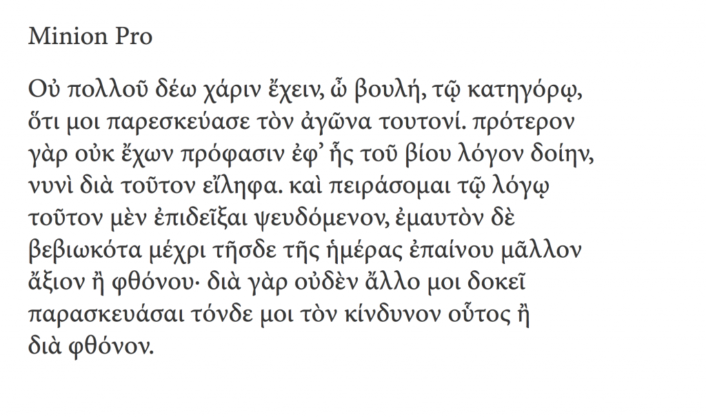
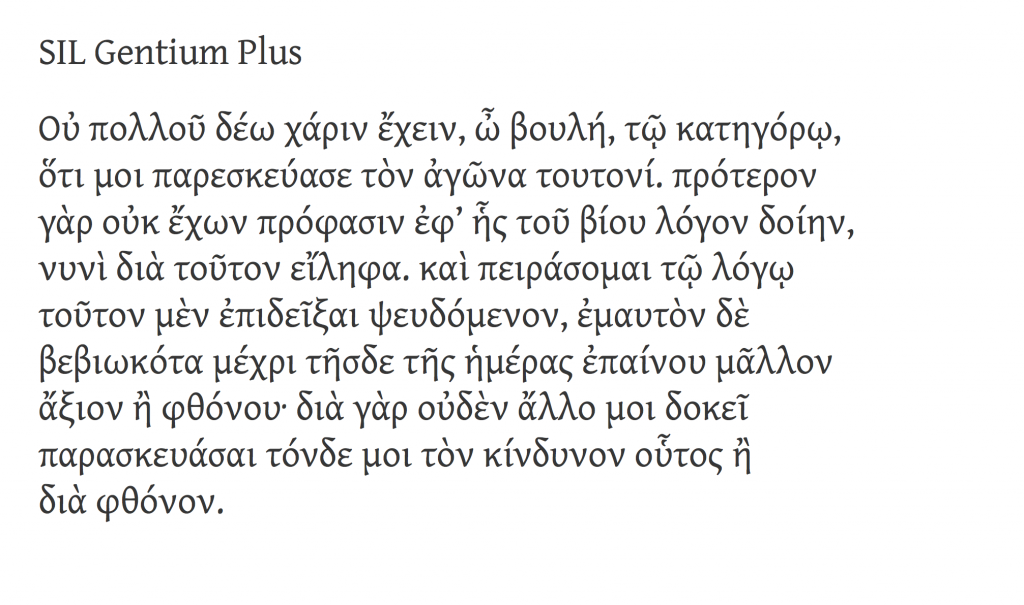
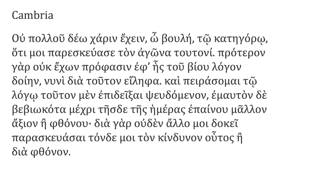
In the meantime, a number of expanded character sets have been developed to address the demand for multilingual and multi-script support. Microsoft was the first significant source of such a set (with WGL4), but from a design perspective are not exceptional; Adobe’s later OpenType fonts are much more notable, [Fig. 16], and include one extensive polytonic typeface which I hope may will hopefully dent the ubiquity of the several versions of Times Greek used by classicists worldwide. As expected, the type designers employed by such companies in most cases cannot read Greek, and may have a very patchy–if any– knowledge –if any–of the relevant Greek history. The problem therefore facing any designer, Greek and or non-Greek, is whether a new design respects the script’s history and design characteristics, while developing the typographic morphology consistently and with originality.

Conclusion

It is an irony of history that while so many people were studying classical Greek, the Greek people were either under foreign occupation, or struggling to mature as a state and a nation. Partly because of this, many Greeks developed an all-too-easy rejection of foreign intervention or example; and many foreign affairs that affected Greece negatively were condemned as if political expediencies were tinged with anti-Hellenic bias. Greeks have often accused non-Greeks of corrupting our cultural inheritance, just as foreigners have accused Greeks of negligence in caring for that inheritance. The truth, as usual, lies somewhere in between. Typeface design has not escaped this attitude, which was aided by the overwhelming dominance of the typesetting equipment market by international companies. Despite protestations that it is very difficult, if not impossible, for a non-Greek to capture the ‘essence’ of Greek typeforms, the fact remains that, until a few years ago, it was mostly non-Greeks who designed and produced Greek typefaces. With hindsight, and in light of recent work, we would have to concede that they did a decent job.

Writing in a different context, Richard Clogg wrote that: ‘… “Greekness” is something that a person is born with and can no more easily be lost than it can be acquired by those of not Greek ancestry’.5 Clogg makes a case for language not being the defining criterion; my experience of non-Greek type designers seems to support that, at least to a considerable degree in the design process. Good typefaces are created through a combination of a knowledge of the traditional forms of the script, and an immersion in dialogue with existing designs, whatever format this interface may take. I would like to think that a well-informed designer with a talent for identifying formal consistencies and distinctions in unfamiliar typeforms can go a long way in Greek type design, without worrying too much about her or his lack or misunderstanding of ‘Greekness’.
A few things about typeface design

Teaching on a postgraduate course feels very much like a spiral: the annual repetition of projects, each a vehicle for a journey of education and discovery for the student, blurs into cyclical clouds of shapes, paragraphs, and personalities. There seems to be little opportunity for reflection across student cohorts, and yet it is only this process that improves the process from one year to the next. Having passed the tenth anniversary of the MA Typeface Design programme was as good an opportunity as any to reflect, and ILT’s offer to publish the result an ideal environment to get some ideas out in the open. Although my perspective is unavoidably linked to the course at Reading, I think that the points I make have wider relevance.

Our students, both young and mature, often find themselves for the first time in an environment where research and rigorous discussion inform design practice. The strong focus on identifying user needs and designing within a rigorous methodology is often at odds with past experiences of design as a self-expressive enterprise: in other words, design with both feet on the ground, in response to real-world briefs. In addition, students are expected to immerse themselves in the literature of the field, and, as much as possible, contribute to the emerging discourse. (There are many more books and articles on typeface design than people generally think; some are not worth the paper they’re printed on, but some are real gems.) I shouldn’t need to argue that research, experimentation, and reflection on the design process lead not only to better designs, but better designers.

In recent years, two significant factors have started influencing attitudes to design. Firstly, as generations grow up using computers from primary school onwards, it is more difficult to identify the influence of the computer as a tool for making design decisions, rather than implementing specifications. Secondly, the trend in higher education to restructure courses as collections of discrete modules results in a compartmentalization of students’ skills and knowledge: it is becoming more difficult for the experience in one class to have an impact on the work done in another. (A third, less ubiquitous, factor   would be the diminishing importance of manual skills in rendering and form-making in design Foundation and BA/BFA courses, a subject worthy of discussion in itself.)

So, repeating the caveat that these observations are strictly personal, I offer them in the hope they will prove interesting at least to the people setting up and running new courses in typeface design, and the many designers teaching themselves.

1 Design has memory (even if many designers don’t)

Typography and typeface design are essentially founded on a four-way dialogue between the desire for identity and originality within each brief (“I want mine to be different, better, more beautiful”), the constraints of the type-making and type-setting technology, the characteristics of the rendering process (printing or illuminating), and the responses to similar conditions given by countless designers already, from centuries ago to this day. Typographic design never happens in a vacuum. A recent example is Emigre magazine: can its early period be seen without reference to the sea-change in type-making and typesetting tools of the mid-eighties? and is not its middle period a mark of emerging maturity and focusing, critically and selectively, on those conventions worth preserving in a digital domain? Emigre is important as a mirror to our responses to new conditions and opportunities, and cannot be fully appreciated just by looking at the issues. (Especially if you look at scaled-down images, rather than the poster-like original sizes!). At a more subtle level, the basic pattern of black and white, foreground and background, for “readable text” sizes has been pretty stable for centuries, and pretty impervious to stylistic treatments. Does not a type designer gain by studying how this pattern survives the rendering environments and the differentiation imposed by genre and style?

And yet, many designers have a very patchy knowledge of the history of typography and letterforms. More worryingly, students and designers alike have little opportunity to experience genre-defining objects in reality (imagine discussing a building looking only at the blueprints for building it, not walking up to it, and through its rooms). It is perhaps not surprising that the wide but shallow knowledge gained from online sources is dominant; there seems also to be little discrimination between sources that employ review and editorial mechanisms, and those that are open to wide, unchecked contributions. This shallow approach to reading and investigating results in a lack of coherent narratives, not only about how things happened, but also why. And how were similar design problems addressed under different design and production environments? What can artefacts tell us about how people made decisions in similar situations before? How did changing conditions give rise to new solutions? To paraphrase Goudy, the problem is not any more that the old-timers stole all the best ideas, but that the old ideas are in danger of being re-discovered from scratch. (Just look at the web designers rediscovering the basic principles of text typography and information design, as if these were newly-found disciplines.)

[IMAGE: Michael Hochleitner’s Ingeborg, an award-winning typeface that revisits Modern conventions with originality and humour.]

2 Design is iterative, and improved by dialogue

The process of typeface design is, in essence, a reductive refinement of ever smaller details. First ideas are just that: sketches that may offer starting points, but have to be followed by a clear methodology of structured changes, reviews, testing – and repetition of the whole process. The attention of the typeface designer must progress in ever decreasing scales of focus: from paragraph-level values on the overall density of a design, to the fundamental interplay of space and main strokes, to elements within a typeform that ensure consistency and homogeneity, and those that impart individuality and character. At the heart of this process is dialogue with the brief: what conditions of use are imposed on the new design, and what are the criteria to determine excellence in responding to the brief? (For example, how will the end users make value associations with the typeface?)

The wider the typeface family, the deeper the need to test conclusively, not only with documents that highlight the qualities of the typeface, but also with documents that approximate a wide range of possible uses. Even in cases of very tight briefs (as in the case of bespoke typefaces for corporate clients), the range of uses can be extremely broad. But good designers are also aware of the constraints of their testing environment. The misleading impression of transparency and fidelity that computer applications give, and the limitations of laser-printer output, obstruct trustworthy decisions. Designers must be aware of how looking at medium resolution printouts in dark toner on highly bleached paper can bias their decisions.

We are also seeing a gradual return to typeface design being a team enterprise, drawing on the expertise of a group rather than an individual. This, of course, is not new: typeface design in the hot-metal and phototype eras was very much a team product. But just as the digital, platform-independent formats enabled designers to function outside a heavy engineering world, so it enabled the explosion of character sets and families to unprecedented levels. The necessary skills and the sheer volume of work required for text typefaces have driven a growth of mid-size foundries, where people with complementary skills collaborate in a single product. The corollary is a rise in the need for documentation and explanation to a community of fellows. The short-lived “creative hermit” model is giving way to new models of work.

[IMAGE: Eben Sorkin’s Arrotino, a contemporary typeface with deep roots in fifteenth-century typography.]

3 Scale effects are not intuitive

The conventional curriculum for design education rarely tackles scales smaller than a postcard. More importantly, the compositional aspects of design tend to take precedence over details at the level of the paragraph, let alone the word. Typeforms for continuous reading are designed at fairly large sizes (on paper or, more usually, occupying most of a computer screen) but are experienced in much smaller sizes where their features have cumulative effects, weighted by the frequency with which specific combinations occur. These conditions arise in every text setting, be it for prose read forty centimetres away, or a sign viewed from a distance of tens of metres.

Of all the skills typeface designers need to develop, understanding how to make shapes at one scale behave a particular way in another scale is the most troublesome one. Imagining the difference that a small change in a single letter will have in a line or paragraph of typeset text is not an innate skill: it is entirely the result of practice. The best designers are the ones who will naturally ask “why does this paragraph look this way?” and try to connect the answer to specific design choices.

A common example of problems connected to scale effects arises whenever a student follows a writing tool too closely as a guide for designing typeforms: whereas the ductus (the movement of the stroke) and and the modulation can be preserved across scales without much difficulty,  the details of stroke endings and joints cannot; typographic scales demand a sensitivity to optical effects that simply do not apply at writing scales. The best examples come from typefaces designed for the extremes of text scales: for telephone directories (famously by Ladislas Mandel and Matthew Carter), Agate sizes for listings, and early typefaces for screen rendering. The smaller the size (or the coarser the rendering resolution), the more the designer primarily separates blobs and bars of white space, and only secondarily deals with style and detail.

[IMAGE: Alice Savoie’s Capucine: an award-winning typeface in a fluid modulated style that successfully integrates Latin and Greek in magazines.]

4 Tools are concepts

Regardless of the scale effects mentioned above, there is a requirement to appreciate the  link between typeface design and writing, and the tools used for writing. To be clear: I am not talking about calligraphy, but writing in the widest possible sense, from graffiti, a hasty ‘back in five minutes’ sign, to the most elaborate piece of public lettering. More than the specific forms of letters, the process of writing illuminates the patterns and combinations we are used to seeing, and gives insights into the balance of shapes and the space between them. The relationship of writing tools to the marks they make has been discussed in some depth (for the Latin script by Noordzij and Smeijers, most importantly), but the transformation of these marks through the computer much less so. (There are some texts, but mostly they focus on specific cases, rather than general principles; the notable exception is Richard Southall.)

And yet, since the early days of punchcutting, type-making involves a process of fracturing the typeforms, modularizing and looking for patterns. Later on, when the roles of designer and maker began to be distinguished (most emblematically with the Romain du Roi, like the Encyclopédie a true product of the Age of Reason) typeface design became programmatic, each typeface an instance of a class of objects, rooted in a theory of letter construction – however sensitive to human practice or aloof that may be. Later, the hot metal “pattern libraries” and the rubylith cutouts of shapes to be photographically scaled and distorted for phototype point to the same process, of abstracting the typographic shapes into elements that have little to do with the movements of a tool. As for the digital domain, deconstruction and repeatability remain key aspects of the design process.

To ensure a typeface built with fragmentary processes has internal consistency, the designer needs to develop a mental model of a tool that may follow the tracks of a writing tool, but may include mark-making and movement behaviours quite distinct from anything that is possible to render with a real writing tool. (Easy example: the parallelogram-like serifs of a slab, on a typeface with a pen-like modulation.) Such mental models for typemaking are increasingly important as type families expand into extremes of weight and width, where any relationship with a writing tool quickly evaporates. So, an invented tool that, for example, makes incised vertical strokes and pen-like bowls, can become the basis for a wide range of styles, ensuring consistency without the limitations of a specific tool; at the same time, because the model is agnostic of weight and width, it does not hinder the generation of large families with overall consistency but local richness. (Compare this approach with a wide family developed through extremes of multiple master outlines, where consistency relies on the details of typeforms having close correspondences.)

[IMAGE: A small part of Jérémie Hornus’ analysis of the Amharic script in preparation for developing his own successful typeface family.]

5 The Latin script is the odd one out

The demand for typefaces with extended character sets has been growing steadily for many years. OEM and branding typefaces are expected to cover more than one script, and often three or more. Beyond the obvious scripts of the wider European region (Cyrillic, Greek, and Latin), the interest has shifted strongly towards Arabic and the Indian scripts. But there are two key differences between the Latin typographic script, and pretty much everything else: firstly, that the type-making and typesetting equipment were developed for a simple alphabetic left-to-right model that would have to be adapted and extended to work with the complexities of the non-Latins. Although rectangular sorts will work sufficiently for the simple structure of western european languages, the model strains at the seams when the diacritics start multiplying, and pretty much collapses when the shapes people use do not fit in neat boxes, or change shape in ways that are not easy to describe algorithmically. No surprise that most non-Latin typesetting implementations make use of compromises and technical hacks to get the script to work. The second factor is that most non-Latin scripts did not experience the full profusion in styles that arises from a competitive publications market, as well as a culture of constant text production. (It’s no surprise that the language of display typography first developed in nineteenth-century Britain, in parallel with the Industrial Revolution: urbanization, rising literacy, and trade in goods and services go hand in hand with the need for typographic richness and differentiation.)

Many students (indeed, many professionals) will ask ‘Can a non-speaker design a script well for a language they do not read?’ But a typeface arises in response to a brief, which by definition taps into wider design problems. For example, many of the conventions surrounding newspapers apply regardless of the market; the constraints on the typographic specification can be deduced from the general qualities of the script and the language (e.g. can you hyphenate? how long are the words and sentences? with what range of word lengths? what is the editorial practice in the region in terms on article structure, levels of hierarchy, and headline composition?). Having established the typographic environment, we can examine the written forms of the language, and the tools that have determined the key shapes. In this matter most scripts other than the Latin (and to some degree Cyrillic) maintain a very close relationship between writing and typographic forms. Writing exercises and a structural analysis of examples can help the designer develop a feel for the script, before reading the words. More importantly, in their non-Latin work, analysis of the script’s structure and the relationship between mark-making tools and typeforms can help the designers to develop criteria for evaluating quality.

Typographic history is well populated with designers excelling in the design of scripts they could not read – indeed, the examples are some numerous that it would be difficult to choose. Encouraging students to address the complicated design problems inherent in non-Latin scripts is not only a way of enriching the global typographic environment, it is also a superb means of producing designers who can tackle a higher level of difficulty in any aspect of their design.

[IMAGE: Fernando Mello’s Frida: an award-winning typeface that redefined what is possible in Latin and Tamil typeface design.]

6 And finally…

The final lesson for students of typeface design is that a formal environment can teach the functional aspects of design, but can only help them at a distance to develop the aesthetic qualities of their typefaces. Especially when they are working in categories already heavily populated with typefaces, the distinctions between the simply good and the superb will be very refined. And when the consideration turns to originality, inventiveness, and how much a particular design causes us to rethink our responses to typeset text, then teachers have little input. The student, balancing between the deep knowledge of the specialist and the broad curiosity of the generalist, must develop, largely on their own, their capacity to be conscious of past and emerging idioms, to see their own work in the context of developing styles, and – most difficult of all – to identify how their own personal style can co-exist with the restrictions of utility and the conventions of genre.


Type ahead

I measure the growth of my field by the questions of border control agents. A decade ago, the phrase ‘I am a typographer’ would trigger a subtle move of the hand towards the ‘dodgy traveller’ button (just in case, you understand), only to relax once my being in the mapping business was confirmed. But in the last few years – three or four, no more – things are different. I may even drop the words ‘typeface design’, without fear of meeting the agent’s supervisor. And, in some cases, I will be offered the name of the agent’s favourite font, and told about a book called Just my type.

This phenomenon, of typefaces becoming part of the mainstream, is not accidental, nor a fashionable blip. It was foreseeable many years ago, and has been accelerating under the dual impetus of the move to a standards-compliant, text-orientated internet, and the growth of mobile devices with usable browsers.

Designers who remember the last decade of the previous century will recall the shift from intensely localised markets with only superficial communication, towards connected regions. The European integration project, from 1992 onwards, followed by the surfacing of the internet onto the mainstream three years later, required fonts that could support a growing number of languages (albeit primarily those written left-to-right, with unconnected letterforms). Fast-forward a decade, and the typefaces on pretty much any up-to-date computing device could render most scripts in the world, even if the more complex writing systems still suffer in fidelity and design range. The two technologies responsible for uniting the world typographically, Unicode and OpenType, are now in a stage of maturity and refinement, covering most of the needs of most readers. (In case you haven’t heard the two names before: Unicode attempts to describe every distinct character used in all written communication; and OpenType allows each character to take the appropriate visual form, depending on context and style.)

Take the core typefaces shipping with an operating system, or a smartphone, or Adobe’s applications: most have well over 2,000 glyphs in each font, with many additional glyphs for stylistic sets like small caps and non-lining numerals, across the Cyrillic, Greek, and extended Latin scripts. Other typefaces cover Arabic, Armenian, Ethiopic, Hebrew, a whole range of scripts for India, and a growing number of scripts for East Asia: from CJK (Chinese, Japanese, and Korean) to Thai, Khmer, and Burmese. All these resources establish a base level for servicing most texts: ‘we’ve probably got some typeface that will render your language, and if you’re lucky there may be more than one, in different styles’. But there are compromises: even if there’s more than one typeface, styles may not match across scripts, and the range of type families is generally uncoordinated. The profusion of styles, widths, and weights of the Latin script is only partly met in other European ones, and far less so in global scripts.

This state ensures basic communication, but is not very helpful for graphic designers and typographers working with global brands, multi-script documents, or with complex applications exclusively in non-Latin scripts. Professionals need a wide range of typeface styles to express the identity of a publication or a brand, and they need the right style in different weights, and widths, and so on. And this is why typeface design is growing, with no sign of abating: a triple combination of growing global brands, a migration to screens of documents with long print traditions (from ebooks and interactive school textbooks on tablets, to local news services replacing traditional newspapers), and a growth of personalised, transactional documents like online shopping catalogues, increasingly on mobile browsers. At the same time, niche print publications are growing: they take up the slack of offset press capacity, but they also thrive in the print runs of a few hundred, a traditional no-man’s land that digital presses have opened up. These conditions, of transformed documents and new platforms, push the demand for ever more typefaces that are typographically rich, wide in script coverage, and tailored for use on a wide range of surfaces: screens, print-on-demand, and traditional presses.

Two factors add substantially to this need. Firstly, the explosion of mobile networks in regions where cable-based broadband is scarce, means that critical communications are restricted to small screens, that render almost exclusively text. Secondly, the speedy adoption of tablets, which are agnostic devices that do not anticipate functional aspects of the documents they render (in other words: the devices do not explain the interaction, like a print document does: the navigation arises from the document’s typographic design, not its ‘hardware’). The four main tools in typographic design become the main carriers of any identity: from a simple publication to a large brand, typefaces, spacing, visual hierarchies, and colour are the only reliable identifiers.

This process has precipitated a radical re-thinking of a typeface designer’s skillset, especially with respect to scripts the designer is unfamiliar with, and most probably cannot read fluently. In such cases, designers need to engage with the characteristics of the script, bringing to the table an understanding of how letterforms are influenced by changes in type-making and typesetting technologies. But just looking at a bunch of local documents is not enough. Designers need to bring an appreciation of the typographic conventions for the genre of documents in each culture. In response to these demands, the best typeface designers integrate research in historical and contemporary artefacts: books and ephemera, type-making and typesetting equipment, but also texts and material such as drawings produced during the type-making process. These combine with a study of texts written by type makers about type-making, designers about their practice, and a range of research texts on the development of typeface design. The key for all these to be included in a commercial schedule is a framework for integrating research into design practice that enriches the designer’s understanding, and unlocks informed creativity.

The weight of methodology and research place multi-script typeface design at odds with art school traditions of design education. There is, quite simply, too much to learn in areas touching on history, linguistics, and technology for self-taught professionals, or the informal osmosis of apprenticeship-based courses. And, rather than be seen as an oddity in the design world, typeface design is in some ways leading a gradual shift in the wider design education sector. Notions of clarifying a body of field-specific knowledge, and formulating a methodology for practice that is transferable across schools and regions are taking off, globally. (Increasingly, I am invited to speak on exactly that subject: how to develop a research-informed, culturally sensitive methodology for teaching that educates potentially excellent professionals. And promotion criteria for design educators worldwide are changing to include research-based outputs, moving design closer to the Humanities than the Arts.)

The growth in books and print magazines dedicated to typography, as well as special sections in broader titles (like the one you are reading now) are just one of the signs of typography maturing. The many conferences, workshops, and exhibitions are another – and they are aimed not only at typographers, but at web designers, brand designers, and graphic designers alike. But there is another, more subtle indicator that typography and typeface design are gradually emerging onto the wider consciousness. As typeface families grow to cover multiple scripts, concepts of national and regional typographic identity become current, and often volatile. New typefaces can reflect both home-grown and imported visual trends; they give concrete form to the expression of community identities, and become inflection points in visual culture at a range of levels. Beyond functional requirements, they can embody political and generational shifts, and encapsulate a society’s dialogue with modernity.

Next time I cross a border, I’ll have a longer tale to tell.

[Published originally in In Computer Arts Collection: Typography Vol 2 no 2, 2013 and republished, slightly edited, on this site as The next ten years.]


An emerging discipline

Marc Weymann’s typeface in this issue is, like all good text typefaces, strangely familiar. Familiar, because the rhythm of black strokes and white counter spaces reminds us of so many texts we’ve read: the strokes neither loudly dark or vainly thin, and the details of the terminals respectful of the excesses of contrast and the resolution of tired eyes. Strangely so, because this veil of familiarity hides a whole range of subtle contrasts: a combination of smooth patterns reminiscent of formal writing with nibs, and the sharp clarity of letters carved in stone.

Marc’s typeface is misleadingly gentle with its references, but rewarding closer inspection. Other typefaces for text are much less discreet, forcefully calling attention to their novelty, even as they still respect that set of conventions that allow us to read comfortably. Jeremy Tankard’s Fenland, probably the most notable of typefaces published in 2011, takes the ancient paradigms derived from writing tools, and throws them aside for the sake of shapes reminding of discarded piping; its stroke joints challenge the instincts embedded in most modulated text typefaces of the last few centuries. Yes, expectations confounded, it proceeds to space the letters on exactly the same underlying pattern as Formal, as respectful of the reader’s eyes as any.

Formal and Fenland
Formal keeps its cross-strokes and bowls closely aligned to the modulation of a broad nib, adding an incised overtone in the underside of the top serifs, the top side of the lower ones, and open curves such as the outside terminals of the ’s’. By contrast, Fenland makes it difficult to talk about a consistent angle of stress: cross-strokes and bows have a discernible reverse stress (reminiscent of shapes in eastern scripts) but allows the modulation to change as if the writing tool was rotated halfway through the stroke. The ’s’ is typical of this approach, reversing completely the traditional notion of the diagonal cross-stroke as a dominant feature.

Typeface design involves, at the most basic level, decisions on shapes at the level of the letter, the line, and the paragraph. I use this definition intentionally, to make the point that design decisions are not circumscribed by the immediately manipulable (in the case of digital fonts: the glyph outlines, or the spacing interface, or the code for positioning and substitutions). Indeed, typeface design decisions happen at the tip of a siphon, where a whole range of considerations about readers, texts, typesetting environments, and wider cultural concerns get distilled into virtual nudges of points or mouse drags.

In other words, a typeface designer is conscious of the context surrounding his field of practice – in the narrow sense of the typeface design industry, in the intermediate sense of typographic design for documents (where typefaces are but one of the constituent elements), and in the wider sense of design as interaction with a visually rich and refined culture.

This is what makes typeface design such an interesting area to work in: it is a context-driven discipline, where past practice, conditions of use, user perspective, and invested meaning all weigh heavily in design decisions. Indeed, professional experience in typeface design is primarily reflected in the depth of understanding of these wider considerations, the clarity with which these can be translated into typeforms, and the insight with which this context can be married to a personal creative voice.  If we want proof of this, we need only look at the older generations of typeface designers, who – working ,more often than not, on decades-old applications – still produce new designs that contribute fundamentally to our typographic libraries.

Formal and Fenland
Despite their very different texture, both typefaces follow a very consistent pattern in their fitting. Notably, Fenland avoids the typical problem of sans typefaces having overly narrow sidebearings in letters with vertical strokes. This more open underlying pattern ensures the typeface remains perfectly readable in smaller sizes.

This approach can be seen most clearly with work in scripts that the designer is unfamiliar with, and in any case cannot read fluently. In this scenario, design decisions cannot be trusted without an engagement with the characteristics of the script, an understanding of the way the typeforms of the script have responded to changes in type-making and typesetting technologies, and an appreciation of the typographic conventions for the genre of documents the typeface is intended for. In fact, the closer the connection of the script to its written form, and the more complex its typesetting, the more important it is that the designer engage intimately with these considerations. This approach places four-plus-one conditions on multi-script typeface design. First, that the designer has access to historical and contemporary artefacts: books and other printed material, ephemera, type-making and typesetting equipment. Second, access to primary sources: texts and material such as drawings produced during the type-making process. Third, access to secondary sources: texts written by type makers about type-making, and designers about their practice. Fourth, interpretative sources: texts by researchers such as historians and theorists on the development of type design. The ‘plus-one’ is a framework for integrating research into design practice that enriches the designer’s understanding, and unlocks informed creativity.

It is not difficult to see the connection  between these conditions and the growth in formal education in typeface design, largely in parallel across the world. In fact, typeface design is in some ways leading a gradual shift in the wider design education sector, away from a paradigm of silently reflective responses towards user-centred, research–informed design practice. This approach is typical for a research-based discipline in the humanities. It is, though, alien to design taught in art colleges and institutions based on practice teaching outside of context, on the model of apprenticeships.

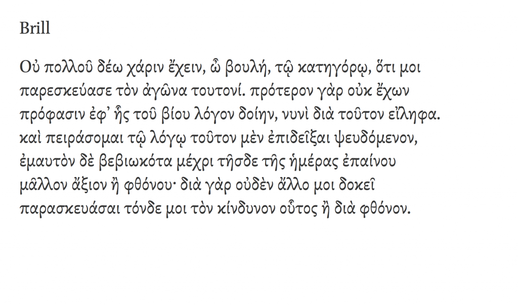
Brill and Brill Greek
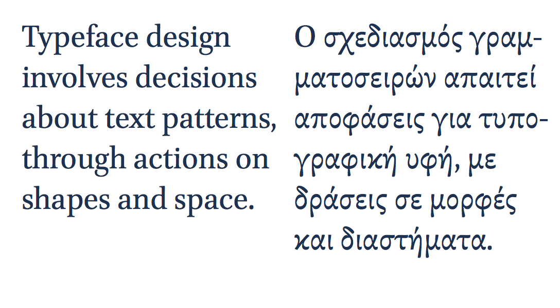
Typeface design across scripts: the Brill typeface, developed for the Dutch academic publisher by John Hudson, covers a wide range of languages and is developed specifically for text-intensive typesetting. The forms of the letters in the two scripts here are quite different, to respect the typographic traditions of each script. The overall typographic colour is similar in tone, allowing the texts to differentiate solely though the differences in typographic texture.

These considerations are not purely an academic matter. In the last decade we have witnessed a rapid growth in the demand for typefaces with very large character sets spanning many scripts. Pan-european typefaces with several hundred characters are often just a starting point, with Arabic or several Indian scripts added during the typeface’s lifetime. More recently we have seen notable growth in Armenian, as well as East Asian and South-East Asian scripts like Korean, Thai, Khmer, and Burmese. This demand, driven by an expansion of communication services and globalised branding, has pushed typeface design towards a level of effort that rewards teamwork, and the gradual building of expertise, through the combination of formal and self-directed study, and professional activity.

This is the environment in which we should seek to educate typeface designers: to expect them to ask questions about their practice, and seek answers through research. Indeed, we should see type design skills as inseparable from research skills, and an enquiring attitude. We should expect designers to engage with their field actively, and to write: to produce knowledge about their discipline. Seeing design activity as wider and deeper than any individual project is a key characteristic of the transition of typeface design towards a fully-established discipline.

Going global: the last decade in multi-script type design

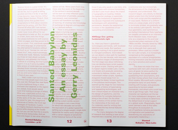
Science fiction is a mirror. It’s rarely good at predicting the future, but it’s great at telling us what we’d like the future to be, or what we fear it may become. Isaac Asimov, Arthur Clarke, Robert Heinlein, Philip K. Dick: familiar names that guided many imaginations to think about societies spanning the galaxy. Then Star Wars finished off what 2001 started: rich visual textures and soundscapes made it ever more difficult for our imaginations to keep up.

But there were two things that always bothered me about science fiction. First, everybody speaks the same language, or understands the other person’s locutions without so much as an “excuse me, can you repeat this?” And, most frustratingly, nobody ever reads. Nobody. Sometimes there are symbols, diagrams, and gibberish that brands a vehicle or a building, but that’s pretty much it. It is as if some mundane version of mind-meld has rendered obsolete those moments between you and some letters on a surface in front of your eyes.

Well, it didn’t turn out that way. We know that people read more than they ever did. Perhaps they read fewer of some traditional thing or other (and even that depends on the region) but, overall, more people spend more time looking at strings of letters. What was once a dedicated activity has expanded to fill out the previously empty spots of the day: news, a story we saved for later, the playground utterances of Twitter, the trivial ego massages of Facebook. It pains to imagine Dick’s Deckard checking his smartphone while slurping at the noodle bar, but you can bet that this is exactly what he’d be doing today. And we have only begun to see what ubiquitous tablets will do. Many years from now, these very few years at the beginning of the century’s second decade will be seen as a key inflection point: The combination of portable, personal, ever-present, ever-connected screens will transform our ideas of learning, of exchange, of creating new knowledge to degrees unimaginable by our idolized authors.

Our regional identity is deeply personal. It is the language in which we dream and laugh, the language of our exasperations and tears. For most of us, this language is not English, and quite likely it is not written with the Latin script.

There is one problem, however: the future is turning out to be more complicated than we had imagined. Instead of a single, Esperanto-like über-language, most of us are growing up with two parallel identities. One is based on a commonly-owned, flexible, and forgiving version of English, with a rubber-band syntax and a constant stream of new words that spread like an epidemic to other tongues. The other is our regional and historical identity: local in geography, and deeply personal in its associations. This identity is awash with the memories that make us who we are. It comes in the language we dream in, the language of our laughter, our exasperations, and our tears. Overwhelmingly, this language is not English, and quite likely it is not in the letters of the Latin script.

Indeed, just as globalization brought a wave of uniformity, it also underlined the rights of communities to express themselves in their local languages and dialects, in the script of their traditions. But the growing urban populations (over half of everybody, now) are contributing to a demand of complex script support. The equivalent of a single typeface rendering a plain-vanilla version of a language is not a new thing. For about two decades we’ve had the equivalent of a global typewriter, spitting out a single-weight, single-style typescript for nearly every language, with varying degrees of sensitivity to the historical forms of the script. Great if you only speak in one tone, only typeset texts with minimal hierarchies, and don’t care much about the impact of typography on reading. Indeed, the typewriter analogy is supremely fitting: the limitations of typewriter-like devices migrated onto subsequent technologies with astonishing persistence, despite the exponential increase in the capabilities of our typesetting environments.

Stage One: getting fundamentals right

So, here’s the context: globalized technologies and trends, with localized identities and needs. But typeface design is nothing if not a good reactor to changing conditions. Indeed we can detect a clear path for typeface design in the last decade, with two-and-a-half distinct stages of development.

The first stage was about rethinking how we develop basic script support for global scripts. Starting with pan-European regions (wider Latin, Cyrillic, and Greek) and gradually extending outwards to Hebrew, Arabic, and mainstream Indian scripts, typeface designers moved away from re-encoding the dated, limited typefaces of the previous technologies. This development led to two narratives that are increasingly central to typeface design. On one hand, an understanding of typemaking and typesetting technologies, and their critical impact on character sets, the design of typeforms, and the possibilities for complex behaviors along a line of text. On the other hand, an appreciation of the written forms: the relationship of the tools and the materials used for writing that determined the key formal features of each script.

For many designers the depth of research required to tackle a new script was a surprise, and not always a welcome one; but increasingly the dimensions of the challenge were respected, and understood. This research began, very slowly, to liberate global scripts from the formal tyranny of the Latin script and the expediency of copy/paste. Notions of a uniform stress at a steep angle, and of serifs to terminate strokes, are gradually seen to be primarily Latin-specific. And the faux-geometric, over-symmetrical, pot-bellied International Style typefaces are steadily unmasked as an intensely North-Western style, meaningful only as a response to the post-war trauma and urban explosion of the 1950s and 60s. Already dated by 1985, their continued adoption serves only to discredit their users and promoters. When taken as a model for non-Latin scripts, they are increasingly recognized as the typographic equivalent of a cultural straightjacket, limiting innovation and the expression of a more sensitive and current identity.

This does not mean that new typefaces with non-Latin character sets were all good, let alone perfect for their purpose. But people started questioning their assumptions, and put their money where their mouth was. Most notably, Microsoft (with a global perspective early on) and Adobe (starting with Europe, and gradually expanding its horizon) asked themselves, and others who could help, how to get things right. Their typefaces with large character sets raised the bar for many subsequent designers, and in many ways continue to determine the default level of script support on a global scale. (Regrettably, Apple never claimed a seat at this table: throughout its ecosystem its use of typefaces remains persistently unimaginative and pedestrian, abandoning any aspirations of typographic leadership.)

Stage Two: linear families

The second stage in global typeface design came when development migrated from the big developers to the publishers catering to the publishing and branding markets. The briefs for typefaces mutated from very broad specifications (for fonts that ship with operating systems and office suites, or bundled with page layout applications) to the needs of very specific documents, with rich hierarchies and multiple styles. While Office could muddle through with four Latin styles and one each for most non-Latin scripts, a newspaper or a magazine demands a range of weights and widths — especially if the templates are imported or designed to match an existing house style. Headings and subheadings, straplines and pull-quotes, footnotes and captions, for starters. And, hot on the tails of global publications and multi-script branding, come the limitations of doing the same on smaller screens, where the color palette and the typefaces may be the only elements that transfer fluidly with some consistency across materials and devices, bridging scales from the pocket to the poster.

In the previous stage designers had to ask themselves what are the fundamental differences, for example, between Arabic-script typefaces for Arabic and Persian and Urdu texts. Now the matter shifts to something like, “What are the typographic conventions in these language communities, what are their traditions, and what are the rules for differentiating between contrasting kinds of text within the same document?” In real terms, this moved design from the single typeface to the family: how will a bold Devanagari relate to a text weight, and how far can you go in adding weight? Can you squeeze, condense, or compress? And how light can you make the strokes?

[Image of Juliet Shen’s Lushootseed typeface.
Caption: Juliet Shen’s typeface for Lushootseed, the language of the Tulalip Native American tribe.]

The answers to these questions stem from a deeper engagement with the script, and an understanding of which elements are integral to maintaining the meaning of the glyph, and which are there to impart a style and build the identity of the typeface. All typeface designers (native or not) need to understand the impact of type-making and typesetting developments on the script, engage intensively with the written forms, and consider the development of typographic norms within a community. But we know, through the evidence of many successful typefaces, that designers need not be native to a script to design well for it; in many cases, they might not even be able to read the text they are typesetting. This may seem counterintuitive. However, good typefaces rely hugely on the designers’ dialogue with convention, and their understanding of very clear — if not always obvious — rules.

Having said all that, this stage of typeface development for global scripts is inherently conservative. The recognition of the formal richness of non-Latin scripts, and the efforts to design new typefaces that respect this complexity and represent it adequately, is a corrective against past sins, technological and human. Typefaces that are well-designed and comfortably read by native communities, while allowing multi-script typesetting for a range of different applications, are a Good Thing, but nothing to be particularly proud of. This is the typographic infrastructure of a connected world. These typefaces are elementary, and essential. They have to be many, because the documents they are used in are hugely variant in their specifications and complexities; and when contemplating multi-script typesetting, the specifics of the document determine which typefaces will do the job better.

But for all the celebration, these new, expansive families are refinements of fundamental forms, without raising difficult questions. It is a relatively simple process to add weights to a typographic script, hindered only by the scale of the work, when the character set is substantial. The challenge becomes interesting only in the extremes of the family, the very dark styles, and the very light ones. At these extremes designers need to deal with loops and counters, stroke joints and cross-overs, and all sorts of terminals that may not accommodate a dense stroke within the available space, or dilute the distinctive features of the typeform. Indeed, these extremes demonstrate clearly how the neatly expandable grammar of the Latin script, with its misleadingly simple-to-modulate strokes, is a crippled model for a global typography.

Problems compound with scripts that have only ever been implemented in type with a modulated stroke, or a monoline stroke, but never both. As the weight approaches the blacks, monoline strokes have to gain some contrast to fold around counters, and to save terminals from turning into blobs or stubby appendages. In the opposite direction, towards the thins, critical modulation may have to be sacrificed, and strokes that have only been experienced as curves turn into long, nearly straight strokes. Unsurprisingly, designers had overwhelmingly steered clear of these extremes for their non-Latin typefaces.

[Image of Vaibhav Singh’s Eczar. Caption: Vaibhav Singh’s Devanagari explores changes in pen shapes as the weight moves towards a Black Display]

Stage two-and-a-half: rich typography and typeface innovation

So far, so good. The developments that make up these two stages are not consistently evident in terms of market position or geography, but the trends are coherent and clear. Yet the last two or three years are beginning to kick typeface design onto a different plane. The causes may be a mix of technical developments (webfonts, and the improving support for complex scripts in browsers), a maturity of design processes informed by research, and a growing number of typeface designers working locally but having graduated from structured courses that build research and reflection skills. There may also be factors that are only barely registering in our discussions, that will be obvious in hindsight. Regardless, four notions are clearly emerging.

Most visible is the development of typefaces not only for mainline scripts, but for scripts from relatively closed markets (like Khmer or Burmese), for minority scripts, and for local dialects, with the required support. Such projects may be as diverse as an extension of Bengali for Meeti Mayek, a typeface for a Native American tribe, or the consideration of diacritics for Brazilian indigenous tribes. Only a few years ago these would be esoteric projects for academics, at best — and candidates for typographic extinction at worst.

[Image of Rafael Dietzsch’s Brasilica. Caption: Rafael Dietzsch’s typeface rethinks diacritics for the specific requirements of Brazilian indigenous languages.]

Secondly, we can see that typeface design is now, very clearly, a global enterprise, for a mobile and connected community. There are relevant courses in many countries, and no national monopoly. Designers from nearly any country are increasingly likely to be working for global projects, diluting the “old world” associations bequeathed to us by the large hot-metal and phototypesetting conglomerates. We may see young designers cutting their teeth in a European company, then returning to their native region to develop typefaces locally. This is unquestionably the mark of a healthy community of practice.

The third notion is that typographic families are being actively rethought, across all scripts. This process began some years ago with large typeface families moving away from a predictable, unimaginative, and frankly un-typographic interpolation between extremes, towards families of variants that are more loosely related, with individual styles designed for specific uses. Although this is only just beginning to be evident in the non-Latin realm, the signs are there. We can safely predict that many designers across the world will be contemplating the constitution of their typeface families on a more typographically sensitive basis.

The fourth notion stems from this expansion of typeface families. As designers try to address the issue of secondary or complementary styles within a family, the absence of established models opens up new possibilities. We have already seen Latin typefaces with radically different ideas of what may pass for a secondary style. Similarly, in non-Latin scripts designers are looking for inspiration in the written forms of native speakers, in a process that reminds us of the adoption of cursive styles for Latin typefaces. Even more, they are looking at the high- and low-lettering traditions: magnificent manuscripts, as well as ephemeral signs and commercial lettering. These sources always existed, but were considered separate domains from typeface design. Armenian, Korean, and many other scripts are beginning to break these typographic taboos.

[Image of Aaron Bell’s Saja. Caption: Aaron Bell’s Korean typeface borrows from native cursive writing to differentiate the secondary style.]

So, there you have it: the world may be turning upside down in other areas, but typographically it is entering a period of global growth, maturity, and cultural sensitivity. There will, of course, be many duds, due as much to deadlines as to over-confidence or sloppiness. But we can confidently look forward to many innovative projects, and exceptional designers from a global scene to making their mark.

(N.b. The first version of this text was published in Slanted Non-Latin Special Issue, July 2013.)

Echoes on designing across scripts

Last Sunday, at the ATypI conference in Amsterdam, Alexandra Korolkova was awarded the Prix Charles Peignot for Excellence in Type Design. Although the award is for work in typeface design, Alexandra stands out for another reason: she has written, illustrated, and composed a book on typography within a very short time after graduation. I can’t read Russian, but I bought the book straight after she showed it to me in 2008, as a superb example of early achievement and determination. It also looks good.

In her acceptance speech Alexandra touched on the issue of typeface designers working in scripts they are not native to. The comments sparked some discussion on Twitter, when Laurence Penney noted the contrast with my article on Typographica reviewing the developments in global type design. My article encapsulated my research and practical experience in this area, rather than address the specific issue of contemporary designers working on multi-script typefaces. (I promised I’ll do this before too long.)

So far, so good. If nothing else, the exchange highlighted that the type world is not yet in agreement about the issue of designers shaping letters in scripts they can’t read. But this morning I was hunting for an unrelated reference and Spotlight brought up an email from the very first OpenType list that gave me that special feeling of

The email is dated 1 July 1998, and the subject is Matching glyphs from different scripts. It is part of a long thread, which does not survive complete in my archive, so it’s somewhat in medias res. I’ve anonymised the correspondents, and excised a short paragraph that was referring to another thread. Otherwise it’s as was.


Dear [A] and [B], I think you missed my point. Please let me explain.

First I wrote:

Greek certainly proves the point that, while proficiency in a non-native language helps the designer, it by no means an essential condition for excellence in type design.

This is supported by typefaces such as Porson Greek, Scholderer’s New Hellenic, the Max Steltzer Series 90 (via Schelter & Giesecke), more recently some of Matthew Carter’s designs. Although the first two knew classical Greek, the conditions of approaching a language as an object of scholarly observation and analysis based on a finite and immutable set of texts, and the conditions of reproduction of such texts, argue against the
classicists having a dynamic relationship with the language. A native user not only engages in dialogue, but also encounters the written/printed language in unknown format & content, and in huge variety. On the other hand, there are too many typefaces designed by Greek graphic designers / computer engineers / whatever in which the native familiarity with the language did not do the least good in terms of the typographical quality of their work. I cannot refer to examples here, since such typefaces are limited to the domestic market, but I promise to bring a folder with examples at ATypI 98 (I showed some examples in my talk at ATypI 97, if things go as planned these will get a wider airing in the coming months).

My point is that the ability to design a successful typeface, resides primarily in the ability to digest as much as possible of the script’s/language’s typographical tradition, analyse it in formal terms pertinent to typograhical design (which are not necessarily as exact as an engineer would have in mind) and apply the personal interpretation stemming from experience, opinion, and talent of the individual. The reason why non-native designers find Greek much harder than their native flavour of the Latin script is not their inability to converse in Greek, but the lack of continuous contact with a plethora of Greek letterforms. (To this you could add the lesser factor of the unfamiliarity with scribal letterforms, but this is a huge debate in typographical circles, and I would take it with a pinch of salt.)

[A] wrote:

I’m afraid you cannot convince me that you believe this when two breaths later you aver

My feeling … is that people at the right places are becoming much more aware of the need to *test a design with qualified native speakers ….* The problem with marketing would seem to be the budgetary and scheduling pressure for few test/feedback cycles. But still, I think the situation nowadays is better than a a decade or two ago.

I’m terribly sorry, but if you grant the requirement to test a design with native speakers — and then go on to decry the evil of budgetary constraints which allow only a “few” test / feedback cycles, you are not doing anything but confirming my original claim in different language. The glyphs may have been rearranged, but they appear to add up to the same point.

[A], I did not write: “test a design with native speakers”, I wrote: “test a design with qualified native speakers”. The “qualified” bit is at least as important — if not more so — than the “native” bit. The non-typographically aware reader is a very poor judge of typeface design, simply because familiarity with the language and the experience of daily exposure to a huge variety of written/printed letterforms makes reading a far from conscious excercise relying hugely on contextual deduction. This is well established and you can easily test yourself. The limited number of revision cycles (and note that I did not place “few” within quotes) simply encroaches on the amount of information the non-native type designer can receive from the _qualified_ native reviewer.

It is also very hard to accept that the type industry has more funds available for testing now than it did two decades ago ! … !

It probably does not. But the speed and ease of altering digital designs makes revision much easier than the production of hot-metal or phototype typefaces ever allowed, wouldn’t you agree?

Moreover I have problems with the implication that all the subtleties of a printed language can be resolved in a few “beta cycles”. A typeface is not some tacky little piece of software, no matter what technological clothes it wears.

Nobody suggested that “all the subtleties of a printed language” can be resolved in a few revisions, whatever these subtleties may be (which I am not sure I could answer conclusively). But I would think that it is beyond doubt that a promising design can be made at least adequate, if not quite good for producing printed/rendered texts in the language in question; and, of course, a design with no promise can be pointed out as such, so that no more effort is spent on it. Yes, a typeface is not a piece of software; it is a bunch of shapes and patterns of black and white whose designer intends to be preceived in a particular way. In other words, typefaces are subjective interpretations of relatively stable common denominators in a far-from-watertight cultural (in the broader sense) environment. It is precicely because of this definition that it is possible for a person with more experience/knowledge/ability/whatever to help another person with parallel qualifications to achieve a new subjective interpretation of these denominators that is accepted as valid within that cultural context.

I scent — perhaps I am being oversensitive? — a deeper implication here, that a great art/craft can be democratized to the point where virtually any “hack” can do it–an important postwar illusion that is gradually being punctured. […]

I think you are jumping to conclusions. Nowhere do I imply that it is possible to write a “Bible for Greek Type Design”. But I am certain that it is possible to put on paper unambiguously certain factors that affect significantly the probabilities a particular design has to be successful. For example, it is not possible to understand the development of Greek letterforms without correlating the changes in letterforms to political and cultural conditions a) within the Greek lands; and b) where Greek was used by non-Greek nationals. There’s nothing under this subject that cannot be put in a book (given the required research and effort) but much that contemporary type designers could not be bothered to delve into.

As a “beta tester” for Greek, I try to bring to the design process all the experience / knowledge / ability / whatever a design requires to be accepted by familiar users of Greek texts. I am confident that I give very good value-for-money, but I cannot guarantee the success of a typeface; that resides with the talent of the original designer. This factor, “the talent of the original designer”, is the only part of the  process that you can call an art. There’s more than one way of designing Greek. I can help the designer to make it “correct” Greek, but only the designer him/herself can make it beautiful.

[…]

I think [C]’s comment sums it up pretty well:
[…] The obvious answer to this dilemma is education and cooperation. We all need to learn from one another, and there will be mistakes but this is the only sensible way to go within our field. […]

**********

Nothing new under the sun. (And, five years later, [C] would spearhead a project that marked a peak for cooperation in typeface design.)


Postscript

I don’t remember when the OpenType list first went live. My earliest emails date from Q4 1997. For several years the list was probably the best source of information and expert opinion for people developing the OpenType standard. Since wide character sets and typographic “smarts” were part of the standard from the very beginning, it is no surprise that many discussions addressed issues in global typography.

The OpenType list of the early years is unique. This was one of the first online fora that documented script- and language-specific information for digital typography in a manner that, to subscribers at least, was easily accessible. If I remember correctly, early archives were lost in one of the server moves. Although these threads exist on subscribers’ personal archives, as far as I know they have not been made public. I’d love to be proven wrong.


Type Compass: pointing ahead

This is the text I submitted for the foreword for the Type Compass: charting new routes in typography book by SHS Publishing. It is an interesting publication, combining reference and notebook; perhaps exactly what design students need: inspiration, with space for sketching.

Type Compass


Members of the type world have every reason to be happy. For years we have secretly yearned to be able to mention our discipline without the despondent knowledge that blank stares would follow, without having to play the well-rehearsed tape that explained what typeface design is, and that — yes, imagine that! — some people actually made their living from designing letters.

In recent years we’ve seen a gradual recognition by the general public of typeface design as a discipline in its own right. Thanks to smartphones, ebook readers, internationalised brands, high profile wayfinding projects in cities and transport hubs (and a few journalists with a nose for a good story) fonts and typefaces are now terms suitable for polite conversation. In fact, they downright exciting, since disbelief has been replaced by credulous surprise, and eagerness to discover the ways in which our daily lives are filtered through fonts.
This gradual move of typeface design into the wider stage of public awareness has gone hand-in-hand with a stronger realisation by designers of all disciplines that typeface design matters. With this, come publications, exhibitions, competitions, and events of all scales. At the same time, the development of webfonts is beginning to breach the browser window, arguably the most important area where typographic choices were limited to handling space relationships, and crude font choices were justified on cross-platform predictability and the need to publish text as text, rather than as some poor pixelated simulacrum.

As typographic environments become more refined (the ones that had a lot of catching up to do, that is — because print is doing just fine in this respect) so do our typeface libraries become richer, more varied, and more complex. Richer, because designers continue to invent new ways of making forms, both exploring and abandoning the influences of manual tools (lots of examples of both in this book; notably, Typotheque’s History project manages to do both at the same time). More varied, because a good number of experienced and upcoming designers are publishing new fonts, raising the number of well-designed typefaces higher than it has ever been. And more complex, because typefaces now come in many weights ands styles, offering a degree of refinement in document design that until some years ago only few typographers could hope to expect from retail fonts.

At the same time, typeface design is maturing as a discipline of study and research. There are targeted modules within Bachelor-level courses, and a growing number of dedicated postgraduate programmes in many countries — some in parts of the world where typeface design itself is a very recent area of activity. Many graduates from these courses manage to leapfrog self-educated contemporaries, to found solid careers that pay the rent: this is overdue in typeface design, but the normal state of affairs in pretty much any established professional discipline. And as we acknowledge the elephant in the room, that typeface design is, more than most design disciplines, informed by past practice and context, so does research flourish. This is emphasised by the expansion of design briefs to cover many world scripts as a matter of course: pan-European Latin with Cyrillic and Greek to begin with, and many combinations of Arabic, Hebrew, Indian and Asian scripts. To meet these demands, designers do more research of their own, and make use of other research, to keep expanding their skills.
But the proliferation of typefaces and the texts that accompany them place a new burden on designers: it is now impossible for one person to keep abreast of developments. Typeface design is global, and the scale of output is similarly overwhelming. Publications about typeface design have similarly had to shift their focus. Many publications in the hot-metal and photo-typesetting eras attempted to show all the typefaces in circulation (or, at least, all the ones that mattered). This approach spilled into the early digital period, but is long now abandoned. Instead, publications can let online retailers to function as catalogues of nearly everything, and focus instead on editorship. The selection of work becomes more interesting than the volume; the editor’s perspective more illuminating than any message the inclusion or exclusion of a single work can get across.

This process opens up the space for editors to give each publication a specific depth of field, to borrow a photographic metaphor. From typefaces shown on their own, worthy of study in their own right, to texts in books, on screens, on street signs, where typefaces become enabling tools for other designers, the editor is very much not a silent partner. In putting Eric Olson’s Seravek (a quintessentially contemporary design that manages to be an accomplished all-rounder at the same time) next to Pierre di Sciullo’s inspired T for the Nice tram service, this book makes a robust case for the healthy invention and originality suffusing typeface design, while reinforcing the ubiquity of manufactured and rendered letterforms surrounding us. In this sense, a book such as this becomes a starting point: for inspiration, argument, and another round of informed selection: as good a send-off as any editor could hope for.


My eight

Disliking lists – let alone “definitive” ones – is not good preparation for answering Elliot Jay Stocks’ request for “8 favourite typefaces to accompany the interview in the magazine”. What if I only really care for six, or twelve? And, eight for what? The typography I do, or the typography others do that I appreciate? Or the ones I admire but cannot imagine using?

Like most type problems, it became much easier to answer by thinking not about the typefaces themselves, but about documents (and, by extension, active and passive users). I settled on typefaces that have proven themselves typographically competent, rewarding to set, and revealing to discuss. This last point (probably irrelevant to most users of typefaces) is central to my selection: what does the typeface tell us about the designer’s intentions, their interpretation of the cultural moment, and ourselves as active users?

The examples in 8 Faces are small and selective, so I repeat them here in pangrams borrowed from Craig Eliason’s Daily Pangram (apart from the Greek ones).

(Incoming MATD students: these are good study material. Both their design, and the reasons for their inclusion.)


Grotesque MT: Frank Hinman Pierpont, 1926 (Monotype digital version 1993)

I wrote: A typography lesson in a typeface: eight uprights with only two italics, a bucketful of quirks and inconsistencies, and capitals so heavy you think they’re channeling Jenson. And yet, if used well it makes mincemeat of complex typography, and leaves you thinking ‘I need no other!’

MT Grotesque


Ideal Sans: Hoefler & Frere-Jones, 2011

I wrote: Next to Ideal Sans most humanistic sans serifs are either too self-absorbed, or too boring. This is a long-text sans: the design balances counters and strokes much better than either neo-grotesques or geometrics, while the slight variations where you expect visual alignments reinforce a subtle identity.

HFJ Ideal Sans


Candara Latin & Greek: Gary Munch, Microsoft, 2007 (but really a bit earlier)

I wrote: Candara is a brave, visionary Microsoft on a good day. Original in concept, impeccably effective in text settings across three scripts, and pleasantly surprising in larger sizes, Candara re-calibrated our ideas about what it was possible to ship with Office. The Greek is even better than the Latin.

CT Candara


CT Candara Greek


Miller Text: Matthew Carter, Font Bureau, 1997

I wrote: Probably the best Scotch Roman available, with a reference typographic texture in the middle weights. Adding grades like Miller Daily would make this near-indispensable. The italic is confident and exuberant, which makes it a little difficult to use, sometimes. Typographic dynamite in the same fonts folder as HTF Chronicle and Eames Century Modern.

Miller Text


Elena: Nicole Dotin, Process Type Foundry, 2011

I wrote: A typeface that looks a bit too light and too uniform at first sight, but resolves into a very readable texture. It captures in a remarkably concise way the post-Unger genre, while employing softer arches in the upright and a contrasting, pen-informed italic. Looks amazing in Instapaper.

PTF Elena


Abril: Veronika Burian and José Scaglione, Type Together, 2011

I wrote: A very contemporary concept for a typeface family, with text styles best described as ‘slabby transitional with a twist’, loosely Modern display styles, and an unashamedly in-your-face Fatface set thrown in for good measure. Forward-looking but historically sensitive in an intelligent way.

TT Abril


Fenland: Jeremy Tankard, 2012

I wrote: Fenland takes the western broad nib model and squashes it with big black boots. Its counter-intuitive treatment of arches and joints demonstrates that text typeface design is far from a saturated design space, even in the Latin script.

Fenland


SBL Greek: John Hudson, SBL, 2009

I wrote: The most accomplished update of the Didot style for Greek typefaces, it combines the fluidity of the original with a superbly competent typographic texture, and attention to detail. One style only, so for modern texts either disastrous or an opportunity for typographic genius.

SBL Greek


Πολυτονικά με καθαρή συνείδηση

Χαζεύοντας το απολαυστικό και ταυτόχρονα εξοργιστικό This.Is.Greece. είδα την Κα Κανέλλη να ωρύεται, μεταξύ των άλλων, και για την έλλειψη γραμματοσειρών για τη σωστή γραφή της ελληνικής γλώσσας στους υπολογιστές. Υπέθεσα ότι εννούσε πολυτονική γραφή. Είπε διάφορα η Κα Κανέλλη για McDonalds και ξεπουλήματα, για τα οποία δε γνωρίζω τίποτα. Ξέρω όμως κανα-δυό πράγματα για τα πολυτονικά στους υπολογιστές. Να λοιπόν μερικές γραμματοσειρές που αξίζει να έχει υπόψη όποιος γράφει σε πολυτονικό, που είναι είτε ελεύθερες για κατέβασμα, ή έρχονται μαζί με το λειτουργικό, ή περιέχονται σε κάποιο πακέτο όπως το Microsoft Office, ή τα πακέτα της Adobe, που χρησιμοποιούνται από σχεδόν όλους στο χώρο της τυπογραφίας. Δηλαδή υπάρχει μεγάλη πιθανότητα να υπάρχουν στον υπολογιστή όποιου ασχολείται με τη γλώσσα, ή την τυπογραφική παραγωγή.

Η λίστα που δίνω δεν είναι καθόλου εξαντλητική, αλλά περιορίζεται σε γραμματοσειρές στις οποίες έβαλα το χέρι μου κι εγώ, και μπορώ να βεβαιώσω ότι αντιπροσωπεύουν σημαντική επένδυση σε έρευνα και εξέλιξη. Επίσης, είναι από έγκυρες πηγές, που σημαίνει ότι μπορούμε να έχουμε εμπιστοσύνη στην ποιότητα του λογισμικού. Εκτός από πολυτονικά Ελληνικά, οι περισσότερες καλύπτουν ευρεία Κυριλλικά, και μεγάλο εύρος του Λατινικού.

Με χρονολογική σειρά, λοιπόν, οκτώ συν μία γραμματοσειρές που μπορεί εύκολα να έχει στη διάθεσή της η Κα Κανέλλη:

1 Adobe Minion Pro (2000)

Η πρώτη σημαντική γραμματοσειρά σε πρότυπο OpenType με ουσιαστική κάλυψη του ελληνικού αλφάβητου, από τις μέρες ακόμα που το πρότυπο Unicode δεν είχε κατασταλάξει (υπάρχουν, δηλαδή, σημαντικές διαφοροποιήσεις ανάμεσα στην πρώτη και τις μετέπειτα εκδόσεις της γραμματοσειράς). Πολλά από τα βασικά ερωτήματα για την εξέλιξη και τυποποίηση των πολυτονικών ελληνικών γραμματοσειρών έγιναν μέσα από την Minion Pro, που με τη σειρά της αποτέλεσε άτυπο πρότυπο για πολλούς σχεδιαστές. Όπως σχεδόν όλες οι ιστορικές γραμματοσειρές κειμένου του Robert Slimbach, η Minion Pro προσφέρεται σε πολλές παραλλαγές βάρους και πλάτους, αλλά και τεσσάρων οπτικών μεγεθών.


2 SIL Gentium (2003)

Μια ιδιαίτερα σημαντική γραμματοσειρά, από τις πρώτες με εκτεταμένη κάλυψη στα τρία ευρωπαϊκά αλφάβητα και πλήρη ενσωμάτωση στο πρότυπο Unicode (το λατινικό τμήμα καλύπτει μέχρι και τις Αφρικανικές γλώσσες νότια της Σαχάρας). Εξελίχθηκε από τον ήδη έμπειρο σχεδιαστή Victor Gaultney ως τμήμα των μεταπτυχιακών σπουδών στο πανεπιστήμιο του Reading, για λογαρισμό του οργανισμού SIL. Ως η πρώτη ελεύθερη Unicode γραμματοσειρά ποιότητας με πολυτονική κάλυψη, η Gentium κυριολεκτικά μεταμόρφωσε την υποστήριξη ελληνικών σε όλα τα πανεπιστήμια όπου υπάρχουν έδρες σπουδών ελληνικής γλώσσας, καθώς και τους εκδότες δίγλωσσων εκκλησιαστικών κειμένων (μια σημαντική αγορά, ειδικά στις ΗΠΑ). Δεν είναι υπερβολή να πούμε ότι δεν υπάρχει πανεπιστήμιο εκτός Ελλάδος που να μην έχει εγκατεστημένη αυτή τη γραμματοσειρά. Διατίθεται ελεύθερα από αυτή τη σελίδα.


3 Adobe Garamond Premier Pro (2005)

Ενώ η Minion Pro είχε λειτουργικό λόγο ύπαρξης, και σαν τετοια είναι πιο συντηρητικά σχεδιασμένη, η Garamond Premier Pro (GPP) αποσκοπούσε στο να αναθεωρήσει τα δεδομένα των γραμματοσειρών κειμένου (μην ξεχνάμε ότι την εποχή που η GPP έπαιρνε το πράσινο φως οι περισσότεροι σχεδιαστές χρησιμοποιούσαν ακόμα μια πλημμύρα από Type 1 γραμματοσειρές με 8-μπιτες συνθέσεις χαρακτήρων: τα πρώτα δοκίμια που είδα, ήδη αρκετά αναπτυγμένα, ήταν το 2003). Η γραμματοσειρά επέστρεψε στις ονομαστικές της ιστορικές ρίζες (δηλαδή τα ελληνικά γράμματα του Garamond και του Granjon) αλλά είναι ξεκάθαρα εηρεασμένη από τα μετέπειτα ελληνικά γράμματα του Didot — και ορθά, αφού απευθύνεται στο σύγχρονο αναγνωστικό κοινό. Πάνω από όλα όμως είναι η γραμματοσειρά που έδειξε ότι η ιστορική ελληνική τυπογραφία μπορεί να εμπνεύσει αξιόλογες νέες δουλειές, που δουλεύουν πολύ καλά σε ρέοντα κείμενα. Και αυτή έχει πλήθος παραλλαγών στα βάρη.


4 Microsoft CT Cambria (2007)

Αν και διατέθηκαν το 2007, οι γραμματοσειρές της Microsoft ήταν έτοιμες σχεδιαστικά ήδη από το 2004. Το σύνολο του προγράμματος αποτελεί αξιοσημείωτο έργο, καθώς είναι η πρώτη φορά που τα τρία βασικά αλφάβητα σχεδιάστηκαν παράλληλα, αντί οι ελληνικοί και κυριλλικοί χαρακτήρες να ακολουθήσουν τους λατινικούς. Όταν η Cambria επιλέχτηκε για να εξελιχτεί σαν βασική γραμματοσειρά «εργασίας» προστέθηκαν εκτεταμένα πολυτονικά, αλλά και μαθηματικοί χαρακτήρες. Οι γραμματοσειρές ClearType είναι σχεδόν παντού: υπάρχουν σε κάθε υπολογιστή με σύγχρονο λειτουργικό Windows, κάθε υπολογιστή ανεξαρτήτως λειτουργικου με σύγχρονο Office, ή οποιονδήποτε υπολογιστή έχει εγκατεστημένο το PowerPoint Viewer (που διατίθεται ελεύθερα).


5 Arno Pro (2007)

H Arno Pro, σχεδιαστικά ανάμεσα στη Minion Pro και την GPP, χρησιμοποιείται εκτεταμένα σε εκδόσεις τόσο με ρέοντα κείμενα, όσο και σε ειδικές εκδόσεις όπως τα λεξικά, οι γλωσσολογικές μελέτες, και οι δίγλωσσες εκδόσεις. Όπως και οι υπόλοιπες γραμματοσειρές κειμένου της Adobe, η πλήρης οικογένεια έχει πολλές παραλλαγές βάρους και εύρους.


6 SBL Greek (2009)

Μία ιδιαίτερα όμορφη γραμματοσειρά, πιθανότατα η καλύτερη ενημέρωση του ιστορικού μοντέλου του Didot (από τον John Hudson, σχεδιαστή με μακρά ενασχόληση με την ελληνική τυπογραφία). Η γραμματοσειρά έχει ίσως το πιο εκτεταμένο σύνολο χαρακτήρων για Ελληνικά κείμενα που μπορεί κανείς να βρει στην αγορά: έχει σχεδιαστεί με κριτήριο τις ανάγκες των μελετητών της Γραφής, και σαν τέτοια καλύπτει και ανάγκες πολλών συγγενών επιστημών (π.χ. παλαιογραφία). Το «πρόβλημα» βέβαια είναι ότι ως γραμματοσειρά μεταγραφής χειρόγραφων δεν παρέχει παρά ένα βάρος. Διατίθεται ελεύθερα από αυτή τη σελίδα.


7 Adobe Text Pro (2010)

Μια γραμματοσειρά με έξι μόνο μέλη (τρία βάρη, συν τα πλάγιά τους) αλλά σύγχρονη σχεδιαστική προσέγγιση στο σύνολο των χαρακτήρων, και στην εμφάνισή της στην οθόνη και τις εκτυπώσεις, κατάλληλη για κείμενα όπου το πλήθος των παραλλαγών είναι περιττό. Ο,τιδήποτε έκανε κάποιος παλαιότερα με την μετριότατη Times Greek, μπορεί να κάνει πολύ καλύτερα με την Adobe Text.


8 Brill (2011)

Μια γραμματοσειρά που σχεδιάστηκε για να αντικαταστήσει το πλήθος των γραμματοσειρών που χρησιμοποιούσε ο εκδοτικός οίκος Brill, που ειδικεύεται στις ακαδημαϊκές εκδόσεις. Για το ελληνικό τμήμα ο John Hudson προσάρμοσε τα καθιερωμένα πρότυπα στις ειδικές ανάγκες του οίκου. Ο Brill ακολούθησε το παράδειγμα της Gentium, και διαθέτει τη γραμματοσειρά ελεύθερα με σκοπό να υποστηρίξει τους συγγραφείς και επιμελητές. Διατίθεται ελεύθερα από αυτή τη σελίδα.


[Συν μία] GFS Didot (2007)

Όπως σημείωσα πιο πάνω, σε όλες αυτές έχω συνεισφέρει, αλλού περισσότερο, κι αλλού λιγότερο. Δε μπορούμε όμως να μιλάμε για πολυτονικές ελληνικές γραμματοσειρές χωρίς να αναφέρουμε τη συνεισφορά της Ελληνικής Εταιρείας Τυπογραφικών Στοιχείων, με κύριο συντελεστή το Γιώργο Ματθιόπουλο. Οι γραμματοσειρές της ΕΕΤΣ βασίζονται σε ιστορικά πρότυπα, και προσφέρονται όλες ελεύθερα. Από αυτές ξεχωρίζω την Didot, που υπάρχει σε δύο εκδόσεις (με λατινικά, ή με εκτεταμένα πολυτονικά).


Υ.Γ. Με σοφή προτροπή του φίλου zvr προσθέτω μια διευκρίνηση: όλες αυτές οι γραμματοσειρές συνοδεύονται από EULA, δηλαδή συμφωνία παραχώρησης δικαιωμάτων χρήσης. Άλλες επιτρέπουν να τις αλλάξεις, άλλες όχι. Άλλες επιτρέπουν μόνο μη-κερδοσκοπική χρήση (π.χ. η Brill) και άλλες μόνο όταν έχεις το λογισμικό της εταιρείας. You get the picture, διαβάστε την άδεια χρήσης. Το βασικό σημείο είναι ότι, από τη στιγμή που ήταν ρεαλιστικό, η υποστήριξη πολυτονικών επιτεύχθηκε και μάλιστα με τρόπο που να επιτρέπει σε χρήστες να γράψουν, να διαβάσουν, και να διακινήσουν πολυτονικά Ελληνικά.

Θα ήταν ωραίο το Υπουργείο Πολιτισμού / Παιδείας / οποιοδήποτε τέλος πάντων, κάποια στιγμή στα πρώτα χρόνια της περασμένης δεκαετίας (ή και νωρίτερα — άνθρωποι σαν τον zvr μιλούσαν για την υποστήριξη ελληνικών απο το 94–95 ήδη) να είχε επιδοτήσει κάτι σαν κι αυτό που έκανε η SIL με τη Gentium, ή η SBL με τη δική της. Και βέβαια αυτοί οι οργανισμοί έχουν τα συμφέροντα και τις σκοπιμότητές τους, αλλά και το όποιο Υπουργείο έχει στόχο την υποστήριξη, ενίσχυση, και εξάπλωση της γλώσσας. Το ότι οι όποιες προσπάθειες δεν έδωσαν μια ελληνική γραμματοσειρά αναφοράς σε διεθνές επίπεδο είναι λυπηρό. (Είναι μεγάλο ζήτημα αυτό το «γραμματοσειρά αναφοράς», και χρειάζεται ολόκληρη ανάρτηση από μόνο του. Ενδεικτικά να πώ ότι μόνο η κωδικοποίηση της αυτόματης αλλαγής από πεζά σε κεφαλαία στις γραμματοσειρές της Adobe πήρε μήνες δοκιμών – και ακόμα δε δουλεύει παντού σωστά, για λόγους που δεν έχουν θέση εδώ).