Type Compass: pointing ahead

This is the text I submitted for the foreword for the Type Compass: charting new routes in typography book by SHS Publishing. It is an interesting publication, combining reference and notebook; perhaps exactly what design students need: inspiration, with space for sketching.

Type Compass


Members of the type world have every reason to be happy. For years we have secretly yearned to be able to mention our discipline without the despondent knowledge that blank stares would follow, without having to play the well-rehearsed tape that explained what typeface design is, and that — yes, imagine that! — some people actually made their living from designing letters.

In recent years we’ve seen a gradual recognition by the general public of typeface design as a discipline in its own right. Thanks to smartphones, ebook readers, internationalised brands, high profile wayfinding projects in cities and transport hubs (and a few journalists with a nose for a good story) fonts and typefaces are now terms suitable for polite conversation. In fact, they downright exciting, since disbelief has been replaced by credulous surprise, and eagerness to discover the ways in which our daily lives are filtered through fonts.
This gradual move of typeface design into the wider stage of public awareness has gone hand-in-hand with a stronger realisation by designers of all disciplines that typeface design matters. With this, come publications, exhibitions, competitions, and events of all scales. At the same time, the development of webfonts is beginning to breach the browser window, arguably the most important area where typographic choices were limited to handling space relationships, and crude font choices were justified on cross-platform predictability and the need to publish text as text, rather than as some poor pixelated simulacrum.

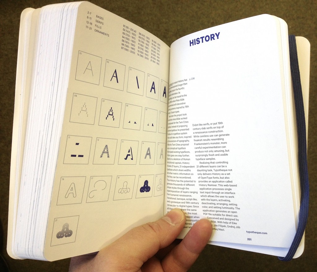
As typographic environments become more refined (the ones that had a lot of catching up to do, that is — because print is doing just fine in this respect) so do our typeface libraries become richer, more varied, and more complex. Richer, because designers continue to invent new ways of making forms, both exploring and abandoning the influences of manual tools (lots of examples of both in this book; notably, Typotheque’s History project manages to do both at the same time). More varied, because a good number of experienced and upcoming designers are publishing new fonts, raising the number of well-designed typefaces higher than it has ever been. And more complex, because typefaces now come in many weights ands styles, offering a degree of refinement in document design that until some years ago only few typographers could hope to expect from retail fonts.

At the same time, typeface design is maturing as a discipline of study and research. There are targeted modules within Bachelor-level courses, and a growing number of dedicated postgraduate programmes in many countries — some in parts of the world where typeface design itself is a very recent area of activity. Many graduates from these courses manage to leapfrog self-educated contemporaries, to found solid careers that pay the rent: this is overdue in typeface design, but the normal state of affairs in pretty much any established professional discipline. And as we acknowledge the elephant in the room, that typeface design is, more than most design disciplines, informed by past practice and context, so does research flourish. This is emphasised by the expansion of design briefs to cover many world scripts as a matter of course: pan-European Latin with Cyrillic and Greek to begin with, and many combinations of Arabic, Hebrew, Indian and Asian scripts. To meet these demands, designers do more research of their own, and make use of other research, to keep expanding their skills.
But the proliferation of typefaces and the texts that accompany them place a new burden on designers: it is now impossible for one person to keep abreast of developments. Typeface design is global, and the scale of output is similarly overwhelming. Publications about typeface design have similarly had to shift their focus. Many publications in the hot-metal and photo-typesetting eras attempted to show all the typefaces in circulation (or, at least, all the ones that mattered). This approach spilled into the early digital period, but is long now abandoned. Instead, publications can let online retailers to function as catalogues of nearly everything, and focus instead on editorship. The selection of work becomes more interesting than the volume; the editor’s perspective more illuminating than any message the inclusion or exclusion of a single work can get across.

This process opens up the space for editors to give each publication a specific depth of field, to borrow a photographic metaphor. From typefaces shown on their own, worthy of study in their own right, to texts in books, on screens, on street signs, where typefaces become enabling tools for other designers, the editor is very much not a silent partner. In putting Eric Olson’s Seravek (a quintessentially contemporary design that manages to be an accomplished all-rounder at the same time) next to Pierre di Sciullo’s inspired T for the Nice tram service, this book makes a robust case for the healthy invention and originality suffusing typeface design, while reinforcing the ubiquity of manufactured and rendered letterforms surrounding us. In this sense, a book such as this becomes a starting point: for inspiration, argument, and another round of informed selection: as good a send-off as any editor could hope for.


Pencil to Peerless


Pencil to Pixel private view

[Preamble]

Reading has a long, fruitful relationship with Monotype stretching back decades. But, whereas “we” have known intimately what makes the company unique (and its uninterrupted presence in large OEM and branding projects), most of the type world held a perception of Monotype as a somewhat monolithic company, that made the transformation from heavy industry to the digital world without shedding the weight of the machinery it scrapped. The expertise of staff, the richness of its library, and the knowhow embedded in its archives (and the staff looking after them) were anything but common knowledge.

Since 2001, when we started directing MATD research towards a global typography, slivers of the archives have started coming to light through the students’ dissertations (several examples here), the typefaces themselves (lots of examples here) but also the PhD and post-doc projects of Jo De Bardemaeker, Sallie Morris, Titus Nemeth, Alice Savoie, and others.

Monotype have also been helping fund postgraduate students in Typography through the Monotype Studentship (tip of the hat to Alan Haley and Robin Nicholas, who spearheaded the establishment of the award in 2006).

A big part of our teaching and research has been enhanced and accelerated by the donation to Reading, in 2003, of the non-Latin drawings held in the Linotype archives in Germany. Otmar Hoefer and Thomas Caldwell were instrumental in this. They shared our vision of turning a historical archive that was opaque to researchers and practicing designers alike into an accessible resource that would cater for different levels of engagement: teaching and research from introductory MA to post-Doc levels, to design support for revivals and new typefaces, and for wider narratives that help engage with the community. The Linotype non-Latin drawings sit well within our Collections & Archives, in the company of world-class collections in printing processes, manuscripts and early printing, ephemera, newspapers, nineteenth and twentieth century posters, type specimens, children’s books, Isotype, corporate and personal archives, and more. (And they are in the room next to one of the best libraries on typography and typeface design,itself an invaluable resource for students and researchers.)

In 2008 we started collaborating more closely with the UK part of the company on a two-year Knowledge Transfer Project. This aimed to recapture know-how embedded in Monotype’s library drawings for key scripts in the Indian market, with a focus on mobile devices, and – later – webfonts (Fiona Ross and myself from Reading, and John McCallum and Robin Nicholas from Monotype; and Dan Rhatigan as the Associate doing the heavy lifting).

Then things started to accelerate: as the company got bigger (much bigger) it got more nimble, open, and imaginative. The same company that supported Doug Wilson’s Linotype the Film, put its weight behind events like the Beauty in the Making exhibition with GFSmith, and the popular BrandPerfect events, aimed at branding agencies. (They’ve also been developing some really neat services, which – I am willing to bet – point to the next big development in the font business.)

[End of preamble]

Pencil to Pixel catalogue

The opening of Pencil to Pixel yesterday made me think that this new confidence is now well embedded in the company. To begin with, the event was a superb example of exhibiting typographic material: just the right amount, and with a broad range of objects; drawings, specimens, books. A collection of films put these objects in perspective, and underlined the transformational effects of digital technologies. The object are not displayed with distanced reverence; on the contrary, these are intended to be seen up close, to help inspire and excite as much as to learn. The cases are shallow, allowing you to come very close to the material, and the lighting ideal for discerning textures and layers. You can easily imagine Bruce Rogers, Frederic Warde, and Chris Brand marking and correcting the sheets of Centaur, Arrighi, and Albertina a few centimetres from your eyes. These objects are typeface design as it really is: decisions and backtracks to get that shape in your head just right, because the inked sketches will turn into letters with the permanence of steel, numbering millions of impressions.

Monotype Recorder

But alongside these are a mesmerising installation by Marcin Ignac, a series of twelve collectable booklets (like this), a tasty selection of specimens, and two very special publications: a celebratory issue of the Recorder, dedicated to Robin Nicholas’ career in the company; and a special issue of Eye, given over entirely to the unique place of Monotype in the type industry, and its contribution to typography. Dan and James, Well Done.

Postscript: I am going to be modest about the Recorder here: I’ve written a piece for it, and will be posting more in the coming weeks. But I will allow myself some hypebole on the special Eye: It is, quite simply, a tour de force of design for a periodical publication. It takes Eye’s established visual cues out for a drink and a spin, then sweet-talks them into all sorts of improbable contortions and surprising twists. Space, scale, contrast, and typography are turned into the best argument for printing things I’ve seen in a long while.

Eye 84 spread

Eye 84 spread

Λυσία υστερόγραφο

[English text below]

Στην προηγούμενη ανάρτηση χρησιμοποίησα την αρχή από τον περίφημο λόγο του Λυσία για τα παραδείγματα. Στην Αναγέννηση, αλλά και αργότερα, οι λόγοι του Λυσία ήταν από τα βασικά κείμενα για τη μάθηση των ελληνικών (δεν τα έλεγαν «αρχαία ελληνικά» τότε, αλλά σκέτα «ελληνικά»). Σήμερα το πρωί προετοιμαζόμουνα για ένα εργαστήρι και μια ομιλία που θα δώσω στο TDC σε λίγες βδομάδες, και έπεσα πάνω στην έκδοση του Λυσία από τον Henri Estienne, του 1570: ένα πανέμορφο βιβλίο (πέντε πόντους πιο ψηλό από Α4, για να πάρετε μια ιδέα από την κλίμακα) με τα περίτεχνα ελληνικά του Garamond. (Συγκρίνετέ τα όμως και με τα γράμματα του Granjon).

(Για το αρχείο υψηλής ανάλυσης: κλικ στη φωτογραφία, και μετά στον υπότιτλο)

1575 Henri Estienne Lucian detail
A detail from Henri Estienne’s 1575 Lucian

Να όλη η σελίδα:

1575 Henri Estienne, Lucian
A page from Henri Estienne’s 1575 Lucian


A postscript on Lucian

In the previous post I used the opening from a speech by Lucian to talk about some typefaces supporting polytonic Greek. From the Renaissance onwards, Lucian’s texts were considered good sources for learning Greek (n.b. At the time Greek was just plain “Greek”, not “Ancient Greek”). This morning I was preparing some material for my upcoming TDC Salon talk and Greek workshop, and took out Henri Estienne’s 1570 Lucian: a beautiful book (about four inches taller that Letter size, to give you a sense of its scale) set in Garamond’s ornate Greek. (Do compare these types with Granjon’s Greek, though.)

(For the hi-res images: click on the image, and then on the subheading.)

Πολυτονικά με καθαρή συνείδηση

Χαζεύοντας το απολαυστικό και ταυτόχρονα εξοργιστικό This.Is.Greece. είδα την Κα Κανέλλη να ωρύεται, μεταξύ των άλλων, και για την έλλειψη γραμματοσειρών για τη σωστή γραφή της ελληνικής γλώσσας στους υπολογιστές. Υπέθεσα ότι εννούσε πολυτονική γραφή. Είπε διάφορα η Κα Κανέλλη για McDonalds και ξεπουλήματα, για τα οποία δε γνωρίζω τίποτα. Ξέρω όμως κανα-δυό πράγματα για τα πολυτονικά στους υπολογιστές. Να λοιπόν μερικές γραμματοσειρές που αξίζει να έχει υπόψη όποιος γράφει σε πολυτονικό, που είναι είτε ελεύθερες για κατέβασμα, ή έρχονται μαζί με το λειτουργικό, ή περιέχονται σε κάποιο πακέτο όπως το Microsoft Office, ή τα πακέτα της Adobe, που χρησιμοποιούνται από σχεδόν όλους στο χώρο της τυπογραφίας. Δηλαδή υπάρχει μεγάλη πιθανότητα να υπάρχουν στον υπολογιστή όποιου ασχολείται με τη γλώσσα, ή την τυπογραφική παραγωγή.

Η λίστα που δίνω δεν είναι καθόλου εξαντλητική, αλλά περιορίζεται σε γραμματοσειρές στις οποίες έβαλα το χέρι μου κι εγώ, και μπορώ να βεβαιώσω ότι αντιπροσωπεύουν σημαντική επένδυση σε έρευνα και εξέλιξη. Επίσης, είναι από έγκυρες πηγές, που σημαίνει ότι μπορούμε να έχουμε εμπιστοσύνη στην ποιότητα του λογισμικού. Εκτός από πολυτονικά Ελληνικά, οι περισσότερες καλύπτουν ευρεία Κυριλλικά, και μεγάλο εύρος του Λατινικού.

Με χρονολογική σειρά, λοιπόν, οκτώ συν μία γραμματοσειρές που μπορεί εύκολα να έχει στη διάθεσή της η Κα Κανέλλη:

1 Adobe Minion Pro (2000)

Η πρώτη σημαντική γραμματοσειρά σε πρότυπο OpenType με ουσιαστική κάλυψη του ελληνικού αλφάβητου, από τις μέρες ακόμα που το πρότυπο Unicode δεν είχε κατασταλάξει (υπάρχουν, δηλαδή, σημαντικές διαφοροποιήσεις ανάμεσα στην πρώτη και τις μετέπειτα εκδόσεις της γραμματοσειράς). Πολλά από τα βασικά ερωτήματα για την εξέλιξη και τυποποίηση των πολυτονικών ελληνικών γραμματοσειρών έγιναν μέσα από την Minion Pro, που με τη σειρά της αποτέλεσε άτυπο πρότυπο για πολλούς σχεδιαστές. Όπως σχεδόν όλες οι ιστορικές γραμματοσειρές κειμένου του Robert Slimbach, η Minion Pro προσφέρεται σε πολλές παραλλαγές βάρους και πλάτους, αλλά και τεσσάρων οπτικών μεγεθών.


2 SIL Gentium (2003)

Μια ιδιαίτερα σημαντική γραμματοσειρά, από τις πρώτες με εκτεταμένη κάλυψη στα τρία ευρωπαϊκά αλφάβητα και πλήρη ενσωμάτωση στο πρότυπο Unicode (το λατινικό τμήμα καλύπτει μέχρι και τις Αφρικανικές γλώσσες νότια της Σαχάρας). Εξελίχθηκε από τον ήδη έμπειρο σχεδιαστή Victor Gaultney ως τμήμα των μεταπτυχιακών σπουδών στο πανεπιστήμιο του Reading, για λογαρισμό του οργανισμού SIL. Ως η πρώτη ελεύθερη Unicode γραμματοσειρά ποιότητας με πολυτονική κάλυψη, η Gentium κυριολεκτικά μεταμόρφωσε την υποστήριξη ελληνικών σε όλα τα πανεπιστήμια όπου υπάρχουν έδρες σπουδών ελληνικής γλώσσας, καθώς και τους εκδότες δίγλωσσων εκκλησιαστικών κειμένων (μια σημαντική αγορά, ειδικά στις ΗΠΑ). Δεν είναι υπερβολή να πούμε ότι δεν υπάρχει πανεπιστήμιο εκτός Ελλάδος που να μην έχει εγκατεστημένη αυτή τη γραμματοσειρά. Διατίθεται ελεύθερα από αυτή τη σελίδα.


3 Adobe Garamond Premier Pro (2005)

Ενώ η Minion Pro είχε λειτουργικό λόγο ύπαρξης, και σαν τετοια είναι πιο συντηρητικά σχεδιασμένη, η Garamond Premier Pro (GPP) αποσκοπούσε στο να αναθεωρήσει τα δεδομένα των γραμματοσειρών κειμένου (μην ξεχνάμε ότι την εποχή που η GPP έπαιρνε το πράσινο φως οι περισσότεροι σχεδιαστές χρησιμοποιούσαν ακόμα μια πλημμύρα από Type 1 γραμματοσειρές με 8-μπιτες συνθέσεις χαρακτήρων: τα πρώτα δοκίμια που είδα, ήδη αρκετά αναπτυγμένα, ήταν το 2003). Η γραμματοσειρά επέστρεψε στις ονομαστικές της ιστορικές ρίζες (δηλαδή τα ελληνικά γράμματα του Garamond και του Granjon) αλλά είναι ξεκάθαρα εηρεασμένη από τα μετέπειτα ελληνικά γράμματα του Didot — και ορθά, αφού απευθύνεται στο σύγχρονο αναγνωστικό κοινό. Πάνω από όλα όμως είναι η γραμματοσειρά που έδειξε ότι η ιστορική ελληνική τυπογραφία μπορεί να εμπνεύσει αξιόλογες νέες δουλειές, που δουλεύουν πολύ καλά σε ρέοντα κείμενα. Και αυτή έχει πλήθος παραλλαγών στα βάρη.


4 Microsoft CT Cambria (2007)

Αν και διατέθηκαν το 2007, οι γραμματοσειρές της Microsoft ήταν έτοιμες σχεδιαστικά ήδη από το 2004. Το σύνολο του προγράμματος αποτελεί αξιοσημείωτο έργο, καθώς είναι η πρώτη φορά που τα τρία βασικά αλφάβητα σχεδιάστηκαν παράλληλα, αντί οι ελληνικοί και κυριλλικοί χαρακτήρες να ακολουθήσουν τους λατινικούς. Όταν η Cambria επιλέχτηκε για να εξελιχτεί σαν βασική γραμματοσειρά «εργασίας» προστέθηκαν εκτεταμένα πολυτονικά, αλλά και μαθηματικοί χαρακτήρες. Οι γραμματοσειρές ClearType είναι σχεδόν παντού: υπάρχουν σε κάθε υπολογιστή με σύγχρονο λειτουργικό Windows, κάθε υπολογιστή ανεξαρτήτως λειτουργικου με σύγχρονο Office, ή οποιονδήποτε υπολογιστή έχει εγκατεστημένο το PowerPoint Viewer (που διατίθεται ελεύθερα).


5 Arno Pro (2007)

H Arno Pro, σχεδιαστικά ανάμεσα στη Minion Pro και την GPP, χρησιμοποιείται εκτεταμένα σε εκδόσεις τόσο με ρέοντα κείμενα, όσο και σε ειδικές εκδόσεις όπως τα λεξικά, οι γλωσσολογικές μελέτες, και οι δίγλωσσες εκδόσεις. Όπως και οι υπόλοιπες γραμματοσειρές κειμένου της Adobe, η πλήρης οικογένεια έχει πολλές παραλλαγές βάρους και εύρους.


6 SBL Greek (2009)

Μία ιδιαίτερα όμορφη γραμματοσειρά, πιθανότατα η καλύτερη ενημέρωση του ιστορικού μοντέλου του Didot (από τον John Hudson, σχεδιαστή με μακρά ενασχόληση με την ελληνική τυπογραφία). Η γραμματοσειρά έχει ίσως το πιο εκτεταμένο σύνολο χαρακτήρων για Ελληνικά κείμενα που μπορεί κανείς να βρει στην αγορά: έχει σχεδιαστεί με κριτήριο τις ανάγκες των μελετητών της Γραφής, και σαν τέτοια καλύπτει και ανάγκες πολλών συγγενών επιστημών (π.χ. παλαιογραφία). Το «πρόβλημα» βέβαια είναι ότι ως γραμματοσειρά μεταγραφής χειρόγραφων δεν παρέχει παρά ένα βάρος. Διατίθεται ελεύθερα από αυτή τη σελίδα.


7 Adobe Text Pro (2010)

Μια γραμματοσειρά με έξι μόνο μέλη (τρία βάρη, συν τα πλάγιά τους) αλλά σύγχρονη σχεδιαστική προσέγγιση στο σύνολο των χαρακτήρων, και στην εμφάνισή της στην οθόνη και τις εκτυπώσεις, κατάλληλη για κείμενα όπου το πλήθος των παραλλαγών είναι περιττό. Ο,τιδήποτε έκανε κάποιος παλαιότερα με την μετριότατη Times Greek, μπορεί να κάνει πολύ καλύτερα με την Adobe Text.


8 Brill (2011)

Μια γραμματοσειρά που σχεδιάστηκε για να αντικαταστήσει το πλήθος των γραμματοσειρών που χρησιμοποιούσε ο εκδοτικός οίκος Brill, που ειδικεύεται στις ακαδημαϊκές εκδόσεις. Για το ελληνικό τμήμα ο John Hudson προσάρμοσε τα καθιερωμένα πρότυπα στις ειδικές ανάγκες του οίκου. Ο Brill ακολούθησε το παράδειγμα της Gentium, και διαθέτει τη γραμματοσειρά ελεύθερα με σκοπό να υποστηρίξει τους συγγραφείς και επιμελητές. Διατίθεται ελεύθερα από αυτή τη σελίδα.


[Συν μία] GFS Didot (2007)

Όπως σημείωσα πιο πάνω, σε όλες αυτές έχω συνεισφέρει, αλλού περισσότερο, κι αλλού λιγότερο. Δε μπορούμε όμως να μιλάμε για πολυτονικές ελληνικές γραμματοσειρές χωρίς να αναφέρουμε τη συνεισφορά της Ελληνικής Εταιρείας Τυπογραφικών Στοιχείων, με κύριο συντελεστή το Γιώργο Ματθιόπουλο. Οι γραμματοσειρές της ΕΕΤΣ βασίζονται σε ιστορικά πρότυπα, και προσφέρονται όλες ελεύθερα. Από αυτές ξεχωρίζω την Didot, που υπάρχει σε δύο εκδόσεις (με λατινικά, ή με εκτεταμένα πολυτονικά).


Υ.Γ. Με σοφή προτροπή του φίλου zvr προσθέτω μια διευκρίνηση: όλες αυτές οι γραμματοσειρές συνοδεύονται από EULA, δηλαδή συμφωνία παραχώρησης δικαιωμάτων χρήσης. Άλλες επιτρέπουν να τις αλλάξεις, άλλες όχι. Άλλες επιτρέπουν μόνο μη-κερδοσκοπική χρήση (π.χ. η Brill) και άλλες μόνο όταν έχεις το λογισμικό της εταιρείας. You get the picture, διαβάστε την άδεια χρήσης. Το βασικό σημείο είναι ότι, από τη στιγμή που ήταν ρεαλιστικό, η υποστήριξη πολυτονικών επιτεύχθηκε και μάλιστα με τρόπο που να επιτρέπει σε χρήστες να γράψουν, να διαβάσουν, και να διακινήσουν πολυτονικά Ελληνικά.

Θα ήταν ωραίο το Υπουργείο Πολιτισμού / Παιδείας / οποιοδήποτε τέλος πάντων, κάποια στιγμή στα πρώτα χρόνια της περασμένης δεκαετίας (ή και νωρίτερα — άνθρωποι σαν τον zvr μιλούσαν για την υποστήριξη ελληνικών απο το 94–95 ήδη) να είχε επιδοτήσει κάτι σαν κι αυτό που έκανε η SIL με τη Gentium, ή η SBL με τη δική της. Και βέβαια αυτοί οι οργανισμοί έχουν τα συμφέροντα και τις σκοπιμότητές τους, αλλά και το όποιο Υπουργείο έχει στόχο την υποστήριξη, ενίσχυση, και εξάπλωση της γλώσσας. Το ότι οι όποιες προσπάθειες δεν έδωσαν μια ελληνική γραμματοσειρά αναφοράς σε διεθνές επίπεδο είναι λυπηρό. (Είναι μεγάλο ζήτημα αυτό το «γραμματοσειρά αναφοράς», και χρειάζεται ολόκληρη ανάρτηση από μόνο του. Ενδεικτικά να πώ ότι μόνο η κωδικοποίηση της αυτόματης αλλαγής από πεζά σε κεφαλαία στις γραμματοσειρές της Adobe πήρε μήνες δοκιμών – και ακόμα δε δουλεύει παντού σωστά, για λόγους που δεν έχουν θέση εδώ).


A comics reminisce, and the Daytripper


It gets more difficult for books to take me by surprise, as I get older. It may be down to the books I read, but I tend to find this in comics more than in prose (my generation never called them ‘graphic novels’, but this is what I’m talking about).

Manara's HP and Giuseppe Bergman
Giuseppe Bergman and the calm before the storm

My love of comics goes back to the dawn of my literacy – the combination of story and images speaks to me very strongly. During my thirteenth year a new magazine called βαβέλ (babel) hit the newsstands in Athens, translating into Greek a knowledgeable selection of mostly European comics. Monthly instalments of anarchic, fantastical, irreverent, and sometimes profound illustrated stories held a mirror up to two deeply messed up decades, full of crises, political fluctuations, and social unrest. Post-1968 European artists had little patience for the self-absorbed, blathering demigods of 2000AD or Marvel. Instead, I got Liberatore and Tamburini’s dystopian Ranxerox, anticipating the broken down cities of Blade Runner; Édika, Gottlieb, and Lauzier, showing up the absurdities of urban middle classness; the dark, black humour of Altan and Vuillemin (still going strong); and Reiser, subversive even thirty years after his death. I balanced these with Will Eisner‘s deeply human stories, Hugo Pratt‘s languorously adventurous Corto Maltese, and Manara’s extended Bergman stories: like Corto Maltese, a man caught in a turbulent stream of fate, but dealing with his predicament rather less gracefully. (By the way, has anybody noticed that Hayao Miyazaki’s Porco Rosso is really a porcine Corto Maltese?)

Abuli & Bernet's Torpedo
Abuli & Bernet’s Torpedo

The French and Italians dominated my early collection: Giardino, Battaglia, Varenne, Saudelli, Crepax, most of them alternating between adaptations of noir story lines and wonderfully indulgent fantasies. I suspect that my love of noir literature was seeded with Abuli & Bernet’s Torpedo, and Muñoz & Sampayo’s Alack Sinner. These partnerships of superb storytellers and image-makers (Spanish and Argentinian, respectively) have superlative peers today: Darwyn Cooke’s coldly amoral Parker, an exceptional translation of Richard Stark‘s character, is rivalled for impact by Jacques Tardi’s adaptation of Manchette’s West Coast Blues. I re-read both frequently: they are masterpieces of telling a story with the least expenditure of words: only situation, and action.

‘Your sorrow, my sorrow’

All of these stories have characters (men, mostly) in different stages of coming to terms with a world that exceeds them. In noir, the main character may have the odds stacked against him, but has perseverance, cunning, and strength to carry him forward. The most interesting stories introduce any range of character flaws, making the personalities more human. Unlike Stark’s ruthlessly efficient Parker, Andrea Pazienza‘s Zanardi is amoral in a self-destructive way, just as Moebius‘ John DiFool is a hunkering coward. By far my favourite ‘man-in-over-his-head’ character has been Pierre Christin & Enki Bilal‘s Alcide Nikopol: dislocated in time (through a bungled hibernation) and frame of reference (an Earth where ancient Egyptian gods play politics) he strives to adapt while still sucking in as much of this new world he finds himself in.

Alcide Nikopol and Horus the God

I knew Fábio Moon and Gabriel Bá from De-Tales (and Bá from The Umbrella Academy). A few days ago I got a copy of Daytripper. I started reading, and it hit me like a sledgehammer.

The book is about Brás, a man with ambitions to be a writer, a good father, a worthy son, and a friend. Each chapter picks one part of his life, but weaves in the storyline the unpredictability of accidents, a series of plausible ‘what ifs’ which interrupt the storyline. This is a device every Greek understands well: the Three Moirai (or Three Fates), Clotho, Lachesis, and Atropos spin, apportion and cut the thread of life. (Yes, that’s the origin of the phrase.) In the Daytripper the story picks up in the next chapter, the point of interruption unknown. This wonderful device, a cross between parallel universes and a linear world, is life laid bare: a microcosm of emotions and personal, immediate relationships, within a maelstrom of unpredictability. Most will pass with little effect, some will upturn everything.

Daytripper, three generations under a tree
Three generations under a tree

There is a lot to read in Brás’ desire for his life to exceed the limits of the immediate action and relationships. He strives to be a good friend, and father, but has deeper desires: he captures perfectly the frustration at the heart of the modern human condition, where a wider consciousness, contemplation, and ambition can place seemingly insurmountable obstructions. For most of the Daytripper, Brás embodies F Scott Fitzgerald’s famous aphorism: ‘This is what I think now: that the natural state of the sentient adult is a qualified unhappiness.’

The dialogue is economical, like reality distilled. With the excess of words removed, the force of the environment and the unspoken, imagined expressions become more powerful. And it underlines the unspoken moments, when what is not said is more powerful than paragraphs of text. This is right at the heart of the power of comics: the illustrator does not supplant the visual imagination of the reader, but fires it up and channels it in new directions. The experience of reading becomes imaginatively richer because of the presence of images.

The women in Brás’ life offer a fascinating insight into the mind of the troubled male. They are ever-present, but in the periphery; they represent the family, continuity, and the next generation, but do not share in his contemplation. Only towards the end do we see a shift: when the son has taken on the role of father himself, companionship and affection have proven a stronger constant. This is juxtaposed with the role of Jorge, Brás’ friend: stronger in intensity, alternatively present and missing, catalytic at times, but ultimately absent. The overarching feeling of solitude, the man and his thoughts alone, is accepted and embraced brilliantly at the end of a life full of people.

The Daytripper is the best example of visual poetry I have read in quite a while.

Daytripper
A man and his thoughts, with coffee, by the sea

Information Design and Typography

[I got asked yesterday by a student in another university “what Information Design (and especially Typography) means to you”, and dumped this out over breakfast; I post it “as is” to avoid going into the black hole of perpetual editing.]


Firstly, typography: this depends on the institutional viewpoint, and the language*. In the English-speaknig world it is a continuum. At one end it refers to the the design of texts at the paragraph level, covering type choice, line measurements, and similar micro-typographic choices. At the other end typography encompasses all choices relating to the construction of a document as a carrier of information that readers engage with because they want or need this information. The critical distinction lies in the engagement with the text: typography, in its wider definition, covers a range of macro choices at the level of the spread, the document as a sequential experience, and the production of a physical or on-screen object.

Information Design covers typographic design where the engagement of the readers with the text is critical and has specific objectives. Navigation (wayfinding, way-showing, route-mapping, and any of a number of similar terms), safety, instruction, and training are the most common applications. At the heart of Information Design is a user-based perspective, and the imperative to test design solutions. As design scenarios migrate to screen-based environments, especially mobile devices, the potential for customisation of information design to each user is increasingly important in its methodology.

My view is that “static” Information Design on fixed substrates (paper, vinyl sheets, plexiglass signs, and so on) is fundamentally different from Information Design on digital environments. In the first case, it strives to maximise the efficiency of the message and eliminate ambiguity for the largest section of the intended audience. In the second, it has the additional function of maximising the value of the information to the specific demands of the user. This is an additional motivation for the reader to engage with the document, and a much more interesting challenge for the designer. Customised paper documents (e.g. utility bills) have tried to bridge the gap between these two poles, with some success, although clearly they will rapidly give way to screen-based versions.

Of course, in all cases Information Design has to carry the identity of the publisher. This is in itself a separate design challenge, usually addressed by aggregating the effect of the designed objects rather than an individual document. For example, a sign system brands a building through the consistency of its appearance, just as much as by the range of the scenarios it enables.


  • In Spanish-speaking countries “tipografia” means “type design”. This, as you can imagine, leads to no end of confusions and clarifications.

The perfect tool

A vise grip

A few days ago a series of coincidences starting with an email about recent work brought me to MB’s drawing about her dad. I was reminded of feelings for my father, a naval engineer for half of his career. He enrolled at the naval academy at the inconceivable age of fourteen (the youngest cadet ever, if family myth is true) and spent the next twenty-five years in and out of the bowels of ships: from wooden torpedo boats to hand-me-down US Navy destroyers, all the way to enormous crude tankers in Japanese shipyards. As much as he could, he exposed me to this world of wonderful machines, making me the only boy in my school who had seen where a propeller shaft exits the hull from the inside of the ship, or heard the deafening clanging of a tanker engine at full ahead (sound so thickly enveloping you that felt like water flowing around you in the sea).

The engineering background brought a garage full of too many tools (no, wrong: you can never have too many tools) and a facility with making and fixing things. I inherited the enthusiasm and some of the skills. I can now appreciate that a confidence to tackle anything I can figure out by looking at how it works and thinking it through, is one of the most valuable things I got from him. (Which also explains my failings with electronics: I can’t look at them work, nor take them apart and lay them on the table.)

In all the years of my tinkering, from toy models to motorcycles and a much-suffering Citroen 2CV, one tool has been my favourite. I’ve got no idea what it’s name is in English,[1. I now know: vise-grips] but in Greek it’s called μποζονοβγάλτης – bozonovgáltis – essentially a tool to loosen nuts. It has an adjustable grip, from a few hairs’ wide to easily six centimetres wide, and once locked onto an object it will grip as strongly as if you had run a bolt through the thing. Its force of grip is such that you can loosen a locknut by gripping two opposing sides with less wear on the nut than a spanner will inflict.

Yet the reach of the handle will always be at the optimum for your hand, and a simple push on the small lever will release the tool. You can use the rear side to bash things loose – or even drive a nail in – and the lever action makes the cutter slice through the thickest cable or rod with little effort.

When we bought our house, it was the first tool I bought. Now, in my oldest son’s hands, I hope it will feed his and his brother’s desire to take things apart and put them back together again.