Disliking lists – let alone “definitive” ones – is not good preparation for answering Elliot Jay Stocks’ request for “8 favourite typefaces to accompany the interview in the magazine”. What if I only really care for six, or twelve? And, eight for what? The typography I do, or the typography others do that I appreciate? Or the ones I admire but cannot imagine using?
Like most type problems, it became much easier to answer by thinking not about the typefaces themselves, but about documents (and, by extension, active and passive users). I settled on typefaces that have proven themselves typographically competent, rewarding to set, and revealing to discuss. This last point (probably irrelevant to most users of typefaces) is central to my selection: what does the typeface tell us about the designer’s intentions, their interpretation of the cultural moment, and ourselves as active users?
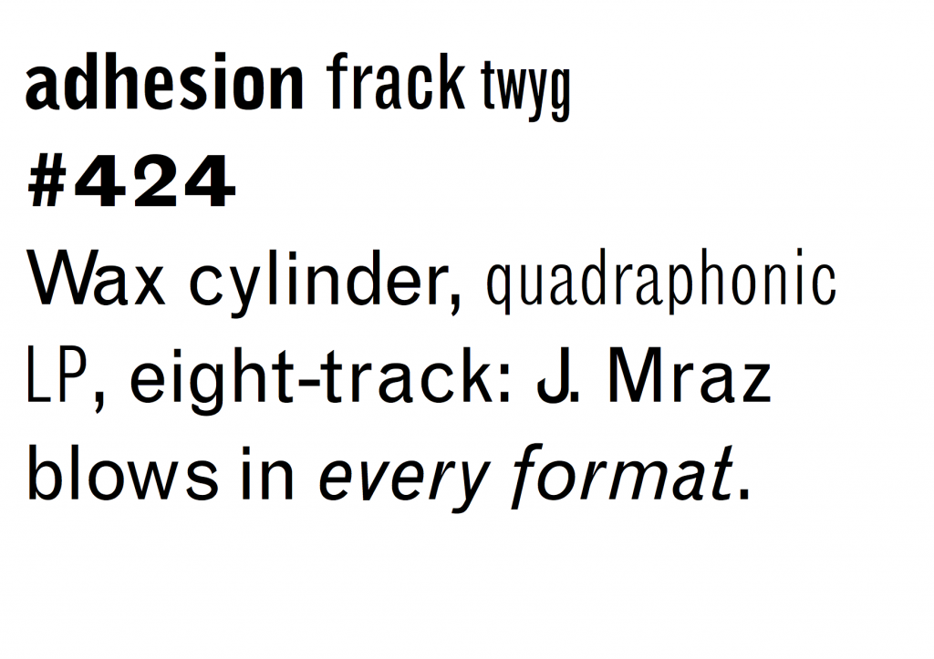
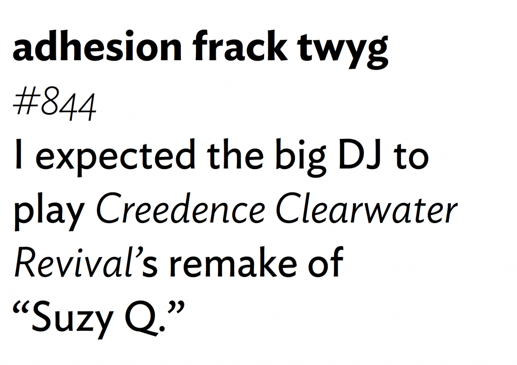
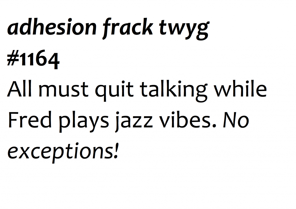
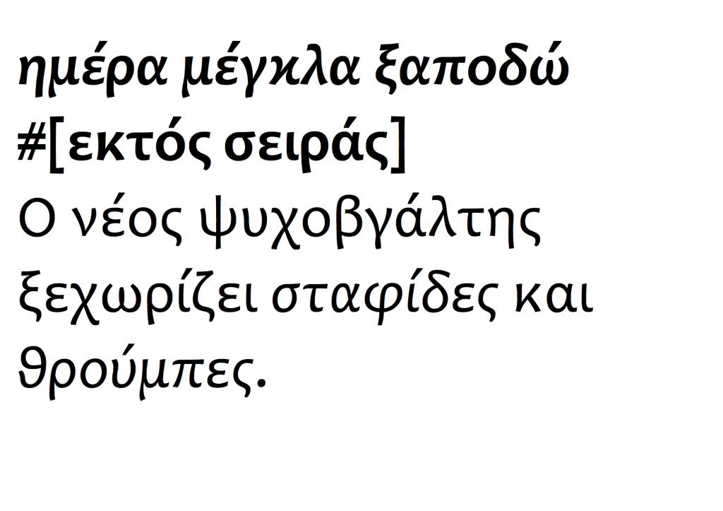
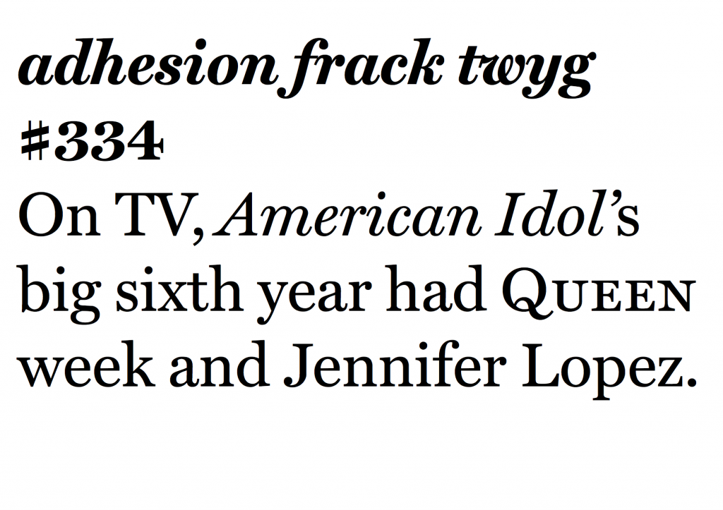
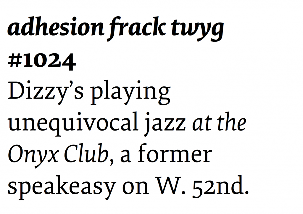
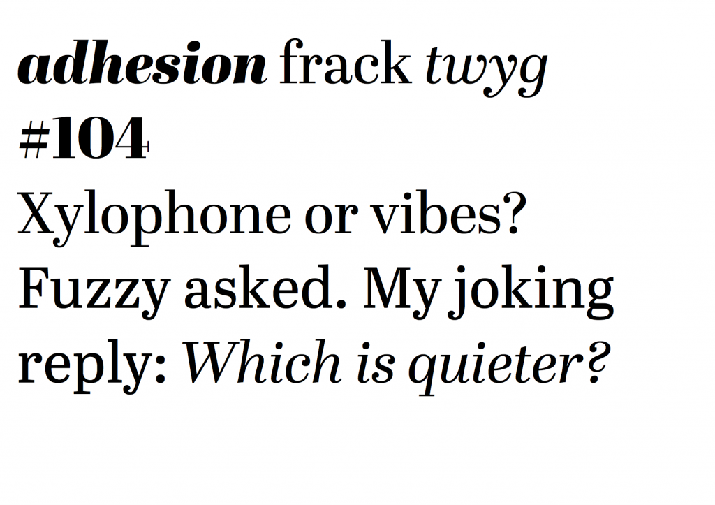
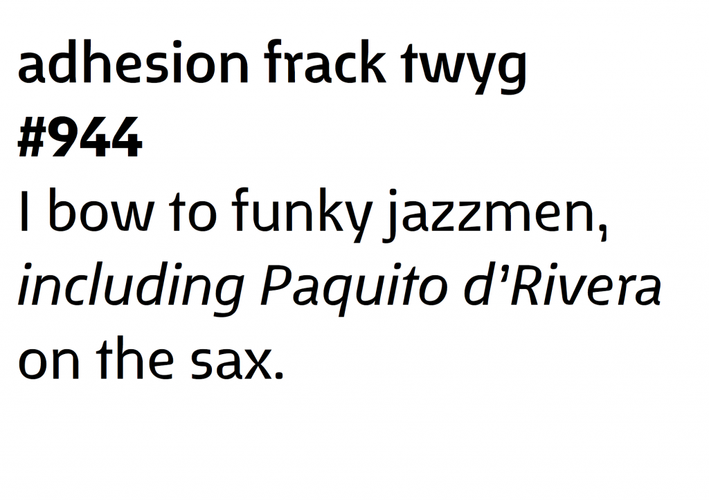
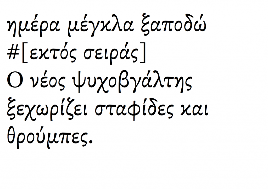
The examples in 8 Faces are small and selective, so I repeat them here in pangrams borrowed from Craig Eliason’s Daily Pangram (apart from the Greek ones).
(Incoming MATD students: these are good study material. Both their design, and the reasons for their inclusion.)
Grotesque MT: Frank Hinman Pierpont, 1926 (Monotype digital version 1993)
I wrote: A typography lesson in a typeface: eight uprights with only two italics, a bucketful of quirks and inconsistencies, and capitals so heavy you think they’re channeling Jenson. And yet, if used well it makes mincemeat of complex typography, and leaves you thinking ‘I need no other!’
Ideal Sans: Hoefler & Frere-Jones, 2011
I wrote: Next to Ideal Sans most humanistic sans serifs are either too self-absorbed, or too boring. This is a long-text sans: the design balances counters and strokes much better than either neo-grotesques or geometrics, while the slight variations where you expect visual alignments reinforce a subtle identity.
Candara Latin & Greek: Gary Munch, Microsoft, 2007 (but really a bit earlier)
I wrote: Candara is a brave, visionary Microsoft on a good day. Original in concept, impeccably effective in text settings across three scripts, and pleasantly surprising in larger sizes, Candara re-calibrated our ideas about what it was possible to ship with Office. The Greek is even better than the Latin.
Miller Text: Matthew Carter, Font Bureau, 1997
I wrote: Probably the best Scotch Roman available, with a reference typographic texture in the middle weights. Adding grades like Miller Daily would make this near-indispensable. The italic is confident and exuberant, which makes it a little difficult to use, sometimes. Typographic dynamite in the same fonts folder as HTF Chronicle and Eames Century Modern.
Elena: Nicole Dotin, Process Type Foundry, 2011
I wrote: A typeface that looks a bit too light and too uniform at first sight, but resolves into a very readable texture. It captures in a remarkably concise way the post-Unger genre, while employing softer arches in the upright and a contrasting, pen-informed italic. Looks amazing in Instapaper.
Abril: Veronika Burian and José Scaglione, Type Together, 2011
I wrote: A very contemporary concept for a typeface family, with text styles best described as ‘slabby transitional with a twist’, loosely Modern display styles, and an unashamedly in-your-face Fatface set thrown in for good measure. Forward-looking but historically sensitive in an intelligent way.
Fenland: Jeremy Tankard, 2012
I wrote: Fenland takes the western broad nib model and squashes it with big black boots. Its counter-intuitive treatment of arches and joints demonstrates that text typeface design is far from a saturated design space, even in the Latin script.
SBL Greek: John Hudson, SBL, 2009
I wrote: The most accomplished update of the Didot style for Greek typefaces, it combines the fluidity of the original with a superbly competent typographic texture, and attention to detail. One style only, so for modern texts either disastrous or an opportunity for typographic genius.
