Basel School of Design

Lecture in the annual Visual Communication series, with the title “Enlightened typography for a small world”, explaining the link between typeface design and documents that work for global, unknown readers. Describing the challenges for designers, and showing how the risks of marching into unknown type territories are outweighed by the opportunities of fascinating knowledge, and the space to innovate in ways that change peoples’ lives.

Video forthcoming.

CCFDR and Glyphs

Two visits at the Centre for Chinese Font Design and Research, hosted in the offices of Founder Electronics, focused on design issues in fonts for Chinese, design  tools and processes, and professional training for multi-script design. The second of the visits had very concrete aims: orchestrating the localisation of Glyphs into Simplified Chinese, to enable designers in China to experiment with new workflows.

Way of Type: Beijing

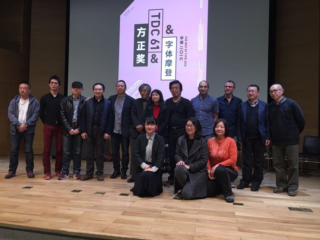
An extended visit to Beijing, invited by CAFA and Founder Electronics. Judging the Latin part of Founder’s 8th Type Design Competition with[ ATypI president] José Scaglione. Held every two years, included for the first time Latin typefaces by Chinese designers. The next day, the winners were announced in the National Centre of the Performing Arts (the “Egg”), together with the opening of the TDC61 exhibition, the Chinese leg of the global tour of the annual design competition; and the opening of the “Chinese Type Modern 1919–1955” exhibition with material from the archives of Founder on the transition of Chinese type-making across technologies.

Font Forum conference

The exhibition and competition awards served as the opening events for the two-day Font Forum, a conference on typeface design with speakers from China, Japan, and Europe. Facilities at CAFA are excellent, making it ideal for an international conference.

Font Forum line-up

workshop at CAFA

CAFA workshop

The main part of the visit was taken over by a workshop on typeface design at CAFA. The interest in Latin typeface design is considerable, and the skills of many students impressive. This is a sign of the gradual globalisation of Chinese design education, and the demands by the local professional employers for skills that can serve markets across language and script regions. Although the workshop was primarily focused on typeface design, there was great interest in typographic design, and especially for mobile platforms.

Granshan Reading

The fourth Granshan Conference on Non-Latin Typeface Design, in Reading – and a celebration of the MATD, with a massive gathering of graduates. Global and intimate, intellectual and relaxed. More here and on YouTube.

Smashing week

Smashing types

My slides from SmashingConf in Freiburg are on Speakerdeck, with some additional annotations. The video of the talk will go online at some point, is now online, but the slides capture the key points.

The stats on Speakerdeck suggest that people find the slides useful, but we are still a bit off from an easy way to host a presentation that makes the content searchable, taggable, connectable. The new TED system of linking the talk transcription to the video is very impressive, but difficult to imagine for smaller events with tighter budgets.

The effort put in to get “just” good video and audio from presentations is already substantial, especially for academic conferences and smaller events (i.e. tight budgets, uneven expertise). For speakers who plan their talks integrating images/video into the spoken narrative, the challenge is harder.

Immediately after SmashingConf, Joana Correia and Eben Sorkin captured almost the totality of the talks at ATypI Barcelona (which will be posted online over the coming weeks and months on the Association’s site). Their dedication and hard work was humbling, but it was obvious that even professional recording systems are external to the presentation proceedings. In a sense, the capturing setup is a plugged-in observer, rather than integrated in the presentation itself. Going further, I’d argue that capturing should be integrated into the authoring process, with markup, annotations, and linking considered from the outset.

This seems like a good time to revisit my thoughts from a year ago on capturing conference presentations, although – TED system apart – most of what I wrote probably stands.

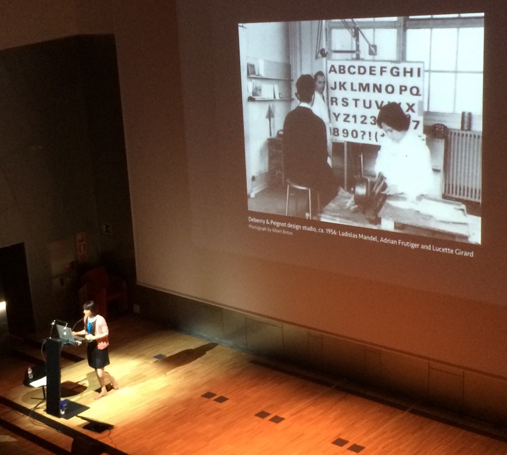
Alice Savoie in BCN
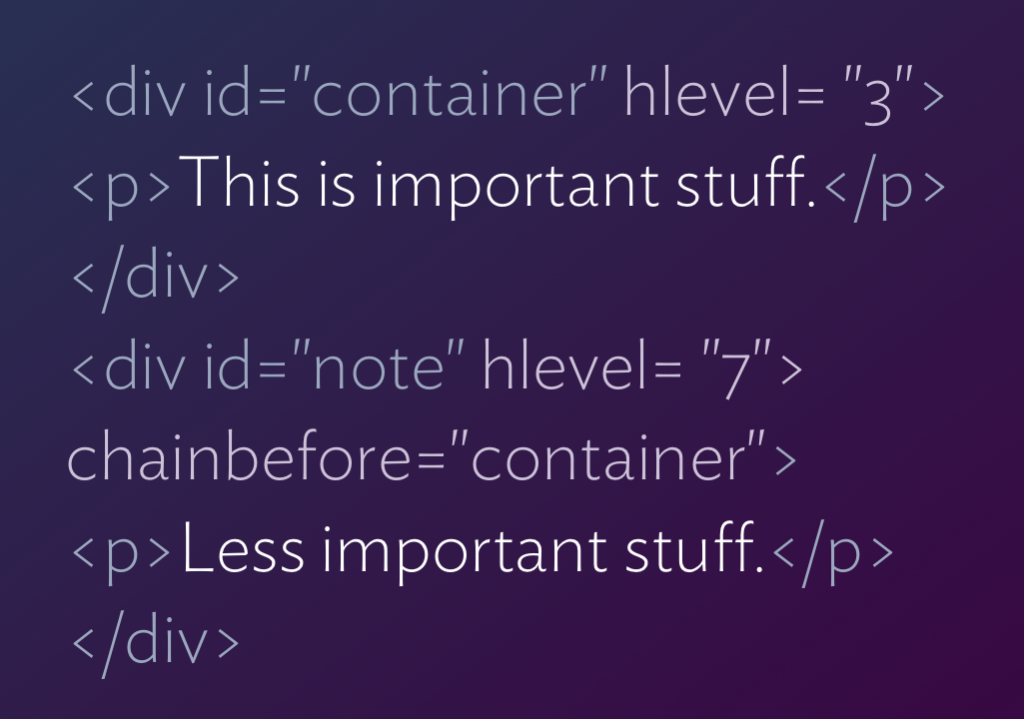
We should be able to markup the slide with “Adrian Frutiger”, “Lucette Girard”, and “Ladislas Mandel”; “Deberny & Peignot”; the location, the attribution, and a description of what’s going on, during the making of the presentation! Alice provides a suitable caption, but video capture does not “read” it in a useful manner.

Typography everywhere

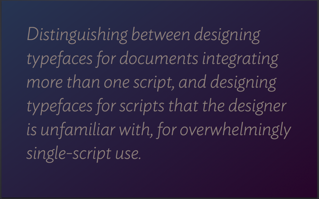
Slide from Ampersand lecture


The first time I heard a typographer complain that people who design texts for screens “don’t get typography” was in 1994. Since then I’ve heard this repeated many times, but relatively few people moved from a – usually unspecified – “what they don’t know” to “how can we explain what matters?” There’s been notable efforts (not least Bringhurst on the web) but I never felt they capture the more complex of typographic decisions.

I’ve been thinking about what typographers would need to explain to related professionals, but a discussion last January with Rich Rutter (who, incidentally, was also responsible for the online Elements I link to above) and Ben Mitchell spurned me to put my ideas into a self-contained presentation. The talk, the first of three that outline similar ideas, is is now on Vimeo. The other two will happen in Paris in a couple of weeks, and in Munich in November.

Typography and type design in NYC, take 2

A detail from a test setting of the letter Tau

Five years after the first Greek Week-End in New York, I am returning to the TDC.

By 2007 Greek was already becoming a central part of most large typeface projects, especially international branding applications. In the intervening years Greek has become a key aspect of professional designers’ skills, and a regular expectation in job postings. Just as importantly, Greek represents a particularly rewarding challenge for designers, combining a long and complex development with a relatively wide space for designers to experiment.

The two-and-a-half day workshop will start with a hands-on research session, and include seminars on aspects of Greek typeface design, in-depth reviews of reference contemporary typefaces, and design critiques of work by participants.

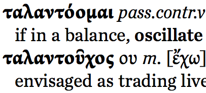
I will also deliver a lecture at the TDC Salon on the design of a major forthcoming Greek-English lexicon by CUP. This Lexicon takes advantage of recent developments in typeface design, and offers insights into a particularly challenging typographic brief.

DeL 2012 paper: Distance learning in archives-rich environments

Proposal for the paper delivered at the Designs on eLearning 2012 conference in the University of the Arts, London, talking about the g MA (Res) TD programme. The description below is in academic-speak, but is useful for those interested in how we’re approaching this.


Developing a New Model for Distance-Learning in an Archives-Rich Discipline

This paper describes the challenges in the development of a new programme targeting distance learners in a domain where conventional literature is not easily available, and engagement with original artefacts is essential for the research skills.


Context

Typeface design is a design field that has experienced considerable growth in the last decade. Central to this growth have been the strategy of OEM suppliers to support global markets without localising instances of their products, and the shift to region- or worldwide branding by major companies. The specialised skills required for high quality multi-script typefaces exclude autodidacts, and underline the need for structured education in multi-script typeface design. The University of Reading has pioneered teaching in this area through a very successful full-time residential MA programme in the Department of Typography & Graphic communication, whose graduates occupy dominant positions in the industry. The programme has inspired similar initiatives at postgraduate level, most notably in Argentina, Mexico, and Switzerland. Teaching relies heavily on the use of artefacts from the Department’s Collections & Archives, and particularly the Non-Latin Collection. The Collection comprises around 10,000 drawings of letterforms, commercial correspondence, and material relating to the technology of typesetting non-Latin typefaces. The artefacts are unique and irreplaceable, and generally sensitive to repeated handling. Student work on the MA is split evenly between practical and academic work. The main academic output takes the form of a rigorous dissertation based on original research. The better examples are of publication quality, and contribute to the nascent scholarship in the field.


Objective, and a Challenge

We surveyed the field and identified a community of practitioners transitioning to teaching careers, and educators seeking to gain higher qualifications in a research-intensive environment. Unlike early-career designers, this community does not require practical skills building, but is characterised by a lack of engagement with the literature in the field, and a lack of understanding in specialist areas, most notably working with archival material, documenting artefact-based research, and integrating artefact-based research into practice. We have also identified a broader lack of academic writing skills. Seeking to capture this audience, we designed a new MA programme: we expanded the academic elements to occupy the full credit weighting, and strengthened particularly the research methods elements. However, our target community is international in location, and limited in mobility: professionals cannot interrupt their practice, and educators cannot easily take out a full twelve months. This represented significant challenges for three reasons: firstly, because the print literature in typeface design is not generally present in university libraries, even if these institutions run graphic design programmes. Secondly, because our methodology for building research skills is founded on intimate engagement with original artefacts. And, thirdly, because we place considerable expectations on group-based learning and peer engagement.


Programme Development

In response to the limitations to student mobility, and the three challenges we identified, we developed a hybrid mode of study. Our model combines a part-time, distance-learning mode for the majority of the 24-month registration, with three full-time residential periods of two weeks each. The aim is to combine self-directed learning through guided study, discourse development through engagement with an online community of peers, face-to-face feedback on presentations and discussion, and hands-on experience with sensitive artefacts. The programme follows a three term per academic year structure. Students will start the course in October of Year 1, with the first residential period towards the end of the the first term (late November – early December). The second residential period will take place in the summer of the first year, at a time that coincides with the vacation period of most HEIs. The third residential period will take place in the autumn of Year 2. Currently we intend  to recruit only one cohort every two years.


Online Presence

We audited the literature we intended  students to have access to, and identified only partial coverage by our institutional provision, especially for a worldwide cohort. We are addressing this by making available online ex-copyright material in an environment that allows shared use and annotation, and working with our institution to enable global access to copyrighted print resources, in electronic form. We will be employing collaborative tools for asynchronous seminars, and building a knowledge base around the core texts of the programme. For the second residential period we will run parallel student-led blogs on predetermined areas of study. All material will be shared amongst the whole cohort and staff, and final states of texts made available more publicly.