[Preamble]
A couple of years or so ago I started discussions with Linotype on student bundles for typography students.My first sketch at a very compact set was this:
DIN Next Light, Regular, Bold, Black | Light Italic, Italic
Malabar Regular, Bold | Italic
Really No 2 Light, Regular, Medium, Demi | Italic, Medium Italic
Trade Gothic Light, Roman, Bold, Condensed #18 and #20 | Oblique, Condensed #18 Oblique
(You can tell I’ve got little use for bold italics…)
The company responded positively, and expanded on my initial proposal with many more fonts, producing eventually a Type Designer Education Pack Catalog that has been a hit with our BA students. The typeface combinations are great for the kind of text-intensive, hierarchically-rich typography we require in our projects. It has also been great to be able to offer incoming students a legal way to begin building their font libraries.
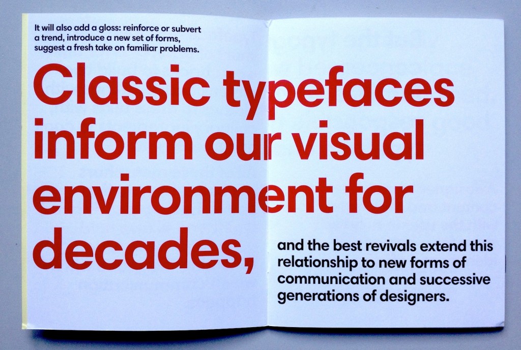
A few weeks ago Dan and James asked me to write a few words for a specimen featuring typefaces from this collection, on the theme of classic typefaces. (They typeset the text in Harmonia Sans by Jim Wasco, one of the nicest people in the type industry).
This is what I sent them:
[End of preamble]
The typographer’s pack
Typeface designers are not short of analogies for their work: bricks to build two-dimensional buildings with, clothes to dress texts with, culinary ingredients to cook documents with. All of these metaphors are helpful as starting points, but a well-designed typeface will also hold up a mirror to its time, reflecting the space within which communication happens. It will also add a gloss: reinforce or subvert a trend, introduce a new set of forms, suggest a fresh take on familiar problems. Classic typefaces inform our visual environment for decades, and the best revivals extend this relationship to new forms of communication and successive generations of designers.
But the typographer is rarely concerned with single typeface families. At the heart of informed, responsible typography lies good typeface choice. A designer who respects the content and makes decisions with the user in mind will strive for a balance between identity and efficiency. These choices happen on a sea of type choices, where (for anything more than a simple sign) several kinds of information need to be visually differentiated, yet balanced and coordinated.
The best typefaces for text-intensive documents have subtle individuality. The balance of counters and blacks might sit comfortably within that ancient sweet spot of typographic density for reading, yet the texture of the paragraph will be delicately self-conscious and subversive. One or two letterforms might step out of line (like the Neo Sans “g”, and the giddy “s” in Trade Gothic). Others might keep to the overall rhythm of good typography while whistling to a tune you can’t quite place: the rootless Really No 2, the deeply rooted Malabar. Yet others stake a claim and own that space forever, marking any interlopers as imitators: DIN and Frutiger, and Swift.
None of these typefaces can be described as indulgent, save for the occasionally too-wide family. But in their combinations they offer an exceptionally rich typographic palette.And this is where the type-fun begins: give me the millions of possible combinations, to discover the ones that not only do the job, but make the document memorable, and a pleasure to read.
