For some years now I have stopped trying to spot all MATD projects completed and used in high profile publications, OEM installations, and the like. But there is one new implementation worth commenting on. The latest update to Instapaper includes six new typefaces, including two that started as MATD student projects: FF Tisa by Mitja Miklavčič and Elena by Nicole Dotin (The original specimens for Tisa (2006) and Elena (2007) are interesting if you are into the type-spotting thing). It is telling both of the skills of the designers, and the clarity of the original briefs that what are, in essence, _tools for learning_ become commercially successful typefaces of the highest calibre.
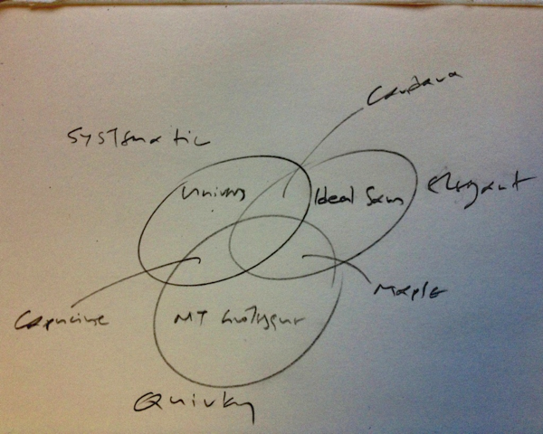
The six new typefaces include three by designers at the peak of the profession (Ideal Sans, Proxima Nova, and FF Meta) but also Lyon Text, a typeface designed by Kai Bernau in 2009–10; Kai graduated from the KABK in The Hague in 2006. The presence of three young designers in this list is as good a sign as any that the field of typeface design as a whole is growing healthily, rejuvenating its ranks and seeding the pool of designers with new talent. I know that Jonathan, Tobias, Mark, and Erik would agree with me that the selection sends a very positive message on the state of typeface design today.
Of course, you could argue “Big deal. New typefaces are published all the time, why are these more important?” The reason is partly personal: I spend a big part of my reading hours looking at Instapaper, both on the iPhone and iPad. Up to now I’ve been using Georgia, ignoring most of the rest (and quietly hoping that a couple would vanish from every interface I come across). But there are two more reasons, worthy of more consideration than my reading habits.
Firstly, I am fairly certain that environments that allow us to collect our own content stream will keep growing, and exponentially so once we figure a good way to introduce this practice in education.
Secondly, because the selection process has been partly documented without the assumption that new typefaces were needed. Marco Arment’s posts (Learning from competition originally, and the announcement linked to at the beginning of this post) are a good introduction to how people recognise the need for new typefaces, and come to appreciate their value. Although his investigations into typefaces started as a response to competition, his enthusiastic description of the improvement in the reading experience is a confirmation of the effort by typeface designers. For an app like Instapaper, so closely focused on the reading experience, the right typeface can make a huge difference to its sustained adoption.
Georgia, thank you for the ride so far.