[Preamble]
Reading has a long, fruitful relationship with Monotype stretching back decades. But, whereas “we” have known intimately what makes the company unique (and its uninterrupted presence in large OEM and branding projects), most of the type world held a perception of Monotype as a somewhat monolithic company, that made the transformation from heavy industry to the digital world without shedding the weight of the machinery it scrapped. The expertise of staff, the richness of its library, and the knowhow embedded in its archives (and the staff looking after them) were anything but common knowledge.
Since 2001, when we started directing MATD research towards a global typography, slivers of the archives have started coming to light through the students’ dissertations (several examples here), the typefaces themselves (lots of examples here) but also the PhD and post-doc projects of Jo De Bardemaeker, Sallie Morris, Titus Nemeth, Alice Savoie, and others.
Monotype have also been helping fund postgraduate students in Typography through the Monotype Studentship (tip of the hat to Alan Haley and Robin Nicholas, who spearheaded the establishment of the award in 2006).
A big part of our teaching and research has been enhanced and accelerated by the donation to Reading, in 2003, of the non-Latin drawings held in the Linotype archives in Germany. Otmar Hoefer and Thomas Caldwell were instrumental in this. They shared our vision of turning a historical archive that was opaque to researchers and practicing designers alike into an accessible resource that would cater for different levels of engagement: teaching and research from introductory MA to post-Doc levels, to design support for revivals and new typefaces, and for wider narratives that help engage with the community. The Linotype non-Latin drawings sit well within our Collections & Archives, in the company of world-class collections in printing processes, manuscripts and early printing, ephemera, newspapers, nineteenth and twentieth century posters, type specimens, children’s books, Isotype, corporate and personal archives, and more. (And they are in the room next to one of the best libraries on typography and typeface design,itself an invaluable resource for students and researchers.)
In 2008 we started collaborating more closely with the UK part of the company on a two-year Knowledge Transfer Project. This aimed to recapture know-how embedded in Monotype’s library drawings for key scripts in the Indian market, with a focus on mobile devices, and – later – webfonts (Fiona Ross and myself from Reading, and John McCallum and Robin Nicholas from Monotype; and Dan Rhatigan as the Associate doing the heavy lifting).
Then things started to accelerate: as the company got bigger (much bigger) it got more nimble, open, and imaginative. The same company that supported Doug Wilson’s Linotype the Film, put its weight behind events like the Beauty in the Making exhibition with GFSmith, and the popular BrandPerfect events, aimed at branding agencies. (They’ve also been developing some really neat services, which – I am willing to bet – point to the next big development in the font business.)
[End of preamble]
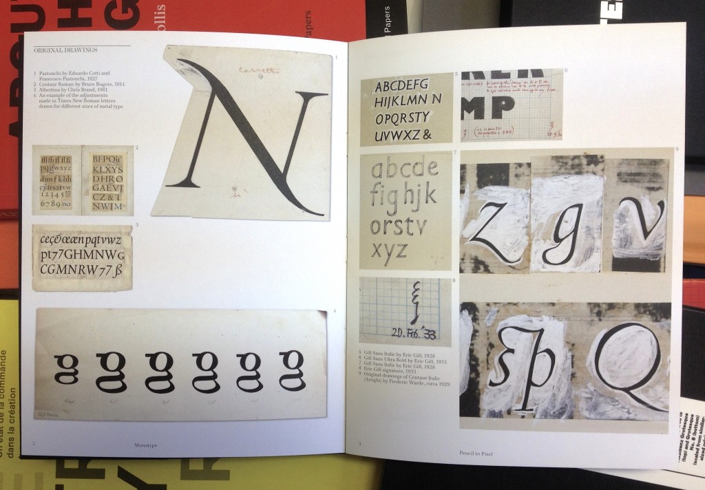
The opening of Pencil to Pixel yesterday made me think that this new confidence is now well embedded in the company. To begin with, the event was a superb example of exhibiting typographic material: just the right amount, and with a broad range of objects; drawings, specimens, books. A collection of films put these objects in perspective, and underlined the transformational effects of digital technologies. The object are not displayed with distanced reverence; on the contrary, these are intended to be seen up close, to help inspire and excite as much as to learn. The cases are shallow, allowing you to come very close to the material, and the lighting ideal for discerning textures and layers. You can easily imagine Bruce Rogers, Frederic Warde, and Chris Brand marking and correcting the sheets of Centaur, Arrighi, and Albertina a few centimetres from your eyes. These objects are typeface design as it really is: decisions and backtracks to get that shape in your head just right, because the inked sketches will turn into letters with the permanence of steel, numbering millions of impressions.
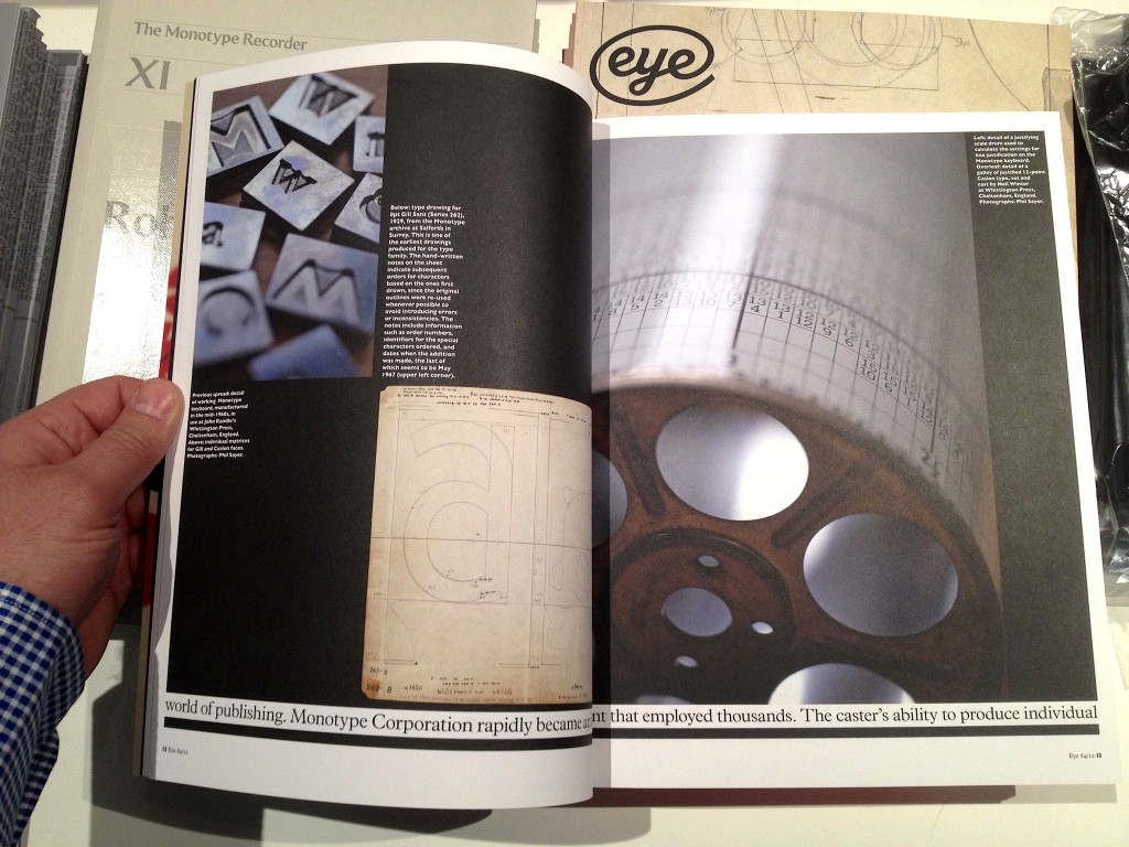
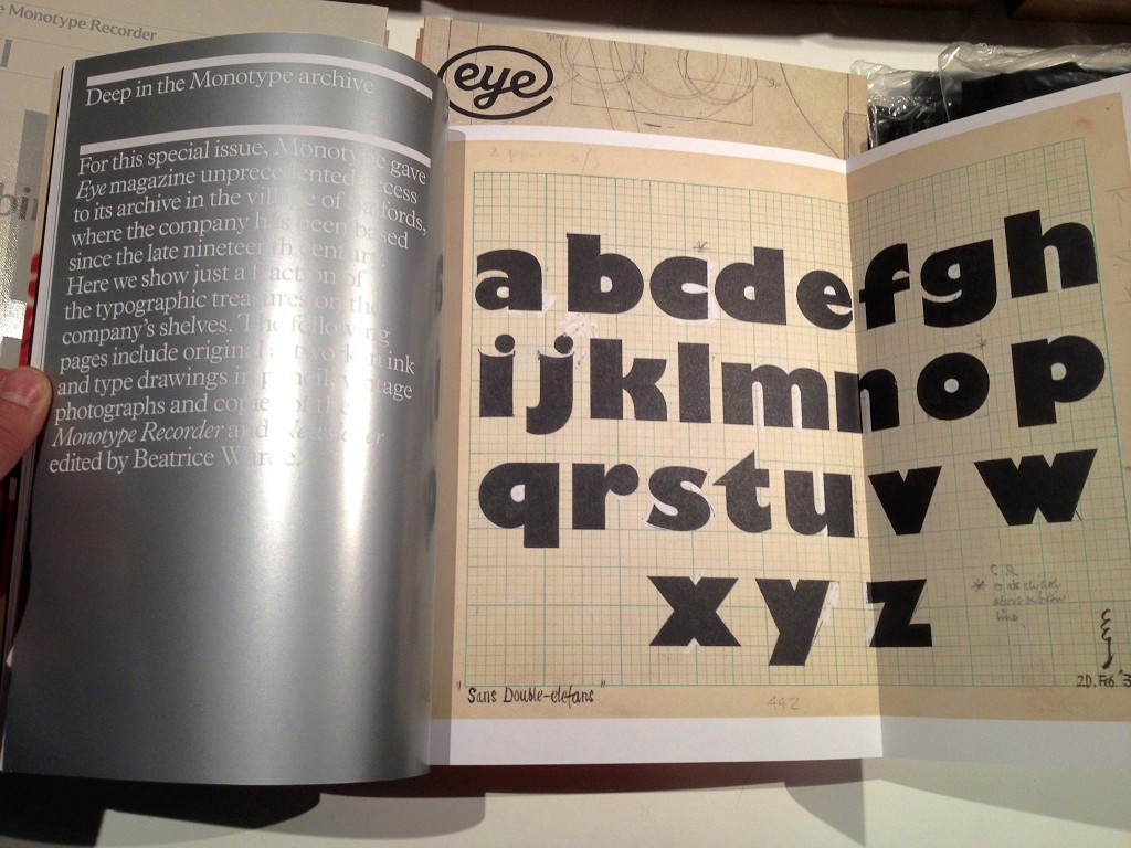
But alongside these are a mesmerising installation by Marcin Ignac, a series of twelve collectable booklets (like this), a tasty selection of specimens, and two very special publications: a celebratory issue of the Recorder, dedicated to Robin Nicholas’ career in the company; and a special issue of Eye, given over entirely to the unique place of Monotype in the type industry, and its contribution to typography. Dan and James, Well Done.
Postscript: I am going to be modest about the Recorder here: I’ve written a piece for it, and will be posting more in the coming weeks. But I will allow myself some hypebole on the special Eye: It is, quite simply, a tour de force of design for a periodical publication. It takes Eye’s established visual cues out for a drink and a spin, then sweet-talks them into all sorts of improbable contortions and surprising twists. Space, scale, contrast, and typography are turned into the best argument for printing things I’ve seen in a long while.
Normally I neither put words in all-caps, nor use “stunning”. So I’ll rephrase: this latest Eye mag is fucking awesome.
— MATD | MResTD | TDi (@typefacedesign) November 15, 2012
