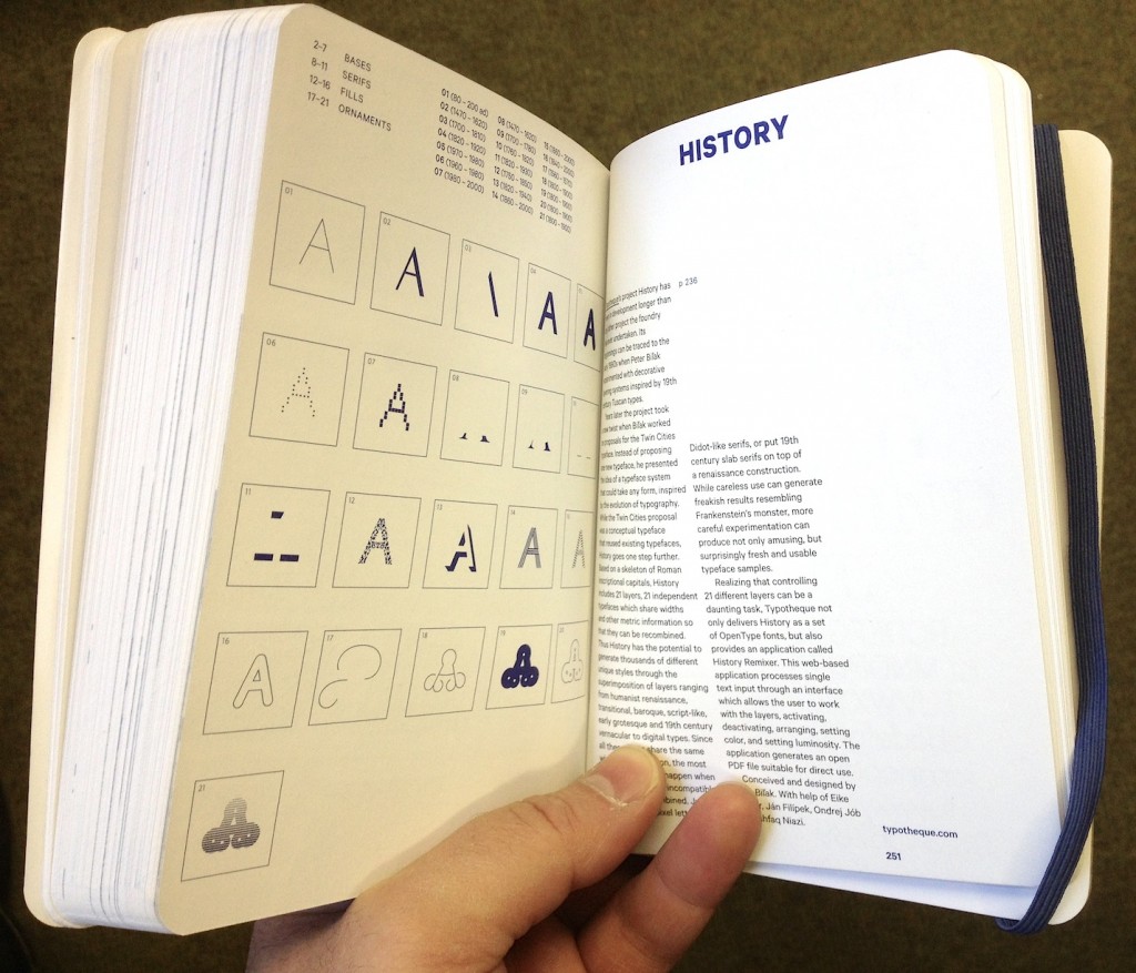
This is the text I submitted for the foreword for the Type Compass: charting new routes in typography book by SHS Publishing. It is an interesting publication, combining reference and notebook; perhaps exactly what design students need: inspiration, with space for sketching.
Members of the type world have every reason to be happy. For years we have secretly yearned to be able to mention our discipline without the despondent knowledge that blank stares would follow, without having to play the well-rehearsed tape that explained what typeface design is, and that — yes, imagine that! — some people actually made their living from designing letters.
In recent years we’ve seen a gradual recognition by the general public of typeface design as a discipline in its own right. Thanks to smartphones, ebook readers, internationalised brands, high profile wayfinding projects in cities and transport hubs (and a few journalists with a nose for a good story) fonts and typefaces are now terms suitable for polite conversation. In fact, they downright exciting, since disbelief has been replaced by credulous surprise, and eagerness to discover the ways in which our daily lives are filtered through fonts.
This gradual move of typeface design into the wider stage of public awareness has gone hand-in-hand with a stronger realisation by designers of all disciplines that typeface design matters. With this, come publications, exhibitions, competitions, and events of all scales. At the same time, the development of webfonts is beginning to breach the browser window, arguably the most important area where typographic choices were limited to handling space relationships, and crude font choices were justified on cross-platform predictability and the need to publish text as text, rather than as some poor pixelated simulacrum.
As typographic environments become more refined (the ones that had a lot of catching up to do, that is — because print is doing just fine in this respect) so do our typeface libraries become richer, more varied, and more complex. Richer, because designers continue to invent new ways of making forms, both exploring and abandoning the influences of manual tools (lots of examples of both in this book; notably, Typotheque’s History project manages to do both at the same time). More varied, because a good number of experienced and upcoming designers are publishing new fonts, raising the number of well-designed typefaces higher than it has ever been. And more complex, because typefaces now come in many weights ands styles, offering a degree of refinement in document design that until some years ago only few typographers could hope to expect from retail fonts.
At the same time, typeface design is maturing as a discipline of study and research. There are targeted modules within Bachelor-level courses, and a growing number of dedicated postgraduate programmes in many countries — some in parts of the world where typeface design itself is a very recent area of activity. Many graduates from these courses manage to leapfrog self-educated contemporaries, to found solid careers that pay the rent: this is overdue in typeface design, but the normal state of affairs in pretty much any established professional discipline. And as we acknowledge the elephant in the room, that typeface design is, more than most design disciplines, informed by past practice and context, so does research flourish. This is emphasised by the expansion of design briefs to cover many world scripts as a matter of course: pan-European Latin with Cyrillic and Greek to begin with, and many combinations of Arabic, Hebrew, Indian and Asian scripts. To meet these demands, designers do more research of their own, and make use of other research, to keep expanding their skills.
But the proliferation of typefaces and the texts that accompany them place a new burden on designers: it is now impossible for one person to keep abreast of developments. Typeface design is global, and the scale of output is similarly overwhelming. Publications about typeface design have similarly had to shift their focus. Many publications in the hot-metal and photo-typesetting eras attempted to show all the typefaces in circulation (or, at least, all the ones that mattered). This approach spilled into the early digital period, but is long now abandoned. Instead, publications can let online retailers to function as catalogues of nearly everything, and focus instead on editorship. The selection of work becomes more interesting than the volume; the editor’s perspective more illuminating than any message the inclusion or exclusion of a single work can get across.
This process opens up the space for editors to give each publication a specific depth of field, to borrow a photographic metaphor. From typefaces shown on their own, worthy of study in their own right, to texts in books, on screens, on street signs, where typefaces become enabling tools for other designers, the editor is very much not a silent partner. In putting Eric Olson’s Seravek (a quintessentially contemporary design that manages to be an accomplished all-rounder at the same time) next to Pierre di Sciullo’s inspired T for the Nice tram service, this book makes a robust case for the healthy invention and originality suffusing typeface design, while reinforcing the ubiquity of manufactured and rendered letterforms surrounding us. In this sense, a book such as this becomes a starting point: for inspiration, argument, and another round of informed selection: as good a send-off as any editor could hope for.
