Type ahead

I measure the growth of my field by the questions of border control agents. A decade ago, the phrase ‘I am a typographer’ would trigger a subtle move of the hand towards the ‘dodgy traveller’ button (just in case, you understand), only to relax once my being in the mapping business was confirmed. But in the last few years – three or four, no more – things are different. I may even drop the words ‘typeface design’, without fear of meeting the agent’s supervisor. And, in some cases, I will be offered the name of the agent’s favourite font, and told about a book called Just my type.

This phenomenon, of typefaces becoming part of the mainstream, is not accidental, nor a fashionable blip. It was foreseeable many years ago, and has been accelerating under the dual impetus of the move to a standards-compliant, text-orientated internet, and the growth of mobile devices with usable browsers.

Designers who remember the last decade of the previous century will recall the shift from intensely localised markets with only superficial communication, towards connected regions. The European integration project, from 1992 onwards, followed by the surfacing of the internet onto the mainstream three years later, required fonts that could support a growing number of languages (albeit primarily those written left-to-right, with unconnected letterforms). Fast-forward a decade, and the typefaces on pretty much any up-to-date computing device could render most scripts in the world, even if the more complex writing systems still suffer in fidelity and design range. The two technologies responsible for uniting the world typographically, Unicode and OpenType, are now in a stage of maturity and refinement, covering most of the needs of most readers. (In case you haven’t heard the two names before: Unicode attempts to describe every distinct character used in all written communication; and OpenType allows each character to take the appropriate visual form, depending on context and style.)

Take the core typefaces shipping with an operating system, or a smartphone, or Adobe’s applications: most have well over 2,000 glyphs in each font, with many additional glyphs for stylistic sets like small caps and non-lining numerals, across the Cyrillic, Greek, and extended Latin scripts. Other typefaces cover Arabic, Armenian, Ethiopic, Hebrew, a whole range of scripts for India, and a growing number of scripts for East Asia: from CJK (Chinese, Japanese, and Korean) to Thai, Khmer, and Burmese. All these resources establish a base level for servicing most texts: ‘we’ve probably got some typeface that will render your language, and if you’re lucky there may be more than one, in different styles’. But there are compromises: even if there’s more than one typeface, styles may not match across scripts, and the range of type families is generally uncoordinated. The profusion of styles, widths, and weights of the Latin script is only partly met in other European ones, and far less so in global scripts.

This state ensures basic communication, but is not very helpful for graphic designers and typographers working with global brands, multi-script documents, or with complex applications exclusively in non-Latin scripts. Professionals need a wide range of typeface styles to express the identity of a publication or a brand, and they need the right style in different weights, and widths, and so on. And this is why typeface design is growing, with no sign of abating: a triple combination of growing global brands, a migration to screens of documents with long print traditions (from ebooks and interactive school textbooks on tablets, to local news services replacing traditional newspapers), and a growth of personalised, transactional documents like online shopping catalogues, increasingly on mobile browsers. At the same time, niche print publications are growing: they take up the slack of offset press capacity, but they also thrive in the print runs of a few hundred, a traditional no-man’s land that digital presses have opened up. These conditions, of transformed documents and new platforms, push the demand for ever more typefaces that are typographically rich, wide in script coverage, and tailored for use on a wide range of surfaces: screens, print-on-demand, and traditional presses.

Two factors add substantially to this need. Firstly, the explosion of mobile networks in regions where cable-based broadband is scarce, means that critical communications are restricted to small screens, that render almost exclusively text. Secondly, the speedy adoption of tablets, which are agnostic devices that do not anticipate functional aspects of the documents they render (in other words: the devices do not explain the interaction, like a print document does: the navigation arises from the document’s typographic design, not its ‘hardware’). The four main tools in typographic design become the main carriers of any identity: from a simple publication to a large brand, typefaces, spacing, visual hierarchies, and colour are the only reliable identifiers.

This process has precipitated a radical re-thinking of a typeface designer’s skillset, especially with respect to scripts the designer is unfamiliar with, and most probably cannot read fluently. In such cases, designers need to engage with the characteristics of the script, bringing to the table an understanding of how letterforms are influenced by changes in type-making and typesetting technologies. But just looking at a bunch of local documents is not enough. Designers need to bring an appreciation of the typographic conventions for the genre of documents in each culture. In response to these demands, the best typeface designers integrate research in historical and contemporary artefacts: books and ephemera, type-making and typesetting equipment, but also texts and material such as drawings produced during the type-making process. These combine with a study of texts written by type makers about type-making, designers about their practice, and a range of research texts on the development of typeface design. The key for all these to be included in a commercial schedule is a framework for integrating research into design practice that enriches the designer’s understanding, and unlocks informed creativity.

The weight of methodology and research place multi-script typeface design at odds with art school traditions of design education. There is, quite simply, too much to learn in areas touching on history, linguistics, and technology for self-taught professionals, or the informal osmosis of apprenticeship-based courses. And, rather than be seen as an oddity in the design world, typeface design is in some ways leading a gradual shift in the wider design education sector. Notions of clarifying a body of field-specific knowledge, and formulating a methodology for practice that is transferable across schools and regions are taking off, globally. (Increasingly, I am invited to speak on exactly that subject: how to develop a research-informed, culturally sensitive methodology for teaching that educates potentially excellent professionals. And promotion criteria for design educators worldwide are changing to include research-based outputs, moving design closer to the Humanities than the Arts.)

The growth in books and print magazines dedicated to typography, as well as special sections in broader titles (like the one you are reading now) are just one of the signs of typography maturing. The many conferences, workshops, and exhibitions are another – and they are aimed not only at typographers, but at web designers, brand designers, and graphic designers alike. But there is another, more subtle indicator that typography and typeface design are gradually emerging onto the wider consciousness. As typeface families grow to cover multiple scripts, concepts of national and regional typographic identity become current, and often volatile. New typefaces can reflect both home-grown and imported visual trends; they give concrete form to the expression of community identities, and become inflection points in visual culture at a range of levels. Beyond functional requirements, they can embody political and generational shifts, and encapsulate a society’s dialogue with modernity.

Next time I cross a border, I’ll have a longer tale to tell.

[Published originally in In Computer Arts Collection: Typography Vol 2 no 2, 2013 and republished, slightly edited, on this site as The next ten years.]
 

An emerging discipline

Marc Weymann’s typeface in this issue is, like all good text typefaces, strangely familiar. Familiar, because the rhythm of black strokes and white counter spaces reminds us of so many texts we’ve read: the strokes neither loudly dark or vainly thin, and the details of the terminals respectful of the excesses of contrast and the resolution of tired eyes. Strangely so, because this veil of familiarity hides a whole range of subtle contrasts: a combination of smooth patterns reminiscent of formal writing with nibs, and the sharp clarity of letters carved in stone.

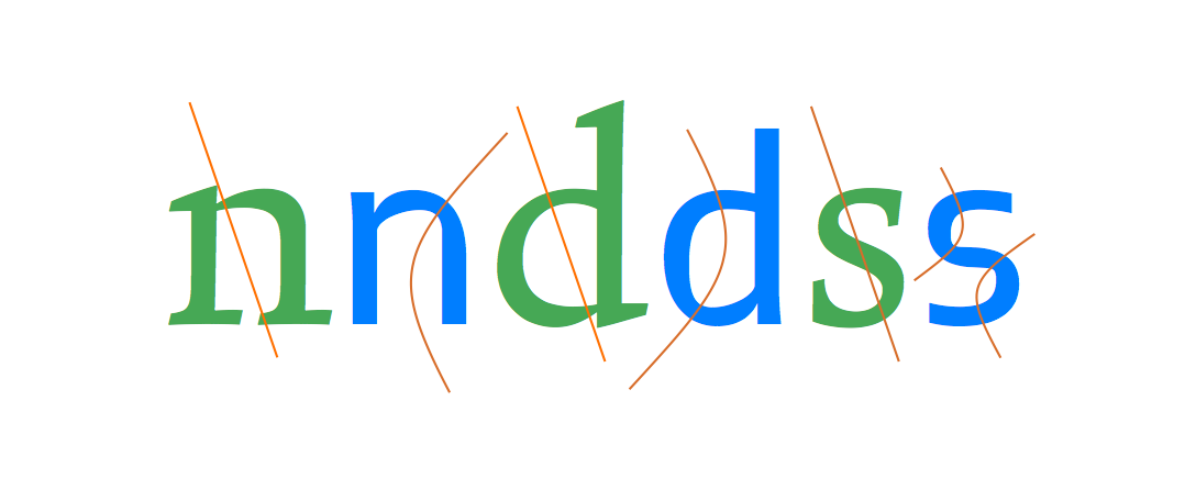
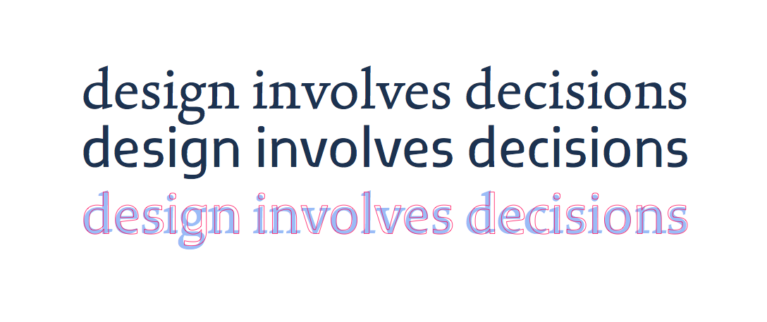
Marc’s typeface is misleadingly gentle with its references, but rewarding closer inspection. Other typefaces for text are much less discreet, forcefully calling attention to their novelty, even as they still respect that set of conventions that allow us to read comfortably. Jeremy Tankard’s Fenland, probably the most notable of typefaces published in 2011, takes the ancient paradigms derived from writing tools, and throws them aside for the sake of shapes reminding of discarded piping; its stroke joints challenge the instincts embedded in most modulated text typefaces of the last few centuries. Yes, expectations confounded, it proceeds to space the letters on exactly the same underlying pattern as Formal, as respectful of the reader’s eyes as any.

Formal and Fenland
Formal keeps its cross-strokes and bowls closely aligned to the modulation of a broad nib, adding an incised overtone in the underside of the top serifs, the top side of the lower ones, and open curves such as the outside terminals of the ’s’. By contrast, Fenland makes it difficult to talk about a consistent angle of stress: cross-strokes and bows have a discernible reverse stress (reminiscent of shapes in eastern scripts) but allows the modulation to change as if the writing tool was rotated halfway through the stroke. The ’s’ is typical of this approach, reversing completely the traditional notion of the diagonal cross-stroke as a dominant feature.

Typeface design involves, at the most basic level, decisions on shapes at the level of the letter, the line, and the paragraph. I use this definition intentionally, to make the point that design decisions are not circumscribed by the immediately manipulable (in the case of digital fonts: the glyph outlines, or the spacing interface, or the code for positioning and substitutions). Indeed, typeface design decisions happen at the tip of a siphon, where a whole range of considerations about readers, texts, typesetting environments, and wider cultural concerns get distilled into virtual nudges of points or mouse drags.

In other words, a typeface designer is conscious of the context surrounding his field of practice – in the narrow sense of the typeface design industry, in the intermediate sense of typographic design for documents (where typefaces are but one of the constituent elements), and in the wider sense of design as interaction with a visually rich and refined culture.

This is what makes typeface design such an interesting area to work in: it is a context-driven discipline, where past practice, conditions of use, user perspective, and invested meaning all weigh heavily in design decisions. Indeed, professional experience in typeface design is primarily reflected in the depth of understanding of these wider considerations, the clarity with which these can be translated into typeforms, and the insight with which this context can be married to a personal creative voice.  If we want proof of this, we need only look at the older generations of typeface designers, who – working ,more often than not, on decades-old applications – still produce new designs that contribute fundamentally to our typographic libraries.

Formal and Fenland
Despite their very different texture, both typefaces follow a very consistent pattern in their fitting. Notably, Fenland avoids the typical problem of sans typefaces having overly narrow sidebearings in letters with vertical strokes. This more open underlying pattern ensures the typeface remains perfectly readable in smaller sizes.

This approach can be seen most clearly with work in scripts that the designer is unfamiliar with, and in any case cannot read fluently. In this scenario, design decisions cannot be trusted without an engagement with the characteristics of the script, an understanding of the way the typeforms of the script have responded to changes in type-making and typesetting technologies, and an appreciation of the typographic conventions for the genre of documents the typeface is intended for. In fact, the closer the connection of the script to its written form, and the more complex its typesetting, the more important it is that the designer engage intimately with these considerations. This approach places four-plus-one conditions on multi-script typeface design. First, that the designer has access to historical and contemporary artefacts: books and other printed material, ephemera, type-making and typesetting equipment. Second, access to primary sources: texts and material such as drawings produced during the type-making process. Third, access to secondary sources: texts written by type makers about type-making, and designers about their practice. Fourth, interpretative sources: texts by researchers such as historians and theorists on the development of type design. The ‘plus-one’ is a framework for integrating research into design practice that enriches the designer’s understanding, and unlocks informed creativity.

It is not difficult to see the connection  between these conditions and the growth in formal education in typeface design, largely in parallel across the world. In fact, typeface design is in some ways leading a gradual shift in the wider design education sector, away from a paradigm of silently reflective responses towards user-centred, research–informed design practice. This approach is typical for a research-based discipline in the humanities. It is, though, alien to design taught in art colleges and institutions based on practice teaching outside of context, on the model of apprenticeships.

Brill and Brill Greek
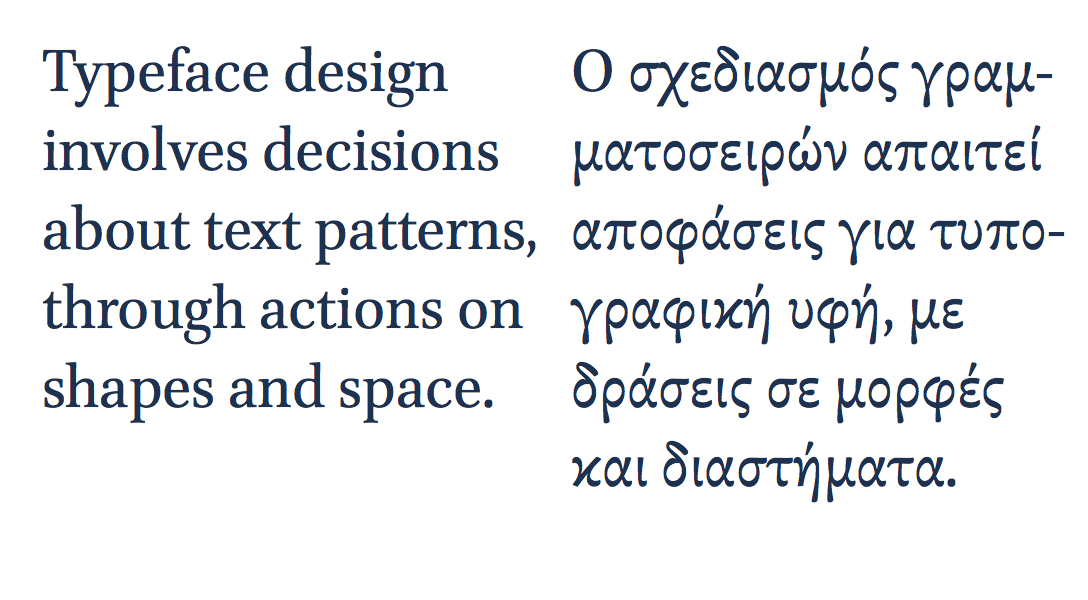
Typeface design across scripts: the Brill typeface, developed for the Dutch academic publisher by John Hudson, covers a wide range of languages and is developed specifically for text-intensive typesetting. The forms of the letters in the two scripts here are quite different, to respect the typographic traditions of each script. The overall typographic colour is similar in tone, allowing the texts to differentiate solely though the differences in typographic texture.

These considerations are not purely an academic matter. In the last decade we have witnessed a rapid growth in the demand for typefaces with very large character sets spanning many scripts. Pan-european typefaces with several hundred characters are often just a starting point, with Arabic or several Indian scripts added during the typeface’s lifetime. More recently we have seen notable growth in Armenian, as well as East Asian and South-East Asian scripts like Korean, Thai, Khmer, and Burmese. This demand, driven by an expansion of communication services and globalised branding, has pushed typeface design towards a level of effort that rewards teamwork, and the gradual building of expertise, through the combination of formal and self-directed study, and professional activity.

This is the environment in which we should seek to educate typeface designers: to expect them to ask questions about their practice, and seek answers through research. Indeed, we should see type design skills as inseparable from research skills, and an enquiring attitude. We should expect designers to engage with their field actively, and to write: to produce knowledge about their discipline. Seeing design activity as wider and deeper than any individual project is a key characteristic of the transition of typeface design towards a fully-established discipline.

Type Compass: pointing ahead

This is the text I submitted for the foreword for the Type Compass: charting new routes in typography book by SHS Publishing. It is an interesting publication, combining reference and notebook; perhaps exactly what design students need: inspiration, with space for sketching.

Type Compass


Members of the type world have every reason to be happy. For years we have secretly yearned to be able to mention our discipline without the despondent knowledge that blank stares would follow, without having to play the well-rehearsed tape that explained what typeface design is, and that — yes, imagine that! — some people actually made their living from designing letters.

In recent years we’ve seen a gradual recognition by the general public of typeface design as a discipline in its own right. Thanks to smartphones, ebook readers, internationalised brands, high profile wayfinding projects in cities and transport hubs (and a few journalists with a nose for a good story) fonts and typefaces are now terms suitable for polite conversation. In fact, they downright exciting, since disbelief has been replaced by credulous surprise, and eagerness to discover the ways in which our daily lives are filtered through fonts.
This gradual move of typeface design into the wider stage of public awareness has gone hand-in-hand with a stronger realisation by designers of all disciplines that typeface design matters. With this, come publications, exhibitions, competitions, and events of all scales. At the same time, the development of webfonts is beginning to breach the browser window, arguably the most important area where typographic choices were limited to handling space relationships, and crude font choices were justified on cross-platform predictability and the need to publish text as text, rather than as some poor pixelated simulacrum.

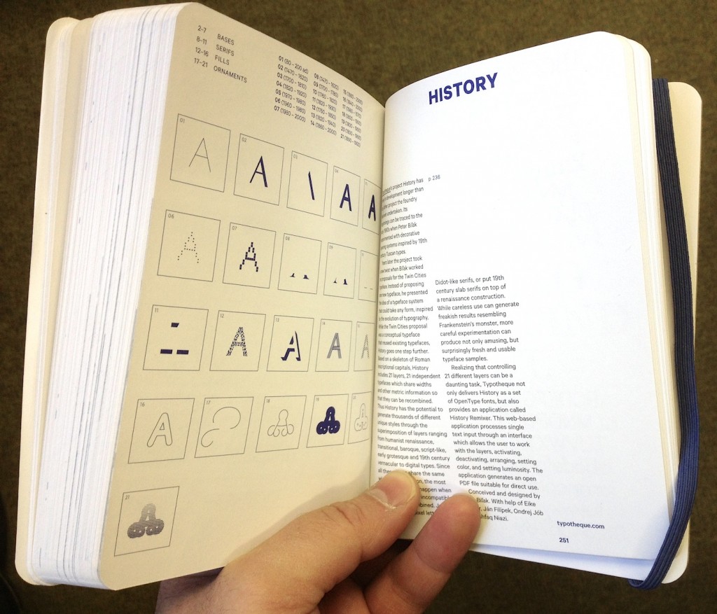
As typographic environments become more refined (the ones that had a lot of catching up to do, that is — because print is doing just fine in this respect) so do our typeface libraries become richer, more varied, and more complex. Richer, because designers continue to invent new ways of making forms, both exploring and abandoning the influences of manual tools (lots of examples of both in this book; notably, Typotheque’s History project manages to do both at the same time). More varied, because a good number of experienced and upcoming designers are publishing new fonts, raising the number of well-designed typefaces higher than it has ever been. And more complex, because typefaces now come in many weights ands styles, offering a degree of refinement in document design that until some years ago only few typographers could hope to expect from retail fonts.

At the same time, typeface design is maturing as a discipline of study and research. There are targeted modules within Bachelor-level courses, and a growing number of dedicated postgraduate programmes in many countries — some in parts of the world where typeface design itself is a very recent area of activity. Many graduates from these courses manage to leapfrog self-educated contemporaries, to found solid careers that pay the rent: this is overdue in typeface design, but the normal state of affairs in pretty much any established professional discipline. And as we acknowledge the elephant in the room, that typeface design is, more than most design disciplines, informed by past practice and context, so does research flourish. This is emphasised by the expansion of design briefs to cover many world scripts as a matter of course: pan-European Latin with Cyrillic and Greek to begin with, and many combinations of Arabic, Hebrew, Indian and Asian scripts. To meet these demands, designers do more research of their own, and make use of other research, to keep expanding their skills.
But the proliferation of typefaces and the texts that accompany them place a new burden on designers: it is now impossible for one person to keep abreast of developments. Typeface design is global, and the scale of output is similarly overwhelming. Publications about typeface design have similarly had to shift their focus. Many publications in the hot-metal and photo-typesetting eras attempted to show all the typefaces in circulation (or, at least, all the ones that mattered). This approach spilled into the early digital period, but is long now abandoned. Instead, publications can let online retailers to function as catalogues of nearly everything, and focus instead on editorship. The selection of work becomes more interesting than the volume; the editor’s perspective more illuminating than any message the inclusion or exclusion of a single work can get across.

This process opens up the space for editors to give each publication a specific depth of field, to borrow a photographic metaphor. From typefaces shown on their own, worthy of study in their own right, to texts in books, on screens, on street signs, where typefaces become enabling tools for other designers, the editor is very much not a silent partner. In putting Eric Olson’s Seravek (a quintessentially contemporary design that manages to be an accomplished all-rounder at the same time) next to Pierre di Sciullo’s inspired T for the Nice tram service, this book makes a robust case for the healthy invention and originality suffusing typeface design, while reinforcing the ubiquity of manufactured and rendered letterforms surrounding us. In this sense, a book such as this becomes a starting point: for inspiration, argument, and another round of informed selection: as good a send-off as any editor could hope for.


You need an opinion, on top of an impulse.

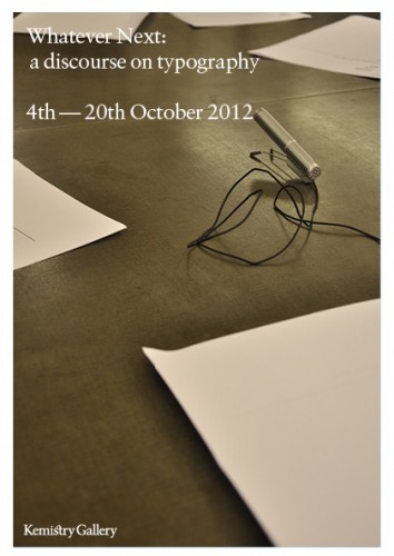
A short while ago James Edgar of the Camberwell Press asked me to write a short text in response to one of four conversations recorded for Whatever next: a discourse on typography. Fraser Muggeridge liked it, so I thought I’d put my final draft here. Blame him if you don’t.


Whatever next: a discourse on typography

Typeface design has arrived. Emerging from the adolescence of an esoteric field absent from wider narratives of culture, it is maturing into an equally esoteric domain; there, gradually increasing numbers of experts witness an explosion of awareness by the wider population, where words like ‘typeface’ and ‘fonts’ will not cause a conversation to freeze.

I am not exaggerating. We are witnessing a celebrated revival in letterpress; the publication of popular books for those who are beginning to notice fonts on their menus; a growing number of serious magazines and larger publications on type; the transformation of texts on screen with webfonts; and the development of massive typeface families spanning several scripts, for branding and pretty much any device that displays text.

This ambiguous state of hesitantly enthusiastic acknowledgement in the periphery of the mainstream is forcing typeface designers, typographers, and educators to clarify our ideas about our disciplines, and the language we use to describe our contribution (as well as fill out the ‘description of work’ in the next invoice). This is less easy than it sounds: typeface design is a quintessentially interdisciplinary field. The immediate actions of form-making and digital encoding rest on a bedrock of historical and cultural understanding, which is gradually establishing its importance in designers’ minds. Type designers need to have an understanding of writing, be familiar with the developments in the technologies of type-making and typesetting, be aware of how texts are transmitted and shared in each society, and respond to the editorial practices and conventions of each market. Some may even engage with the sprinkling of usability and human perception discourse (although, I would argue, with minimal impact on the quality of their work).

All these caveats may make typeface design appear dry, bereft of the originality in form-making associated with the creative industries. This would be a false interpretation. It is better to put it this way: while the typeface designer needs to be just as creative as the next professional, she also needs to show that history, technology, culture, and society are peering over her head as she sketches or nudges outlines. Indeed, it is exactly this increased expectation of knowledge and understanding that separates typeface design from most disciplines in the creative sector.

This issue is reflected in the discussion in the following pages, as is the imperative to distinguish between ‘typeface design’ and ‘typography’. Indeed, it is not difficult to come up with simple definitions: whereas typeface design refers to the design, testing, and production of useable typeforms in whatever appropriate technology, typography relates to the determination of structure and the specification of appearance at the document level. The scale of perspective is quite different: the typeface designer works at the very limit of shape perception, managing patterns of visual recognition more that individual shapes; and the typographer looks at a the complete document, or even a whole class of documents (in the case of series design, and periodical publications). Furthermore, the relationship of the two disciplines to the content is very different. The typographer reliably knows what texts she is giving form to: the semantic content, style of language, length of text, and density of image support, all are known. On the other hand, the typeface designer can only speculate on the texts her typefaces will transmit, or even the most basic typographic parameters. Ironically, the typographer of periodicals, working with templates to provide for a wide set of possible configurations, may be closer to understanding the exercises in abstraction required in developing a typeface. Reflecting on the work of some of the contributors here, we could even argue that the designer of one-off publications like art catalogues may be closer to a lettering artist than a typeface designer.

And, yet, it would be wrong to take the distinctions too far. Both disciplines can be approached along four axes: at the outset is a brief. (Not just ‘clients’: they may approach the designer with a project, but this must translated into a coherent description of requirements and design parameters. The more experienced the designer, the more she may be expected to contribute to the brief.) Second, is the understanding of the functional aspects of the job, as they arise from a consideration of all those who have a stake in the design. This is user-centred design at its most fundamental: ‘does it work for its intended users, for what it was supposed to do?’ Thirdly, both typeface designers and typographers develop identities: there is a potentially infinite combination of design decisions that deliver a strictly functional product, but which capture the broader semantics? Does the typeface (or the document) acknowledge its genre, and does it reflect its time and place? Does it capture the values inherent in the client’s identity, and explore the potential of stylistic and cultural associations? It is this third dimension that gives a design project relevance and value: the ability of the designer to amplify meaning beyond the functional specifications of the brief, into something wider that engages with peers, and the wider community.

The last axis is the designer herself: the form-giver not just as a social observer, but a social commentator. Moving beyond functionality and usability, the designer employs association, style, identity, differentiation, and beauty to reflect a cultural moment back to its members, and express new ways of looking at ourselves. The most successful designers are the ones who gradually (or, sometimes, abruptly) push the envelope of what we consider acceptable, and reveal to us the patterns of our behaviour.

In these respects, both typeface designers and typographers are equal, and unique: different from the lighter domain of graphic design and many applied arts, exactly because their tasks involve strict functional requirements and a deeper knowledge of their domain. And, still, different from the specificity of the engineering disciplines they may employ: because the real value of typographic work lies in its reading of, and response to, social conditions in a transparent dialogue with peers. The idea of typeface designers and typographers as social scientists may be unfamiliar, but one that we may need to get used to.