Type ahead

I measure the growth of my field by the questions of border control agents. A decade ago, the phrase ‘I am a typographer’ would trigger a subtle move of the hand towards the ‘dodgy traveller’ button (just in case, you understand), only to relax once my being in the mapping business was confirmed. But in the last few years – three or four, no more – things are different. I may even drop the words ‘typeface design’, without fear of meeting the agent’s supervisor. And, in some cases, I will be offered the name of the agent’s favourite font, and told about a book called Just my type.

This phenomenon, of typefaces becoming part of the mainstream, is not accidental, nor a fashionable blip. It was foreseeable many years ago, and has been accelerating under the dual impetus of the move to a standards-compliant, text-orientated internet, and the growth of mobile devices with usable browsers.

Designers who remember the last decade of the previous century will recall the shift from intensely localised markets with only superficial communication, towards connected regions. The European integration project, from 1992 onwards, followed by the surfacing of the internet onto the mainstream three years later, required fonts that could support a growing number of languages (albeit primarily those written left-to-right, with unconnected letterforms). Fast-forward a decade, and the typefaces on pretty much any up-to-date computing device could render most scripts in the world, even if the more complex writing systems still suffer in fidelity and design range. The two technologies responsible for uniting the world typographically, Unicode and OpenType, are now in a stage of maturity and refinement, covering most of the needs of most readers. (In case you haven’t heard the two names before: Unicode attempts to describe every distinct character used in all written communication; and OpenType allows each character to take the appropriate visual form, depending on context and style.)

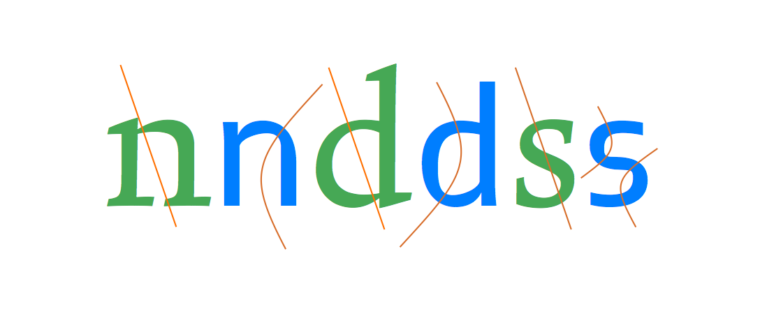
Take the core typefaces shipping with an operating system, or a smartphone, or Adobe’s applications: most have well over 2,000 glyphs in each font, with many additional glyphs for stylistic sets like small caps and non-lining numerals, across the Cyrillic, Greek, and extended Latin scripts. Other typefaces cover Arabic, Armenian, Ethiopic, Hebrew, a whole range of scripts for India, and a growing number of scripts for East Asia: from CJK (Chinese, Japanese, and Korean) to Thai, Khmer, and Burmese. All these resources establish a base level for servicing most texts: ‘we’ve probably got some typeface that will render your language, and if you’re lucky there may be more than one, in different styles’. But there are compromises: even if there’s more than one typeface, styles may not match across scripts, and the range of type families is generally uncoordinated. The profusion of styles, widths, and weights of the Latin script is only partly met in other European ones, and far less so in global scripts.

This state ensures basic communication, but is not very helpful for graphic designers and typographers working with global brands, multi-script documents, or with complex applications exclusively in non-Latin scripts. Professionals need a wide range of typeface styles to express the identity of a publication or a brand, and they need the right style in different weights, and widths, and so on. And this is why typeface design is growing, with no sign of abating: a triple combination of growing global brands, a migration to screens of documents with long print traditions (from ebooks and interactive school textbooks on tablets, to local news services replacing traditional newspapers), and a growth of personalised, transactional documents like online shopping catalogues, increasingly on mobile browsers. At the same time, niche print publications are growing: they take up the slack of offset press capacity, but they also thrive in the print runs of a few hundred, a traditional no-man’s land that digital presses have opened up. These conditions, of transformed documents and new platforms, push the demand for ever more typefaces that are typographically rich, wide in script coverage, and tailored for use on a wide range of surfaces: screens, print-on-demand, and traditional presses.

Two factors add substantially to this need. Firstly, the explosion of mobile networks in regions where cable-based broadband is scarce, means that critical communications are restricted to small screens, that render almost exclusively text. Secondly, the speedy adoption of tablets, which are agnostic devices that do not anticipate functional aspects of the documents they render (in other words: the devices do not explain the interaction, like a print document does: the navigation arises from the document’s typographic design, not its ‘hardware’). The four main tools in typographic design become the main carriers of any identity: from a simple publication to a large brand, typefaces, spacing, visual hierarchies, and colour are the only reliable identifiers.

This process has precipitated a radical re-thinking of a typeface designer’s skillset, especially with respect to scripts the designer is unfamiliar with, and most probably cannot read fluently. In such cases, designers need to engage with the characteristics of the script, bringing to the table an understanding of how letterforms are influenced by changes in type-making and typesetting technologies. But just looking at a bunch of local documents is not enough. Designers need to bring an appreciation of the typographic conventions for the genre of documents in each culture. In response to these demands, the best typeface designers integrate research in historical and contemporary artefacts: books and ephemera, type-making and typesetting equipment, but also texts and material such as drawings produced during the type-making process. These combine with a study of texts written by type makers about type-making, designers about their practice, and a range of research texts on the development of typeface design. The key for all these to be included in a commercial schedule is a framework for integrating research into design practice that enriches the designer’s understanding, and unlocks informed creativity.

The weight of methodology and research place multi-script typeface design at odds with art school traditions of design education. There is, quite simply, too much to learn in areas touching on history, linguistics, and technology for self-taught professionals, or the informal osmosis of apprenticeship-based courses. And, rather than be seen as an oddity in the design world, typeface design is in some ways leading a gradual shift in the wider design education sector. Notions of clarifying a body of field-specific knowledge, and formulating a methodology for practice that is transferable across schools and regions are taking off, globally. (Increasingly, I am invited to speak on exactly that subject: how to develop a research-informed, culturally sensitive methodology for teaching that educates potentially excellent professionals. And promotion criteria for design educators worldwide are changing to include research-based outputs, moving design closer to the Humanities than the Arts.)

The growth in books and print magazines dedicated to typography, as well as special sections in broader titles (like the one you are reading now) are just one of the signs of typography maturing. The many conferences, workshops, and exhibitions are another – and they are aimed not only at typographers, but at web designers, brand designers, and graphic designers alike. But there is another, more subtle indicator that typography and typeface design are gradually emerging onto the wider consciousness. As typeface families grow to cover multiple scripts, concepts of national and regional typographic identity become current, and often volatile. New typefaces can reflect both home-grown and imported visual trends; they give concrete form to the expression of community identities, and become inflection points in visual culture at a range of levels. Beyond functional requirements, they can embody political and generational shifts, and encapsulate a society’s dialogue with modernity.

Next time I cross a border, I’ll have a longer tale to tell.

[Published originally in In Computer Arts Collection: Typography Vol 2 no 2, 2013 and republished, slightly edited, on this site as The next ten years.]


An emerging discipline

Marc Weymann’s typeface in this issue is, like all good text typefaces, strangely familiar. Familiar, because the rhythm of black strokes and white counter spaces reminds us of so many texts we’ve read: the strokes neither loudly dark or vainly thin, and the details of the terminals respectful of the excesses of contrast and the resolution of tired eyes. Strangely so, because this veil of familiarity hides a whole range of subtle contrasts: a combination of smooth patterns reminiscent of formal writing with nibs, and the sharp clarity of letters carved in stone.

Marc’s typeface is misleadingly gentle with its references, but rewarding closer inspection. Other typefaces for text are much less discreet, forcefully calling attention to their novelty, even as they still respect that set of conventions that allow us to read comfortably. Jeremy Tankard’s Fenland, probably the most notable of typefaces published in 2011, takes the ancient paradigms derived from writing tools, and throws them aside for the sake of shapes reminding of discarded piping; its stroke joints challenge the instincts embedded in most modulated text typefaces of the last few centuries. Yes, expectations confounded, it proceeds to space the letters on exactly the same underlying pattern as Formal, as respectful of the reader’s eyes as any.

Formal and Fenland
Formal keeps its cross-strokes and bowls closely aligned to the modulation of a broad nib, adding an incised overtone in the underside of the top serifs, the top side of the lower ones, and open curves such as the outside terminals of the ’s’. By contrast, Fenland makes it difficult to talk about a consistent angle of stress: cross-strokes and bows have a discernible reverse stress (reminiscent of shapes in eastern scripts) but allows the modulation to change as if the writing tool was rotated halfway through the stroke. The ’s’ is typical of this approach, reversing completely the traditional notion of the diagonal cross-stroke as a dominant feature.

Typeface design involves, at the most basic level, decisions on shapes at the level of the letter, the line, and the paragraph. I use this definition intentionally, to make the point that design decisions are not circumscribed by the immediately manipulable (in the case of digital fonts: the glyph outlines, or the spacing interface, or the code for positioning and substitutions). Indeed, typeface design decisions happen at the tip of a siphon, where a whole range of considerations about readers, texts, typesetting environments, and wider cultural concerns get distilled into virtual nudges of points or mouse drags.

In other words, a typeface designer is conscious of the context surrounding his field of practice – in the narrow sense of the typeface design industry, in the intermediate sense of typographic design for documents (where typefaces are but one of the constituent elements), and in the wider sense of design as interaction with a visually rich and refined culture.

This is what makes typeface design such an interesting area to work in: it is a context-driven discipline, where past practice, conditions of use, user perspective, and invested meaning all weigh heavily in design decisions. Indeed, professional experience in typeface design is primarily reflected in the depth of understanding of these wider considerations, the clarity with which these can be translated into typeforms, and the insight with which this context can be married to a personal creative voice.  If we want proof of this, we need only look at the older generations of typeface designers, who – working ,more often than not, on decades-old applications – still produce new designs that contribute fundamentally to our typographic libraries.

Formal and Fenland
Despite their very different texture, both typefaces follow a very consistent pattern in their fitting. Notably, Fenland avoids the typical problem of sans typefaces having overly narrow sidebearings in letters with vertical strokes. This more open underlying pattern ensures the typeface remains perfectly readable in smaller sizes.

This approach can be seen most clearly with work in scripts that the designer is unfamiliar with, and in any case cannot read fluently. In this scenario, design decisions cannot be trusted without an engagement with the characteristics of the script, an understanding of the way the typeforms of the script have responded to changes in type-making and typesetting technologies, and an appreciation of the typographic conventions for the genre of documents the typeface is intended for. In fact, the closer the connection of the script to its written form, and the more complex its typesetting, the more important it is that the designer engage intimately with these considerations. This approach places four-plus-one conditions on multi-script typeface design. First, that the designer has access to historical and contemporary artefacts: books and other printed material, ephemera, type-making and typesetting equipment. Second, access to primary sources: texts and material such as drawings produced during the type-making process. Third, access to secondary sources: texts written by type makers about type-making, and designers about their practice. Fourth, interpretative sources: texts by researchers such as historians and theorists on the development of type design. The ‘plus-one’ is a framework for integrating research into design practice that enriches the designer’s understanding, and unlocks informed creativity.

It is not difficult to see the connection  between these conditions and the growth in formal education in typeface design, largely in parallel across the world. In fact, typeface design is in some ways leading a gradual shift in the wider design education sector, away from a paradigm of silently reflective responses towards user-centred, research–informed design practice. This approach is typical for a research-based discipline in the humanities. It is, though, alien to design taught in art colleges and institutions based on practice teaching outside of context, on the model of apprenticeships.

Brill and Brill Greek
Typeface design across scripts: the Brill typeface, developed for the Dutch academic publisher by John Hudson, covers a wide range of languages and is developed specifically for text-intensive typesetting. The forms of the letters in the two scripts here are quite different, to respect the typographic traditions of each script. The overall typographic colour is similar in tone, allowing the texts to differentiate solely though the differences in typographic texture.

These considerations are not purely an academic matter. In the last decade we have witnessed a rapid growth in the demand for typefaces with very large character sets spanning many scripts. Pan-european typefaces with several hundred characters are often just a starting point, with Arabic or several Indian scripts added during the typeface’s lifetime. More recently we have seen notable growth in Armenian, as well as East Asian and South-East Asian scripts like Korean, Thai, Khmer, and Burmese. This demand, driven by an expansion of communication services and globalised branding, has pushed typeface design towards a level of effort that rewards teamwork, and the gradual building of expertise, through the combination of formal and self-directed study, and professional activity.

This is the environment in which we should seek to educate typeface designers: to expect them to ask questions about their practice, and seek answers through research. Indeed, we should see type design skills as inseparable from research skills, and an enquiring attitude. We should expect designers to engage with their field actively, and to write: to produce knowledge about their discipline. Seeing design activity as wider and deeper than any individual project is a key characteristic of the transition of typeface design towards a fully-established discipline.

Going global: the last decade in multi-script type design

Science fiction is a mirror. It’s rarely good at predicting the future, but it’s great at telling us what we’d like the future to be, or what we fear it may become. Isaac Asimov, Arthur Clarke, Robert Heinlein, Philip K. Dick: familiar names that guided many imaginations to think about societies spanning the galaxy. Then Star Wars finished off what 2001 started: rich visual textures and soundscapes made it ever more difficult for our imaginations to keep up.

But there were two things that always bothered me about science fiction. First, everybody speaks the same language, or understands the other person’s locutions without so much as an “excuse me, can you repeat this?” And, most frustratingly, nobody ever reads. Nobody. Sometimes there are symbols, diagrams, and gibberish that brands a vehicle or a building, but that’s pretty much it. It is as if some mundane version of mind-meld has rendered obsolete those moments between you and some letters on a surface in front of your eyes.

Well, it didn’t turn out that way. We know that people read more than they ever did. Perhaps they read fewer of some traditional thing or other (and even that depends on the region) but, overall, more people spend more time looking at strings of letters. What was once a dedicated activity has expanded to fill out the previously empty spots of the day: news, a story we saved for later, the playground utterances of Twitter, the trivial ego massages of Facebook. It pains to imagine Dick’s Deckard checking his smartphone while slurping at the noodle bar, but you can bet that this is exactly what he’d be doing today. And we have only begun to see what ubiquitous tablets will do. Many years from now, these very few years at the beginning of the century’s second decade will be seen as a key inflection point: The combination of portable, personal, ever-present, ever-connected screens will transform our ideas of learning, of exchange, of creating new knowledge to degrees unimaginable by our idolized authors.

Our regional identity is deeply personal. It is the language in which we dream and laugh, the language of our exasperations and tears. For most of us, this language is not English, and quite likely it is not written with the Latin script.

There is one problem, however: the future is turning out to be more complicated than we had imagined. Instead of a single, Esperanto-like über-language, most of us are growing up with two parallel identities. One is based on a commonly-owned, flexible, and forgiving version of English, with a rubber-band syntax and a constant stream of new words that spread like an epidemic to other tongues. The other is our regional and historical identity: local in geography, and deeply personal in its associations. This identity is awash with the memories that make us who we are. It comes in the language we dream in, the language of our laughter, our exasperations, and our tears. Overwhelmingly, this language is not English, and quite likely it is not in the letters of the Latin script.

Indeed, just as globalization brought a wave of uniformity, it also underlined the rights of communities to express themselves in their local languages and dialects, in the script of their traditions. But the growing urban populations (over half of everybody, now) are contributing to a demand of complex script support. The equivalent of a single typeface rendering a plain-vanilla version of a language is not a new thing. For about two decades we’ve had the equivalent of a global typewriter, spitting out a single-weight, single-style typescript for nearly every language, with varying degrees of sensitivity to the historical forms of the script. Great if you only speak in one tone, only typeset texts with minimal hierarchies, and don’t care much about the impact of typography on reading. Indeed, the typewriter analogy is supremely fitting: the limitations of typewriter-like devices migrated onto subsequent technologies with astonishing persistence, despite the exponential increase in the capabilities of our typesetting environments.

Stage One: getting fundamentals right

So, here’s the context: globalized technologies and trends, with localized identities and needs. But typeface design is nothing if not a good reactor to changing conditions. Indeed we can detect a clear path for typeface design in the last decade, with two-and-a-half distinct stages of development.

The first stage was about rethinking how we develop basic script support for global scripts. Starting with pan-European regions (wider Latin, Cyrillic, and Greek) and gradually extending outwards to Hebrew, Arabic, and mainstream Indian scripts, typeface designers moved away from re-encoding the dated, limited typefaces of the previous technologies. This development led to two narratives that are increasingly central to typeface design. On one hand, an understanding of typemaking and typesetting technologies, and their critical impact on character sets, the design of typeforms, and the possibilities for complex behaviors along a line of text. On the other hand, an appreciation of the written forms: the relationship of the tools and the materials used for writing that determined the key formal features of each script.

For many designers the depth of research required to tackle a new script was a surprise, and not always a welcome one; but increasingly the dimensions of the challenge were respected, and understood. This research began, very slowly, to liberate global scripts from the formal tyranny of the Latin script and the expediency of copy/paste. Notions of a uniform stress at a steep angle, and of serifs to terminate strokes, are gradually seen to be primarily Latin-specific. And the faux-geometric, over-symmetrical, pot-bellied International Style typefaces are steadily unmasked as an intensely North-Western style, meaningful only as a response to the post-war trauma and urban explosion of the 1950s and 60s. Already dated by 1985, their continued adoption serves only to discredit their users and promoters. When taken as a model for non-Latin scripts, they are increasingly recognized as the typographic equivalent of a cultural straightjacket, limiting innovation and the expression of a more sensitive and current identity.

This does not mean that new typefaces with non-Latin character sets were all good, let alone perfect for their purpose. But people started questioning their assumptions, and put their money where their mouth was. Most notably, Microsoft (with a global perspective early on) and Adobe (starting with Europe, and gradually expanding its horizon) asked themselves, and others who could help, how to get things right. Their typefaces with large character sets raised the bar for many subsequent designers, and in many ways continue to determine the default level of script support on a global scale. (Regrettably, Apple never claimed a seat at this table: throughout its ecosystem its use of typefaces remains persistently unimaginative and pedestrian, abandoning any aspirations of typographic leadership.)

Stage Two: linear families

The second stage in global typeface design came when development migrated from the big developers to the publishers catering to the publishing and branding markets. The briefs for typefaces mutated from very broad specifications (for fonts that ship with operating systems and office suites, or bundled with page layout applications) to the needs of very specific documents, with rich hierarchies and multiple styles. While Office could muddle through with four Latin styles and one each for most non-Latin scripts, a newspaper or a magazine demands a range of weights and widths — especially if the templates are imported or designed to match an existing house style. Headings and subheadings, straplines and pull-quotes, footnotes and captions, for starters. And, hot on the tails of global publications and multi-script branding, come the limitations of doing the same on smaller screens, where the color palette and the typefaces may be the only elements that transfer fluidly with some consistency across materials and devices, bridging scales from the pocket to the poster.

In the previous stage designers had to ask themselves what are the fundamental differences, for example, between Arabic-script typefaces for Arabic and Persian and Urdu texts. Now the matter shifts to something like, “What are the typographic conventions in these language communities, what are their traditions, and what are the rules for differentiating between contrasting kinds of text within the same document?” In real terms, this moved design from the single typeface to the family: how will a bold Devanagari relate to a text weight, and how far can you go in adding weight? Can you squeeze, condense, or compress? And how light can you make the strokes?

[Image of Juliet Shen’s Lushootseed typeface.
Caption: Juliet Shen’s typeface for Lushootseed, the language of the Tulalip Native American tribe.]

The answers to these questions stem from a deeper engagement with the script, and an understanding of which elements are integral to maintaining the meaning of the glyph, and which are there to impart a style and build the identity of the typeface. All typeface designers (native or not) need to understand the impact of type-making and typesetting developments on the script, engage intensively with the written forms, and consider the development of typographic norms within a community. But we know, through the evidence of many successful typefaces, that designers need not be native to a script to design well for it; in many cases, they might not even be able to read the text they are typesetting. This may seem counterintuitive. However, good typefaces rely hugely on the designers’ dialogue with convention, and their understanding of very clear — if not always obvious — rules.

Having said all that, this stage of typeface development for global scripts is inherently conservative. The recognition of the formal richness of non-Latin scripts, and the efforts to design new typefaces that respect this complexity and represent it adequately, is a corrective against past sins, technological and human. Typefaces that are well-designed and comfortably read by native communities, while allowing multi-script typesetting for a range of different applications, are a Good Thing, but nothing to be particularly proud of. This is the typographic infrastructure of a connected world. These typefaces are elementary, and essential. They have to be many, because the documents they are used in are hugely variant in their specifications and complexities; and when contemplating multi-script typesetting, the specifics of the document determine which typefaces will do the job better.

But for all the celebration, these new, expansive families are refinements of fundamental forms, without raising difficult questions. It is a relatively simple process to add weights to a typographic script, hindered only by the scale of the work, when the character set is substantial. The challenge becomes interesting only in the extremes of the family, the very dark styles, and the very light ones. At these extremes designers need to deal with loops and counters, stroke joints and cross-overs, and all sorts of terminals that may not accommodate a dense stroke within the available space, or dilute the distinctive features of the typeform. Indeed, these extremes demonstrate clearly how the neatly expandable grammar of the Latin script, with its misleadingly simple-to-modulate strokes, is a crippled model for a global typography.

Problems compound with scripts that have only ever been implemented in type with a modulated stroke, or a monoline stroke, but never both. As the weight approaches the blacks, monoline strokes have to gain some contrast to fold around counters, and to save terminals from turning into blobs or stubby appendages. In the opposite direction, towards the thins, critical modulation may have to be sacrificed, and strokes that have only been experienced as curves turn into long, nearly straight strokes. Unsurprisingly, designers had overwhelmingly steered clear of these extremes for their non-Latin typefaces.

[Image of Vaibhav Singh’s Eczar. Caption: Vaibhav Singh’s Devanagari explores changes in pen shapes as the weight moves towards a Black Display]

Stage two-and-a-half: rich typography and typeface innovation

So far, so good. The developments that make up these two stages are not consistently evident in terms of market position or geography, but the trends are coherent and clear. Yet the last two or three years are beginning to kick typeface design onto a different plane. The causes may be a mix of technical developments (webfonts, and the improving support for complex scripts in browsers), a maturity of design processes informed by research, and a growing number of typeface designers working locally but having graduated from structured courses that build research and reflection skills. There may also be factors that are only barely registering in our discussions, that will be obvious in hindsight. Regardless, four notions are clearly emerging.

Most visible is the development of typefaces not only for mainline scripts, but for scripts from relatively closed markets (like Khmer or Burmese), for minority scripts, and for local dialects, with the required support. Such projects may be as diverse as an extension of Bengali for Meeti Mayek, a typeface for a Native American tribe, or the consideration of diacritics for Brazilian indigenous tribes. Only a few years ago these would be esoteric projects for academics, at best — and candidates for typographic extinction at worst.

[Image of Rafael Dietzsch’s Brasilica. Caption: Rafael Dietzsch’s typeface rethinks diacritics for the specific requirements of Brazilian indigenous languages.]

Secondly, we can see that typeface design is now, very clearly, a global enterprise, for a mobile and connected community. There are relevant courses in many countries, and no national monopoly. Designers from nearly any country are increasingly likely to be working for global projects, diluting the “old world” associations bequeathed to us by the large hot-metal and phototypesetting conglomerates. We may see young designers cutting their teeth in a European company, then returning to their native region to develop typefaces locally. This is unquestionably the mark of a healthy community of practice.

The third notion is that typographic families are being actively rethought, across all scripts. This process began some years ago with large typeface families moving away from a predictable, unimaginative, and frankly un-typographic interpolation between extremes, towards families of variants that are more loosely related, with individual styles designed for specific uses. Although this is only just beginning to be evident in the non-Latin realm, the signs are there. We can safely predict that many designers across the world will be contemplating the constitution of their typeface families on a more typographically sensitive basis.

The fourth notion stems from this expansion of typeface families. As designers try to address the issue of secondary or complementary styles within a family, the absence of established models opens up new possibilities. We have already seen Latin typefaces with radically different ideas of what may pass for a secondary style. Similarly, in non-Latin scripts designers are looking for inspiration in the written forms of native speakers, in a process that reminds us of the adoption of cursive styles for Latin typefaces. Even more, they are looking at the high- and low-lettering traditions: magnificent manuscripts, as well as ephemeral signs and commercial lettering. These sources always existed, but were considered separate domains from typeface design. Armenian, Korean, and many other scripts are beginning to break these typographic taboos.

[Image of Aaron Bell’s Saja. Caption: Aaron Bell’s Korean typeface borrows from native cursive writing to differentiate the secondary style.]

So, there you have it: the world may be turning upside down in other areas, but typographically it is entering a period of global growth, maturity, and cultural sensitivity. There will, of course, be many duds, due as much to deadlines as to over-confidence or sloppiness. But we can confidently look forward to many innovative projects, and exceptional designers from a global scene to making their mark.

(N.b. The first version of this text was published in Slanted Non-Latin Special Issue, July 2013.)

From concrete to fluid, but not yet to social

Lectures are often static objects. The size of the audience, time constraints, and the need for conference organisers to keep some editorial control make sessions mostly about transmission (“this is going to be just me speaking now”) rather than engagement (“I’ll guide a discussion through which you’ll learn”).

Although the audience size and format are often quoted, the traditional static nature of lectures was also connected, and in no small measure, to the way visual material was prepared. Slides (of the old kind, not digital ones) were expensive things you’d have to plan very carefully. Object needed to be photographed (expensive and slow), and slides developed and mounted (ditto). If you wanted text on slides, you’d need to prepare the text separately and shoot the slide on a rostrum (yet more cost and delay). Once lectures were delivered, they would either remain in the memories and notes of attendees, or be published as pamphlets or transcripts, usually omitting the images. The situation for lectures that are preserved as podcasts is similar.

My oldest lecture with PDF slides is from early 1999. I still remember the elation of being liberated from film. Scanners and Acrobat made planning of versions for different lengths and audiences orders of magnitude easier, and eliminated many costs. And working with text in slides became trivial. Yet, while the speed and flexibility of building lectures improved dramatically, the format of the lectures changed very little. From the point of view of the audience, the only difference is that transitions between slides were much faster and smoother, and that it was possible to linger on a single slide for many minutes, since doing this with a transparency risked burning the slide. Regardless, the transition to PDFs did not change the structure of the lecture from a somewhat rigid narrative punctuated by images.

The gradual adoption of presentation software like Keynote and PowerPoint for public lectures (because teaching environments are a different case; another blog post)  precipitated a shift to lectures being structured as sequences of images with annotations attached to them. The ease with which presentation apps allowed tree-style outlines to be built or imported strengthened this trend as a way to compose a lecture.


two lecture structures
From a single script with reminders to change the slide, to a series of slides with annotations.

For the speaker this means a greater number of slides, since each point in the narrative needs a slide simply to exist, let alone be elaborated. For the audience this is a Good Thing, since it adds a visual dimension to explanations that would otherwise be left to words alone. This is pretty much where we are today; tools like Prezi do not shift from this model. (Sliderocket offers collaborative functions and tracking elements, but these are intended for internal teams, not public engagement.)

But whereas lecture composition and delivery has (sort-of, if you’re in a generous mood) kept up with developments in content authoring, it has not progressed much in adding value to a lecture after it has been captured. We have acceptable records of what was shown and said at the time of delivery, mostly by sticking a camera in the aisle so that both the speaker and the slides are in the frame, or by splicing a talking head in a frame that is mostly taken over by the slide, or by trying to switch between the two. From the speaker’s point of view, the best you can hope for is a separate feed for the audio from the  microphone, instead of the camera’s own.

GL at ALUO talk, Ljubljana 2013
Close but no cigar, v.1: Less that half of the frame is important, images are skewed, and details may be lost. (From http://www.youtube.com/watch?v=oTMop3DUvs8)

Both these options exist in silos on YouTube or Vimeo, mostly. Although comments on the video’s page are possible, these stick on the page of the video, and by default refer to the whole: comments cannot link explicitly to a point in the stream.

River-Valley.TV slide
Close but no cigar v.2: both speaker and slides are visible all the time, but the interaction between the two is lost. (From http://river-valley.tv/e-book-trends-an-industry-analysts-viewpoint/)

Depending on the how the speaker uses the lecture slides, posting the deck on Speakerdeck or Slideshare may be anything from very useful to utterly confusing. Some speakers use their slides to illustrate points and punctuate their talk: they conceive the narrative as a combination of verbal and visual content in sync. But these decks tend to make little sense on their own, since the speakers’ explanations and bridging sentences are missing. (A “bridging sentence” spans two slides, and is used to join the transition to a new visual message with the verbal narrative.)

Tribute to Adam
Close but no cigar v. 3: “What’s this guy doing here? What’s the speaker’s point? By the way, nice jacket.” (My slide, from a TypoLondon 2012 talk)

On the other hand, speakers that use their slides as a record of the argument trade a less engaging presentation for a more useful record of the talk’s key points. This category of decks spans anything from a few sentences on a slide, like this:

Slide from a W3C workshop
Close but no cigar v. 4: “Why do I need to hear the speaker say these things, if I can read them already?” (My slide, from a W3C workshop panel, 2013)

… to semantic soups that make your head spin and scream “FFS, what where you thinking?!”

NSA PRISM slide
Close but no cigar v. 5: It really is impressive that any eavesdropping happens at all if they use these for training.

Both video capture and deck publishing are undeniably useful. But they are closed objects, with very limited scope for interaction and cross-referencing. Especially in non-academic circles, where a talk is not an exposition of a scholarly paper, the video or slide deck may be the only “text”. Speakers may transcribe their points in blog posts, but then the text in the blog post encapsulates the ideas, not the talk itself.

It is also possible to take a deck as a starting point, and annotate it in a way that it becomes a more-or-less self-contained text. I tried this with my latest talk on the relationship of tools and innovation, delivered in Warsaw a week ago. The slides went from 67 to 93, and the word count from 590 to 1,330. This is an experiment to compare the reach of this deck with other decks that were uploaded within minutes of delivery, warts n’ all.

Warsaw Design Debate uploaded slide
A slide that was projected during the lecture.

This was the slide that I added immediately after, in the uploaded deck:

Warsaw Design Debate uploaded slide
This slide summarises the explanations of the four points in the previous slide.

In some slides, I added text on the original slides:

Warsaw Design Debate uploaded slide
The text in white was presented in the lecture; the darker text was spoken, and added in the uploaded version.

So far so good?

But a good lecture generates commentary, both during its delivery and after it has been published. While a lecture is being delivered, things are happening: people are reportingcommenting, expanding, and even making old-style notes:

speaker evaluation

Services like Eventifier or Storify can build a partial record of an event after the fact, but they are not optimised for the smaller scale of a single lecture. And they primarily compile what’s already out there, without the functionality to edit the results or comment on specific parts. Even so, these results are not linked back to the lectures themselves, let alone the moment the tweets were posted or the images taken.

Worse, if someone writes a coherent and engaged response to a talk (like John D. Berry did for my Ampersand talk) this is isolated from the source, whether it exists on video or slide deck. Or any other part of the discussion the talk might have generated, for that matter.

Not very “social”, then. Events that are, in essence, starting points for discussions and catalysts for ideas, become fragmented, flat sets of disconnected objects.

So, what then?

A good lecture is a story with convincing arguments. A great lecture will leave the audience with new ideas, and set off ripples of discussions and further “texts”. Ideally, all these things are connected, and become part of a collaborative document. This is what citations do in the academic world, and what links do online. It seems paradoxical that we have easy ways to connect verbal hiccups, but do not have an easy, robust, and open way to link within lectures. Considering the effort that a good lecture encapsulates, this is pretty wasteful.

I don’t know if this platform exists, but here’s my back-of-an-envelope model for a slide deck viewer; obviously only one slide (and the discussion it generates) are viewable at a time:


Model of a slidedeck viewer
A vertical timeline, with author content on one side (slides and annotations) and social content on the other (comments, tweets, links) arranged alongside a specific slide, or a span of slides.

For this to work every slide would need to have its own URL, but that should be really easy. (So, my slides above could have addresses like
speakerdeck.com/gerryleonidas/2013/11/23/tti/slide28
and a comment
speakerdeck.com/gerryleonidas/2013/11/23/tti/slide28#http://twitter.com/username/status/01234567890123456789

For a video talk, something like this:

Model of a video viewer
Author annotations (if supplied) below the image, appearing according to timestamps. Below, a timeline with a liveblog-style scroll of tweets, in sync with the timestamp they relate to. And, next to them, a column with links and external references.

If there’s an easy way to link to a specific time point in a video stream from within a comment or a tweet, and collect all that together, I’ve missed it. But I’d like to be able to link to
vimeo.com/clearleft/2013/06/28/ampersand/gerryleonidas/20-45/.

You get the picture.

Any takers, internet?

Echoes on designing across scripts

Last Sunday, at the ATypI conference in Amsterdam, Alexandra Korolkova was awarded the Prix Charles Peignot for Excellence in Type Design. Although the award is for work in typeface design, Alexandra stands out for another reason: she has written, illustrated, and composed a book on typography within a very short time after graduation. I can’t read Russian, but I bought the book straight after she showed it to me in 2008, as a superb example of early achievement and determination. It also looks good.

In her acceptance speech Alexandra touched on the issue of typeface designers working in scripts they are not native to. The comments sparked some discussion on Twitter, when Laurence Penney noted the contrast with my article on Typographica reviewing the developments in global type design. My article encapsulated my research and practical experience in this area, rather than address the specific issue of contemporary designers working on multi-script typefaces. (I promised I’ll do this before too long.)

So far, so good. If nothing else, the exchange highlighted that the type world is not yet in agreement about the issue of designers shaping letters in scripts they can’t read. But this morning I was hunting for an unrelated reference and Spotlight brought up an email from the very first OpenType list that gave me that special feeling of

The email is dated 1 July 1998, and the subject is Matching glyphs from different scripts. It is part of a long thread, which does not survive complete in my archive, so it’s somewhat in medias res. I’ve anonymised the correspondents, and excised a short paragraph that was referring to another thread. Otherwise it’s as was.


Dear [A] and [B], I think you missed my point. Please let me explain.

First I wrote:

Greek certainly proves the point that, while proficiency in a non-native language helps the designer, it by no means an essential condition for excellence in type design.

This is supported by typefaces such as Porson Greek, Scholderer’s New Hellenic, the Max Steltzer Series 90 (via Schelter & Giesecke), more recently some of Matthew Carter’s designs. Although the first two knew classical Greek, the conditions of approaching a language as an object of scholarly observation and analysis based on a finite and immutable set of texts, and the conditions of reproduction of such texts, argue against the
classicists having a dynamic relationship with the language. A native user not only engages in dialogue, but also encounters the written/printed language in unknown format & content, and in huge variety. On the other hand, there are too many typefaces designed by Greek graphic designers / computer engineers / whatever in which the native familiarity with the language did not do the least good in terms of the typographical quality of their work. I cannot refer to examples here, since such typefaces are limited to the domestic market, but I promise to bring a folder with examples at ATypI 98 (I showed some examples in my talk at ATypI 97, if things go as planned these will get a wider airing in the coming months).

My point is that the ability to design a successful typeface, resides primarily in the ability to digest as much as possible of the script’s/language’s typographical tradition, analyse it in formal terms pertinent to typograhical design (which are not necessarily as exact as an engineer would have in mind) and apply the personal interpretation stemming from experience, opinion, and talent of the individual. The reason why non-native designers find Greek much harder than their native flavour of the Latin script is not their inability to converse in Greek, but the lack of continuous contact with a plethora of Greek letterforms. (To this you could add the lesser factor of the unfamiliarity with scribal letterforms, but this is a huge debate in typographical circles, and I would take it with a pinch of salt.)

[A] wrote:

I’m afraid you cannot convince me that you believe this when two breaths later you aver

My feeling … is that people at the right places are becoming much more aware of the need to *test a design with qualified native speakers ….* The problem with marketing would seem to be the budgetary and scheduling pressure for few test/feedback cycles. But still, I think the situation nowadays is better than a a decade or two ago.

I’m terribly sorry, but if you grant the requirement to test a design with native speakers — and then go on to decry the evil of budgetary constraints which allow only a “few” test / feedback cycles, you are not doing anything but confirming my original claim in different language. The glyphs may have been rearranged, but they appear to add up to the same point.

[A], I did not write: “test a design with native speakers”, I wrote: “test a design with qualified native speakers”. The “qualified” bit is at least as important — if not more so — than the “native” bit. The non-typographically aware reader is a very poor judge of typeface design, simply because familiarity with the language and the experience of daily exposure to a huge variety of written/printed letterforms makes reading a far from conscious excercise relying hugely on contextual deduction. This is well established and you can easily test yourself. The limited number of revision cycles (and note that I did not place “few” within quotes) simply encroaches on the amount of information the non-native type designer can receive from the _qualified_ native reviewer.

It is also very hard to accept that the type industry has more funds available for testing now than it did two decades ago ! … !

It probably does not. But the speed and ease of altering digital designs makes revision much easier than the production of hot-metal or phototype typefaces ever allowed, wouldn’t you agree?

Moreover I have problems with the implication that all the subtleties of a printed language can be resolved in a few “beta cycles”. A typeface is not some tacky little piece of software, no matter what technological clothes it wears.

Nobody suggested that “all the subtleties of a printed language” can be resolved in a few revisions, whatever these subtleties may be (which I am not sure I could answer conclusively). But I would think that it is beyond doubt that a promising design can be made at least adequate, if not quite good for producing printed/rendered texts in the language in question; and, of course, a design with no promise can be pointed out as such, so that no more effort is spent on it. Yes, a typeface is not a piece of software; it is a bunch of shapes and patterns of black and white whose designer intends to be preceived in a particular way. In other words, typefaces are subjective interpretations of relatively stable common denominators in a far-from-watertight cultural (in the broader sense) environment. It is precicely because of this definition that it is possible for a person with more experience/knowledge/ability/whatever to help another person with parallel qualifications to achieve a new subjective interpretation of these denominators that is accepted as valid within that cultural context.

I scent — perhaps I am being oversensitive? — a deeper implication here, that a great art/craft can be democratized to the point where virtually any “hack” can do it–an important postwar illusion that is gradually being punctured. […]

I think you are jumping to conclusions. Nowhere do I imply that it is possible to write a “Bible for Greek Type Design”. But I am certain that it is possible to put on paper unambiguously certain factors that affect significantly the probabilities a particular design has to be successful. For example, it is not possible to understand the development of Greek letterforms without correlating the changes in letterforms to political and cultural conditions a) within the Greek lands; and b) where Greek was used by non-Greek nationals. There’s nothing under this subject that cannot be put in a book (given the required research and effort) but much that contemporary type designers could not be bothered to delve into.

As a “beta tester” for Greek, I try to bring to the design process all the experience / knowledge / ability / whatever a design requires to be accepted by familiar users of Greek texts. I am confident that I give very good value-for-money, but I cannot guarantee the success of a typeface; that resides with the talent of the original designer. This factor, “the talent of the original designer”, is the only part of the  process that you can call an art. There’s more than one way of designing Greek. I can help the designer to make it “correct” Greek, but only the designer him/herself can make it beautiful.

[…]

I think [C]’s comment sums it up pretty well:
[…] The obvious answer to this dilemma is education and cooperation. We all need to learn from one another, and there will be mistakes but this is the only sensible way to go within our field. […]

**********

Nothing new under the sun. (And, five years later, [C] would spearhead a project that marked a peak for cooperation in typeface design.)


Postscript

I don’t remember when the OpenType list first went live. My earliest emails date from Q4 1997. For several years the list was probably the best source of information and expert opinion for people developing the OpenType standard. Since wide character sets and typographic “smarts” were part of the standard from the very beginning, it is no surprise that many discussions addressed issues in global typography.

The OpenType list of the early years is unique. This was one of the first online fora that documented script- and language-specific information for digital typography in a manner that, to subscribers at least, was easily accessible. If I remember correctly, early archives were lost in one of the server moves. Although these threads exist on subscribers’ personal archives, as far as I know they have not been made public. I’d love to be proven wrong.


You can’t put a price on expertise

Them:

Good afternoon,

[publisher name] is currently considering a book proposal titled [something to do with your work]. We are looking for reviewers who actively teach this course or a course on Graphic Design / Typography / Communication Design / Visual Communication. You will have approximately 1 week to complete your review of a proposal including an abstract, sample material and table of contents; the honorarium will be $50 worth of books from [publisher name]. We will send the material via email attachment.

If you are interested in reviewing, please reply and let me know:
• The name of the course you teach.
• When did you most recently teach it, and how soon will you teach it in the future?
• What book, if any, do you require your students to use in the course?

Thank you in advance for your reply.


Me:

Dear [redacted name],

thank you for your email.

I’m sorry, but I cannot help you. My rate for commercial work is 150 GBP per hour, or 900 GBP per day. I am happy to come down if the project is one I am really keen to be involved in, but, in all honesty, 50 USD in book vouchers is insulting.

A saying about monkeys and peanuts does come to mind.

Good luck with the project,


I never heard back.


Typography everywhere

Slide from Ampersand lecture


The first time I heard a typographer complain that people who design texts for screens “don’t get typography” was in 1994. Since then I’ve heard this repeated many times, but relatively few people moved from a – usually unspecified – “what they don’t know” to “how can we explain what matters?” There’s been notable efforts (not least Bringhurst on the web) but I never felt they capture the more complex of typographic decisions.

I’ve been thinking about what typographers would need to explain to related professionals, but a discussion last January with Rich Rutter (who, incidentally, was also responsible for the online Elements I link to above) and Ben Mitchell spurned me to put my ideas into a self-contained presentation. The talk, the first of three that outline similar ideas, is is now on Vimeo. The other two will happen in Paris in a couple of weeks, and in Munich in November.

The origin of “adhesion”

In 2001 I came up with this word for a workshop I was doing. I wanted a word that I could get people to think about designing a typeface very quickly. This is in the context of people who don’t have much experience in designing typefaces, and can’t do what Gerard [Unger] suggested, use pre-existing work as a starting point. [They] start with a clean sheet of paper. It also needed to help people get over the problem of the absence of a brief, which we find is one of the most difficult problems with new students. Even if they are professionals with ten or fifteen years of experience, they’re conditioned to respond to a brief: read a brief, restate a brief, find out the limitations inherent in a brief. But if you start with a completely blank sheet of paper you have to imagine the thing yourself, and that’s a very different kind of challenge. So, what we want to do is help this period of experimentation and exploration to happen fairly quickly.

I chose the word “adhesion” because at the time people were having discussions [about] the h and the o – which I don’t think are very helpful – or “hamburgefonstiv”, “hamburgefons” or whatever. People forget that “hamburgefons” and its variants were not a design tool, they were a testing tool. There’s photographs of people at Linotype etc. looking at these strings of characters to space and to see how the letters would fit together, but once they had already been designed, under a process (which Gerard mentioned, and our archives here show, and indeed Walter Tracy’s Times Europa s up there shows) – [which] was extremely protracted in the early stages: there was a lot of effort to get the basic shapes right. There was a lot of know-how being passed down from the company – because there was an explicit company doing that stuff – and this is completely absent now, so we need to accelerate this process.

So the point with “adhesion” was to identify a set of shapes that allow people to – very quickly – get a feel for the style of the typeface; and also the differentiating elements in the typeface, but without having the risk of every small change needing to propagate through the rest of the typeface and taking forever, and leading them down blind alleys.

So, there’s an o and an n. The o is there only to make a word – I don’t think the o needs to be there, the o is an aberration in that it is the only completely symmetrical letter; as a round counter it is not very helpful. In terms of round counters of letters, the d or b are be much more helpful, because they help you decide how does a round counter stick onto a vertical stroke, which is an integral part of the Latin typographic script, and is not at all answered by the o – or indeed the n to a large degree. So, one of the b, d, p, q letters needs to be there.

The h and the n are very helpful to have because you can begin to build in people the skill of how do bits that stick out influence the perception of shapes. So if you design the h the same as the n, students will fairly quickly through just these two shapes realise that the fact that the stem of the h ascends, will make the curve of the h look different in relation to the n’s. We can begin to get some idea of how things interact.

The most important letter for identity is the a. Because the h and the n, and the o, and to a large degree the d, are useful to give the underlying pattern and uniformity in a typeface – but the distinguishing features will come much more from letters like the a which has the key decision that we make between the balance of the top and the bottom halves within the x-height. How dominant is the top in relation to the bottom, or vice versa, which we can see propagating though to the e and the s, and so on. But also the treatment of the open stroke: is it something that is heavy at its tip, is it something that is light? Is it something that curves in quite a lot, or leaves a big gap between itself, its tip, and the closed bowl? And also the treatment of the underside strokes again in a, d, and we can look at how these things propagate. The e and the a build this set of relationships, [they are] the two main letters that interrupt the zone of the x-height, which is a key design feature that can very quickly give a lighter or heavier feel to the typeface.

And the s is the really tricky letter in the lot, it’s the one really difficult letter. Because it has the problem of making a concave and convex curve look part of a single stroke. It also helps people learn quite a lot about conventional structures, where thicks and thins might start, and also gives a very quick idea of how fast, or how slow the typeface might be on the page. A wider s will make the typeface look much more slow because there’ll be a stronger horizontal emphasis in the centre; a narrower s will have a diagonal stroke which will make the typeface look “faster”.

There’s no descenders, because the depth of descenders can change quite a lot in a typeface, and depending on the style, and indeed the brief, the descenders might have different characteristics. We have very good examples, like Lexicon, where typefaces have different ascender and descender lengths with no detriment to their quality.

But this set of letters allows people to very quickly try out their ideas without the problems of all the diagonals (v, w, x, y) which are a set of problems in themselves; without letters that are traps, like the g, which are extremely individual – but exactly because of the individuality you need to build them into the context of the rest of the typeface, so that they both support and emphasise its individuality. [“adhesion”] allows [students] a good enough combination of vowels and consonants so that they can get decent [texts]. I’ll plug Miguel Sousa’s adhesiontext website because it came out of this problem: from having a small number of characters, how do you get valid test text strings. He built a website that you can enter any set of characters and will return a string of words sources from online documents like dictionaries, using the characters that you have selected. (It’s now a standard design tool for all of our students.)

But it means that very quickly this process of experimentation that Gerard alluded to can happen for people who are not used to building consistency and variance in typeface design. And very quickly we can begin to look at things like that. [Showing early test document by a previous student.]

The next ten years

adhesionSut

I measure the growth of typeface design by the questions of border control agents.

A decade ago, the phrase ‘I am a typographer’ would trigger a subtle move of the hand towards the ‘dodgy traveller’ button (just in case, you understand). The agent would relax once I confirmed that I was indeed in the mapping business. But in the last few years – three or four, no more – things are different. Sometimes I even drop the words ‘typeface design’ without expecting to meet the agent’s supervisor. And, in a growing number of cases, agents will tell me the name of their favourite font, and that they got a book called Just my type for Christmas.

Typefaces becoming part of the mainstream is neither accidental, nor a fashionable blip. It was foreseeable many years ago, and has been accelerating under the dual impetus of the accelerating move to a standards-compliant, text-orientated internet, and the growth of mobile devices with usable browsers.

Designers who remember the last decade of the twentieth century will recall the shift from intensely localised markets, with only superficial communication, towards connected regions. The European integration project, from 1992 onwards, followed by the surfacing of the internet onto the mainstream three years later, required fonts that could support a growing number of languages (albeit primarily those written left-to-right, with unconnected letterforms). Fast-forward a decade, and the typefaces on pretty much any up-to-date computing device could render most scripts in the world, even if the more complex writing systems still suffer in fidelity and design range. The two technologies responsible for uniting the world typographically, Unicode and OpenType, are now in a stage of maturity and refinement, covering most of the needs of most readers.

The core typefaces shipping with an operating system, or a smartphone, or Adobe’s applications, are a good litmus test. Most have well over 2,000 glyphs in each font, with many additional glyphs for stylistic sets like small caps and non-lining numerals, across the Cyrillic, Greek, and extended Latin scripts. Other typefaces cover Arabic, Armenian, Ethiopic, Hebrew, a whole range of scripts for India, and a growing number of scripts for East Asia: from CJK (Chinese, Japanese, and Korean) to Thai, Khmer, and Burmese. All these resources establish a base level for servicing most texts. It is now very likely that there is some typeface that will render almost any language, and possibly more than one, in different styles. But there are compromises: even if there’s more than one typeface, styles may not match across scripts, and the range of type families are generally uncoordinated. The profusion of styles, widths, and weights of the Latin script is only partly met in other European ones, and far less so in global scripts.

This state ensures basic communication, but is not very helpful for graphic designers and typographers working with global brands, multi-script documents, or with complex applications exclusively in non-Latin scripts. Communications professionals (in disciplines including, and beyond the obvious candidates of education and publishing)  need a wide range of typeface styles to express the complexity of a publication or a brand, and they need the right style in different weights, and widths, and so on. And this is why typeface design is growing, with no sign of abating: a triple combination of growing global brands, a migration to screens of documents with long print traditions (from ebooks and interactive school textbooks on tablets, to local news services replacing traditional newspapers), and a growth of personalised, transactional documents like online shopping catalogues, increasingly on mobile browsers. At the same time, niche print publications are growing: they take up the slack of offset press capacity, but they also thrive in print runs of a few hundred, a traditional no-man’s land that digital presses have opened up. These conditions, of transformed documents and new platforms, push the demand for ever more typefaces that are typographically rich, wide in script coverage, and tailored for use on a wider range of environments: not just different surfaces (screens, print-on-demand, and traditional presses) but also different canvases: spreads, pages, and columns of hugely variant sizes, each with its own demands on line density, contrast, and spacing.

Two factors add substantially to this need. Firstly, the explosion of mobile networks in regions where cable-based broadband is scarce, means that critical communications are restricted to smaller screens that render primarily text. Secondly, the speedy adoption of tablets, which are agnostic devices that do not convey any functional aspects of the documents they render. (In other words, the devices do not explain the interaction, like a print document does. The navigation arises from the document’s typographic design, not its material qualities.) The four main tools of typographic design become the main carriers of any identity everywhere: typefaces, spacing, visual hierarchies, and colour are the only reliable identifiers.

This process has precipitated a radical re-thinking of a typeface designer’s skillset, especially with respect to scripts the designer is unfamiliar with, and most probably cannot read fluently. In such cases, designers need to engage with the characteristics of the script, bringing to the table an understanding of how letterforms are influenced by changes in type-making and typesetting technologies. But just looking at a bunch of local documents is not enough. Designers need to bring an appreciation of the typographic conventions for the genre of documents in each culture. In response to these demands, the best typeface designers integrate research in historical and contemporary artefacts: books and ephemera, type-making and typesetting equipment, but also texts and material such as drawings produced during the type-making process. These combine with a study of texts written by type makers about type-making, designers about their practice, and a range of research texts on the development of typeface design. The key for all these to be included in a commercial schedule is a framework for integrating research into design practice that enriches the designer’s understanding, and unlocks informed creativity.

The weight of methodology and research place multi-script typeface design at odds with art school traditions of design education. There is, quite simply, too much to learn in areas touching on history, linguistics, and technology for self-taught professionals, or the informal osmosis of apprenticeship-based courses. And, rather than be seen as an oddity in the design world, typeface design is leading a gradual shift in the wider design education sector. Notions of clarifying a body of field-specific knowledge, and formulating a methodology for practice that is transferable across schools and regions are taking off, globally. (Increasingly, I am invited to speak on exactly that subject: how to develop a research-informed, culturally sensitive methodology for teaching that educates potentially excellent professionals. And promotion criteria for design educators worldwide are changing to include research-based outputs, moving design closer to the Humanities than the Arts.)

The growth in books and print magazines dedicated to typography, as well as special sections in general interest titles, are just one of the signs of typography maturing. The many conferences, workshops, and exhibitions are another – and they are aimed not only at typographers, but at web designers, brand designers, and graphic designers alike. But there is another, more subtle indicator that typography and typeface design are gradually emerging onto the wider consciousness.

As typeface families grow to cover multiple scripts, concepts of national and regional typographic identity become current, and often volatile. New typefaces can reflect both home-grown and imported visual trends; they give concrete form to the expression of community identities, and become inflection points in visual culture at a range of levels. Beyond functional requirements, they can embody political and generational shifts, and encapsulate a society’s dialogue with modernity. And it is exactly on this front that typeface design will be most visible, and relevant: in enabling this dialogue between different approaches to text-based communication, and making visible the tension between different traditions and ways of thinking.

Next time I cross a border, I’ll have a longer tale to tell.