Form(al) education

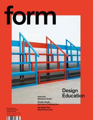
form magazine cover

The re-issued form magazine dedicated an  issue to design education. Anja Neidhardt asked me four questions, as part of her research for her article. (The issue can be read on Isuu via the form website.) Here are my answers to Anja’s questions:


At Typo Berlin (if I remember right) you said about teaching: “What we do is: We cheat”. Please explain this statement.

The context for this sentence was a longer statement about the nature of typographic and typeface design. Typography happens in contrast with other areas of design, where the functional conditions are relatively simple and the space for formal experimentation relatively wide. In the typographic disciplines we look to past practice as a guide to the assumptions that users will make in each circumstance. This happens because the design objectives are relatively complex (the information density is high) and their configurations relatively stable (a news article has a similar structure on a print newspaper as on a smartphone); and because the consumption of typographic design is iterative, and cumulative: changes take place in an environment of many similar objects used concurrently, within a continuum of experience by each user. In other words, the more radical a change, the more it needs to echo and relate to pre-existing structures and affordances. The use of visual metaphors in interface design is a typical case of this mechanism.

So, designers rely on a whole range of pre-existing decisions for their own designs to make sense. In the best case, these pre-existing conventions are consciously acknowledged; in these cases the designer can engage in depth with his subject, and improve the discipline. But in many cases designers are only partially aware of the way conventions have been formed, and how their own ideas are influenced by the design environment. In these cases, designers “cheat” in the sense that their work feeds off past projects without due recognition.


How does education in the field of typography look like today? What should be changed, and why?

It is possible to see strong growth in some areas, and early signs of risk in others. My own niche area of typeface design is experiencing strong growth, and will continue to do so for many years, in response to the globalisation of typographically complex documents, and the need to support text-intensive environments. The result is a lot of new courses at a range of levels, and a strong interest by both younger and more experienced designers to study. With regard to document-level typography (from a periodical publication to newspapers to reference works) there is a critical transformation in progress, with inadequate response by education institutions globally.

Until roughly the last decade the design and the production spheres were relatively separate, and with clear professional roles (in other words, a designer was not also the printer). The situation nowadays is different, where the “maker” may be a designer as well, or work in an environment with a lot of overlap (the person who writes the code to render a text on screen may implement a specification by someone else, but may just as easily devise the typographic specification him/herself).

This new environment, where the typographic specification has, in fact, a high overlap with the encoding of the text, places new requirements for typographic education. The easiest examples are those of “conventional” publications like novels and magazines turned into ebooks and tablet-based apps. The old model called for a relatively stable typographic specification, implemented by typesetters and printers who made the content of authors and editors appear in print. In contrast, we now have typographic specifications that are not only fluid across platforms and use scenarios, but also across time: the typographic design changes often in little steps, instead of only every few years in big ways. And, whereas the roles of authors and editors may be clear, the “makers” (designers and coders who make the content appear on each device) are now melded into multi-skilled individuals, or closely integrated teams (at least where things go well).

It is my impression that design education has not responded fast enough to the challenge of these new models of publishing, and have not acknowledged the need to respond to the demand for these new roles. Furthermore, we are now at a stage where “tradition” typographic education is at risk of falling behind. The sequence in which complex documents are migrating to screens, and the way in which content is specified, has helped establish some basic parameters for on-screen typography that makers can refer to while maintaining the readability of documents, but lacking the skills and understanding to deal with more complex information structures (this is a kind of “cheating” like that discussed above).

Colleges and universities teaching typography face the challenge of adapting to a typography that is personal, portable, responsive to its context and that of the reader’s route through texts, that references established conventions, that integrates time-based elements, and even jumps across may possible combinations of all these parameters. The ones that respond to this challenge will have strong growth ahead, but I think that the difficulty of radical change in many institutions puts typographic education at risk.


On the one hand there are many, many fonts made for the latin writing system. But on the other hand there is a lack of fonts in some countries. How can students be taught to design typefaces for languages they don’t speak?

Indeed, in recent years we see an overdue push to cover gaps in global typeface design coverage, both in wide character sets (multi-script typefaces) but also in extended typeface families in non-Latin scripts. This corrective is a response to changes in type-making and typesetting technologies, the growth in the range of documents (in the widest sense of the word) produced in global scripts, and the spread of readership in new demographics. Although digital technology liberated the type-making tools from the geographic restrictions of previous technologies, the know-how and support resources have remained, for many scripts, near the traditional centres of typeface design. It is not surprising, then, that designers who are experienced in some scripts may be called on to design typefaces in new scripts – a practice reinforced by existing professional networks and the focus on business development in English. In practice, professional designers may be expected to build experience in a whole range of related or unrelated scripts. The education challenge is then clear – and pressing, since the market is growing faster than existing designers can develop their skills.

Four areas need to be addressed for a student to develop non-native design skills (and the same for a designer experienced only in their native script):

First, and most fundamentally, an understanding of the historical development of the written and typographic script as it currently stands, with particular focus on the impact of type-making and typesetting technologies on the form of individual characters, the character set and any composition rules (esp. substitution and positioning).

Second, an exploration of the key combinations of writing tools and movements that generate “valid” letterforms and words in the script. This is particularly important in all the scripts that have a much closer relationship to written forms than the Latin (which is, in fact, the overwhelming majority).

Third, an understanding of how existing styles correspond to specific typographic structures, and how they are used in native documents. (For example, how is hierarchy, emphasis, and differentiation in tone indicated in the typography of the non-native script? What is the practice when equivalents to styles like “italic” or “thin” are not present?)

Fourth, an understanding of the tension between tradition and modernity in the context of the local visual culture. This forms the basis for progressing beyond mere adaptation towards originality and even innovation. The role that lettering can play in inspiring alternate styles is a key example of this area; another is the relationship of stroke properties to established styles (for example, in one script a monoline stroke may be considered “default and traditional” whereas in another the loos of contrast may be a radical proposition).

While developing a critical understanding of the non-native script, students also need to do some text analysis. This will give them insights into the combinations of letters and the patterns of shapes (just as a German designer will also test their Latin typeface with texts from all European languages). Unlike the four areas of learning, this is a process that is easy to share amongst designers, and pool the results, which can then be converted into common test documents.

It is, of course, important to seek feedback from native readers, but not any native reader – even if they are design professionals from the native community. Feedback needs to be sought from people who can give type-specific comments, which are fairly specialised. (Graphic designers, for example, are used to seeing type in a different scale from type designers, and tend not to understand the cumulative effects of detail changes within individual letters.) And before readers instinctively object, it is useful to be reminded that there are many examples of exceptional typefaces by non-native designers, with and – in some cases – without native feedback.

A final caveat: in Reading type design students develop native- and non-native script skills in parallel. This makes for better, deeper education, but is a different scenario from that of an already experienced designer of (for example) Latin typefaces seeking to learn how to design in another script.


Will there be another, new Erik Spiekermann? Or is time up for big stars like him?

This is a nonsense question. Erik is very successful in his field, with a high public profile – but the same can be said of many professionals in their respective fields. It is more appropriate to ask why is Erik’s success interesting, or whether his career is more revealing in relation to other high profile designers of his generation (of which, let’s be clear, there are many).

Erik’s career is notable for two reasons: firstly because, unlike other designers whose work is focused within a relatively narrow domain (such as typefaces, or posters, or transport maps, or branding) his work spans several domains: all of the ones I just mentioned, and then some. This richness of practice is illuminating in itself, regardless form the fact that in some of these cases it can be described as capturing the spirit of the times perfectly, and in a few cases even being ahead of the curve. There is a problem in this richness for those who want to capture design outputs into neat narratives, because clearly in Erik’s case there isn’t one, but multiple strands of thinking in parallel. So, the uniqueness of his work lies not in individual projects, but in the totality of his work.

The second reason Erik’s career is notable is that he has made a point of using his visibility to get key messages about design to wider audiences, and not just in the design world. Even in his most indulgent moments, the notions of rigour and process are present. He has also shown that user-sensitive, evidence-driven design does not need to be dry or visually uninspiring – a common failing in the wide information design world. And, related to this, Erik does not take himself seriously – one of the most positive personality traits one can aim for.

The second question (“is it time up for big stars”) neglects the length of Erik’s career. There are many people in the wider design world who are gradually building very strong public personas that can be expected to be just as recognisable and influential when they reach Erik’s age (and probably, give the speed with which things happen nowadays, much sooner). They are more likely to be from the “design for screens” crown (I want to avoid separating IA, UX, and so on) but there are many possible candidates.
The right kind of support

typeface publishing incentive program

In June 2013 Ampersand conference hosted an exhibition of work by students of typeface design courses, there were submissions from over 30 countries: a reminder that typeface design is an international endeavour, growing in recognition as a career with path for study and recognised professional norms. As with other professions, this maturity brings increasing competition for new designers.

Eighteen months ago Monotype initiated a Mentorship Program for designers under 30. Yesterday, Type-Together announced their Typeface Publishing Incentive Program, for graduating students. This initiative, open to all designers currently studying typeface design, recognises the pressures on designers who may have promising projects alongside financial loans, and the very real stress of “what happens after graduation?”

Like in any established profession, the careers paths of typeface design graduates are not uniform, and the demand by the market and potential employers may not match exactly with the skills and experience of graduates — this is normal, and it is one of the correctives that allows outliers to enter the profession, as well as feedback to education institutions so that they evolve. But anyone with a good understanding of the sector will regret the small number of exceptional projects developed during study that never, or very late, make it onto a foundry’s catalogue.

Type-Together and Monotype are putting their money where their mouth is, and are offering support to a promising designer for those crucial first months after graduation. This support can make the difference between a typeface with potential being developed properly, and it being lost between the Scylla of “I’ll do it when I have more time” and the Charybdis of some “free” service, for peanuts.

People will object and say that this is too little for a growing profession. I’ll counter that this may well be the beginning of a trend in companies supporting new professionals, parallel to many schemes in other sectors. It is not too far-fetched to imagine that most major foundries might soon have a similar scheme: this would allow them to get in early on potentially great typefaces, and check out a new professional (who may well end up being hired, or contracted). More widely, it allows foundries to send a clear message that they recognise and support excellence in typeface design, and — through their selections — what is innovative and worth exploring.


A few things about typeface design

Teaching on a postgraduate course feels very much like a spiral: the annual repetition of projects, each a vehicle for a journey of education and discovery for the student, blurs into cyclical clouds of shapes, paragraphs, and personalities. There seems to be little opportunity for reflection across student cohorts, and yet it is only this process that improves the process from one year to the next. Having passed the tenth anniversary of the MA Typeface Design programme was as good an opportunity as any to reflect, and ILT’s offer to publish the result an ideal environment to get some ideas out in the open. Although my perspective is unavoidably linked to the course at Reading, I think that the points I make have wider relevance.

Our students, both young and mature, often find themselves for the first time in an environment where research and rigorous discussion inform design practice. The strong focus on identifying user needs and designing within a rigorous methodology is often at odds with past experiences of design as a self-expressive enterprise: in other words, design with both feet on the ground, in response to real-world briefs. In addition, students are expected to immerse themselves in the literature of the field, and, as much as possible, contribute to the emerging discourse. (There are many more books and articles on typeface design than people generally think; some are not worth the paper they’re printed on, but some are real gems.) I shouldn’t need to argue that research, experimentation, and reflection on the design process lead not only to better designs, but better designers.

In recent years, two significant factors have started influencing attitudes to design. Firstly, as generations grow up using computers from primary school onwards, it is more difficult to identify the influence of the computer as a tool for making design decisions, rather than implementing specifications. Secondly, the trend in higher education to restructure courses as collections of discrete modules results in a compartmentalization of students’ skills and knowledge: it is becoming more difficult for the experience in one class to have an impact on the work done in another. (A third, less ubiquitous, factor   would be the diminishing importance of manual skills in rendering and form-making in design Foundation and BA/BFA courses, a subject worthy of discussion in itself.)

So, repeating the caveat that these observations are strictly personal, I offer them in the hope they will prove interesting at least to the people setting up and running new courses in typeface design, and the many designers teaching themselves.

1 Design has memory (even if many designers don’t)

Typography and typeface design are essentially founded on a four-way dialogue between the desire for identity and originality within each brief (“I want mine to be different, better, more beautiful”), the constraints of the type-making and type-setting technology, the characteristics of the rendering process (printing or illuminating), and the responses to similar conditions given by countless designers already, from centuries ago to this day. Typographic design never happens in a vacuum. A recent example is Emigre magazine: can its early period be seen without reference to the sea-change in type-making and typesetting tools of the mid-eighties? and is not its middle period a mark of emerging maturity and focusing, critically and selectively, on those conventions worth preserving in a digital domain? Emigre is important as a mirror to our responses to new conditions and opportunities, and cannot be fully appreciated just by looking at the issues. (Especially if you look at scaled-down images, rather than the poster-like original sizes!). At a more subtle level, the basic pattern of black and white, foreground and background, for “readable text” sizes has been pretty stable for centuries, and pretty impervious to stylistic treatments. Does not a type designer gain by studying how this pattern survives the rendering environments and the differentiation imposed by genre and style?

And yet, many designers have a very patchy knowledge of the history of typography and letterforms. More worryingly, students and designers alike have little opportunity to experience genre-defining objects in reality (imagine discussing a building looking only at the blueprints for building it, not walking up to it, and through its rooms). It is perhaps not surprising that the wide but shallow knowledge gained from online sources is dominant; there seems also to be little discrimination between sources that employ review and editorial mechanisms, and those that are open to wide, unchecked contributions. This shallow approach to reading and investigating results in a lack of coherent narratives, not only about how things happened, but also why. And how were similar design problems addressed under different design and production environments? What can artefacts tell us about how people made decisions in similar situations before? How did changing conditions give rise to new solutions? To paraphrase Goudy, the problem is not any more that the old-timers stole all the best ideas, but that the old ideas are in danger of being re-discovered from scratch. (Just look at the web designers rediscovering the basic principles of text typography and information design, as if these were newly-found disciplines.)

[IMAGE: Michael Hochleitner’s Ingeborg, an award-winning typeface that revisits Modern conventions with originality and humour.]

2 Design is iterative, and improved by dialogue

The process of typeface design is, in essence, a reductive refinement of ever smaller details. First ideas are just that: sketches that may offer starting points, but have to be followed by a clear methodology of structured changes, reviews, testing – and repetition of the whole process. The attention of the typeface designer must progress in ever decreasing scales of focus: from paragraph-level values on the overall density of a design, to the fundamental interplay of space and main strokes, to elements within a typeform that ensure consistency and homogeneity, and those that impart individuality and character. At the heart of this process is dialogue with the brief: what conditions of use are imposed on the new design, and what are the criteria to determine excellence in responding to the brief? (For example, how will the end users make value associations with the typeface?)

The wider the typeface family, the deeper the need to test conclusively, not only with documents that highlight the qualities of the typeface, but also with documents that approximate a wide range of possible uses. Even in cases of very tight briefs (as in the case of bespoke typefaces for corporate clients), the range of uses can be extremely broad. But good designers are also aware of the constraints of their testing environment. The misleading impression of transparency and fidelity that computer applications give, and the limitations of laser-printer output, obstruct trustworthy decisions. Designers must be aware of how looking at medium resolution printouts in dark toner on highly bleached paper can bias their decisions.

We are also seeing a gradual return to typeface design being a team enterprise, drawing on the expertise of a group rather than an individual. This, of course, is not new: typeface design in the hot-metal and phototype eras was very much a team product. But just as the digital, platform-independent formats enabled designers to function outside a heavy engineering world, so it enabled the explosion of character sets and families to unprecedented levels. The necessary skills and the sheer volume of work required for text typefaces have driven a growth of mid-size foundries, where people with complementary skills collaborate in a single product. The corollary is a rise in the need for documentation and explanation to a community of fellows. The short-lived “creative hermit” model is giving way to new models of work.

[IMAGE: Eben Sorkin’s Arrotino, a contemporary typeface with deep roots in fifteenth-century typography.]

3 Scale effects are not intuitive

The conventional curriculum for design education rarely tackles scales smaller than a postcard. More importantly, the compositional aspects of design tend to take precedence over details at the level of the paragraph, let alone the word. Typeforms for continuous reading are designed at fairly large sizes (on paper or, more usually, occupying most of a computer screen) but are experienced in much smaller sizes where their features have cumulative effects, weighted by the frequency with which specific combinations occur. These conditions arise in every text setting, be it for prose read forty centimetres away, or a sign viewed from a distance of tens of metres.

Of all the skills typeface designers need to develop, understanding how to make shapes at one scale behave a particular way in another scale is the most troublesome one. Imagining the difference that a small change in a single letter will have in a line or paragraph of typeset text is not an innate skill: it is entirely the result of practice. The best designers are the ones who will naturally ask “why does this paragraph look this way?” and try to connect the answer to specific design choices.

A common example of problems connected to scale effects arises whenever a student follows a writing tool too closely as a guide for designing typeforms: whereas the ductus (the movement of the stroke) and and the modulation can be preserved across scales without much difficulty,  the details of stroke endings and joints cannot; typographic scales demand a sensitivity to optical effects that simply do not apply at writing scales. The best examples come from typefaces designed for the extremes of text scales: for telephone directories (famously by Ladislas Mandel and Matthew Carter), Agate sizes for listings, and early typefaces for screen rendering. The smaller the size (or the coarser the rendering resolution), the more the designer primarily separates blobs and bars of white space, and only secondarily deals with style and detail.

[IMAGE: Alice Savoie’s Capucine: an award-winning typeface in a fluid modulated style that successfully integrates Latin and Greek in magazines.]

4 Tools are concepts

Regardless of the scale effects mentioned above, there is a requirement to appreciate the  link between typeface design and writing, and the tools used for writing. To be clear: I am not talking about calligraphy, but writing in the widest possible sense, from graffiti, a hasty ‘back in five minutes’ sign, to the most elaborate piece of public lettering. More than the specific forms of letters, the process of writing illuminates the patterns and combinations we are used to seeing, and gives insights into the balance of shapes and the space between them. The relationship of writing tools to the marks they make has been discussed in some depth (for the Latin script by Noordzij and Smeijers, most importantly), but the transformation of these marks through the computer much less so. (There are some texts, but mostly they focus on specific cases, rather than general principles; the notable exception is Richard Southall.)

And yet, since the early days of punchcutting, type-making involves a process of fracturing the typeforms, modularizing and looking for patterns. Later on, when the roles of designer and maker began to be distinguished (most emblematically with the Romain du Roi, like the Encyclopédie a true product of the Age of Reason) typeface design became programmatic, each typeface an instance of a class of objects, rooted in a theory of letter construction – however sensitive to human practice or aloof that may be. Later, the hot metal “pattern libraries” and the rubylith cutouts of shapes to be photographically scaled and distorted for phototype point to the same process, of abstracting the typographic shapes into elements that have little to do with the movements of a tool. As for the digital domain, deconstruction and repeatability remain key aspects of the design process.

To ensure a typeface built with fragmentary processes has internal consistency, the designer needs to develop a mental model of a tool that may follow the tracks of a writing tool, but may include mark-making and movement behaviours quite distinct from anything that is possible to render with a real writing tool. (Easy example: the parallelogram-like serifs of a slab, on a typeface with a pen-like modulation.) Such mental models for typemaking are increasingly important as type families expand into extremes of weight and width, where any relationship with a writing tool quickly evaporates. So, an invented tool that, for example, makes incised vertical strokes and pen-like bowls, can become the basis for a wide range of styles, ensuring consistency without the limitations of a specific tool; at the same time, because the model is agnostic of weight and width, it does not hinder the generation of large families with overall consistency but local richness. (Compare this approach with a wide family developed through extremes of multiple master outlines, where consistency relies on the details of typeforms having close correspondences.)

[IMAGE: A small part of Jérémie Hornus’ analysis of the Amharic script in preparation for developing his own successful typeface family.]

5 The Latin script is the odd one out

The demand for typefaces with extended character sets has been growing steadily for many years. OEM and branding typefaces are expected to cover more than one script, and often three or more. Beyond the obvious scripts of the wider European region (Cyrillic, Greek, and Latin), the interest has shifted strongly towards Arabic and the Indian scripts. But there are two key differences between the Latin typographic script, and pretty much everything else: firstly, that the type-making and typesetting equipment were developed for a simple alphabetic left-to-right model that would have to be adapted and extended to work with the complexities of the non-Latins. Although rectangular sorts will work sufficiently for the simple structure of western european languages, the model strains at the seams when the diacritics start multiplying, and pretty much collapses when the shapes people use do not fit in neat boxes, or change shape in ways that are not easy to describe algorithmically. No surprise that most non-Latin typesetting implementations make use of compromises and technical hacks to get the script to work. The second factor is that most non-Latin scripts did not experience the full profusion in styles that arises from a competitive publications market, as well as a culture of constant text production. (It’s no surprise that the language of display typography first developed in nineteenth-century Britain, in parallel with the Industrial Revolution: urbanization, rising literacy, and trade in goods and services go hand in hand with the need for typographic richness and differentiation.)

Many students (indeed, many professionals) will ask ‘Can a non-speaker design a script well for a language they do not read?’ But a typeface arises in response to a brief, which by definition taps into wider design problems. For example, many of the conventions surrounding newspapers apply regardless of the market; the constraints on the typographic specification can be deduced from the general qualities of the script and the language (e.g. can you hyphenate? how long are the words and sentences? with what range of word lengths? what is the editorial practice in the region in terms on article structure, levels of hierarchy, and headline composition?). Having established the typographic environment, we can examine the written forms of the language, and the tools that have determined the key shapes. In this matter most scripts other than the Latin (and to some degree Cyrillic) maintain a very close relationship between writing and typographic forms. Writing exercises and a structural analysis of examples can help the designer develop a feel for the script, before reading the words. More importantly, in their non-Latin work, analysis of the script’s structure and the relationship between mark-making tools and typeforms can help the designers to develop criteria for evaluating quality.

Typographic history is well populated with designers excelling in the design of scripts they could not read – indeed, the examples are some numerous that it would be difficult to choose. Encouraging students to address the complicated design problems inherent in non-Latin scripts is not only a way of enriching the global typographic environment, it is also a superb means of producing designers who can tackle a higher level of difficulty in any aspect of their design.

[IMAGE: Fernando Mello’s Frida: an award-winning typeface that redefined what is possible in Latin and Tamil typeface design.]

6 And finally…

The final lesson for students of typeface design is that a formal environment can teach the functional aspects of design, but can only help them at a distance to develop the aesthetic qualities of their typefaces. Especially when they are working in categories already heavily populated with typefaces, the distinctions between the simply good and the superb will be very refined. And when the consideration turns to originality, inventiveness, and how much a particular design causes us to rethink our responses to typeset text, then teachers have little input. The student, balancing between the deep knowledge of the specialist and the broad curiosity of the generalist, must develop, largely on their own, their capacity to be conscious of past and emerging idioms, to see their own work in the context of developing styles, and – most difficult of all – to identify how their own personal style can co-exist with the restrictions of utility and the conventions of genre.


An emerging discipline

Marc Weymann’s typeface in this issue is, like all good text typefaces, strangely familiar. Familiar, because the rhythm of black strokes and white counter spaces reminds us of so many texts we’ve read: the strokes neither loudly dark or vainly thin, and the details of the terminals respectful of the excesses of contrast and the resolution of tired eyes. Strangely so, because this veil of familiarity hides a whole range of subtle contrasts: a combination of smooth patterns reminiscent of formal writing with nibs, and the sharp clarity of letters carved in stone.

Marc’s typeface is misleadingly gentle with its references, but rewarding closer inspection. Other typefaces for text are much less discreet, forcefully calling attention to their novelty, even as they still respect that set of conventions that allow us to read comfortably. Jeremy Tankard’s Fenland, probably the most notable of typefaces published in 2011, takes the ancient paradigms derived from writing tools, and throws them aside for the sake of shapes reminding of discarded piping; its stroke joints challenge the instincts embedded in most modulated text typefaces of the last few centuries. Yes, expectations confounded, it proceeds to space the letters on exactly the same underlying pattern as Formal, as respectful of the reader’s eyes as any.

Formal and Fenland
Formal keeps its cross-strokes and bowls closely aligned to the modulation of a broad nib, adding an incised overtone in the underside of the top serifs, the top side of the lower ones, and open curves such as the outside terminals of the ’s’. By contrast, Fenland makes it difficult to talk about a consistent angle of stress: cross-strokes and bows have a discernible reverse stress (reminiscent of shapes in eastern scripts) but allows the modulation to change as if the writing tool was rotated halfway through the stroke. The ’s’ is typical of this approach, reversing completely the traditional notion of the diagonal cross-stroke as a dominant feature.

Typeface design involves, at the most basic level, decisions on shapes at the level of the letter, the line, and the paragraph. I use this definition intentionally, to make the point that design decisions are not circumscribed by the immediately manipulable (in the case of digital fonts: the glyph outlines, or the spacing interface, or the code for positioning and substitutions). Indeed, typeface design decisions happen at the tip of a siphon, where a whole range of considerations about readers, texts, typesetting environments, and wider cultural concerns get distilled into virtual nudges of points or mouse drags.

In other words, a typeface designer is conscious of the context surrounding his field of practice – in the narrow sense of the typeface design industry, in the intermediate sense of typographic design for documents (where typefaces are but one of the constituent elements), and in the wider sense of design as interaction with a visually rich and refined culture.

This is what makes typeface design such an interesting area to work in: it is a context-driven discipline, where past practice, conditions of use, user perspective, and invested meaning all weigh heavily in design decisions. Indeed, professional experience in typeface design is primarily reflected in the depth of understanding of these wider considerations, the clarity with which these can be translated into typeforms, and the insight with which this context can be married to a personal creative voice.  If we want proof of this, we need only look at the older generations of typeface designers, who – working ,more often than not, on decades-old applications – still produce new designs that contribute fundamentally to our typographic libraries.

Formal and Fenland
Despite their very different texture, both typefaces follow a very consistent pattern in their fitting. Notably, Fenland avoids the typical problem of sans typefaces having overly narrow sidebearings in letters with vertical strokes. This more open underlying pattern ensures the typeface remains perfectly readable in smaller sizes.

This approach can be seen most clearly with work in scripts that the designer is unfamiliar with, and in any case cannot read fluently. In this scenario, design decisions cannot be trusted without an engagement with the characteristics of the script, an understanding of the way the typeforms of the script have responded to changes in type-making and typesetting technologies, and an appreciation of the typographic conventions for the genre of documents the typeface is intended for. In fact, the closer the connection of the script to its written form, and the more complex its typesetting, the more important it is that the designer engage intimately with these considerations. This approach places four-plus-one conditions on multi-script typeface design. First, that the designer has access to historical and contemporary artefacts: books and other printed material, ephemera, type-making and typesetting equipment. Second, access to primary sources: texts and material such as drawings produced during the type-making process. Third, access to secondary sources: texts written by type makers about type-making, and designers about their practice. Fourth, interpretative sources: texts by researchers such as historians and theorists on the development of type design. The ‘plus-one’ is a framework for integrating research into design practice that enriches the designer’s understanding, and unlocks informed creativity.

It is not difficult to see the connection  between these conditions and the growth in formal education in typeface design, largely in parallel across the world. In fact, typeface design is in some ways leading a gradual shift in the wider design education sector, away from a paradigm of silently reflective responses towards user-centred, research–informed design practice. This approach is typical for a research-based discipline in the humanities. It is, though, alien to design taught in art colleges and institutions based on practice teaching outside of context, on the model of apprenticeships.

Brill and Brill Greek
Typeface design across scripts: the Brill typeface, developed for the Dutch academic publisher by John Hudson, covers a wide range of languages and is developed specifically for text-intensive typesetting. The forms of the letters in the two scripts here are quite different, to respect the typographic traditions of each script. The overall typographic colour is similar in tone, allowing the texts to differentiate solely though the differences in typographic texture.

These considerations are not purely an academic matter. In the last decade we have witnessed a rapid growth in the demand for typefaces with very large character sets spanning many scripts. Pan-european typefaces with several hundred characters are often just a starting point, with Arabic or several Indian scripts added during the typeface’s lifetime. More recently we have seen notable growth in Armenian, as well as East Asian and South-East Asian scripts like Korean, Thai, Khmer, and Burmese. This demand, driven by an expansion of communication services and globalised branding, has pushed typeface design towards a level of effort that rewards teamwork, and the gradual building of expertise, through the combination of formal and self-directed study, and professional activity.

This is the environment in which we should seek to educate typeface designers: to expect them to ask questions about their practice, and seek answers through research. Indeed, we should see type design skills as inseparable from research skills, and an enquiring attitude. We should expect designers to engage with their field actively, and to write: to produce knowledge about their discipline. Seeing design activity as wider and deeper than any individual project is a key characteristic of the transition of typeface design towards a fully-established discipline.

Lost for words

[Preamble]

A couple of years or so ago I started discussions with Linotype on student bundles for typography students.My first sketch at a very compact set was this: 

DIN Next  Light, Regular, Bold, Black  |  Light Italic, Italic 

Malabar  Regular, Bold  |  Italic

Really No 2  Light, Regular, Medium, Demi  |  Italic, Medium Italic

Trade Gothic   Light, Roman, Bold, Condensed #18 and #20  |  Oblique, Condensed #18 Oblique

(You can tell I’ve got little use for bold italics…)

The company responded positively, and expanded on my initial proposal with many more fonts, producing eventually a Type Designer Education Pack Catalog that has been a hit with our BA students. The typeface combinations are great for the kind of text-intensive, hierarchically-rich typography we require in our projects. It has also been great to be able to offer incoming students a legal way to begin building their font libraries. 

A few weeks ago Dan and James asked me to write a few words for a specimen featuring typefaces from this collection, on the theme of classic typefaces. (They typeset the text in Harmonia Sans by Jim Wasco, one of the nicest people in the type industry).

This is what I sent them:

[End of preamble]


The typographer’s pack

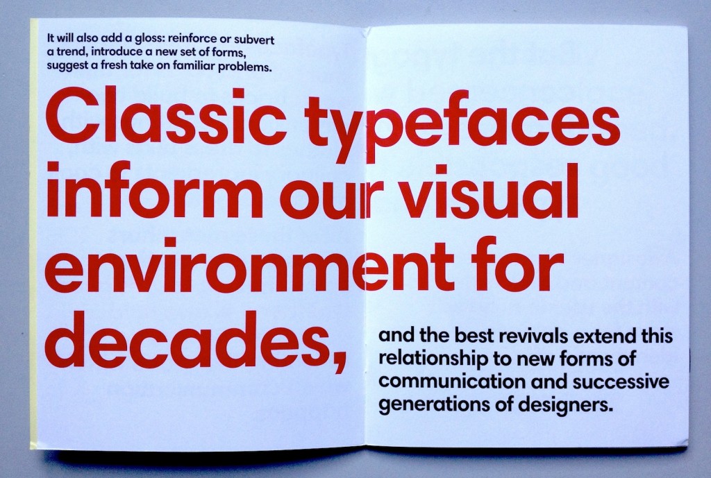
Typeface designers are not short of analogies for their work: bricks to build two-dimensional buildings with, clothes to dress texts with, culinary ingredients to cook documents with. All of these metaphors are helpful as starting points, but a well-designed typeface will also hold up a mirror to its time, reflecting the space within which communication happens. It will also add a gloss: reinforce or subvert a trend, introduce a new set of forms, suggest a fresh take on familiar problems. Classic typefaces inform our visual environment for decades, and the best revivals extend this relationship to new forms of communication and successive generations of designers.

But the typographer is rarely concerned with single typeface families. At the heart of informed, responsible typography lies good typeface choice. A designer who respects the content and makes decisions with the user in mind will strive for a balance between identity and efficiency. These choices happen on a sea of type choices, where (for anything more than a simple sign) several kinds of information need to be visually differentiated, yet balanced and coordinated.

The best typefaces for text-intensive documents have subtle individuality. The balance of counters and blacks might sit comfortably within that ancient sweet spot of typographic density for reading, yet the texture of the paragraph will be delicately self-conscious and subversive. One or two letterforms might step out of line (like the Neo Sans “g”, and the giddy “s” in Trade Gothic). Others might keep to the overall rhythm of good typography while whistling to a tune you can’t quite place: the rootless Really No 2, the deeply rooted Malabar. Yet others stake a claim and own that space forever, marking any interlopers as imitators: DIN and Frutiger, and Swift.

None of these typefaces can be described as indulgent, save for the occasionally too-wide family. But in their combinations they offer an exceptionally rich typographic palette.And this is where the type-fun begins: give me the millions of possible combinations, to discover the ones that not only do the job, but make the document memorable, and a pleasure to read.

Od „Ala Ma Kota” Do E-Matury slides

These are the slides from my presentation at the Od „Ala Ma Kota” Do E-Matury conference in Warsaw, on 18 April 2012. The talks were 16 minutes long, so this is a fairly condensed deck. As always, my slides are starting points for each idea; there’s about a minute’s worth of elaboration for the key ones. I’ve been asked to write the talk up, and I’ll link to that when it goes public.

Ala Ma Kota conference slide 1
“It’s typography, Jim, but not as we know it…”

Six observations, four challenges, one conclusion, and five predictions…

Ala Ma Kota conference slide 2
Observations
Ala Ma Kota conference slide 3
People run out of time faster than they run out of options
Ala Ma Kota conference slide 4
There’s no such thing as “new media”, only new users
Ala Ma Kota conference slide 5
Internationalisation and geography matter
Ala Ma Kota conference slide 6
The permanent and ephemeral are reversed
Ala Ma Kota conference slide 7
Materials become precious
Ala Ma Kota conference slide 8
The market does not wait for teachers to write lesson plans
Ala Ma Kota conference slide 9
Physical properties are no help in predicting potential uses
Ala Ma Kota conference slide 10
Challenges for designers
Ala Ma Kota conference slide 11
Support for text and typography is not Good Enough
Ala Ma Kota conference slide 12
Support for text and typography is not Good Enough
Ala Ma Kota conference slide 13
Typographers lose the reassurance of familiar, visible, tactile structures
Ala Ma Kota conference slide 14
(A conventional structure is defined by spreads and sequence in the bound object)
Ala Ma Kota conference slide 15
(An e-publication’s structure relies on content sections…)
Ala Ma Kota conference slide 16
(…which are not differentiated without reference to external navigation)
Ala Ma Kota conference slide 17
(…and therefore rely on the root-level navigation for the publication to explain itself)
Ala Ma Kota conference slide 18
We lack great models for integrating inline and immersive content
Ala Ma Kota conference slide 19
Texts are becoming nodes in networks, but typography has been volume-bound 
Ala Ma Kota conference slide 20
(A single of the sections we identified has four aspects that traditional typography has no solution for:) 
Ala Ma Kota conference slide 21
(links within the text to other texts,)
Ala Ma Kota conference slide 22
(annotations by the user,)
Ala Ma Kota conference slide 23
(annotations by other users,)
Ala Ma Kota conference slide 24
(and links within the annotations.)
Ala Ma Kota conference slide 25
(Developments in literature, which is easy to parse, show some ways forward) 
Ala Ma Kota conference slide 26
(uncovering meaningful connections in the text)
Ala Ma Kota conference slide 27
Conclusion
Ala Ma Kota conference slide 28
This emerging typography is traditional at the paragraph level, and potentially innovative at the semantic level 
Ala Ma Kota conference slide 29
Predictions 
Ala Ma Kota conference slide 30
Three to five years of conservative solutions: just ‘digital books’
Ala Ma Kota conference slide 31
Local interfaces will adopt traditional solutions
Ala Ma Kota conference slide 32
Personal aggregators will threaten traditional authorship models
Ala Ma Kota conference slide 33
Knowledge platforms will push beyond ‘digital books’ when trust systems mature
Ala Ma Kota conference slide 34
Authors, publishers, and students will continue to adapt much faster than teachers (and schools, and education authorities)
Ala Ma Kota conference slide 35
Thank you


Sans serif options

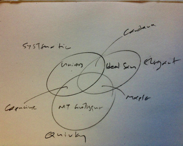
An impromptu Venn diagram to help explain a point about styles for a sans serif student project, from earlier today.

The three circles are Systematic / Elegant / Quirky. The typefaces fully in each are Univers, Ideal Sans, and MT Grotesque. The Systematic/Elegant one is Candara, the Systematic/Quirky is Capucine, and the Quirky/Elegant is Maple. Nothing in the centre.

Explaining typeface design

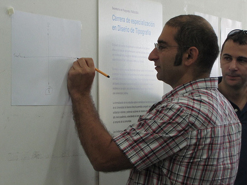
This morning Fiona, Peter Bil’ak and I visited the UBA to see some of the work of the postgraduates on the UBA course (see the Typography at Reading blog). One of Henrique Nardi’s images captured me sketching an aide memoire for the session, which is worth linking to here to have handy for the sessions next week.

The axes describe a simple framework for talking about typeface design projects. At the top of the diagram is the Designer, and at the bottom the brief (and the client, who represent the requirements of the users). The left of the horizontal axis represents the Functional requirements in the project, and to the right the expression of individuality and Identity through the design of the typeface.

Τριτοβάθμια εκπαίδευση γραφιστικής (2010)

Δύο απαντήσεις για την τριτοβάθμια εκπαίδευση στην γραφιστική στην Ελλάδα


Θανάσης Αντωνίου Ποια είναι η εικόνα που έχετε για το συνολικό επίπεδο της ελληνικής επαγγελματικής εκπαίδευσης πάνω στο γραφιστικό σχεδιασμό και ποια είναι η σχέση του με το αντίστοιχο επίπεδο στην αγγλική πανεπιστημιακή εκπαίδευση;

ΓΛ Η εικόνα που έχω για την επαγγελματική εκπαίδευση στο χώρο μας στην Ελλαδα ειναι δειγματολειπτικη και εξ αποστάσεως, συνεπως ελλειπής και αναξιόπιστη. Στο βαθμό που ενδιαφέρει, φαίνεται οτι σε γενικές γραμμές προσανατολίζεται στην κατάρτιση, δηλαδή το χτίσιμο δεξιοτήτων για επαγγελματίες, παρά την εκπαίδευση, δηλαδή την ανάπτυξη μιας ευρύτερης αντίληψης για το χώρο της τυπογραφίας και τη αναμιξη με την έρευνα στο χώρο. Με άλλα λόγια ο σχεδιασμός δεν πρέπει να περιορίζεται στην επίλυση ενός συγκεκριμένου προβλήματος (o σχεδιαστής ως problem-solver) αλλά να επεκτείνεται στην αλληλεπίδραση με το πολιτισμικό πλαίσιο (ο σχεδιαστής ως cultural commentator), και την καινοτομία στο χώρο (o σχεδιαστής ως innovator). Αυτή η εξάπλωση της αντίληψης του επαγγελματία ως παράγοντα που συμμετέχει και πιθανά συνεισφέρει στο γνωστικό χώρο είναι μια εξέλιξη που δε μπορεί να κινητοποιηθεί μέσα από την αγορά εργασίας, παρά από τις διάφορες σχολές. (Η σύγκριση με την αρχιτεκτονική ως χώρο έρευνας, εκπαίδευσης, και επαγελματικής δραστηριοποίησης προσφέρει το πιο πρόσφορο παράδειγμα.)
Θανάσης Αντωνίου Γιατί μέχρι σήμερα η δημόσια εκπαίδευση στη γραφιστική, έτσι όπως ασκείται στο ΤΕΙ της Αθήνας, δεν ΄χει καταφέρει να αποκτήσει εκτόπισμα στην ελληνική αγορά και να αντιμετωπίσει την πρωτοκαθεδρία των ιδιωτικών σχολών; Είναι μόνο ζήτημα χρημάτων; Είναι ζήτημα προσωπικοτήτων- διδασκόντων; Ή έχει να κάνει με τη γενικότερη κακοδαιμονία της εκπαίδευσης στην Ελλάδα;

ΓΛ Δυστυχώς δεν μου έχει δοθεί η ευκαιρία να γνωρίσω το πρόγραμμα των ΤΕΙ απο κοντά, οπότε δε μπορώ να εκφέρω γνώμη. Υπάρχουν όμως κάποιες παράμετροι που ισύχουν γενικότερα, που διαφοροποιούν τη δημόσια από την ιδιωτική εκπαίδευση στο χώρο. Πρώτα από όλα η συνέχεια και η μακροπρόθεσμη προοπτική: ένα δημόσιο πρόγραμμα μπορεί να ενσωματώσει πηγές και εμπειρία ετών, θέτοντας στόχους για την ευρύτερη διαμόρφωση του χώρου (για παράδειγμα την παραγωγή ερευνητών και διδασκόντων της επόμενης γενιάς). Δεύτερον, η επένδυση σε υλικοτεχνική υποδομή (π.χ. εκτυπωτικές μηχανές) και αρχειακό υλικό (π.χ. συλλογές εντύπων και αντικειμένων) που συνεισφέρουν όχι μόνο στην βαθύτερη κατανόηση του αντικειμένου, αλλά και στην ενθάρρυνση της έρευνας στο χώρο, και της αναβάθμισης του γνωστικού χώρου στην ευρύτερη κοινωνία. Τρίτο, η υποστήριξη διδασκόντων με μεγάλο βαθμό απασχόλησης με στόχο την καλλιέργεια αρίστων τεχνικών διδασκαλίας, αλλά και την παραγωγή ερευνητικού έργου. Με άλλα λόγια, η διεθνής εμπειρία δείχνει ότι ενώ τα ιδιωτικά ιδρύματα προσανατολίζονται στην άμεση εξυπηρέτηση της αγοράς, τα δημόσια ιδρύματα έχουν τη δυνατότητα να παράγουν γνώση, και να αναπτύξουν τον γνωστικό πεδίο στο οποίο στηρίζεται η επαγγελματική δραστηριότητα. Τέλος, υπάρχει και ένας ουσιαστικός κίνδυνος από τον οποία νομίζω ότι υποφέρουν τα ΤΕΙ: ενώ το Κράτος πρέπει να χρηματοδοτεί τις σχολές, πέραν τούτου πρέπει απλά να εμπιστεύεται τους ερευνητές και διδάσκοντες να σχηματίσουν οι ίδιοι τα προγράμματα σπουδών με ευελιξία και με ευαισθησία στην εξέλιξη του χώρου, χωρίς άλλη ανάμιξη.