InstaFonts

For some years now I have stopped trying to spot all MATD projects completed and used in high profile publications, OEM installations, and the like. But there is one new implementation worth commenting on. The latest update to Instapaper includes six new typefaces, including two that started as MATD student projects: FF Tisa by Mitja Miklavčič and Elena by Nicole Dotin (The original specimens for Tisa (2006) and Elena (2007) are interesting if you are into the type-spotting thing). It is telling both of the skills of the designers, and the clarity of the original briefs that what are, in essence, _tools for learning_ become commercially successful typefaces of the highest calibre.

The six new typefaces include three by designers at the peak of the profession (Ideal Sans, Proxima Nova, and FF Meta) but also Lyon Text, a typeface designed by Kai Bernau in 2009–10; Kai graduated from the KABK in The Hague in 2006. The presence of three young designers in this list is as good a sign as any that the field of typeface design as a whole is growing healthily, rejuvenating its ranks and seeding the pool of designers with new talent. I know that Jonathan, Tobias, Mark, and Erik would agree with me that the selection sends a very positive message on the state of typeface design today.

Of course, you could argue “Big deal. New typefaces are published all the time, why are these more important?” The reason is partly personal: I spend a big part of my reading hours looking at Instapaper, both on the iPhone and iPad. Up to now I’ve been using Georgia, ignoring most of the rest (and quietly hoping that a couple would vanish from every interface I come across). But there are two more reasons, worthy of more consideration than my reading habits.

Firstly, I am fairly certain that environments that allow us to collect our own content stream will keep growing, and exponentially so once we figure a good way to introduce this practice in education.

Secondly, because the selection process has been partly documented without the assumption that new typefaces were needed. Marco Arment’s posts (Learning from competition originally, and the announcement linked to at the beginning of this post) are a good introduction to how people recognise the need for new typefaces, and come to appreciate their value. Although his investigations into typefaces started as a response to competition, his enthusiastic description of the improvement in the reading experience is a confirmation of the effort by typeface designers. For an app like Instapaper, so closely focused on the reading experience, the right typeface can make a huge difference to its sustained adoption.

Georgia, thank you for the ride so far.

InstaElena_iPad1.PNG


Information Design and Typography

[I got asked yesterday by a student in another university “what Information Design (and especially Typography) means to you”, and dumped this out over breakfast; I post it “as is” to avoid going into the black hole of perpetual editing.]


Firstly, typography: this depends on the institutional viewpoint, and the language*. In the English-speaknig world it is a continuum. At one end it refers to the the design of texts at the paragraph level, covering type choice, line measurements, and similar micro-typographic choices. At the other end typography encompasses all choices relating to the construction of a document as a carrier of information that readers engage with because they want or need this information. The critical distinction lies in the engagement with the text: typography, in its wider definition, covers a range of macro choices at the level of the spread, the document as a sequential experience, and the production of a physical or on-screen object.

Information Design covers typographic design where the engagement of the readers with the text is critical and has specific objectives. Navigation (wayfinding, way-showing, route-mapping, and any of a number of similar terms), safety, instruction, and training are the most common applications. At the heart of Information Design is a user-based perspective, and the imperative to test design solutions. As design scenarios migrate to screen-based environments, especially mobile devices, the potential for customisation of information design to each user is increasingly important in its methodology.

My view is that “static” Information Design on fixed substrates (paper, vinyl sheets, plexiglass signs, and so on) is fundamentally different from Information Design on digital environments. In the first case, it strives to maximise the efficiency of the message and eliminate ambiguity for the largest section of the intended audience. In the second, it has the additional function of maximising the value of the information to the specific demands of the user. This is an additional motivation for the reader to engage with the document, and a much more interesting challenge for the designer. Customised paper documents (e.g. utility bills) have tried to bridge the gap between these two poles, with some success, although clearly they will rapidly give way to screen-based versions.

Of course, in all cases Information Design has to carry the identity of the publisher. This is in itself a separate design challenge, usually addressed by aggregating the effect of the designed objects rather than an individual document. For example, a sign system brands a building through the consistency of its appearance, just as much as by the range of the scenarios it enables.


  • In Spanish-speaking countries “tipografia” means “type design”. This, as you can imagine, leads to no end of confusions and clarifications.

Sans serif options

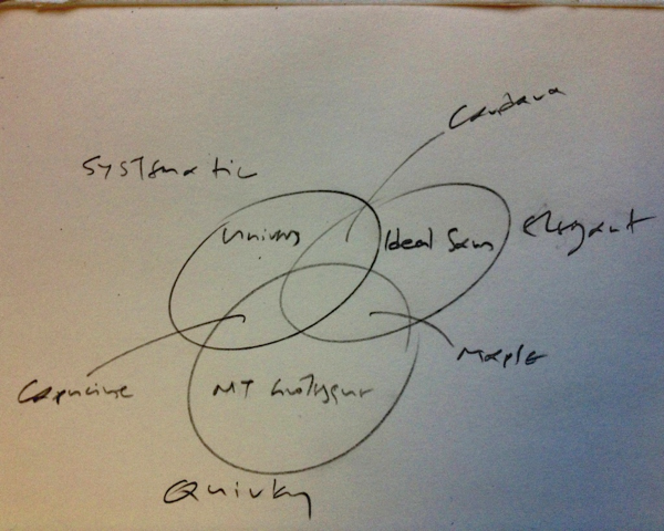
An impromptu Venn diagram to help explain a point about styles for a sans serif student project, from earlier today.

The three circles are Systematic / Elegant / Quirky. The typefaces fully in each are Univers, Ideal Sans, and MT Grotesque. The Systematic/Elegant one is Candara, the Systematic/Quirky is Capucine, and the Quirky/Elegant is Maple. Nothing in the centre.

Preparation for Greek typeface design

Here is a short list of references for students beginning to work on Greek. It is not exhaustive by any measure, only a starting point. I list some historical texts, for the necessary grounding in the development of the [typographic] script, and some typefaces that are good examples of practice. (Don’t get all worked up about the typefaces on the list: each one listed may have unresolved issues, just as many good ones may not be listed. This is, after all, an introductory list. Also, I only include work I know in detail.) All texts are in English. (For MATD students: all items exist in the University Library, or the Department Reading Room, and in my office.)

Manuscripts and writing 

Books with manuscripts and images of rare books might be good; there are some truly comprehensive editions of Greek manuscripts (like Greek literary hands by C H Roberts, in two volumes, and Repertorium der griechishen Kopisten, in three volumes. It is important to get a feeling for Greek writing, as it is (and was) done on entirely different models than western writing. In short, the the arm rotates freely, and the nibs (when not round) are cut with an opposite bias. If the titles above are not available, look up sources on Byzantine scribes. (But note: if you do general searches online, you must focus on secular or less formal documents, rather than the very ornate manuscripts of the Empire.)

As with all unfamiliar scripts, doing some writing exercises is essential to understand the entry and exit strokes, and the structure of the letterforms. I have included two sheets for practice in a zipped archive; use a pencil or other “direction-agnostic” tool when starting with writing exercises.

Typographic history

Victor Scholderer’s Greek printing types 1465–1927 catalogue is a good historical introduction. It stops in 1927, and has a specific bias. Scholderer outlines helpfully the three early strands of Greek typeface “design”: the upright joined style of Zacharias Kalliergis, the eventually dominant Aldine style, and the short-lived Complutensian. (I put “design” in quotes since “typemaking” would be more appropriate term. Our current interpretation of “design” implies a level of deliberation an reflection that did not apply at the time.) There is a somewhat rare original (500 copies only, grab one if you find it on sale) and a reprint from 2004 or so, with new essays by John Bowman and Martin Davies added. (Oak Knoll sells it in the US, and independent booksellers elsewhere.) The original has some exceptional reproductions in collotype, worth the price of purchase alone.

If you read this you can safely skip Robert Proctor’s The printing of Greek in the fifteenth century (1900), the other key text for early Greek printing, which is also more limited in coverage. (If interested, you can get a free PDF of Proctor’s book.)

H. D. L. Vervliet had published significant texts on the history of Greek typefaces. The Journal of the Printing Historical Society has two relevant articles: “Greek printing types of the French Renaissance: the ‘grecs du roy’ and their successors” (in new series no 2, 2000) and “The Greek typefaces of the early French Renaissance” (in New Series no 4, 2002).

John Bowman’s Greek printing types in Britain: from the late eighteenth to the early twentieth century is based on his PhD (Reading, 1988). It is interesting in its totality, but has an invaluable second chapter where forms from different typefaces are compared. It is published by Typofilia, and should be available to order via independent booksellers.

Michael Macrakis’s Greek Letters: from tablets to pixels has some articles that are very useful, and a few that are not very helpful, or under-researched. Some are out of date. But John Bowman and John Lane’s are essential reading.

I wrote an article in Language, Culture, Type (ed. John D Berry, ATypI/Graphis 2002) with some basic ideas on the development of Greek typeface design. Also, I posted a couple of short texts on Typophile, one in a thread on Garamond Premier Pro encapsulating the history of Greek typefaces, and one on Greek scripts that comments on the model that designers need to have in mind.

There are also some useful comments on parallel script development in the booklet produced by Microsoft to document the development of the ClearType typefaces, Now read this (2003). According to a recent Typophile thread, it may eventually be available as a PDF. Regardless, the typefaces are relatively easy to view, since they are available with Microsoft Office.

Typefaces to study

In addition to the historical examples illustrated in the publications above, it is worth studying good examples. My list below is not exhaustive, and is only focused on text-intensive typefaces.

– Start with the Didot Greeks, which defined the contemporary modulated-stroke style; and

– the Monotype hot metal monoline / low contrast Greeks, which were models for Greek adaptations of Latin sans serifs

I omit on purpose the first batch of phototypesetting Greek typefaces, which were intentionally “Latinised”. Contemporary digital typefaces to look at:

– the ClearType family: the Greeks in all are good enough, but Gary Munch’s Candara is a superb example of fresh thinking.

– Robert Slimbach’s modulated Greeks: Garamond Premiere Pro offers a re-interpretation of a historical standard; Arno Pro, a versatile update of a calligraphy-inspired family, and the relatively new Adobe Text Pro (which always makes me think “This is what Times Greek should look like!”).

– Jeremy Tankard’s Greek typefaces: his Bliss Pro (as well as the CT Corbel) are exemplary low-modulation Greeks.

– Frantisek Storm’s Anselm Sans Pro and Anselm Serif Pro show a successful adaptation of Greek to a very eclectic style.

– Peter Bilak’s Fedra Greeks (the family is massive, and in the serif styles I strongly prefer Serif B over A). The extensive weights and styles of Fedra have made it extremely popular within Greece in recent years, mostly in newspapers and magazines.

– Hoefler & Frere-Jones’ Whitney Greek, a very good example of a Greek extension to a successful Latin family

Last but not least, John Hudson’s SBL Greek is probably the best updating of the traditional Didot style, with a twist. It has a massive character set, but unfortunately only one weight. It is a free download from the SBL site.

There have been some very good custom jobs, like the Vodafone Greek corporate typeface done a few years back by DaltonMaag (unfortunately the site does not show the Greek portion of the job) and the localised Cheltenham for the Greek edition of the New York Times (not easily seen online, if you don’t know Greek). Others are similarly difficult to see.

Student typefaces

Some very good Greek typefaces have been designed by students at the MATD. Here’s a small selection:

– Ben Jones’ Emrys (2011), an interpretation of a low-contrast style with an incised feel.

Toshi Omagari’s Marco (2011), a contemporary modulated style.

– Riccardo De Franceschi’s Ginnasio (2010), a typeface for reference editions.

– Alice Savoie’s Capucine (2007), a novel style reminiscent of a modulated brush stroke. The typeface is now published commercially by Process Type Foundry.

Postscript: letter grouping

If you are starting to design Greek letters, it is good to avoid the alphabetic sequence. A good basic set to begin with is alpha / epsilon / eta / iota / mu / rho (α, ε, η, ι, μ, ρ) which give a structure to the main counters, and some form to instrokes and outstrokes. This sequence will also allow many typical test words, such as είμαι, αίμα, ηρεμία, άρμη, ρήμα, ημέρα, ερημιά.

Try to group letters by their features. Here’s one grouping:

αδορσυωφβθ  ες  ηιμ  γνχλ  ζξ  κ  πτ  ψ[φ long]

And another (with thanks to IV):

αηιμυ ψφ βδεθορσω  πτ  ζξς  γκλνχ
Explaining typeface design

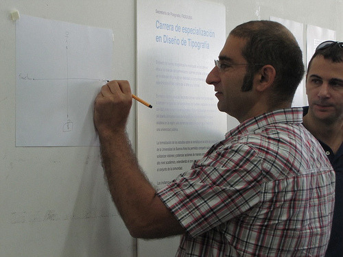
This morning Fiona, Peter Bil’ak and I visited the UBA to see some of the work of the postgraduates on the UBA course (see the Typography at Reading blog). One of Henrique Nardi’s images captured me sketching an aide memoire for the session, which is worth linking to here to have handy for the sessions next week.

The axes describe a simple framework for talking about typeface design projects. At the top of the diagram is the Designer, and at the bottom the brief (and the client, who represent the requirements of the users). The left of the horizontal axis represents the Functional requirements in the project, and to the right the expression of individuality and Identity through the design of the typeface.

Palettes are evil

In a recent piece for #Eye80 I lamented the loss of insight in document design that the vertical flat screen and zoom brought. I also dropped an aside that “palettes are evil”. I wasn’t clear enough, and confused @mmBubbleTea who thought I meant colour palettes. I meant the interface ones, and I apologise for the confusion. I might as well explain briefly why I don’t like palettes.

When the basic conventions for interfacing with apps got established, apps couldn’t perform the amount of operations we see in pro apps today. Even on smaller screens, there was enough space to fit a range of commands. But as features increase, there is an increasing competition for screen real estate: the document (your constant focus) versus the chrome of the app (and the OS, of course – not so much on Windows, but very much so until recently on the Mac). The problem is not only that the vital area of the screen decreases, as more selections and commands need to be accommodated; it is that only a few of those are you likely to need to select.

As apps often compete on features, and propagate those from one category of app to another (e.g. vector commands to a page layout application) the number of possible choices balloon. Palettes then become an exercise in squeezing options in. This happens on two levels: one, grouping related options and fitting them on a single object on screen; and second, the management of all the possible groupings. Adobe apps are particularly problematic in this respect: there simply are too many things to add, leading to problems at both levels: what to put in each group (palette) and how to manage the various palettes themselves.

Look at this screenshot, for example: I am designing at the level of a paragraph, but cannot see the options for both paragraph styles (the basis for my design choices) and the “local” paragraph palette. I cannot see both paragraph and character styles at the same time, without “unhooking” the palette from the column. This is problematic, as I then have the absurd situation in the second image, where the “heading” of the palette floats over the document, and the palette hangs to its left. (Bad luck if your focus was the text underneath!)

InDesign screen shot

The first image also shows a big problem with the secondary options, which are enabled by a really small button, next to the “retract palette” one. A big secondary surface (actually, tertiary, if you count the column of palettes)  opens up, covering yet more of your screen, in a visual style that departs completely from the language established by the column and the hanging palettes. And I can’t keep the damn thing open, even though things like “Keep options” might be pretty useful to have hanging around (pun unintended).

Indesign screenshot
And why  do I need three palettes to design a table? In my typographer’s mind the table is a single object, with a cascade of attributes. Can I please see all in one go? Of course, the explanation is obvious: the design interface follows the engineering, rather than the other way round. The app applies attributes in discreet levels (document, object, paragraph, word, and so on) and the palettes follow this structure.

In recent years we have seen app developers trying to second-guess what the designer is working on, and what they might want to do. They then try to provide only the pertinent options. (Cue Office’s ribbon, or indeed InDesign’s “workspace”.) Apps that are unencumbered by legacy features have tried smarter interfaces (Pixelmator and Acorn come to mind), although their developers are having to say clearly that feature parity with Photoshop, for example, is not their objective. This may be a good thing, and presage the current approach of tablet apps, where one-app-for-all models are eschewed for the “does a few things really well” approach.

The wider problem of interface design for command-heavy apps is whether the developer thinks about the design process in ways parallel to the designer (cough, Fontlab, cough!). Designers usually think about a cluster of attributes at the same time, and work in their mind with relative terms. They have to translate these to specific (and often meaningless) measurements, which detract from the real: the pattern of form and counterform, foreground and background.

Here’s a simplistic example. Let’s say I need to make some decisions about these two lines:

apples and oranges

Should I really be thinking separately about type size and linespacing? Column width and depth? In what units? Actually, I tend to think in fruit:

apples and oranges

It doesn’t matter what the units are, and indeed the tendency of apps to snap to “neat” round numbers is a big problem. I think only of relative relationships, how much is this in relation to that, and them to the other? And, if I’m more careful, I’m really thinking of the white space surrounding the column as an integral part of the paragraph, rather than as an attribute of the containing frame. So, what I want is a design environment that reflect my thinking – not an app that requires me to translate design decisions based on relative proportions into a set of discreet, unrelated measurements.

fruit in a box

Finally, the elephant in the room: the screen size on which we are working. Whereas large screens are becoming ever more affordable, we are seeing more complex tasks performed on tablets (okay, on iPads). We won’t see page layout apps rushing to migrate to the iPad, although the argument for some editing on-the-go cannot be avoided. But we are already seeing many good image editing apps on the iPad, and it is not a huge leap of the imagination to think of a web-based layout environment with a client on the app.

Well, that was a rant and a half.

What, how, why

I recently saw Simon Sinek’s How great leaders inspire action TED talk (linked to in the Open letter to BlackBerry bosses, via @daringfireball ). It is slightly evangelical in tone, but the core message survives scrutiny. The idea that sustainable actions flow from a vision, rather than objectives, is worthy, as are the implied messages of clarity, simplicity, and direct accountability. This approach applies particularly well when seen in a context where the outcomes are not gizmos (physical products of any kind) but new conditions for people.

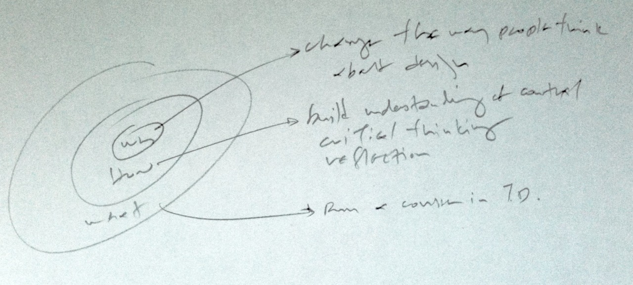
I wondered how it applied to my direct environment, and scribbled the concentric Why / How / What above. Deciphered, it reads:

• Why: change the way people think about design

• How: build understanding of context | critical thinking | reflection

• What: run a course in TD [typeface design]

One of my ways to test the model was to put different things in the last line (our actions) and still the cascade makes sense. It works for the TDi summer course, and it works when the model for our new course, soon to be outlined in New Orleans.

It also explains, for me, why so many people connected to the MATD go out there and do stuff. Conferences, meetings, jam sessions, things that are driven by a deeper desire to change the way people think about design and typography.

I’m okay with that.

Τριτοβάθμια εκπαίδευση γραφιστικής (2010)

Δύο απαντήσεις για την τριτοβάθμια εκπαίδευση στην γραφιστική στην Ελλάδα


Θανάσης Αντωνίου Ποια είναι η εικόνα που έχετε για το συνολικό επίπεδο της ελληνικής επαγγελματικής εκπαίδευσης πάνω στο γραφιστικό σχεδιασμό και ποια είναι η σχέση του με το αντίστοιχο επίπεδο στην αγγλική πανεπιστημιακή εκπαίδευση;

ΓΛ Η εικόνα που έχω για την επαγγελματική εκπαίδευση στο χώρο μας στην Ελλαδα ειναι δειγματολειπτικη και εξ αποστάσεως, συνεπως ελλειπής και αναξιόπιστη. Στο βαθμό που ενδιαφέρει, φαίνεται οτι σε γενικές γραμμές προσανατολίζεται στην κατάρτιση, δηλαδή το χτίσιμο δεξιοτήτων για επαγγελματίες, παρά την εκπαίδευση, δηλαδή την ανάπτυξη μιας ευρύτερης αντίληψης για το χώρο της τυπογραφίας και τη αναμιξη με την έρευνα στο χώρο. Με άλλα λόγια ο σχεδιασμός δεν πρέπει να περιορίζεται στην επίλυση ενός συγκεκριμένου προβλήματος (o σχεδιαστής ως problem-solver) αλλά να επεκτείνεται στην αλληλεπίδραση με το πολιτισμικό πλαίσιο (ο σχεδιαστής ως cultural commentator), και την καινοτομία στο χώρο (o σχεδιαστής ως innovator). Αυτή η εξάπλωση της αντίληψης του επαγγελματία ως παράγοντα που συμμετέχει και πιθανά συνεισφέρει στο γνωστικό χώρο είναι μια εξέλιξη που δε μπορεί να κινητοποιηθεί μέσα από την αγορά εργασίας, παρά από τις διάφορες σχολές. (Η σύγκριση με την αρχιτεκτονική ως χώρο έρευνας, εκπαίδευσης, και επαγελματικής δραστηριοποίησης προσφέρει το πιο πρόσφορο παράδειγμα.)
Θανάσης Αντωνίου Γιατί μέχρι σήμερα η δημόσια εκπαίδευση στη γραφιστική, έτσι όπως ασκείται στο ΤΕΙ της Αθήνας, δεν ΄χει καταφέρει να αποκτήσει εκτόπισμα στην ελληνική αγορά και να αντιμετωπίσει την πρωτοκαθεδρία των ιδιωτικών σχολών; Είναι μόνο ζήτημα χρημάτων; Είναι ζήτημα προσωπικοτήτων- διδασκόντων; Ή έχει να κάνει με τη γενικότερη κακοδαιμονία της εκπαίδευσης στην Ελλάδα;

ΓΛ Δυστυχώς δεν μου έχει δοθεί η ευκαιρία να γνωρίσω το πρόγραμμα των ΤΕΙ απο κοντά, οπότε δε μπορώ να εκφέρω γνώμη. Υπάρχουν όμως κάποιες παράμετροι που ισύχουν γενικότερα, που διαφοροποιούν τη δημόσια από την ιδιωτική εκπαίδευση στο χώρο. Πρώτα από όλα η συνέχεια και η μακροπρόθεσμη προοπτική: ένα δημόσιο πρόγραμμα μπορεί να ενσωματώσει πηγές και εμπειρία ετών, θέτοντας στόχους για την ευρύτερη διαμόρφωση του χώρου (για παράδειγμα την παραγωγή ερευνητών και διδασκόντων της επόμενης γενιάς). Δεύτερον, η επένδυση σε υλικοτεχνική υποδομή (π.χ. εκτυπωτικές μηχανές) και αρχειακό υλικό (π.χ. συλλογές εντύπων και αντικειμένων) που συνεισφέρουν όχι μόνο στην βαθύτερη κατανόηση του αντικειμένου, αλλά και στην ενθάρρυνση της έρευνας στο χώρο, και της αναβάθμισης του γνωστικού χώρου στην ευρύτερη κοινωνία. Τρίτο, η υποστήριξη διδασκόντων με μεγάλο βαθμό απασχόλησης με στόχο την καλλιέργεια αρίστων τεχνικών διδασκαλίας, αλλά και την παραγωγή ερευνητικού έργου. Με άλλα λόγια, η διεθνής εμπειρία δείχνει ότι ενώ τα ιδιωτικά ιδρύματα προσανατολίζονται στην άμεση εξυπηρέτηση της αγοράς, τα δημόσια ιδρύματα έχουν τη δυνατότητα να παράγουν γνώση, και να αναπτύξουν τον γνωστικό πεδίο στο οποίο στηρίζεται η επαγγελματική δραστηριότητα. Τέλος, υπάρχει και ένας ουσιαστικός κίνδυνος από τον οποία νομίζω ότι υποφέρουν τα ΤΕΙ: ενώ το Κράτος πρέπει να χρηματοδοτεί τις σχολές, πέραν τούτου πρέπει απλά να εμπιστεύεται τους ερευνητές και διδάσκοντες να σχηματίσουν οι ίδιοι τα προγράμματα σπουδών με ευελιξία και με ευαισθησία στην εξέλιξη του χώρου, χωρίς άλλη ανάμιξη.

Lego Technic 8860

My father used to travel frequently for business. One airport welcome, when I was twelve, I remember most vividly: on the luggage trolley was a brand new Technic 8860, the biggest, most complicated model you could get your hands on. This was 1980, and at that time in Greece Lego Technic – let alone the big, kick-ass models like this one – were pretty much unobtainable. I fed its pieces to my imagination for years to come.

My childhood Lego is half a continent away, for son and nephews to share, so a gazillion new models found a home here. But aunt eBay called, (she had a few oldies floating around), and I’m not sure the new models have shifting gears and a differential transmission…

Gerard Unger gets the SoTA award

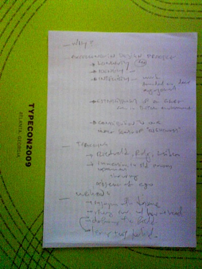
Yesterday evening Gerard Unger was deservedly awarded the S[o]TA Award, and joins an illustrious group of previous recipients. I had the pleasure of following John Downer and Juliet Shen with a few words. He later asked me if I’d written it down, and I responded that I only had headings noted:

notes on GU's award

Not possible to read, so here’s an exact transcription; some day I’ll have to write this up:
— Why?

— Excellence in design practice
* Longevity (40)
* Identity
* Integrity — work founded on deep engagement
* Establishment of a genre [even in Dutch environment
* Contribution to our innate sense of “rightness”

— Teaching
* Rietveld, __Rdg__, Leiden
* immersion in st[u]d[ent] processes
* openness
* sharing
* absence of ego

— Writing
* engaging with discourse
* strong inv[olvement] w[ith] how we read
* defining the field [of typeface design]
* leaving texts for reflect[ion]
I realize these notes don’t make much sense, but they give the outline of my thoughts yesterday.