Thoughts on a quiet master

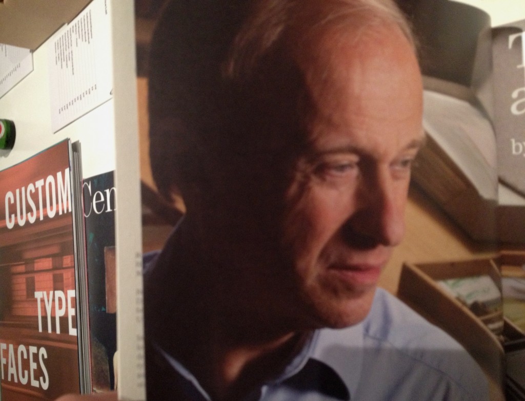
Fifteen years after the centenary Monotype Recorder (published in time for the ATYpI 1997 conference in Reading) the title was revived, this time to celebrate the four-decade long career of Robin Nicholas. There were copies available at the shop of the Pencil to Pixel exhibition, but they have not yet circulated worldwide. This text was my contribution.


Forty years is a long time, by any measure. In typography and typeface design, the last forty years are aeons, encompassing tectonic shifts in the industry. From stable, verdant summers to tumultuous storms and heavy winters, to hesitant then blooming springs, the type industry has seen more change and upheaval in the last few decades than in its previous centuries combined. We know of large companies that ceased to exist, others that transformed into very different entities, and of new ones – small and sometimes getting larger – that are growing into a new environment. And yet, the core principles of typeface design somehow persist, mutate, adapt, and survive the changes.

The company that Robin Nicholas joined is probably the most interesting, and certainly the most persistent survivor. At the time of his joining Monotype as a young draftsman, the industrial behemoth smelting heavy but precise machinery for dispatch to a global market must have seemed like a mountain of granite, immovable through the scale of its commerce and the confidence of its technology. Indeed, expanding his letter-making skills from two to three dimensions in his first years pointed to techniques handed down to apprentices for centuries before his time. And yet, before long, accelerating changes started introducing new ideas in typemaking. The swishes and squirts of pumps gave way to the clicks of flashing lights, and soon after just the hums of cooling fans and the low buzz of electronic devices. The process of making letters lost a dimension: from drawings to ink, the miniscule ridges and valleys of carefully cast metal gave their place to letters cut out of light (more changes were yet to come). New collaborators brought very different skillsets into typemaking, to be replaced in their turn by a dispersed, localised, and by comparison chaotic community. This story is often told, and well-known by all typeface designers and typographers, and we do not need to dwell on the details. Yet, it is only marginally a story of typeface design: it is one of typesetting, of documents in front of readers’ eyes. These documents responded to the seismic industrial upheaval by filtering typography through the new technologies: a great part of their conventions survived, at the level of the letter, the word, and the paragraph. Many more changed, most visibly in layout, and document structure. Primarily, and from our point of view, the technological shifts have been a story of ideas about typefaces surviving across technologies, like a vessel floating from a river to an estuary to an open sea.

Robin’s career has almost entirely coincided with these fundamental transitions in the way typeface designers capture their intentions, and then encode them for production. Precise paper drawings for the letter shapes, specific for each range of sizes, survived across technologies more than people would expect. The delicate pencil outlines captured details in ways that it would take decades for screens to match, even if they gradually lost a lot of the formality of their earlier years (for a brief period of time making beautiful rubylith transparencies the apogee of flat encoding: in many ways, the most pristine form that letters have ever been stored). Downstream of the sheets of paper, however, the story is very different. Once drawings could be stored on a computer, it is not just the direct relationship to the rendered sizes that is missing (away from a punchcutter’s desk, this was never really present).
Letter shapes stored as digital constructs abstracts them from a rendered reality, and makes the drawn letters only a beginning in a process of shape manipulation on a scale that twisting lenses or rheostats could not begin to hint at.

These transitions placed unique challenges for a designer whose career spanned such changes. Superficially, the designer would participate in changing the ways of doing things: new units of measurement, new equipment down the line, new production processes. More visibly, a new class of professionals joined the companies, with a language for describing the making and rendering of letters that would seem alien only a couple of decades in the past. But fundamentally, the changes in typesetting technologies forced a reflection on the key skills of a typeface designer. At the beginning of Robin’s career it would be easy to assume that the typeface designer was inseparable from the making of pencil renderings on paper. The only distinction one could make would be between the degrees of seniority (a draftsman, a designer, the Head of the Drawing Office), to which different levels of privilege for making changes would be assigned. But from when the locus of the designer’s decisions became fluid and transferable across type-making technologies, the contribution of the designer needed to be more carefully articulated. A – not at all rhetorical – ‘what is it that I am really adding to this process?’ has been central to deliberations on typeface design from the mid-sixties onwards (neatly overlapping with Robin’s career). The loss of directness makes this a critical reflection: letters are not anymore perceptible in any approximation of their true form as they travel though each process, but only witnessed indirectly though human-friendly compromises – as every digital technology demands.

Faced with this question, the typeface designer will invariably return to the fundamentals that survive the technological shifts: the designer’s craft involves decisions about typographic patterns and shape details at a level abstracted from the encoding of the shapes, and the mechanisms of rendering. In other words, the designer imagines an idealised visual and intellectual experience by the reader that is derived from a particular typeface, and will strive to make this a reality through – and around – the technology at hand. Robin’s work offers some particularly good examples of this three-way dialogue between the designer, the ideal model of a typeface, and the technology used to capture it, none more so than the revivals of historical types. Is a true Bell, a Centaur, a Fournier, a Janson, a Van Dijk, a Walbaum one closest to the imprint of metal types in the sources – and, of those types, which? In these we see a masterly distillation of a whole range of possible appearances into a definitive set of shapes that have defined typographic reference points. Such digital classics defined not only mainstream textures for typographers and readers, but also an indirect basis for the digital explorations of the 1990s, which found a voice by negating the refreshed historical models. And the approach to the chameleon that is Dante, and the revisitation of Bembo in Bembo Book, show an exceptionally delicate adaptation of style to the digital medium. (Although we must admit that not even Robin’s skills can help the historical accident that is Pastonchi…)

Next to revivals, the other big challenge for typeface designers is a very tight brief for a text-intensive design, of which none more so than newspaper typefaces. These must meet extremely high functional parameters, in tight spaces and with requirements of economy and stylistic discretion that make the achievement of a distinguishing identity the typographic equivalent of hitting a bullseye blindfolded. Yet, the longevity of Nimrod, whose combination of gently swelling terminals and deep arches on the x-height, with an light, strong baseline set a much imitated pattern: directly in new designs even thirty years later, but also in hints that when applied to Scotch Romans updated a style that is one of the dominant styles for text typography to this day. The same pedigree of absolute control of a dense texture (and a familiar clarity in the horizontal alignments) can be seen in the more recent Ysobel, which updates the style with a more self-indulgent italic. Ysobel’s italic is not only a response to rendering improvements in news presses since Nimrod, but also an endorsement of the contemporary rediscovery of the potential of italics in text typefaces, and the gradual abandonment of historical models for the secondary styles.

Whereas revivals and text-intensive typefaces are most illuminating of the designer’s skill, Robin’s work with typefaces for branding and OEMs testify to a side of his work that is not possible to list in a type specimen. For those of us that have had the pleasure of working with him, Robin exemplified the quintessential collaborator: he combines mastery with humility, and confidence with a sincere willingness to discuss a design, and share his expertise. At the heart of his approach lie a deep respect for his fellow designers, and constant striving for learning and, in turn, contributing to the discipline. (I remember fondly sitting with Robin over a stack of printouts with an OEM Greek typeface, our discussion taking us from the shapes in front of us to a pile of books and specimens that would help us answer why a particular treatment of a bowl is true to the style and appropriate to the brief, rather than just formally pleasing.)

This combination of openness and respect for the discipline of typeface design points to two key aspects of Robin’s work, not directly related with any shapes he made. First, his nurturing of several designers that worked under his supervision at Monotype. And secondly, his dedicated efforts to support education in typeface design, not least through his involvement with the masters programme at Reading. As an External Examiner, Robin has directly influenced the direction of education in typeface design; as an advocate for the concrete support of promising applicants he has helped change the lives of a small number of people in very real terms.

I am leaving for last an area of Robin’s contribution that perhaps few people outside the company know much about, but has been paramount in supporting an extremely important trend, as well as foreground the unique nature of Monotype. Through his engaged stewardship of the Monotype Archive in Salfords, Robin has enabled numerous researchers in their work in Latin and non-Latin scripts. This has had a critically beneficial effect in the typefaces designed, and – even more importantly – in the documentation that is available to the next generation of researchers and designers. It is no understatement to say that Robin’s support for the integration of archival research into our postgraduate projects is benefiting in fundamental ways the skills of the younger generation of typeface designers from Reading, and, though them, the appreciation of a research-informed approach in the wider typeface design community. (We should note that Robin is far from alone within Monotype in his active support of education and research: the company is highly sensitive to the unique legacy it holds, the real value for contemporary design of the knowledge embedded in its archives, and the benefits of supporting students at a range of levels.) It would be remiss of me to omit Robin’s involvement with the first Knowledge Transfer project between Monotype and the University of Reading. The project, which demonstrated in concrete terms the value of the Archive in Salfords for the development of new typefaces for the Indian market, captured a key moment in the globalisation of typeface design and the shift towards screen-based texts, and, specifically, mobile devices. The project also enabled a marketing narrative of differentiation based on concrete and deep expertise spanning decades; arguably Monotype is the only active company able to make that claim with regard to the support of non-Latin scripts.

I hope that I have done justice, in the limited space here, to Robin’s long and diverse career. I have attempted to paint a picture of a consummate professional, adaptable to the conditions of his industry, reflective about his practice and the fundamentals of his discipline; an enlightened collaborator, keen to share expertise and support the growth of a younger generation of professionals; and – crucially – a Type Director with a clear vision about protecting and promoting the unique legacy of a very special company, actively engaging with research and education in ways that influence the future of the discipline. For all these, typeface design owes Robin Nicholas a debt of gratitude.
Monotype Recorder

Type Compass: pointing ahead

This is the text I submitted for the foreword for the Type Compass: charting new routes in typography book by SHS Publishing. It is an interesting publication, combining reference and notebook; perhaps exactly what design students need: inspiration, with space for sketching.

Type Compass


Members of the type world have every reason to be happy. For years we have secretly yearned to be able to mention our discipline without the despondent knowledge that blank stares would follow, without having to play the well-rehearsed tape that explained what typeface design is, and that — yes, imagine that! — some people actually made their living from designing letters.

In recent years we’ve seen a gradual recognition by the general public of typeface design as a discipline in its own right. Thanks to smartphones, ebook readers, internationalised brands, high profile wayfinding projects in cities and transport hubs (and a few journalists with a nose for a good story) fonts and typefaces are now terms suitable for polite conversation. In fact, they downright exciting, since disbelief has been replaced by credulous surprise, and eagerness to discover the ways in which our daily lives are filtered through fonts.
This gradual move of typeface design into the wider stage of public awareness has gone hand-in-hand with a stronger realisation by designers of all disciplines that typeface design matters. With this, come publications, exhibitions, competitions, and events of all scales. At the same time, the development of webfonts is beginning to breach the browser window, arguably the most important area where typographic choices were limited to handling space relationships, and crude font choices were justified on cross-platform predictability and the need to publish text as text, rather than as some poor pixelated simulacrum.

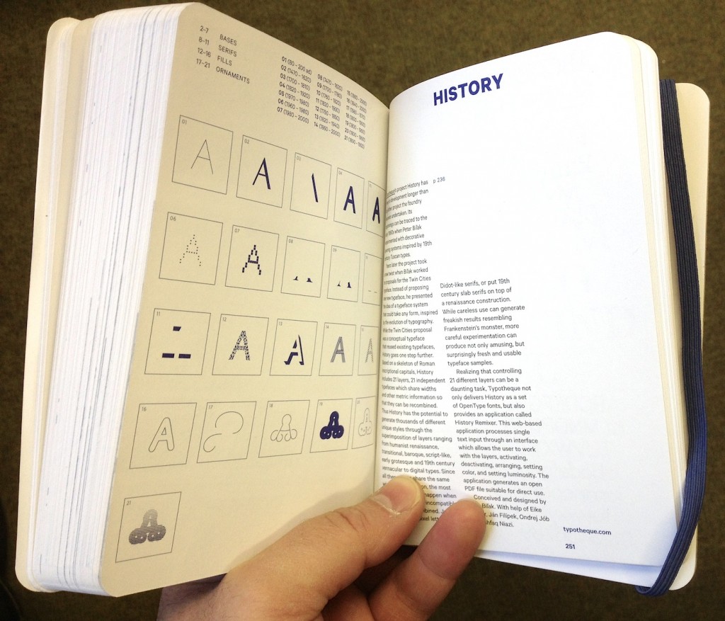
As typographic environments become more refined (the ones that had a lot of catching up to do, that is — because print is doing just fine in this respect) so do our typeface libraries become richer, more varied, and more complex. Richer, because designers continue to invent new ways of making forms, both exploring and abandoning the influences of manual tools (lots of examples of both in this book; notably, Typotheque’s History project manages to do both at the same time). More varied, because a good number of experienced and upcoming designers are publishing new fonts, raising the number of well-designed typefaces higher than it has ever been. And more complex, because typefaces now come in many weights ands styles, offering a degree of refinement in document design that until some years ago only few typographers could hope to expect from retail fonts.

At the same time, typeface design is maturing as a discipline of study and research. There are targeted modules within Bachelor-level courses, and a growing number of dedicated postgraduate programmes in many countries — some in parts of the world where typeface design itself is a very recent area of activity. Many graduates from these courses manage to leapfrog self-educated contemporaries, to found solid careers that pay the rent: this is overdue in typeface design, but the normal state of affairs in pretty much any established professional discipline. And as we acknowledge the elephant in the room, that typeface design is, more than most design disciplines, informed by past practice and context, so does research flourish. This is emphasised by the expansion of design briefs to cover many world scripts as a matter of course: pan-European Latin with Cyrillic and Greek to begin with, and many combinations of Arabic, Hebrew, Indian and Asian scripts. To meet these demands, designers do more research of their own, and make use of other research, to keep expanding their skills.
But the proliferation of typefaces and the texts that accompany them place a new burden on designers: it is now impossible for one person to keep abreast of developments. Typeface design is global, and the scale of output is similarly overwhelming. Publications about typeface design have similarly had to shift their focus. Many publications in the hot-metal and photo-typesetting eras attempted to show all the typefaces in circulation (or, at least, all the ones that mattered). This approach spilled into the early digital period, but is long now abandoned. Instead, publications can let online retailers to function as catalogues of nearly everything, and focus instead on editorship. The selection of work becomes more interesting than the volume; the editor’s perspective more illuminating than any message the inclusion or exclusion of a single work can get across.

This process opens up the space for editors to give each publication a specific depth of field, to borrow a photographic metaphor. From typefaces shown on their own, worthy of study in their own right, to texts in books, on screens, on street signs, where typefaces become enabling tools for other designers, the editor is very much not a silent partner. In putting Eric Olson’s Seravek (a quintessentially contemporary design that manages to be an accomplished all-rounder at the same time) next to Pierre di Sciullo’s inspired T for the Nice tram service, this book makes a robust case for the healthy invention and originality suffusing typeface design, while reinforcing the ubiquity of manufactured and rendered letterforms surrounding us. In this sense, a book such as this becomes a starting point: for inspiration, argument, and another round of informed selection: as good a send-off as any editor could hope for.


Pencil to Peerless


Pencil to Pixel private view

[Preamble]

Reading has a long, fruitful relationship with Monotype stretching back decades. But, whereas “we” have known intimately what makes the company unique (and its uninterrupted presence in large OEM and branding projects), most of the type world held a perception of Monotype as a somewhat monolithic company, that made the transformation from heavy industry to the digital world without shedding the weight of the machinery it scrapped. The expertise of staff, the richness of its library, and the knowhow embedded in its archives (and the staff looking after them) were anything but common knowledge.

Since 2001, when we started directing MATD research towards a global typography, slivers of the archives have started coming to light through the students’ dissertations (several examples here), the typefaces themselves (lots of examples here) but also the PhD and post-doc projects of Jo De Bardemaeker, Sallie Morris, Titus Nemeth, Alice Savoie, and others.

Monotype have also been helping fund postgraduate students in Typography through the Monotype Studentship (tip of the hat to Alan Haley and Robin Nicholas, who spearheaded the establishment of the award in 2006).

A big part of our teaching and research has been enhanced and accelerated by the donation to Reading, in 2003, of the non-Latin drawings held in the Linotype archives in Germany. Otmar Hoefer and Thomas Caldwell were instrumental in this. They shared our vision of turning a historical archive that was opaque to researchers and practicing designers alike into an accessible resource that would cater for different levels of engagement: teaching and research from introductory MA to post-Doc levels, to design support for revivals and new typefaces, and for wider narratives that help engage with the community. The Linotype non-Latin drawings sit well within our Collections & Archives, in the company of world-class collections in printing processes, manuscripts and early printing, ephemera, newspapers, nineteenth and twentieth century posters, type specimens, children’s books, Isotype, corporate and personal archives, and more. (And they are in the room next to one of the best libraries on typography and typeface design,itself an invaluable resource for students and researchers.)

In 2008 we started collaborating more closely with the UK part of the company on a two-year Knowledge Transfer Project. This aimed to recapture know-how embedded in Monotype’s library drawings for key scripts in the Indian market, with a focus on mobile devices, and – later – webfonts (Fiona Ross and myself from Reading, and John McCallum and Robin Nicholas from Monotype; and Dan Rhatigan as the Associate doing the heavy lifting).

Then things started to accelerate: as the company got bigger (much bigger) it got more nimble, open, and imaginative. The same company that supported Doug Wilson’s Linotype the Film, put its weight behind events like the Beauty in the Making exhibition with GFSmith, and the popular BrandPerfect events, aimed at branding agencies. (They’ve also been developing some really neat services, which – I am willing to bet – point to the next big development in the font business.)

[End of preamble]

Pencil to Pixel catalogue

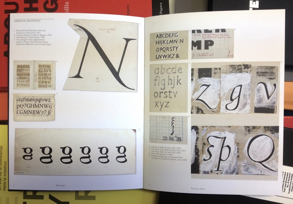
The opening of Pencil to Pixel yesterday made me think that this new confidence is now well embedded in the company. To begin with, the event was a superb example of exhibiting typographic material: just the right amount, and with a broad range of objects; drawings, specimens, books. A collection of films put these objects in perspective, and underlined the transformational effects of digital technologies. The object are not displayed with distanced reverence; on the contrary, these are intended to be seen up close, to help inspire and excite as much as to learn. The cases are shallow, allowing you to come very close to the material, and the lighting ideal for discerning textures and layers. You can easily imagine Bruce Rogers, Frederic Warde, and Chris Brand marking and correcting the sheets of Centaur, Arrighi, and Albertina a few centimetres from your eyes. These objects are typeface design as it really is: decisions and backtracks to get that shape in your head just right, because the inked sketches will turn into letters with the permanence of steel, numbering millions of impressions.

Monotype Recorder

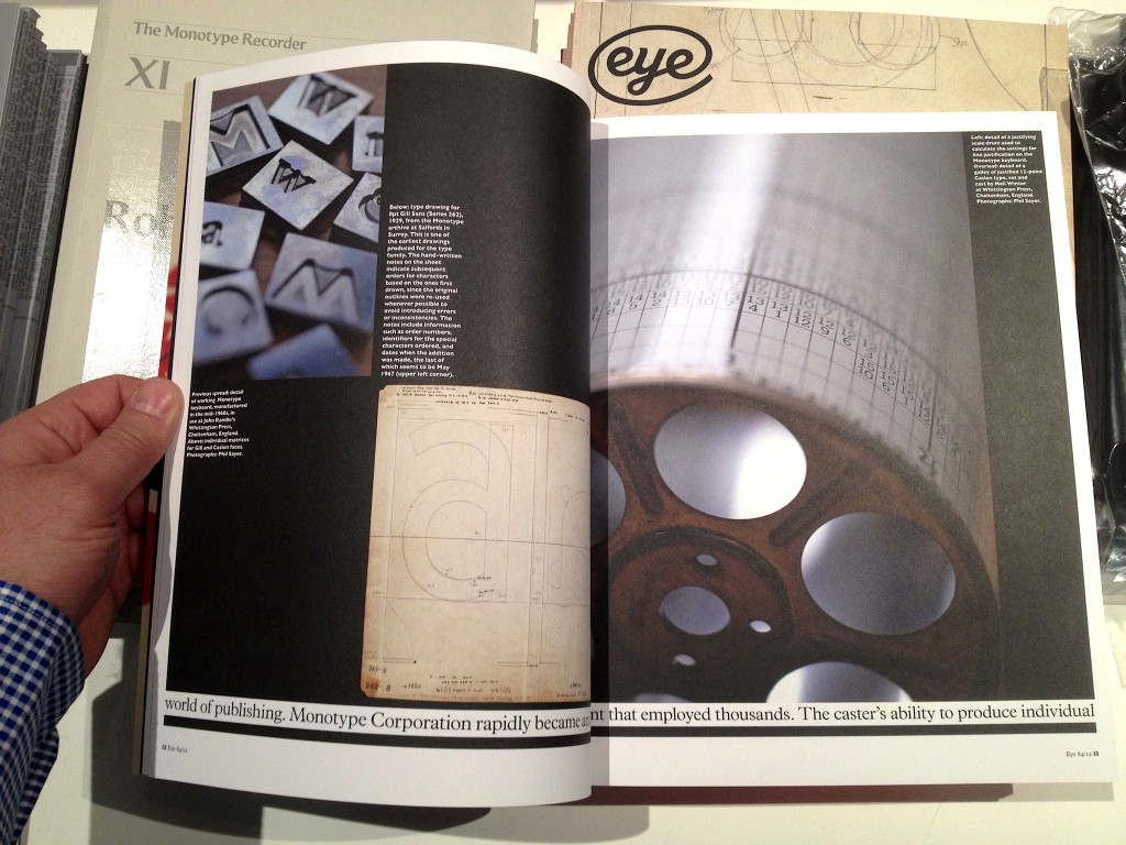
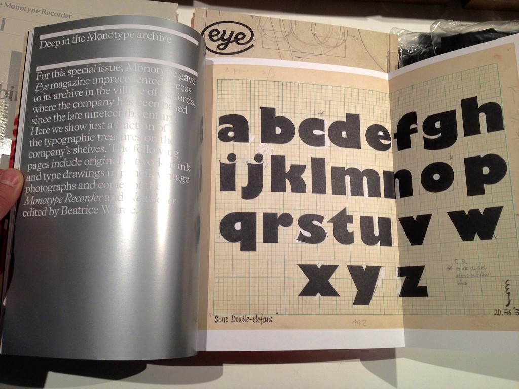
But alongside these are a mesmerising installation by Marcin Ignac, a series of twelve collectable booklets (like this), a tasty selection of specimens, and two very special publications: a celebratory issue of the Recorder, dedicated to Robin Nicholas’ career in the company; and a special issue of Eye, given over entirely to the unique place of Monotype in the type industry, and its contribution to typography. Dan and James, Well Done.

Postscript: I am going to be modest about the Recorder here: I’ve written a piece for it, and will be posting more in the coming weeks. But I will allow myself some hypebole on the special Eye: It is, quite simply, a tour de force of design for a periodical publication. It takes Eye’s established visual cues out for a drink and a spin, then sweet-talks them into all sorts of improbable contortions and surprising twists. Space, scale, contrast, and typography are turned into the best argument for printing things I’ve seen in a long while.

Eye 84 spread

Eye 84 spread

You need an opinion, on top of an impulse.

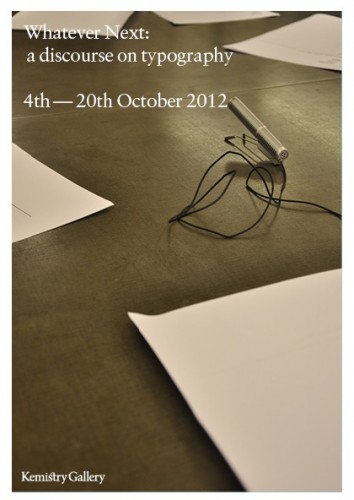
A short while ago James Edgar of the Camberwell Press asked me to write a short text in response to one of four conversations recorded for Whatever next: a discourse on typography. Fraser Muggeridge liked it, so I thought I’d put my final draft here. Blame him if you don’t.


Whatever next: a discourse on typography

Typeface design has arrived. Emerging from the adolescence of an esoteric field absent from wider narratives of culture, it is maturing into an equally esoteric domain; there, gradually increasing numbers of experts witness an explosion of awareness by the wider population, where words like ‘typeface’ and ‘fonts’ will not cause a conversation to freeze.

I am not exaggerating. We are witnessing a celebrated revival in letterpress; the publication of popular books for those who are beginning to notice fonts on their menus; a growing number of serious magazines and larger publications on type; the transformation of texts on screen with webfonts; and the development of massive typeface families spanning several scripts, for branding and pretty much any device that displays text.

This ambiguous state of hesitantly enthusiastic acknowledgement in the periphery of the mainstream is forcing typeface designers, typographers, and educators to clarify our ideas about our disciplines, and the language we use to describe our contribution (as well as fill out the ‘description of work’ in the next invoice). This is less easy than it sounds: typeface design is a quintessentially interdisciplinary field. The immediate actions of form-making and digital encoding rest on a bedrock of historical and cultural understanding, which is gradually establishing its importance in designers’ minds. Type designers need to have an understanding of writing, be familiar with the developments in the technologies of type-making and typesetting, be aware of how texts are transmitted and shared in each society, and respond to the editorial practices and conventions of each market. Some may even engage with the sprinkling of usability and human perception discourse (although, I would argue, with minimal impact on the quality of their work).

All these caveats may make typeface design appear dry, bereft of the originality in form-making associated with the creative industries. This would be a false interpretation. It is better to put it this way: while the typeface designer needs to be just as creative as the next professional, she also needs to show that history, technology, culture, and society are peering over her head as she sketches or nudges outlines. Indeed, it is exactly this increased expectation of knowledge and understanding that separates typeface design from most disciplines in the creative sector.

This issue is reflected in the discussion in the following pages, as is the imperative to distinguish between ‘typeface design’ and ‘typography’. Indeed, it is not difficult to come up with simple definitions: whereas typeface design refers to the design, testing, and production of useable typeforms in whatever appropriate technology, typography relates to the determination of structure and the specification of appearance at the document level. The scale of perspective is quite different: the typeface designer works at the very limit of shape perception, managing patterns of visual recognition more that individual shapes; and the typographer looks at a the complete document, or even a whole class of documents (in the case of series design, and periodical publications). Furthermore, the relationship of the two disciplines to the content is very different. The typographer reliably knows what texts she is giving form to: the semantic content, style of language, length of text, and density of image support, all are known. On the other hand, the typeface designer can only speculate on the texts her typefaces will transmit, or even the most basic typographic parameters. Ironically, the typographer of periodicals, working with templates to provide for a wide set of possible configurations, may be closer to understanding the exercises in abstraction required in developing a typeface. Reflecting on the work of some of the contributors here, we could even argue that the designer of one-off publications like art catalogues may be closer to a lettering artist than a typeface designer.

And, yet, it would be wrong to take the distinctions too far. Both disciplines can be approached along four axes: at the outset is a brief. (Not just ‘clients’: they may approach the designer with a project, but this must translated into a coherent description of requirements and design parameters. The more experienced the designer, the more she may be expected to contribute to the brief.) Second, is the understanding of the functional aspects of the job, as they arise from a consideration of all those who have a stake in the design. This is user-centred design at its most fundamental: ‘does it work for its intended users, for what it was supposed to do?’ Thirdly, both typeface designers and typographers develop identities: there is a potentially infinite combination of design decisions that deliver a strictly functional product, but which capture the broader semantics? Does the typeface (or the document) acknowledge its genre, and does it reflect its time and place? Does it capture the values inherent in the client’s identity, and explore the potential of stylistic and cultural associations? It is this third dimension that gives a design project relevance and value: the ability of the designer to amplify meaning beyond the functional specifications of the brief, into something wider that engages with peers, and the wider community.

The last axis is the designer herself: the form-giver not just as a social observer, but a social commentator. Moving beyond functionality and usability, the designer employs association, style, identity, differentiation, and beauty to reflect a cultural moment back to its members, and express new ways of looking at ourselves. The most successful designers are the ones who gradually (or, sometimes, abruptly) push the envelope of what we consider acceptable, and reveal to us the patterns of our behaviour.

In these respects, both typeface designers and typographers are equal, and unique: different from the lighter domain of graphic design and many applied arts, exactly because their tasks involve strict functional requirements and a deeper knowledge of their domain. And, still, different from the specificity of the engineering disciplines they may employ: because the real value of typographic work lies in its reading of, and response to, social conditions in a transparent dialogue with peers. The idea of typeface designers and typographers as social scientists may be unfamiliar, but one that we may need to get used to.

Typography and type design in NYC, take 2

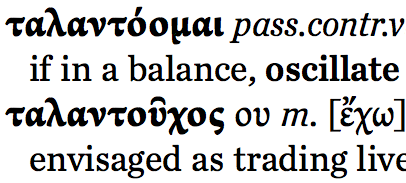
A detail from a test setting of the letter Tau

Five years after the first Greek Week-End in New York, I am returning to the TDC.

By 2007 Greek was already becoming a central part of most large typeface projects, especially international branding applications. In the intervening years Greek has become a key aspect of professional designers’ skills, and a regular expectation in job postings. Just as importantly, Greek represents a particularly rewarding challenge for designers, combining a long and complex development with a relatively wide space for designers to experiment.

The two-and-a-half day workshop will start with a hands-on research session, and include seminars on aspects of Greek typeface design, in-depth reviews of reference contemporary typefaces, and design critiques of work by participants.

I will also deliver a lecture at the TDC Salon on the design of a major forthcoming Greek-English lexicon by CUP. This Lexicon takes advantage of recent developments in typeface design, and offers insights into a particularly challenging typographic brief.

My eight

Disliking lists – let alone “definitive” ones – is not good preparation for answering Elliot Jay Stocks’ request for “8 favourite typefaces to accompany the interview in the magazine”. What if I only really care for six, or twelve? And, eight for what? The typography I do, or the typography others do that I appreciate? Or the ones I admire but cannot imagine using?

Like most type problems, it became much easier to answer by thinking not about the typefaces themselves, but about documents (and, by extension, active and passive users). I settled on typefaces that have proven themselves typographically competent, rewarding to set, and revealing to discuss. This last point (probably irrelevant to most users of typefaces) is central to my selection: what does the typeface tell us about the designer’s intentions, their interpretation of the cultural moment, and ourselves as active users?

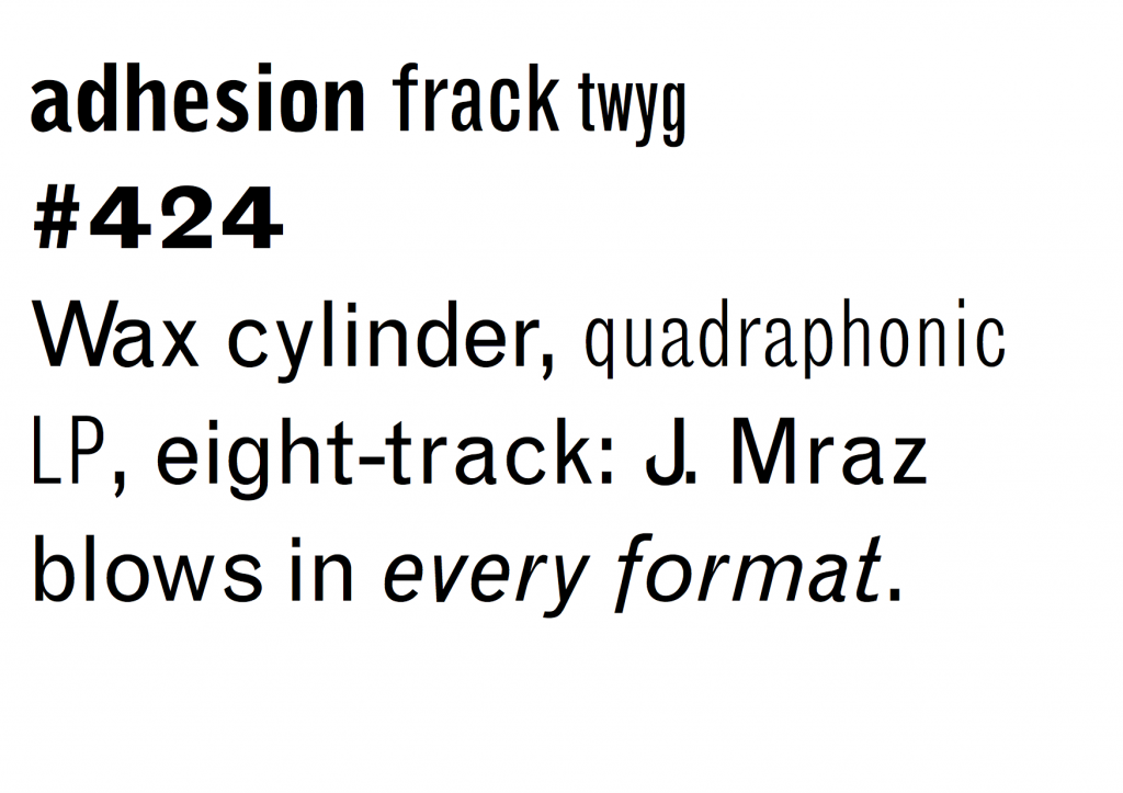
The examples in 8 Faces are small and selective, so I repeat them here in pangrams borrowed from Craig Eliason’s Daily Pangram (apart from the Greek ones).

(Incoming MATD students: these are good study material. Both their design, and the reasons for their inclusion.)


Grotesque MT: Frank Hinman Pierpont, 1926 (Monotype digital version 1993)

I wrote: A typography lesson in a typeface: eight uprights with only two italics, a bucketful of quirks and inconsistencies, and capitals so heavy you think they’re channeling Jenson. And yet, if used well it makes mincemeat of complex typography, and leaves you thinking ‘I need no other!’

MT Grotesque


Ideal Sans: Hoefler & Frere-Jones, 2011

I wrote: Next to Ideal Sans most humanistic sans serifs are either too self-absorbed, or too boring. This is a long-text sans: the design balances counters and strokes much better than either neo-grotesques or geometrics, while the slight variations where you expect visual alignments reinforce a subtle identity.

HFJ Ideal Sans


Candara Latin & Greek: Gary Munch, Microsoft, 2007 (but really a bit earlier)

I wrote: Candara is a brave, visionary Microsoft on a good day. Original in concept, impeccably effective in text settings across three scripts, and pleasantly surprising in larger sizes, Candara re-calibrated our ideas about what it was possible to ship with Office. The Greek is even better than the Latin.

CT Candara


CT Candara Greek


Miller Text: Matthew Carter, Font Bureau, 1997

I wrote: Probably the best Scotch Roman available, with a reference typographic texture in the middle weights. Adding grades like Miller Daily would make this near-indispensable. The italic is confident and exuberant, which makes it a little difficult to use, sometimes. Typographic dynamite in the same fonts folder as HTF Chronicle and Eames Century Modern.

Miller Text


Elena: Nicole Dotin, Process Type Foundry, 2011

I wrote: A typeface that looks a bit too light and too uniform at first sight, but resolves into a very readable texture. It captures in a remarkably concise way the post-Unger genre, while employing softer arches in the upright and a contrasting, pen-informed italic. Looks amazing in Instapaper.

PTF Elena


Abril: Veronika Burian and José Scaglione, Type Together, 2011

I wrote: A very contemporary concept for a typeface family, with text styles best described as ‘slabby transitional with a twist’, loosely Modern display styles, and an unashamedly in-your-face Fatface set thrown in for good measure. Forward-looking but historically sensitive in an intelligent way.

TT Abril


Fenland: Jeremy Tankard, 2012

I wrote: Fenland takes the western broad nib model and squashes it with big black boots. Its counter-intuitive treatment of arches and joints demonstrates that text typeface design is far from a saturated design space, even in the Latin script.

Fenland


SBL Greek: John Hudson, SBL, 2009

I wrote: The most accomplished update of the Didot style for Greek typefaces, it combines the fluidity of the original with a superbly competent typographic texture, and attention to detail. One style only, so for modern texts either disastrous or an opportunity for typographic genius.

SBL Greek


Λυσία υστερόγραφο

[English text below]

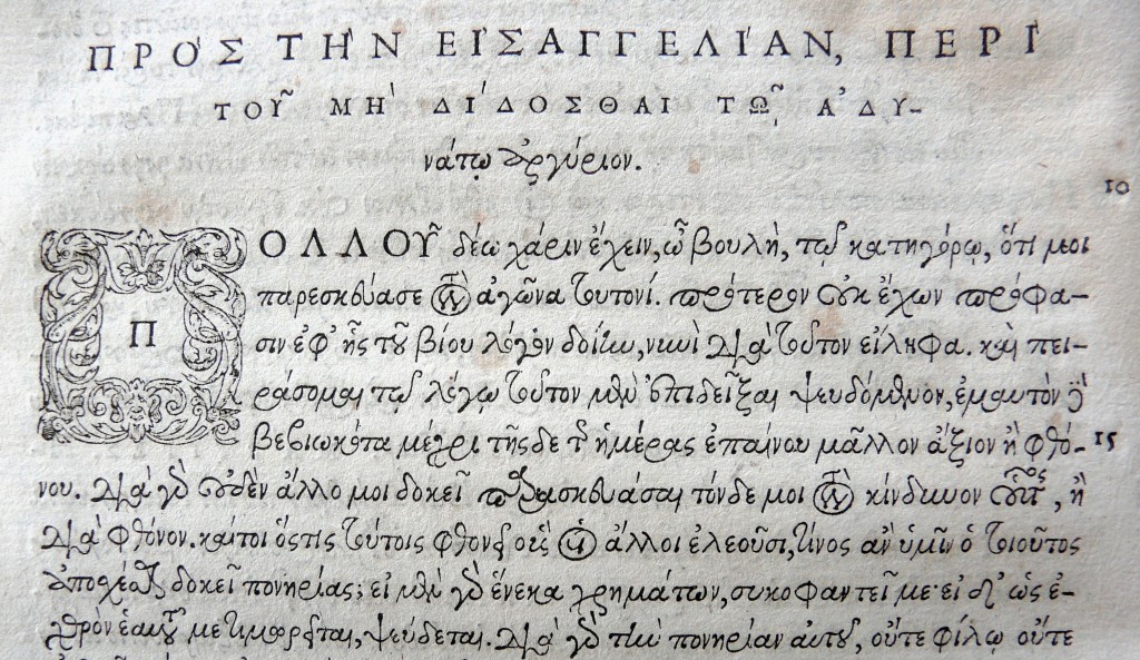
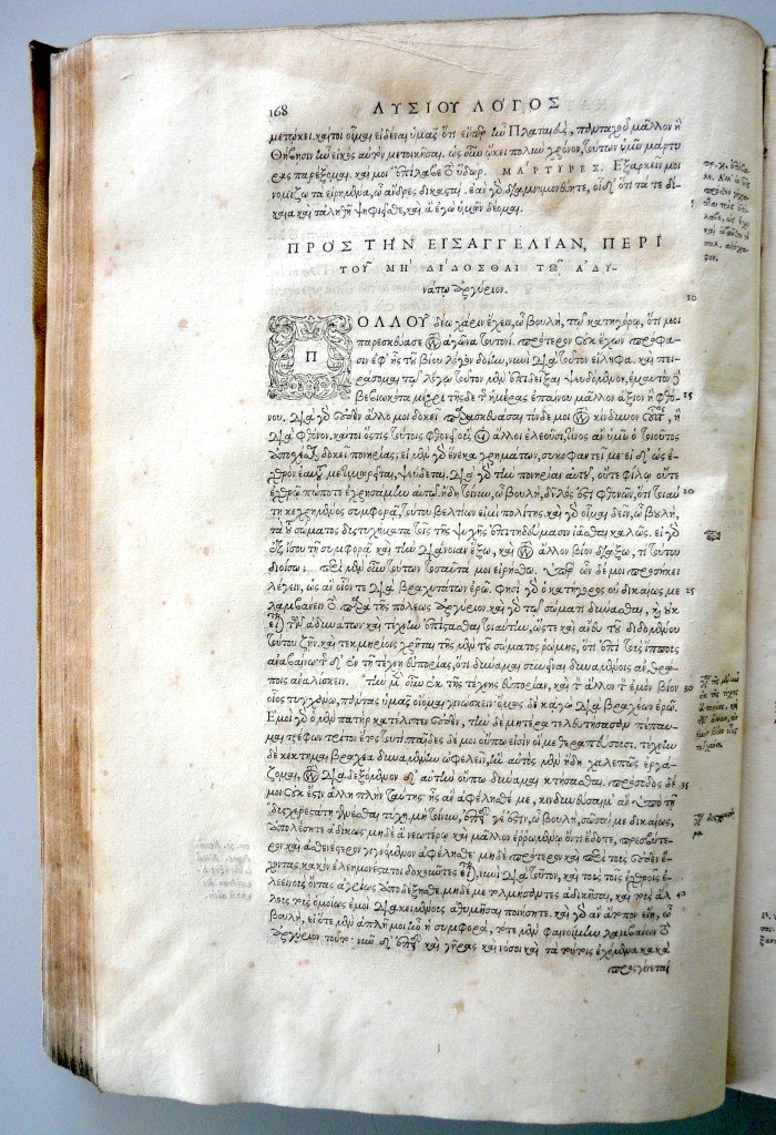
Στην προηγούμενη ανάρτηση χρησιμοποίησα την αρχή από τον περίφημο λόγο του Λυσία για τα παραδείγματα. Στην Αναγέννηση, αλλά και αργότερα, οι λόγοι του Λυσία ήταν από τα βασικά κείμενα για τη μάθηση των ελληνικών (δεν τα έλεγαν «αρχαία ελληνικά» τότε, αλλά σκέτα «ελληνικά»). Σήμερα το πρωί προετοιμαζόμουνα για ένα εργαστήρι και μια ομιλία που θα δώσω στο TDC σε λίγες βδομάδες, και έπεσα πάνω στην έκδοση του Λυσία από τον Henri Estienne, του 1570: ένα πανέμορφο βιβλίο (πέντε πόντους πιο ψηλό από Α4, για να πάρετε μια ιδέα από την κλίμακα) με τα περίτεχνα ελληνικά του Garamond. (Συγκρίνετέ τα όμως και με τα γράμματα του Granjon).

(Για το αρχείο υψηλής ανάλυσης: κλικ στη φωτογραφία, και μετά στον υπότιτλο)

1575 Henri Estienne Lucian detail
A detail from Henri Estienne’s 1575 Lucian

Να όλη η σελίδα:

1575 Henri Estienne, Lucian
A page from Henri Estienne’s 1575 Lucian


A postscript on Lucian

In the previous post I used the opening from a speech by Lucian to talk about some typefaces supporting polytonic Greek. From the Renaissance onwards, Lucian’s texts were considered good sources for learning Greek (n.b. At the time Greek was just plain “Greek”, not “Ancient Greek”). This morning I was preparing some material for my upcoming TDC Salon talk and Greek workshop, and took out Henri Estienne’s 1570 Lucian: a beautiful book (about four inches taller that Letter size, to give you a sense of its scale) set in Garamond’s ornate Greek. (Do compare these types with Granjon’s Greek, though.)

(For the hi-res images: click on the image, and then on the subheading.)

1800 to 2010, then


Two Iliad editions

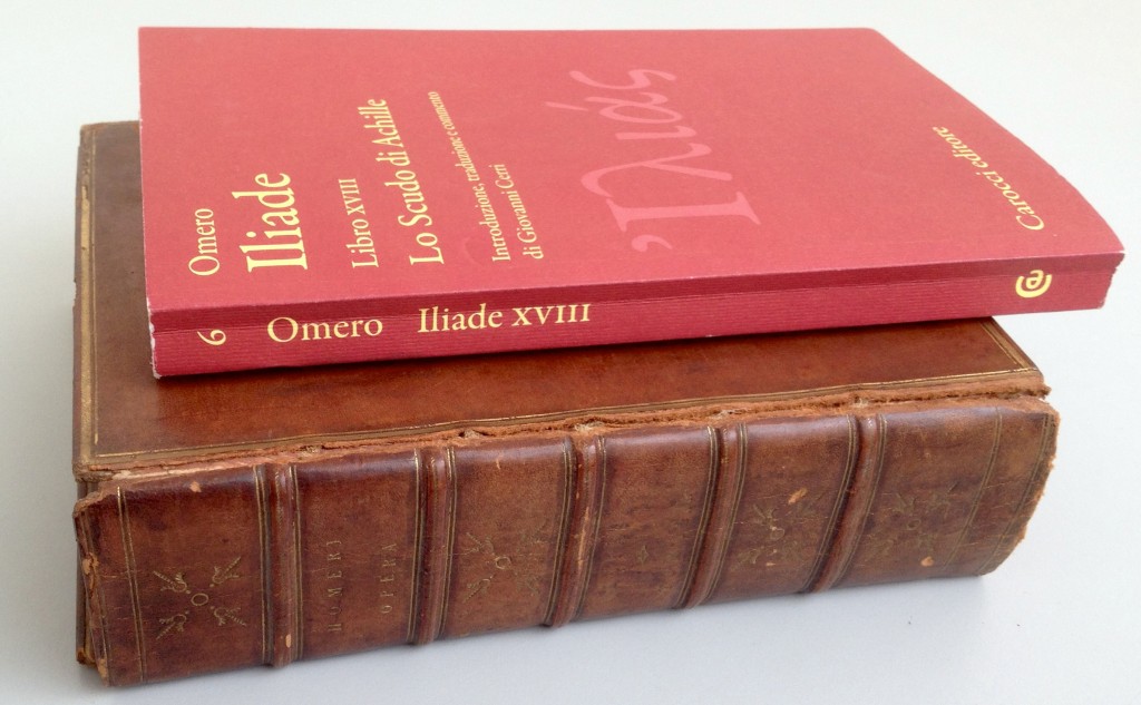
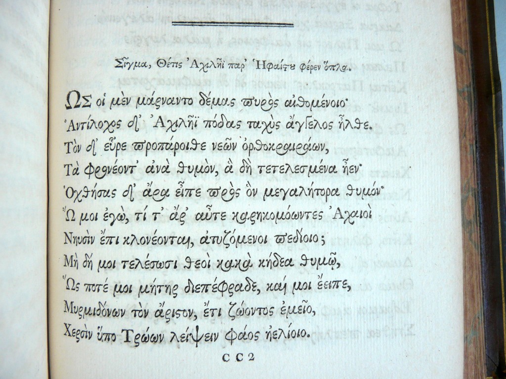
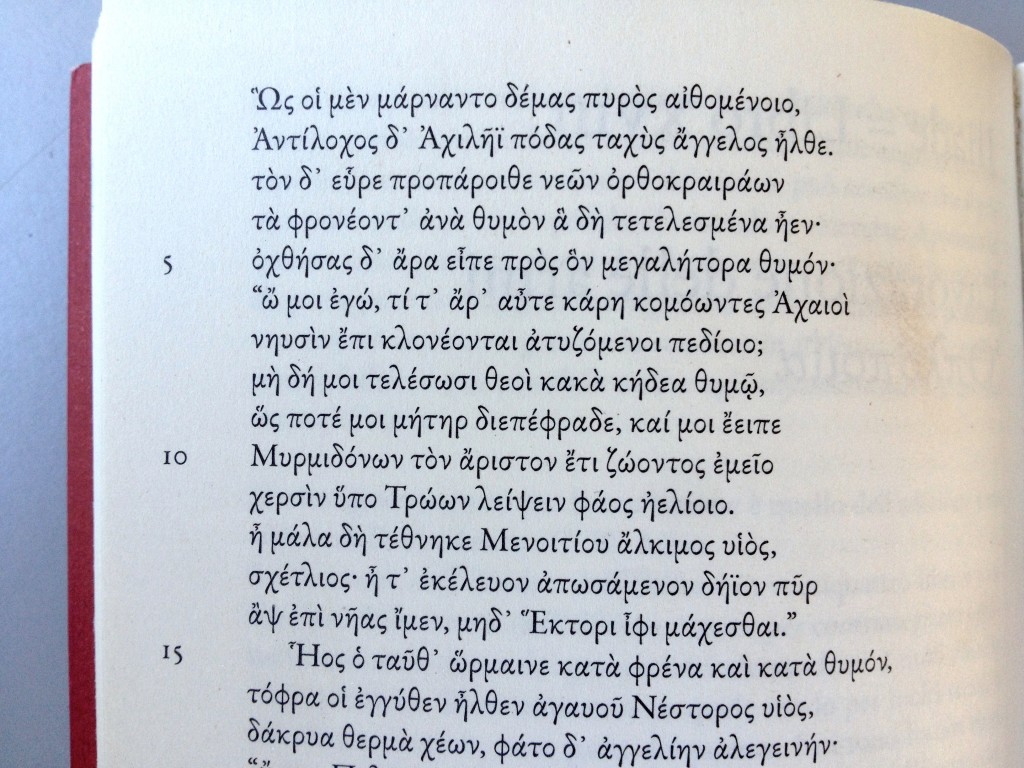
Preparing for the TDC Greek weekend and Salon talk in a few weeks, I had by my side these two beauties: an OUP Iliad from 1800 typeset in the Granjon Parangon from 1565 (them Greek types have long shelf lives) and a elegantly restrained 2010 Iliad by Carocci Editore designed by Giovanni Lussu, set in Garamond Premier Pro. Here’s some type p*rn:


1800 Oxford Iliad Sigma detail


2010 Carocci Iliad Sigma detail


Πολυτονικά με καθαρή συνείδηση

Χαζεύοντας το απολαυστικό και ταυτόχρονα εξοργιστικό This.Is.Greece. είδα την Κα Κανέλλη να ωρύεται, μεταξύ των άλλων, και για την έλλειψη γραμματοσειρών για τη σωστή γραφή της ελληνικής γλώσσας στους υπολογιστές. Υπέθεσα ότι εννούσε πολυτονική γραφή. Είπε διάφορα η Κα Κανέλλη για McDonalds και ξεπουλήματα, για τα οποία δε γνωρίζω τίποτα. Ξέρω όμως κανα-δυό πράγματα για τα πολυτονικά στους υπολογιστές. Να λοιπόν μερικές γραμματοσειρές που αξίζει να έχει υπόψη όποιος γράφει σε πολυτονικό, που είναι είτε ελεύθερες για κατέβασμα, ή έρχονται μαζί με το λειτουργικό, ή περιέχονται σε κάποιο πακέτο όπως το Microsoft Office, ή τα πακέτα της Adobe, που χρησιμοποιούνται από σχεδόν όλους στο χώρο της τυπογραφίας. Δηλαδή υπάρχει μεγάλη πιθανότητα να υπάρχουν στον υπολογιστή όποιου ασχολείται με τη γλώσσα, ή την τυπογραφική παραγωγή.

Η λίστα που δίνω δεν είναι καθόλου εξαντλητική, αλλά περιορίζεται σε γραμματοσειρές στις οποίες έβαλα το χέρι μου κι εγώ, και μπορώ να βεβαιώσω ότι αντιπροσωπεύουν σημαντική επένδυση σε έρευνα και εξέλιξη. Επίσης, είναι από έγκυρες πηγές, που σημαίνει ότι μπορούμε να έχουμε εμπιστοσύνη στην ποιότητα του λογισμικού. Εκτός από πολυτονικά Ελληνικά, οι περισσότερες καλύπτουν ευρεία Κυριλλικά, και μεγάλο εύρος του Λατινικού.

Με χρονολογική σειρά, λοιπόν, οκτώ συν μία γραμματοσειρές που μπορεί εύκολα να έχει στη διάθεσή της η Κα Κανέλλη:

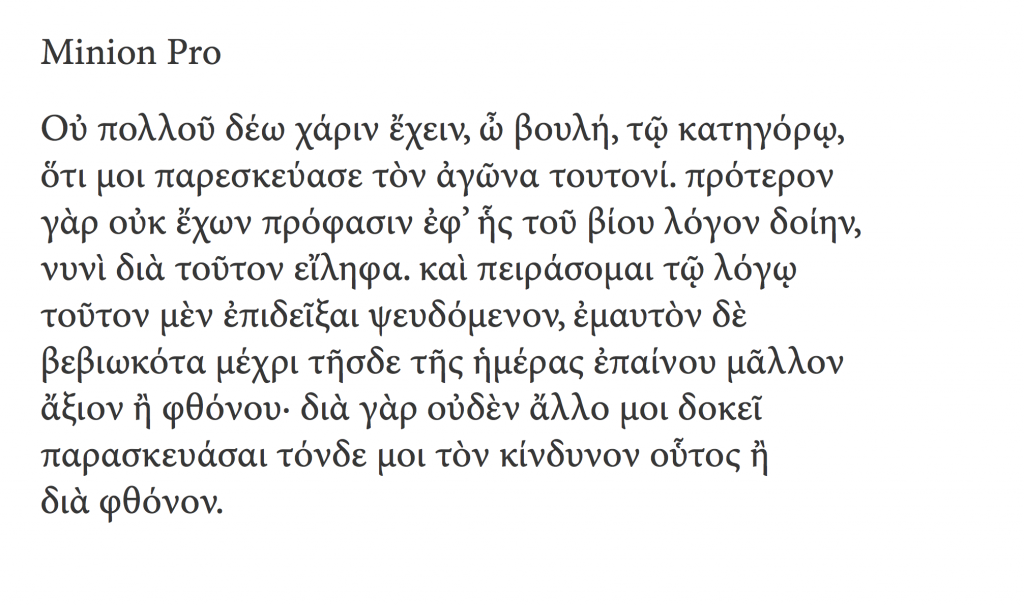
1 Adobe Minion Pro (2000)

Η πρώτη σημαντική γραμματοσειρά σε πρότυπο OpenType με ουσιαστική κάλυψη του ελληνικού αλφάβητου, από τις μέρες ακόμα που το πρότυπο Unicode δεν είχε κατασταλάξει (υπάρχουν, δηλαδή, σημαντικές διαφοροποιήσεις ανάμεσα στην πρώτη και τις μετέπειτα εκδόσεις της γραμματοσειράς). Πολλά από τα βασικά ερωτήματα για την εξέλιξη και τυποποίηση των πολυτονικών ελληνικών γραμματοσειρών έγιναν μέσα από την Minion Pro, που με τη σειρά της αποτέλεσε άτυπο πρότυπο για πολλούς σχεδιαστές. Όπως σχεδόν όλες οι ιστορικές γραμματοσειρές κειμένου του Robert Slimbach, η Minion Pro προσφέρεται σε πολλές παραλλαγές βάρους και πλάτους, αλλά και τεσσάρων οπτικών μεγεθών.


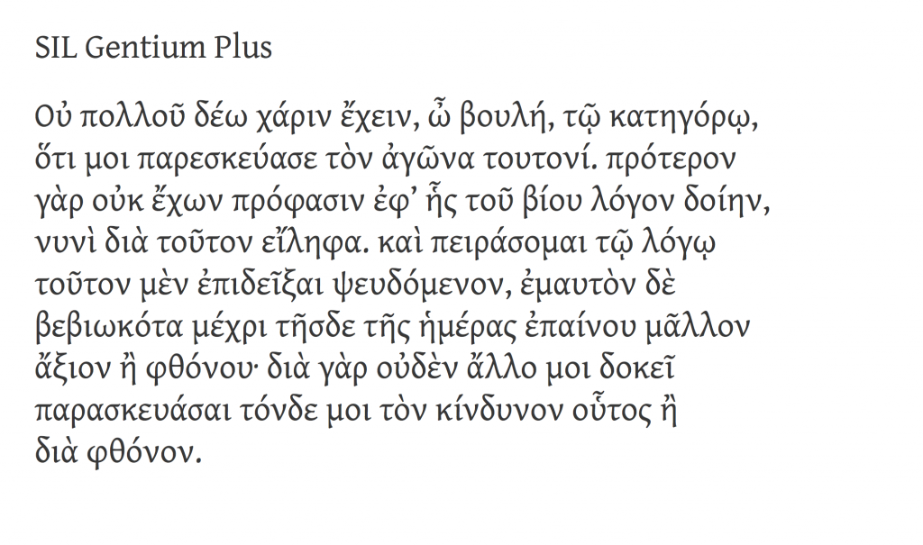
2 SIL Gentium (2003)

Μια ιδιαίτερα σημαντική γραμματοσειρά, από τις πρώτες με εκτεταμένη κάλυψη στα τρία ευρωπαϊκά αλφάβητα και πλήρη ενσωμάτωση στο πρότυπο Unicode (το λατινικό τμήμα καλύπτει μέχρι και τις Αφρικανικές γλώσσες νότια της Σαχάρας). Εξελίχθηκε από τον ήδη έμπειρο σχεδιαστή Victor Gaultney ως τμήμα των μεταπτυχιακών σπουδών στο πανεπιστήμιο του Reading, για λογαρισμό του οργανισμού SIL. Ως η πρώτη ελεύθερη Unicode γραμματοσειρά ποιότητας με πολυτονική κάλυψη, η Gentium κυριολεκτικά μεταμόρφωσε την υποστήριξη ελληνικών σε όλα τα πανεπιστήμια όπου υπάρχουν έδρες σπουδών ελληνικής γλώσσας, καθώς και τους εκδότες δίγλωσσων εκκλησιαστικών κειμένων (μια σημαντική αγορά, ειδικά στις ΗΠΑ). Δεν είναι υπερβολή να πούμε ότι δεν υπάρχει πανεπιστήμιο εκτός Ελλάδος που να μην έχει εγκατεστημένη αυτή τη γραμματοσειρά. Διατίθεται ελεύθερα από αυτή τη σελίδα.


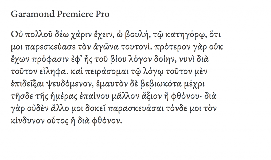
3 Adobe Garamond Premier Pro (2005)

Ενώ η Minion Pro είχε λειτουργικό λόγο ύπαρξης, και σαν τετοια είναι πιο συντηρητικά σχεδιασμένη, η Garamond Premier Pro (GPP) αποσκοπούσε στο να αναθεωρήσει τα δεδομένα των γραμματοσειρών κειμένου (μην ξεχνάμε ότι την εποχή που η GPP έπαιρνε το πράσινο φως οι περισσότεροι σχεδιαστές χρησιμοποιούσαν ακόμα μια πλημμύρα από Type 1 γραμματοσειρές με 8-μπιτες συνθέσεις χαρακτήρων: τα πρώτα δοκίμια που είδα, ήδη αρκετά αναπτυγμένα, ήταν το 2003). Η γραμματοσειρά επέστρεψε στις ονομαστικές της ιστορικές ρίζες (δηλαδή τα ελληνικά γράμματα του Garamond και του Granjon) αλλά είναι ξεκάθαρα εηρεασμένη από τα μετέπειτα ελληνικά γράμματα του Didot — και ορθά, αφού απευθύνεται στο σύγχρονο αναγνωστικό κοινό. Πάνω από όλα όμως είναι η γραμματοσειρά που έδειξε ότι η ιστορική ελληνική τυπογραφία μπορεί να εμπνεύσει αξιόλογες νέες δουλειές, που δουλεύουν πολύ καλά σε ρέοντα κείμενα. Και αυτή έχει πλήθος παραλλαγών στα βάρη.


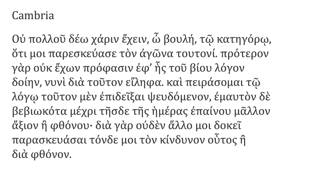
4 Microsoft CT Cambria (2007)

Αν και διατέθηκαν το 2007, οι γραμματοσειρές της Microsoft ήταν έτοιμες σχεδιαστικά ήδη από το 2004. Το σύνολο του προγράμματος αποτελεί αξιοσημείωτο έργο, καθώς είναι η πρώτη φορά που τα τρία βασικά αλφάβητα σχεδιάστηκαν παράλληλα, αντί οι ελληνικοί και κυριλλικοί χαρακτήρες να ακολουθήσουν τους λατινικούς. Όταν η Cambria επιλέχτηκε για να εξελιχτεί σαν βασική γραμματοσειρά «εργασίας» προστέθηκαν εκτεταμένα πολυτονικά, αλλά και μαθηματικοί χαρακτήρες. Οι γραμματοσειρές ClearType είναι σχεδόν παντού: υπάρχουν σε κάθε υπολογιστή με σύγχρονο λειτουργικό Windows, κάθε υπολογιστή ανεξαρτήτως λειτουργικου με σύγχρονο Office, ή οποιονδήποτε υπολογιστή έχει εγκατεστημένο το PowerPoint Viewer (που διατίθεται ελεύθερα).


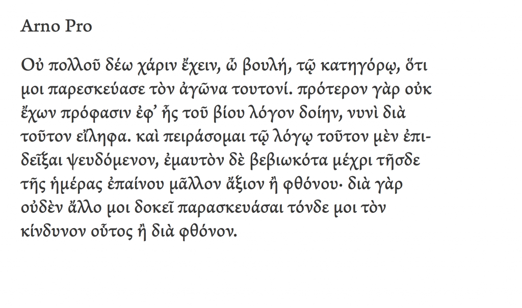
5 Arno Pro (2007)

H Arno Pro, σχεδιαστικά ανάμεσα στη Minion Pro και την GPP, χρησιμοποιείται εκτεταμένα σε εκδόσεις τόσο με ρέοντα κείμενα, όσο και σε ειδικές εκδόσεις όπως τα λεξικά, οι γλωσσολογικές μελέτες, και οι δίγλωσσες εκδόσεις. Όπως και οι υπόλοιπες γραμματοσειρές κειμένου της Adobe, η πλήρης οικογένεια έχει πολλές παραλλαγές βάρους και εύρους.


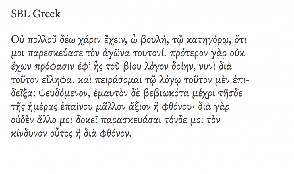
6 SBL Greek (2009)

Μία ιδιαίτερα όμορφη γραμματοσειρά, πιθανότατα η καλύτερη ενημέρωση του ιστορικού μοντέλου του Didot (από τον John Hudson, σχεδιαστή με μακρά ενασχόληση με την ελληνική τυπογραφία). Η γραμματοσειρά έχει ίσως το πιο εκτεταμένο σύνολο χαρακτήρων για Ελληνικά κείμενα που μπορεί κανείς να βρει στην αγορά: έχει σχεδιαστεί με κριτήριο τις ανάγκες των μελετητών της Γραφής, και σαν τέτοια καλύπτει και ανάγκες πολλών συγγενών επιστημών (π.χ. παλαιογραφία). Το «πρόβλημα» βέβαια είναι ότι ως γραμματοσειρά μεταγραφής χειρόγραφων δεν παρέχει παρά ένα βάρος. Διατίθεται ελεύθερα από αυτή τη σελίδα.


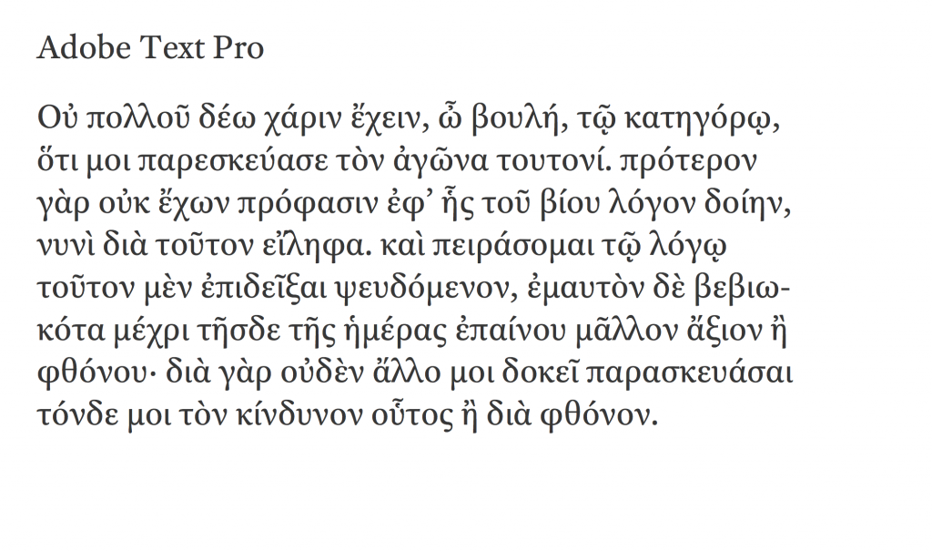
7 Adobe Text Pro (2010)

Μια γραμματοσειρά με έξι μόνο μέλη (τρία βάρη, συν τα πλάγιά τους) αλλά σύγχρονη σχεδιαστική προσέγγιση στο σύνολο των χαρακτήρων, και στην εμφάνισή της στην οθόνη και τις εκτυπώσεις, κατάλληλη για κείμενα όπου το πλήθος των παραλλαγών είναι περιττό. Ο,τιδήποτε έκανε κάποιος παλαιότερα με την μετριότατη Times Greek, μπορεί να κάνει πολύ καλύτερα με την Adobe Text.


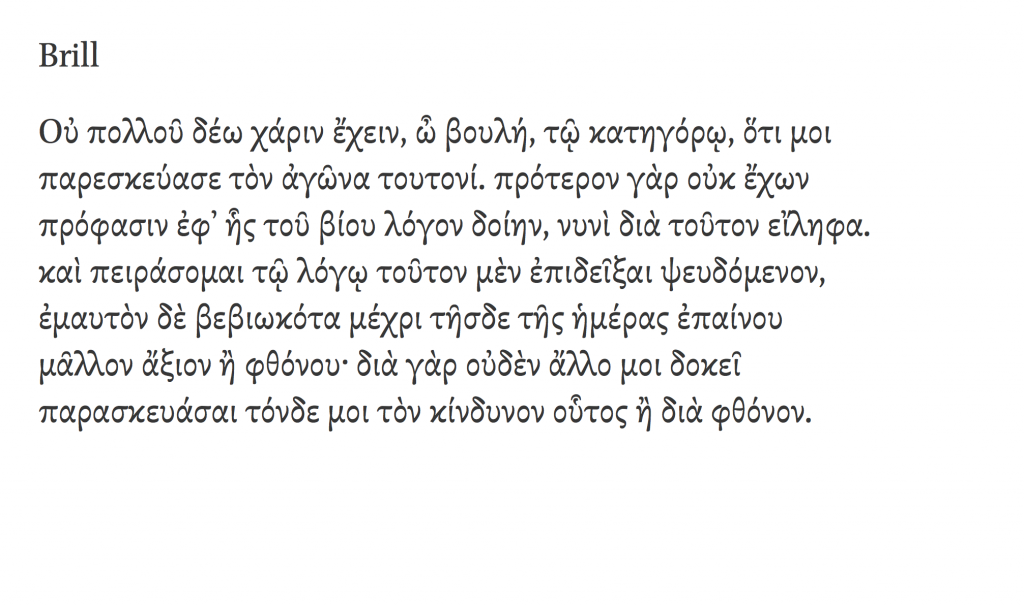
8 Brill (2011)

Μια γραμματοσειρά που σχεδιάστηκε για να αντικαταστήσει το πλήθος των γραμματοσειρών που χρησιμοποιούσε ο εκδοτικός οίκος Brill, που ειδικεύεται στις ακαδημαϊκές εκδόσεις. Για το ελληνικό τμήμα ο John Hudson προσάρμοσε τα καθιερωμένα πρότυπα στις ειδικές ανάγκες του οίκου. Ο Brill ακολούθησε το παράδειγμα της Gentium, και διαθέτει τη γραμματοσειρά ελεύθερα με σκοπό να υποστηρίξει τους συγγραφείς και επιμελητές. Διατίθεται ελεύθερα από αυτή τη σελίδα.


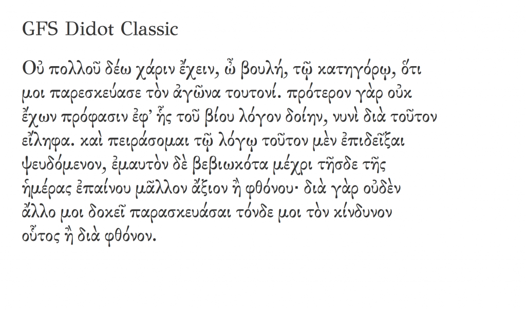
[Συν μία] GFS Didot (2007)

Όπως σημείωσα πιο πάνω, σε όλες αυτές έχω συνεισφέρει, αλλού περισσότερο, κι αλλού λιγότερο. Δε μπορούμε όμως να μιλάμε για πολυτονικές ελληνικές γραμματοσειρές χωρίς να αναφέρουμε τη συνεισφορά της Ελληνικής Εταιρείας Τυπογραφικών Στοιχείων, με κύριο συντελεστή το Γιώργο Ματθιόπουλο. Οι γραμματοσειρές της ΕΕΤΣ βασίζονται σε ιστορικά πρότυπα, και προσφέρονται όλες ελεύθερα. Από αυτές ξεχωρίζω την Didot, που υπάρχει σε δύο εκδόσεις (με λατινικά, ή με εκτεταμένα πολυτονικά).


Υ.Γ. Με σοφή προτροπή του φίλου zvr προσθέτω μια διευκρίνηση: όλες αυτές οι γραμματοσειρές συνοδεύονται από EULA, δηλαδή συμφωνία παραχώρησης δικαιωμάτων χρήσης. Άλλες επιτρέπουν να τις αλλάξεις, άλλες όχι. Άλλες επιτρέπουν μόνο μη-κερδοσκοπική χρήση (π.χ. η Brill) και άλλες μόνο όταν έχεις το λογισμικό της εταιρείας. You get the picture, διαβάστε την άδεια χρήσης. Το βασικό σημείο είναι ότι, από τη στιγμή που ήταν ρεαλιστικό, η υποστήριξη πολυτονικών επιτεύχθηκε και μάλιστα με τρόπο που να επιτρέπει σε χρήστες να γράψουν, να διαβάσουν, και να διακινήσουν πολυτονικά Ελληνικά.

Θα ήταν ωραίο το Υπουργείο Πολιτισμού / Παιδείας / οποιοδήποτε τέλος πάντων, κάποια στιγμή στα πρώτα χρόνια της περασμένης δεκαετίας (ή και νωρίτερα — άνθρωποι σαν τον zvr μιλούσαν για την υποστήριξη ελληνικών απο το 94–95 ήδη) να είχε επιδοτήσει κάτι σαν κι αυτό που έκανε η SIL με τη Gentium, ή η SBL με τη δική της. Και βέβαια αυτοί οι οργανισμοί έχουν τα συμφέροντα και τις σκοπιμότητές τους, αλλά και το όποιο Υπουργείο έχει στόχο την υποστήριξη, ενίσχυση, και εξάπλωση της γλώσσας. Το ότι οι όποιες προσπάθειες δεν έδωσαν μια ελληνική γραμματοσειρά αναφοράς σε διεθνές επίπεδο είναι λυπηρό. (Είναι μεγάλο ζήτημα αυτό το «γραμματοσειρά αναφοράς», και χρειάζεται ολόκληρη ανάρτηση από μόνο του. Ενδεικτικά να πώ ότι μόνο η κωδικοποίηση της αυτόματης αλλαγής από πεζά σε κεφαλαία στις γραμματοσειρές της Adobe πήρε μήνες δοκιμών – και ακόμα δε δουλεύει παντού σωστά, για λόγους που δεν έχουν θέση εδώ).


Lost for words

[Preamble]

A couple of years or so ago I started discussions with Linotype on student bundles for typography students.My first sketch at a very compact set was this: 

DIN Next  Light, Regular, Bold, Black  |  Light Italic, Italic 

Malabar  Regular, Bold  |  Italic

Really No 2  Light, Regular, Medium, Demi  |  Italic, Medium Italic

Trade Gothic   Light, Roman, Bold, Condensed #18 and #20  |  Oblique, Condensed #18 Oblique

(You can tell I’ve got little use for bold italics…)

The company responded positively, and expanded on my initial proposal with many more fonts, producing eventually a Type Designer Education Pack Catalog that has been a hit with our BA students. The typeface combinations are great for the kind of text-intensive, hierarchically-rich typography we require in our projects. It has also been great to be able to offer incoming students a legal way to begin building their font libraries. 

A few weeks ago Dan and James asked me to write a few words for a specimen featuring typefaces from this collection, on the theme of classic typefaces. (They typeset the text in Harmonia Sans by Jim Wasco, one of the nicest people in the type industry).

This is what I sent them:

[End of preamble]


The typographer’s pack

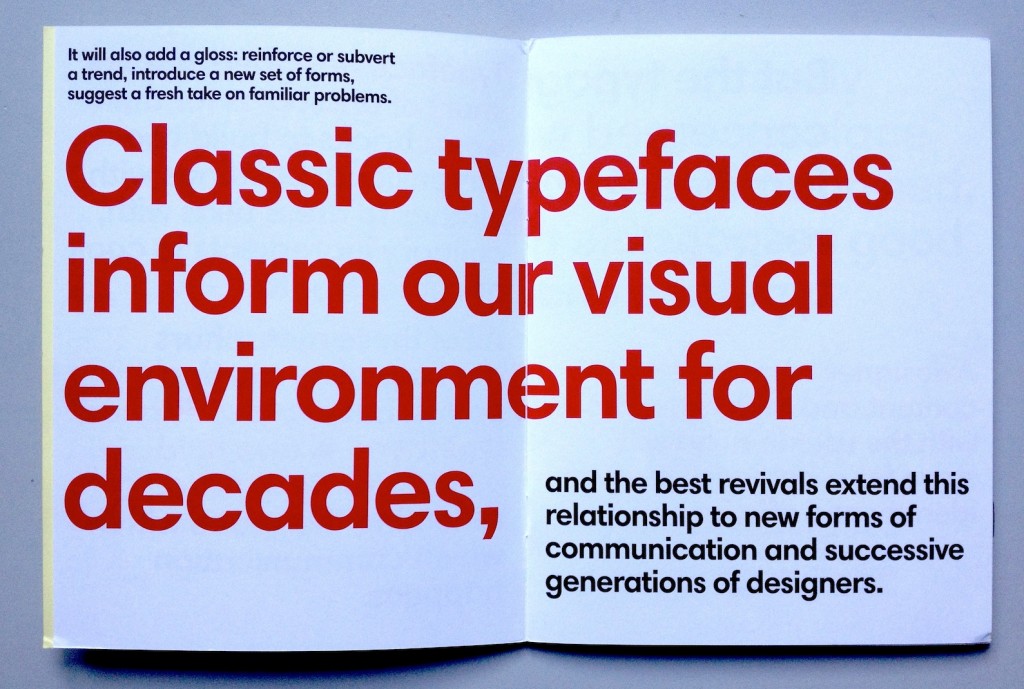
Typeface designers are not short of analogies for their work: bricks to build two-dimensional buildings with, clothes to dress texts with, culinary ingredients to cook documents with. All of these metaphors are helpful as starting points, but a well-designed typeface will also hold up a mirror to its time, reflecting the space within which communication happens. It will also add a gloss: reinforce or subvert a trend, introduce a new set of forms, suggest a fresh take on familiar problems. Classic typefaces inform our visual environment for decades, and the best revivals extend this relationship to new forms of communication and successive generations of designers.

But the typographer is rarely concerned with single typeface families. At the heart of informed, responsible typography lies good typeface choice. A designer who respects the content and makes decisions with the user in mind will strive for a balance between identity and efficiency. These choices happen on a sea of type choices, where (for anything more than a simple sign) several kinds of information need to be visually differentiated, yet balanced and coordinated.

The best typefaces for text-intensive documents have subtle individuality. The balance of counters and blacks might sit comfortably within that ancient sweet spot of typographic density for reading, yet the texture of the paragraph will be delicately self-conscious and subversive. One or two letterforms might step out of line (like the Neo Sans “g”, and the giddy “s” in Trade Gothic). Others might keep to the overall rhythm of good typography while whistling to a tune you can’t quite place: the rootless Really No 2, the deeply rooted Malabar. Yet others stake a claim and own that space forever, marking any interlopers as imitators: DIN and Frutiger, and Swift.

None of these typefaces can be described as indulgent, save for the occasionally too-wide family. But in their combinations they offer an exceptionally rich typographic palette.And this is where the type-fun begins: give me the millions of possible combinations, to discover the ones that not only do the job, but make the document memorable, and a pleasure to read.